The Holt Basic Reading System
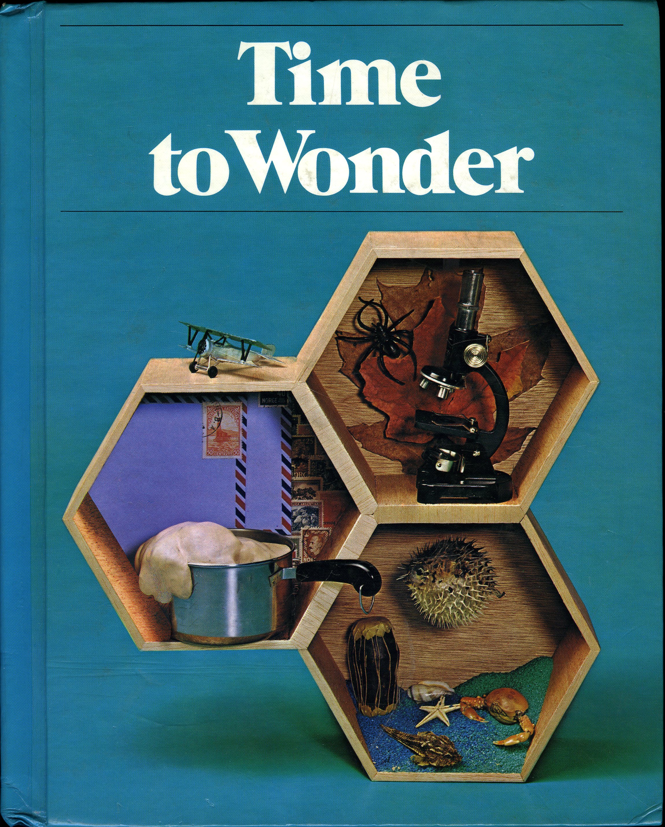
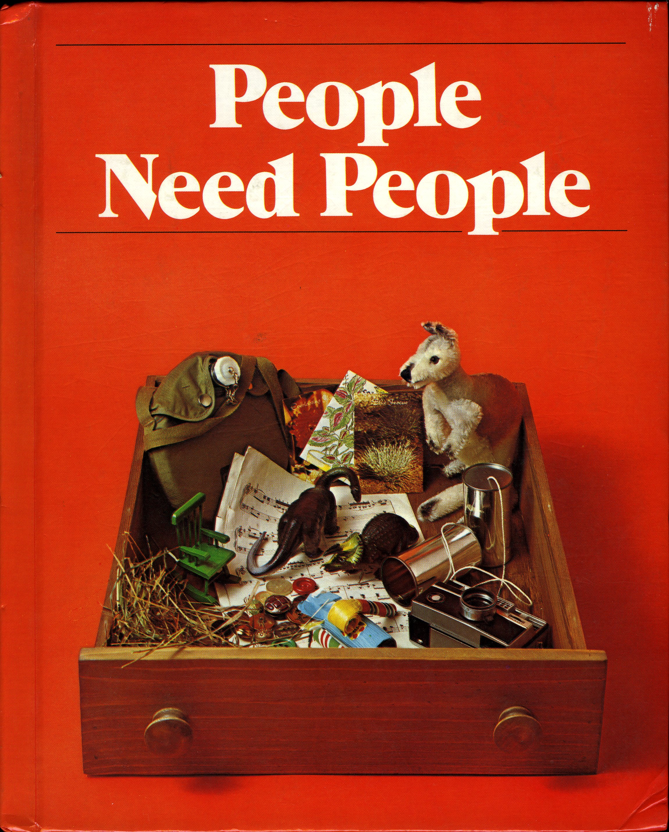
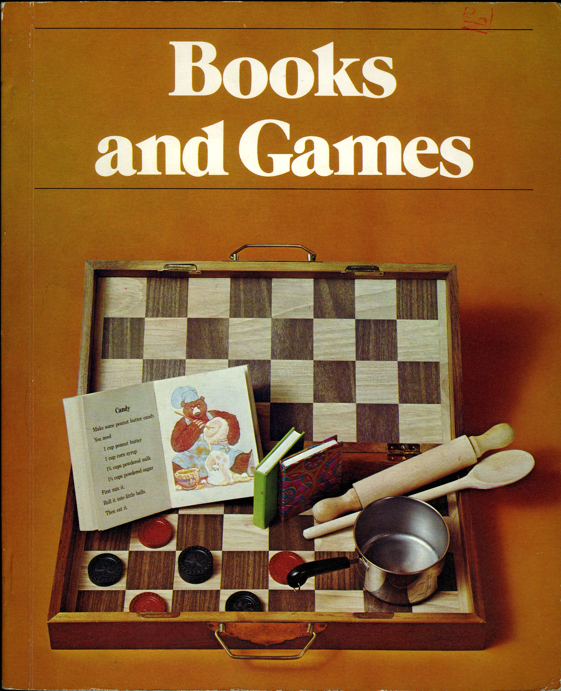
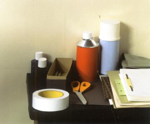
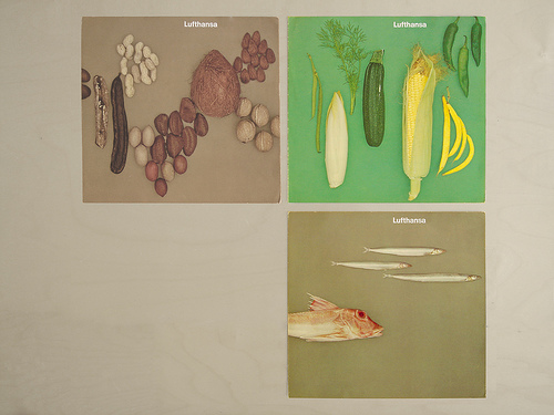
Above: Time to Wonder (Level 13, Grade 4 of the Holt Basic Reading System). Also shown: People Need People, and Books and Games. Series design by Pellegrini Kaestle & Gross. Photography by Dick Frank.
Every designer I know gets visually obsessed with something from time to time. For me, one ongoing obsession happens to be the Holt Basic Reading System.
I don’t know too much about the books themselves—the series was launched in 1977, and, according to this study, it seems to have been a hit with teachers and school administrators. It was used in my elementary school, Countryside, and I must’ve stared at the Time to Wonder cover (above) for a whole year in 4th Grade, though I don’t have a strong memory of it. But shortly after finishing an article on ITC Grouch a few years ago, I went home to see my parents. I showed them the typeface I’d written about, and my mom, a lifelong teacher, pulled Time to Wonder off a basement shelf and said, “It reminds me of this old textbook.” Of course she’d spec’d the typeface perfectly, but what really captivated me was the image that went with it.
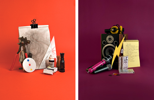

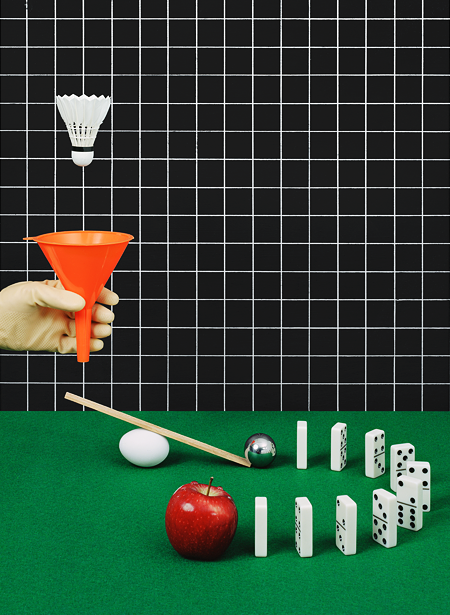
Above, top: Photos from the 2007 RISD Yearbook designed by Nikolay Saveliev, Caroline May, Steve Reinmuth and Frank Vandiver. More here. Above, bottom: Franklin Vandiver for Topic 11: Escape.
I took Time to Wonder into my studio, where it sat on my desk for a few weeks in summer 2007. Around that time, a young designer named Franklin Vandiver stopped by to show us his portfolio. In it was the RISD Yearbook, which he’d designed with a few friends. The dividers featured photo setups that strongly reminded me of the Holt Basic Reading System. I asked Topic Magazine to commission Franklin to do some similar photos for our upcoming Escape issue. The bright, playful tableaus act as teasers to the articles within.
Above, top: Phototrophy, Detail X, 2005 by Thomas Demand. Above, bottom: XYZ 1 cover for ‘Boards by RBG6.
A few months later, Ryan Nelson put up a post on the Walker Art Center’s Design Blog called “Balloons, Spilt Liquids and Paper Constructions.” He wrote,
There is no doubt that each of these elements are visually interesting, but besides that, I have had little luck finding an explanation to their existence (or even their emergence) in current graphic design and photography. Perhaps the use of spilt liquids originated with Swedish designers, RGB6 and their poster for the typeface Kada. While it’s even possible that the use of paper constructions could have stemmed from the intricate workings of German photographer, Thomas Demand.
To this keen observation, Nelson added a nicely Hamiltonian wordlist:
Balloons: celebration, youthfulness, pop, expressive/abstract typography, party, etc. Spilt Liquids: spontaneity, irresponsibility, mysteriousness, happy accidents, playfulness, etc. Paper Constructions: exaggerated representations of actual objects, a play between reality and fabrication, artificiality, etc.
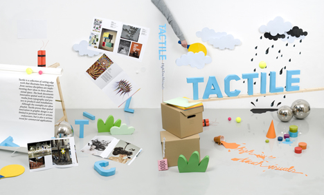
Around the same time, the book Tactile appeared, and it seemed the trend was official.
I started grabbing any images I found that reminded me of the Holt Basic Reading System Covers, which I’ve added below.
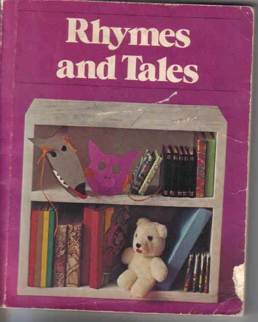
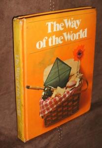
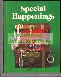
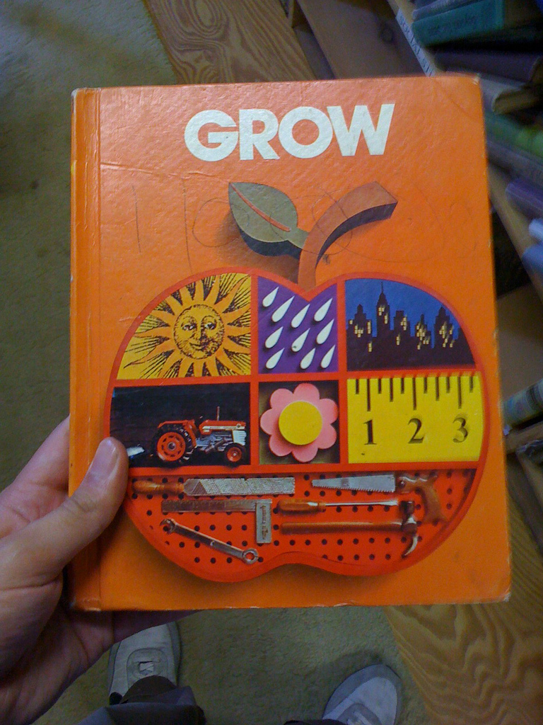
I’ve been trying to collect the whole Holt Basic Reading System, but so far it’s been tricky. Textbooks with this series of covers can be difficult to find because they were re-editioned and redesigned every several years. But after a bit of research it seems Pellegrini Kaestle & Gross might have also done covers for About Me, Pets and People, Can You Imagine?, A Place for Me, Hear Say See Write!, Time for Friends, Never Give Up!, Special Happenings, The Adventure of Flight, and Great Waves Breaking—as well as Rhymes and Tales, The Way of the World, and Grow, seen above.
The names are classic textbook titles, offering just the slightest suggestions to spur childrens’ imagination. And the photo tableaus invite inquiry and investigation in the same way—which is why the Holt Basic Reading System remains, for me, a quiet obsession and classic bit of design inspiration.