Too Cool for School

With alumni like Marc Jacobs, Tom Ford, and Donna Karan, Parsons School of Design is no stranger to the power of a great brand. And, since we teach there, we’re certainly no strangers to Parsons. So, naturally, our interest was piqued a few months ago when a faculty email announced that the school would now be known as “Parsons The New School for Design” and that New School University would now be “The New School.” Since it preserved the name “Parsons” but clarified our tie to The New School, the new title sat well with us. The email went on to explain that The New School’s other seven colleges would be renamed accordingly, and a new logo would be introduced. Then we saw the new logo.
The new logo, created by brand veterans Siegel & Gale, scraps nearly every convention in the book. There is no heraldry or traditional academic symbolism. Instead of a school color, there’s a school palette. Instead of a single mark, there are several visually similar marks. And instead of well-mannered, serif capital letters, there is stenciled, spray-painted, graffiti-inspired text that Alan Siegel, speaking to AdCritic.com, describes as “hipster typography and blurry lettering designed to capture the irreverent, urban flavor of the university.” The net effect of all this misbehavior is something that feels less like a school and more like a soft drink.
In a New York Times article spurred by The New School’s new name, our outstanding president, Bob Kerrey, was asked about the recent trend in higher education toward rebranding and renaming. His answer was honest and direct. “My view is that you never argue with the customer about your name,” he said.
What some might argue with, however, is the idea of the student as a customer and the school as a lifestyle brand. Schools didn’t use to advertise themselves much, because advertising’s guileless buying and selling was once considered déclassé and unsuitable for the more refined realm of the academy. If schools did any selling at all, it was based not on differentiation but on a commonly agreed-upon standard of excellence. As a result, school logos have traditionally drawn on shields and flags and other heraldic imagery that suggested legacy, exclusivity, and academic discipline.
The New School’s previous logo took its cue from this tradition. Six turning squares, one for each college, create a modern-looking shield. Designed in the early 1990s by Chermayeff & Geissmar—who’ve created identities for PBS, NBC, and Chase Manhattan Bank—the shield was paired with Matrix, one of the first computer-created typefaces. The logo was celebrated as a modern take on a traditional symbol, uniting the past and future with elegance and simplicity.

As colleges refashion themselves as brands, however, their icons must shift from symbols of defense to symbols that attempt to identify and empathize with a target audience. The replacement of the traditional shield by the new logo, with its visual cues intended to link the school with a young urban culture, reflects The New School’s embrace of lifestyle marketing as its method for facing the public and attracting new students.
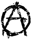
But the method is not without its pitfalls. In fact, the new logo exemplifies the dangers of exploiting pop culture forms such as graffiti. Like Alan Siegel, many a marketing exec has been enticed by the vibrant street art, but the problem with an institution’s use of graffiti, as The New School case shows, is authenticity. Though Siegel & Gale Chief Creative Officer Howard Belk has emphasized that the graffiti “was painted, not Photoshopped,” that is not enough. Dissertations could be written on what makes an artform “authentic,” but most everyone would agree that corporate graffiti is not. Graffiti is almost always the critique of an establishment rather than the symbol of one. It is telling that one of the only unifying marks for graffiti artists is anarchy’s circled capital A.
While it may be true, as Belk went on to note, that “graffiti has been a medium for voices with alternative views,” any institutional attempt to harness that subversive quality is doomed. British advertisers Saatchi & Saatchi learned this lesson back in May, when they attempted to introduce a campaign via graffiti in London’s East End. Within days, The London Times reported, street artists hostile to the ad campaign had begun defacing it.
Elsewhere in London, however, is a different sort of lesson. While designing the Tate’s identity in 2000, the British firm Wolff Olins created an indentity that’s remarkably similar to The New School’s, with more successful results. Like Siegel & Gale, Wolff Olins was asked to create an identity that would unify several locations with different missions. They were also asked to create an identity that would empower museumgoers rather than the institution of the museum itself. The resulting identity is all about shifts of focus, as the logo’s design suggests. The name, “Tate,” is blurred and the specific locations are sharp, just as with The New School and its member colleges.

Interestingly, one of Parsons’s most direct competitors for students, the School of Visual Arts, also has a logo with a handmade feel. Created by SVA faculty member George Tscherny, it depicts a sun—a classic symbol of education—painted in fluid, Matisse-like brushstrokes by Tscherny himself. In so doing, the mark references both the hand of the creative artist and the tradition of the academic emblem.

Both the Tate and SVA succeed by avoiding the thorny language of graffiti, which is impossible for any institution to control. And both succeed in branding to their “customers” with big ideas rather than stylistic rationalizations. While it’s true that higher education is a business of youth, exuberance, and constant change, it’s hardly as fluid as fashion, which is seldom the same from one season to the next. Yet the Chanel logo, designed in 1925 by Coco Chanel herself, is only six years older than The New School, and it’s remained unchanged and in fashion ever since.

Diagnosis? In choosing their new logo, perhaps The New School should have asked for a little advice from its more fashionable alumni.