30/30: Ads for Alfieri & Lacroix by Franco Grignani
Launched in 1896, the Milan-based printer of Alfieri & Lacroix found its truest leader in Dario Morani, a pharmacist and sportswriter who joined as general manager one year after it was purchased from its founders by Antonio Crespi in 1924. In addition to Morani, Crespi hired his former military school classmate Antonio Boggeri, a musician and photographer, to work alongside him. The time was deeply formative for Boggeri and by 1933 he had opened the legendary Studio Boggeri, a design office that employed Bruno Monguzzi, Bruno Munari, Max Huber, Walter Ballmer, Enzo Mari, Bob Noorda, Albe Steiner, and many others. From the beginning, Alfieri & Lacroix pioneered a then-new form of printing known as zincography, or photogravure. The method was ideal for Boggeri’s evolving style, which mixed tones and rhythms like music and layered images atop images like filmic montage. The deeply synthetic and persuasive style suited both commerce and Fascist propaganda. While Morani abstained from joining the Fascist party and was placed under constant surveillance, Alfieri & Lacroix printed travel guides to Libya and even an illustrated edition of Benito Mussolini’s Voci D’Italia alongside children’s’ books and orchestra posters.
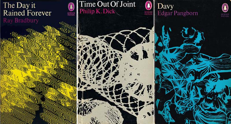
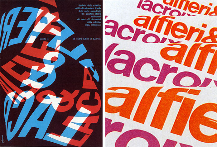
In the postwar years, Morani needed to restore the printing house’s status as a high-quality commercial firm that remained technologically cutting-edge, and he turned to another Studio Boggeri alumni to help: Franco Grignani. Trained in architecture and reared in Futurism, Grignani took Boggeri’s methods and built on them. Where Boggeri made planes, Grignani made worlds. His twisting, liquid forms blur, stretch, knot, and puddle in space, and then fuse back to the flat plane on which they sit. A few of these posters date from 1960 and their formal experimentation culminates in Grignani’s most famous commercial work, the pseudonymously-created Woolmark logo from 1964, which debuted in London in the moment of Bridget Riley’s paintings (Riley was an art director at J. Walter Thompson until 1962) and Mary Quant’s fashions, along with the birth of psychedelia. Often rendered on black, Grignani’s compositions are variously evocative of the photographic negative, the projected image, and the illuminated imagery of the computer screen. By 1970, a photo-driven montague technique that started as a way of mobilizing the masses by synthesizing a coherent utopian ideal was being used by Grignani to evoke a shattered, dystopian dread in his covers for Philip K. Dick’s Time out of Joint and Ray Bradbury’s The Day It Rained Forever.
Commissioned by Alexander Tochilovsky, Director of the Herb Lubalin Center of Design and Typography, for the exhibition “Thirty: 1985–2015,” in which 30 critics reflect on 30 pieces from the collection for the Center’s 30th Anniversary.