Collected Words
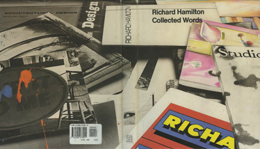
Above: Richard Hamilton, Collected Words. Thames & Hudson, 1983. Cover design by Richard Hamilton.
View larger
Ames Room
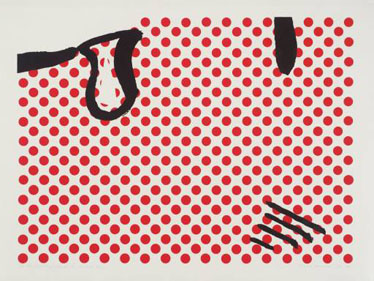
Occupants of an Ames Room appear to those viewing it from a peephole at a fixed point to be greatly distorted in size. Someone may appear the size of a giant one moment, and, crossing the room, seem no larger than a baby the next. In fact, it is the room that is distorted, not its occupants. Created in 1946 by American opthamologist Adelbert Ames, Jr., almost none of the walls or floors of an Ames Room are at right angles, even though the room appears to be a perfect cube. Floor and ceiling slope; one back corner is much farther away than the other. The room plays on our predisposition to judge size comparatively and gauge space according to fixed laws of perspective defined during the Renaissance by Alberti and others.
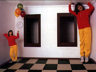
Richard Hamilton cites Ames’s work in his book Collected Words alongside two reproductions of his early works, Induction study (1950) and Chromatic spiral (1950). Next to this jumble of diagonal lines, both abstractly reminiscent of Collected Words’s cover, Hamilton writes, “Perspective is the dominant clue in our interpretation of any image. The human eye will read diagonal marks as having spatial connotations even when they are contradicted by other clues. The Ames experiment in which perspective was so perverted as to propose a giant human being in one corner and a midget in another corner of a logical-seeming room proved this convincingly.”
- See also: Interior I
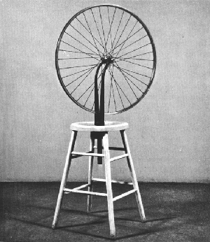
Bicycle Wheel (1913)
Marcel Duchamp inverted the front wheel of a bicycle wheel and attached it to an ordinary stool for what has come to be called his first readymade, though he did not officially coin the term until 1915. The sculpture seems to be celebration, at least to some degree, of point-less, going-in-circles kind of motion, with Duchamp frequently comparing the wheel’s spinning to “flames dancing in a fireplace” or the back-and-forth of a game of chess. Collected Words collects a number of Hamilton’s writings about Duchamp, including a general piece on Duchamp he wrote for Art International on the occasion of Duchamp’s retrospective at the Pasadena Museum in 1963, which mentions the Bicycle Wheel: “[it] is evidence of Duchamp’s concern with motion. If we look for intention it seems to have little significance other than as an enjoyable homemade toy.” Hamilton goes on to point out that by appropriating objects as sculpture rather than making them himself, Duchamp was able to “satisfy the desire to suppress the artistic hand, leaving the mind in command.” The Bicycle Wheel appears on Collected Words’s back cover in a photograph that also includes Hamilton’s own readymade-inspired piece Epiphany (1964), his painting Interior I (1964), and his screenprint homage A little of Roy Lichtenstein for… (1964).
- See also: Sign
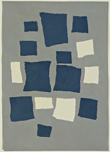
Collage with Squares Arranged According to the Laws of Chance (1916–17)
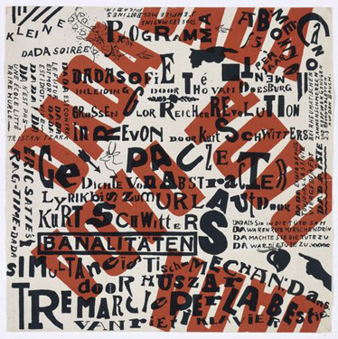
Collage, of course, was as important for Dada artist Hans Arp as it was for Hamilton and other Pop Artists. The critic John Elderfield cites a story by Hans Richter, Arp’s colleague, who “claim[ed] that the ‘law of chance’ was discovered when Arp tore up a failed drawing and was struck by the pattern it made on the floor.” Like Duchamp’s readymade, Arp’s collage minimizes the artist’s hand and supplants a logical chain of ideas with a more automatic, spontaneous way of making. There is a distinction made, too, between accident (in the negative sense) and chance (in the positive sense). Graphically, Arp’s collage is reminiscent of Theo van Doesburg and Kurt Schwitters’s 1922 invitation to a Small Dada Evening (Kleine Dada Soirée), as well as Hamilton’s photograph of Duchamp’s unordered notes from the Green Box on p.194 of Collected Words and the cover of Collected Words itself, with its tumbling sense of order in a very disorderly desktop.
- See also: Green Box; “Urbane Image”
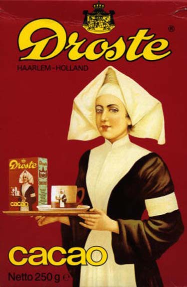
Droste effect
The Droste effect is named for a brand of Dutch cocoa whose box has a picture of a nurse holding a serving tray with a cup of hot chocolate and a box of the same brand of cocoa bearing the image on the box. Since the rendering of the nurse holding the tray is relatively realistic, the Droste effect is a Pop play both on space and time. Theoretically, on the smaller version of the box in the picture is a still smaller version of the box in the picture, and on and on into infinity. In heraldry this shield-within-an-identical shield is termed mise en abyme. The play on time happens, whether on a shield or a cocoa box, because the moment of unique description coincides with an identical description’s prior existence. The inclusion of an exact copy, then, creates both window through the surface and a timeline into the past to when the presumed “original” was created. The effect can be seen in Hamiltons’s painting Interior I, where the entire painting itself is reproduced on the far right edge of the painting. A photo of Interior I appears within another photo on Collected Words’s back cover.
- See also: Interior I; X
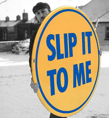
Epiphany (1964)
Hamilton’s Epiphany shares much in both form and strategy with Duchamp’s Bicycle Wheel. Both are based on large circles – Epiphany is slightly larger – and both are “found” or readymade objects presented via the artist in the gallery space to the public. In a Guardian interview about his “Imaging Ulysses” show at the British Museum in 2002, Hamilton compares James Joyce to Duchamp and says, “Their genius pervades my life.” Hamilton argues that Joyce’s concept of epiphany, a moment of profound illumination in which “the soul of the commonest object appears to us radiant,” is uncannily parallel to Duchamp’s recognition of undistinguished objects as full of an illimitable aesthetic appeal. “I sometimes wonder,” Hamilton muses, “if a sudden epiphany hit Marcel Duchamp when he picked up a bicycle wheel and put it through a hole in the top of a kitchen stool in 1913. I experienced such a moment of understanding when I encountered a large button in a seedy gift shop in Pacific Ocean Park, Venice, California, with the words SLIP IT TO ME blatantly displayed across it. The greatly enlarged version which I characterized as a work of art was entitled Epiphany.”
Epiphany appears on Collected Words’s cover reproduced in black and white with orange and blue blots of paint and is considered one of Hamilton’s first “Products.”
- See also: Bicycle Wheel; Sign
Fonts
Hamilton espouses a certain amount of typographic diversity both in his “typo-translation” of Duchamp’s notes for the Green Box and in the settings of the essays in Collected Words itself. In the “Preamble” to the book, he writes, “Oddities of typesetting in the later parts of the book relate the sections back to their original publication, or non-publication, and also to their subject matter. A piece written for the Sunday Times or The Times Educational Supplement looks plausible set in Times Roman. An unpublished text is likely to appear in more intimate italics. A general lack of conformity helps to isolate and identify segments of a sporadic and diverse output” (italics Hamilton’s). In addition to Times Roman, Hamilton uses Helvetica for the majority of essays. For this reason, in this glossary Hamilton’s direct quotations appear in Helvetica. Collected Words also uses ITC Century Book for transcripts or letters and Monotype Garamond for a single essay from Design magazine. Plantin, Modern, and Bembo are used in the discussion of typesetting the Green Box, and Futura is used in the collaborations with Dieter Roth. Collected Words’s front and back covers include at least eight different typefaces in their original contexts.
- See also: Green Box
Green Box (1934)
Publishing under his nom de plume Rrose Sélavy, Duchamp recreated “93 documents (photographs, drawings, and manuscript notes of the years 1911–1915) as well as a plate in color” with obsessive exactitude – down to every last blot and tear – in a limited edition of 300 green felt–wrapped cardboard boxes bearing the title of his great work, The Bride stripped bare by her bachelors, even (aka The Large Glass, 1915–23). The Green Box was not meant to supplement the Large Glass but to extend it into the verbal sphere. Hamilton writes, “[Duchamp] contrived an art form without parallel, a unique marriage of visual and linguistic concepts. […] The text exists beside the Glass as a commentary and within it as a necessary component of its structure. Without the notes the painting loses some of its significance and without the monumental presence of the Glass the notes have an air of random irrelevance.”
Throughout 1959–60 Hamilton undertook a typographic English translation of the Green Box with Yale art history professor George Head Hamilton. Duchamp introduced the two men to one another. The professor handled the translation from French to English, and the artist handled the translation from facsimile to typography. The challenge, of course, was to ensure that “[Duchamp’s] doubts, the rethinks and doubletakes, the flat bewilderment and the moments of assurance; the pauses and reaffirmations are there, the winces, private sniggers and nervous tics” when “calligraphy is converted into hard metal.” Hamilton’s rendition of the Green Box in book form also required sequencing the documents with his usual idiosyncratic thoughtfulness.
In 1966 Hamilton created a full-scale replica of the Large Glass for the Tate Gallery’s retrospective when the original was considered too fragile to travel from the US. In 2003 Hamilton used Adobe Illustrator to create Typo/Topography, in which the book’s pages are unbound and superimposed onto a digital rendition of the Large Glass itself at actual size. The effect of these pages scattered over space is uncannily like that of the photograph of the contents of the Green Box itself on p.194 of Collected Words. The cover of Collected Words – which, like the Green Box, is a collection of artist’s writings – shares this loose sense of visual organization, although rather than translating the handmade to the mechanical as Duchamp does, Hamilton painstakingly illustrates several of the covers shown on top of a coarsely-screened photograph to create the cover image, working as he does in many of his collage paintings.
- See also: Collage with Squares…; Questions (from A–Z Box); White Album
Hamilton, Richard
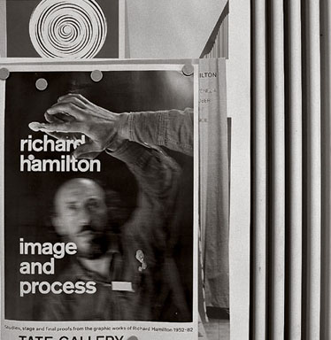
Hamilton shows himself reflected in a mirror for the poster of the 1982 Tate show “Image and Process.” The image is identical to a 1974 project of Hamilton’s entitled Palindrome. (A “palindrome” is a phrase that reads the same backward or forward.) Palindrome was created at the invitation of art critic Nicholas Calas for a group edition of artist’s multiples called “Mirrors of the Mind” on the subject of mirrors. Hamilton’s submission was created using stereoscopic lenticular printing, which involves interlacing strips from two two-dimensional images taken approximately two inches apart onto the back of plastic prism-like lenses. The result is a sense of three-dimensional depth without the special glasses. Hamilton writes, “I touched the mirror surface and realized that the fact that I could see part of my physical self, as well as its reflection, made the visual experience stronger. […] Reaching for a volume behind the mirror suggested that the use of three-dimensional photography might help to reconstruct that experience.”
Interior I (1964)
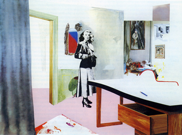
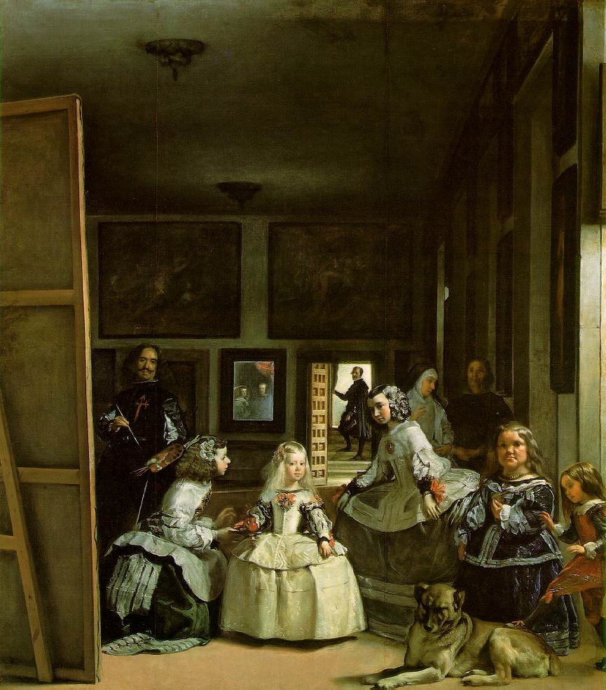
This painting started from Hamilton’s fascination with a publicity still from the Douglas Sirk thriller Shockproof (1948) featuring the actress Patricia Knight in an oddly-lit and irregularly constructed living room, the body of a dead man at her feet. Knight stares slightly to the right of the viewer’s glance though her body faces left, a positioning identical to that of the central figure of Velázquez’s Las Meninas (1656), the Infanta Margarita, which Hamilton references in his essay on “Interiors” in Collected Words: “Velázquez’s great interior painting Las Meninas must have been hanging around in my head waiting for some loving attention.” (Picasso was obsessed with Las Meninas, too, completing 58 paintings inspired by it in 1957 alone.) Beyond the central figure of Knight, however, Hamilton was struck by the artifice of this particular interior image, shot by a wide-angle lens with walls that do not meet at right angles and multiple sources of lighting. Similar to an Ames Room, this film set had been constructed to fool the eye, deepening the flat, wide angle of the camera by imitating the rules of perspective. Despite these efforts, though, Hamilton writes that “the foreground remained emphatically close and the recession extreme.” In Interior I, the body has been removed, but the sense of disquiet remains because the perspectival ambiguity “contributed more to the foreboding atmosphere than the casually observed body lying on the floor, partially concealed by a desk.” In the process of making a collage, one whole is clipped and placed in a different whole. Contexts are changed, but resonances remain. What’s been taken away affects what’s there, and what’s been brought together is altered by what’s been left behind.
Hamilton connects his interiors to still lifes in an almost cinematic way, explaining that “still life paintings [are], in a sense, interior details,” as close-ups or “insert” shots are in film. The cover of Collected Words can certainly be seen in this way, cropped from the desk of a larger room, perhaps even that of Interior, of which Hamilton made multiple versions. Also like the cover of Collected Words, Interior I combines painting on photo-reproduction, and this strategy, too, is discussed by Hamilton: “I found that art was as often the subject as they were about rooms. […] A secondary concern of my painting was this transformation of a work of art into a new image by the processing it receives through photography and printing and back again into painting.” On Collected Words’s cover, Interior I is itself reproduced, selected, as it was, for the back cover image of an earlier printed publication of Hamilton’s. Hamilton then photographed the back cover reproduction for the Collected Words cover image itself, heightening this photograph with his own drawing and painting. This “original” altered photograph is then reproduced as the printed cover on the book itself. From reality to publicity still, reproduction to painting, painting to cover image, cover image to collage, and collage back to printed cover again: the result is a dizzying displacement not just of space but of time, each level stepped further back from reality toward representation, each reproduction altered slightly by the one that succeeds it.
- See also: Ames Room; Just what is it…
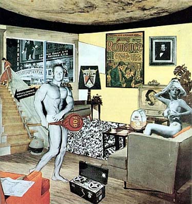
Just what is it that makes today’s homes so different, so appealing? (1956)
This small collage was submitted by John McHale, John Voelcker, and Hamilton for the “This Is Tomorrow” exhibition at London’s ICA. The image was also featured in the show’s catalog and posters. Heavily influenced by Eduardo Paolozzi’s Bunk collages and lecture from 1952. Hamilton famously describes his image in Collected Words as “tabular as well as pictorial.” Included above this statement is a table of words from which the collage was supposedly developed.
In a virtuoso essay in the New Left Review, critic Hal Foster examines the implications of the term “tabular” from almost every conceivable resonance. He begins, “‘tabular’ derives from tabula, Latin for table, but also for writing-tablet, in which, in ancient use, both painting and printing figure as modes of inscription.” Writing, then, is bound up with image-making, and vice versa, both for Hamilton and for the Pop Culture he investigates. Foster continues,
his pictures register the traces of the visual-verbal hybrid characteristic of the magazine spread or the tabloid layout (perhaps “tabular” connotes “tabloid” as well), a hybrid that anticipates the visual-verbal sign (call it a bit or a byte) that dominates electronic media space today.
Foster points out that “tabulation” is also a systematic process favored by electronic media. He uses this systematizaton to correlate Hamilton’s diversity of imagery with the techniques favored Madison Avenue itself:
Like an ad-man, then, Hamilton tabulates – as in correlates – different media and messages, and tabulates – as in calculates – this correlation in terms of visual appeal and psychological effect.
In Foster’s description, the spreadsheet almost appears before our eyes.
Foster then recalls that Hamilton carefully defined the collage as more than merely tabular. It is also “pictorial” in his formulation, a kind of hybrid in which the words become types of pictures, arranged in many ways as words would be, within a square of what Foster describes as “semi-illusionistic space” and what Hamilton describes as “domestic interiors,” one of which is the site for Just what is it… What this creates is a reading that occurs not just in two dimensions but in three, being translated and retranslated perpetually back-and-forth. Here Foster points out Walter Benjamin’s assertion that in an age of mechanical reproduction, “‘literacy’ must include the decoding of captioned photographs.” From words to pictures, and back to words again.
Foster goes on, explaining that the tabular image can function as a “research model” for a new society. The laws that govern this society, written on tablets of course, suggest that Hamilton’s tabular images are also “pedagogical investigations of a ‘new body of laws’, a new subjective inscription, a new symbolic order, of Pop society.” The tabular picture is not just evocative of a cluttered contemporary magazine layout, it is also evocative of a cluttered shop window. Behind the glass is an anthology of “presentation techniques” that “mimes the distracted attention of the desirous viewer-consumer.” Our wandering eyes are given much more wandering to do. Pleasure, both sexual and consumptive, is the intended and eventual result.
The glass of the shop window is of course connected with the Glass of Duchamp, and in many ways Duchamp’s Large Glass is, for both Foster and Hamilton, a “proto-tabular” work. But Foster explains what Hamilton only intuits, which is that for this new tabular strategy to work it must tap not only into the future, but also into the past. The effect of this disguise is, finally, to create a tableau, and this final bit of tabular transmogrification concludes Foster’s essay. He writes,
The tableau and the tabular can no longer be held apart as distinctive forms. […] This is another Pop insight that Hamilton shares with Lichtenstein in particular: that today, in both compositional order and subjective effect, there is often no great difference between a good comic or ad and a grand painting.
Hamilton concludes the book with a statement explicitly connecting his paintings to the art of the past: “I have never made a painting which does not show an intense awareness of the human figure.” Following thathe includes, on p.275, a Table of Contents. Its placement suggests it’s not there for navigation. It’s almost an afterthought. If Hamilton took away the cover collage, however, his readers would certainly be lost. Like the tabular image Just what is it…, the table was useful in the image’s making, but it is scarcely necessary for the image’s reading.
- See also: Newspapers; Telephone
Kitaj, R.B.
Hamilton mentions this British Pop artist in passing when discussing his own painting Pin-up (1961). Hamilton writes, “R.B. Kitaj is liable to assemble disconcertingly disparate styles in his paintings (an extreme case is Certain forms of Association Neglected Before). He has said of these jumps that they are, among other things, ‘a change of pace.’”
- See also: “Urbane Image”
Le Journal
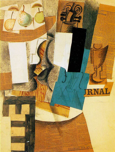
Picasso’s masterpiece of synthetic cubism Still Life with Violin and Fruit includes actual portions of the newspaper Le Journal from 6 and 9 December 1912 pasted to the illustration board. The newsprint is used abstractly to create a bowl shape for the fruit, decoratively to dress the table’s skirt and the wallpapering behind the violin, representationally via the masthead clipping to show the newspaper lying on the table, and literally as the thing itself.
- See also: Newspapers; Telephone
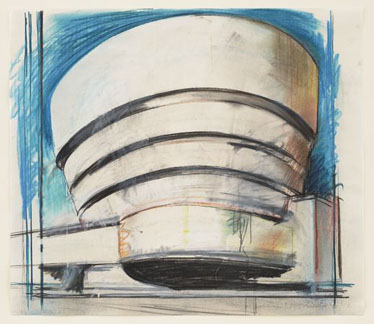
Museum
Throughout 1965–66, Hamilton made a series of drawings, paintings, collages, and relief sculptures of Frank Lloyd Wright’s Guggenheim Museum. Each is titled The Solomon R. Guggenheim with the word “museum” conspicuously omitted. Hamilton adds it, instead, by cycling through a wide array of visual styles that include and mimic those found inside a museum like the Guggenheim itself: the architectural rendering, the Pop serial screenprint, the sentimental watercolor, even the ancient form of bas relief. Though he omits the word “museum” from the titles of these works, the word crops up elsewhere in Collected Words during his discussion of the domestic interiors that inform Interior I. He describes them as “a set of anachronisms, a museum, with the lingering residues of decorative styles that an inhabited space collects. Banal or beautiful, exquisite or sordid, each says a lot about its owner and something about humanity in general.”
The Solomon R. Guggenheim – Architect’s Visual, which is in the permanent collection of MoMA, is shown on a back cover on the back cover of Collected Words.
Newspapers
“Newspapers” is one of the words in the table Hamilton used to develop the collage Just what is it… This table also includes the words “Man, Woman, Humanity, History, Food, Cinema, TV, Telephone, Comics (picture information), Words (textual information), Tape recording (aural information), Cars, Domestic appliances,” and “Space.” A newspaper is reproduced at an angle is shown on the arm of a chair in the corner of the collage.
- See also: Just what is it…; Le Journal
Obrist, Hans-Ulrich
An influential Swiss curator and art critic currently codirecting the Serpentine Gallery in London. Interviewing Hamilton for Tate Magazine in 2003, Obrist asked him about an Exhibit, an exhibition staged by Hamilton with Victor Pasamore in 1957. Hamilton explained, “Victor Pasmore told me that he liked the ‘Man, Machine and Motion’ show but didn’t care for the pictures. He’d have preferred the show without a subject.” Hamilton devised a show with no visual content beyond the division of space. Photographs included in Collected Words show acrylic panels of varying sizes and degrees of translucency intersecting in space at a different angles and depths. These overlapping planes are reminiscent of the depiction of printed matter on Collected Words’s cover. In the Obrist interview, Hamilton continues,
I thought about what was novel in this experience of “exhibition” and decided that it is a form that requires the movement of the spectator in a space. There are other ways to absorb information: watching a projected image in a cinema, reading a book; but an exhibition presents information in such a way that you are required to move to it rather than have it directed at you. […] an Exhibit had no subject, no theme other than itself; it was self-referential.
- See also: Ames Room
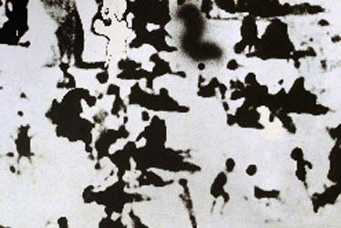
People (1965–66)
The people in Hamilton’s series People are an abstracted set of bathers blown up – Antonioni’s Blowup is from 1966 as well – from a postcard image taken at Whitley Bay in northern England. The image yielded “several variations, a medium-sized painting, a print on a photographic base, a postcard, a one-off ‘multiple,’ and the cover for the March 1969 issue of Studio International” The Studio International cover is recreated in watercolor by Hamilton for the front cover of Collected Words.
Hamilton goes on,
Photographs such as this […] show a random sample of humanity. When broken down and analyzed they can provide an incredible amount of information about individuals and their activity. There is, however, a breaking-point, a stage at which the emulsion is too large to absorb the imprint of form. It was a search for this moment of loss that became the real subject of the series.
Photographers also refer to the amount of “information” present on the photographic negative. When a print is overdeveloped, underexposed, or otherwise misprocessed, the result can muddy the mottling of a shadow or blow out a brightly-lit face. In this sense, Hamilton’s photographed beachgoers face a double loss: their behaviors are gone, but so are their formal attributes, as there is simply not enough photographic information available on the negative to read their forms at such a high degree of enlargement. It is telling that Hamilton has not represented individuals in People; the very title suggests a multiple, or mass, number. As we learn less about these single human beings, we learn more about the specific photographic surface that’s captured and grouped them.
- See also: Telephone
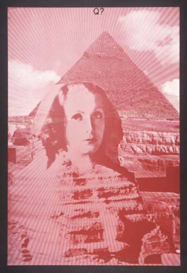
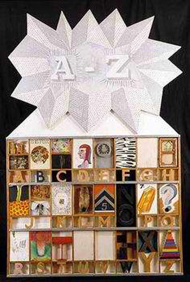
Questions (from A–Z Box) (1969)
The same year Hamilton wrote the essay “Urbane Image” and its accompanying glossary for Living Arts 2, his fellow artist Joe Tilson was finishing a glossary-like, multi-authored collage work entitled A–Z Box of Friends and Family, and Hamilton was asked to be a part of the project. (The timing is uncanny – it’s hard to imagine both artists were not influenced in some way by Duchamp’s Green Box, as Hamilton’s “typotranslation” had been published in 1960.) In his essay on AAH (1962) in Collected Words, Hamilton describes Tilson’s piece:
The vertical panels were installed in rows running from A to Z. Various friends were selected either by surname or Christian name or initial. I was allocated ‘R’ for Richard but I liked the idea of ‘R’ for AAH! [… But] Joe didn’t like undoing his picture every time I wanted my piece for a retrospective so I made a replica for my own use.”
Tilson made several contributions, one of which was the box itself, a dead ringer for a printer’s California Job Case. Another of Tilson’s contributions was a graphic for the letter Q, whose box includes a playfully drawn question mark.
The question mark returns in Tilson’s 1969 follow-up A–Z Box, which extends ideas from the 1963 version, though all prints are now by Tilson himself. The letter Q’s print, Questions, shows an image of the Great Sphinx of Giza screened in red on pink paper with the phrase “Q?” screened in black Helvetica centered along the top edge. In one of two alterations to the source image, Tilson has superimposed Greta Garbo’s face onto the Sphinx. The swap is classic Pop, exchanging a symbolic work from antiquity for an iconic star of the silver screen, but Tilson’s work is particularly knowing. Following her work in the film Mata Hari (1931), Garbo became known as “The Swedish Sphinx,” an epithet that acknowledged both the widespread exoticism triggered in part by the release of Mata Hari and to Garbo’s transformation – aided in part by photographers like Edward Steichen and Clarence Bull – from chubby extra to “the most beautiful woman that ever lived” (at least according to the 1954 Guinness Book of World Records). “Mata Hari” is the Indonesian term for the sun, literally translating to “eye of the day.” The Egyptian Pharaoh whose image Garbo’s character replaces is Kafra, or Kaf-Ra, which means “Appearing like Ra,” the Egyptian god whose eye was believed to be the sun. “Kafra” may also be spelled “Kafre,” which is the name for a computer encryption method known as a “block cypher” developed by researchers at Xerox’s Palo Alto Research Center in 1989. The Kafre cypher relies on numerical constants from the RAND Corporation’s famous 1955 book A Million Random Digits with 100,000 Normal Deviates, described by tech historian Tom Jennings as “a monstrous anti-table, a work of intentional disorder produced by machine in an undoing of order itself,” and “guaranteed to contain absolutely no information” whatsoever. In other words, a higher form of chance.
The word “sphinx” comes from the Greek “sphiggo,” meaning “to strangle,” which was the fate of those who answered the Sphinx’s famous riddle – ”Which creature in the morning goes on four feet, at noon on two, and in the evening upon three?” – incorrectly. Oedipus famously cracked the code: the answer is “man.”
The second of Tilson’s alterations is the creation of a moiré effect in which rays seem to emanate from Garbo’s eyes. The effect, heightened by the pyramid in the background, is a reference to the “all-seeing eye,” or “Eye of Providence,” a Masonic symbol that appears most famously floating above an unfinished pyramid on the back of a U.S. $1 bill.
- See also: “Urbane Image”; Green Box
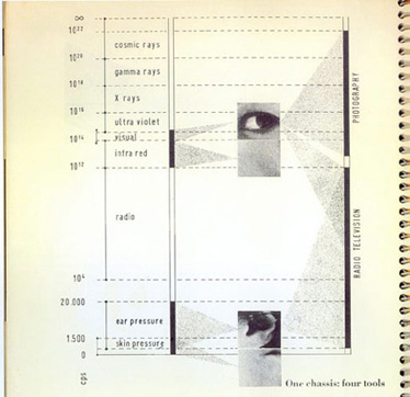
Radio
The eye peering out from the spine of Collected Words belongs to part of a table Hamilton and collaborators John McHale and John Voelcker created for the spiral-bound This Is Tomorrow exhibition catalog. The table is titled “One Chassis: Four Tools,” and, in addition to the eye, it shows cropped images of an ear and skin from the hand and face. On the left are a series of frequencies ranging from zero to ∞ on a CPS, or cycles per second, scale. (CPS, once a common unit of frequency, was replaced by the hertz in 1960 shortly after This Is Tomorrow débuted.) These frequencies are divided among a set of horizontal bands beginning with “skin pressure” at the bottom and “cosmic rays” at the top. In the band from 10^4 to 10^12 CPS is “radio,” here referring to the type of wave. “Radio” is also described as a technology, along with television and photography, on the black vertical bar furthest to the right of the table. In keeping with organizer Theo Crosby’s theme of habitation and the human senses, the table integrates key ideas about media and communication from Marshall McLuhan with ideas about systems and cybernetics from Norbert Wiener, both of whose ideas were then gaining prominence.
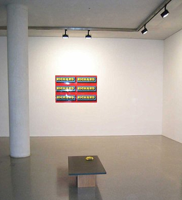
Sign (1975)
Hamilton’s “Products” build on the ideas introduced with Duchamp’s readymades, but they are particular to a Pop sensibility and high-gloss aesthetic. Sign is one of the first Products produced and is shown, presumably on the cover of a catalog, bleeding off the bottom of Collected Words’s cover. Though it is perhaps the most prominent work by Hamilton on the cover, it is not discussed inside the book. To create it, Hamilton appropriated the logo for Ricard, a French brand of anise-flavored liqeur, intervening only to add an “H” in order to spell his first name. As such, Sign both names and misnames; it is at once a sign for someone and an altered sign for something else, anticipating efforts at “culture jamming” by two decades or more. Hamilton’s final Sign, made with vitreous enamel on steel, is nearly identical to a real Ricard sign that would be posted on the wall of a bar or café. These original Ricard signs go up for auction on eBay all the time. One description reads:
Ricard Anisette Liquor is found on the tables at all the European cafes. Bright advertising letters of in red, yellow, and blue. Excellent condition. This is original, and bought in France. You may feel like you are at a wonderful café in Paris. Thanks for looking, and good luck!
- See also: Bicycle Wheel
Telephone
Hamilton is interested in electronic communication media of all types, but certainly the telephone ranks high on the list, appearing in the hand of a young woman on the television screen of Just what is it…, in the art-directed cover photograph for Living Arts 2 and its accompanying essay “Urbane Image,” and in the art directions relayed to Ed Paschke in Chicago for the exhibition Art by Telephone in 1969. The Living Arts 2 cover is recreated in watercolor for Collected Words’s cover, although Bell’s “Princess” model telephone is obscured by the Studio magazine cover featuring People. Hamilton discusses the telephone in “Urbane Image” this way: “This month’s playmate, however, is Miss June. […] She’s built (37, 22, 36), sociable (show a record player and a couple of highballs), intelligent (use a record sleeve with Zen in the title), available through the Bell system (Princess handset), and has friendly eyes that come out green on Ektachrome.”
The two paintings created by Hamilton and Ed Paschke, called Chicago project I and II, blurred lines between the performative aspects of Fluxus and the photo enlargements of Pop painting as well as between the Conceptual Art instructions of Baldessari and Lewitt and the art direction and Young and Rubicam. Hamilton’s script for “Composition,” included on p.268 of Collected Words, begins by asking Paschke to “Get a coloured postcard in the Chicago area of a subject in Chicago” and proceeds, almost clinically, through “Leave 20% of the surface untouched, black and white” to conclude, “Either use transparent stains or opaque colors, some thick, some thin, which areas are at your discretion.” There is some agency yeilded to the maker and some instruction provided by the conceiver. The telephone links brain and hand, mind and body, like a cybernetic version of the nervous system.
The Tate’s educational website offers a similar strategy to young students of art first learning about Cubism. “The difference between a perspective and a Cubist representation of reality,” the site explains, “can be compared to the way two people might describe the same scene to us on the telephone. […] The first person gives us a steady mental picture. But the second person’s description is lively and becomes increasingly revealing as we mentally assemble the various pieces of information they give us.”
- See also: Just what is it…; Le Journal; People;* “Urbane Image”
“Urbane Image”
Hamilton wrote what is probably his best-known essay as part of a package for the ICA’s Living Arts magazine in 1963. The text of the essay is a rapid-fire collage of Pop culture signifiers that begins, “Chrysler Vice-President Virgil Exner models the plump detailing of the sleek ‘flight sweep’ – lining the crustacean recesses of Plymouth’s headlamp hood with mirror-like chrome,” and continues breathlessly from there. Hamilton was certainly not alone in these text-collage explorations. Around the same time, fellow Pop artist Eduardo Paolozzi constructed his novel Kex from bits of dimestore thrillers, film reviews, and magazine ads; artist Tom Phillips discovered a used copy of W.H. Mallock’s 1892 novel A Human Document by chance on a walk with R.B. Kitaj and began altering it into his collage novel A Humument; Graham Rawle strung phrases from women’s magazines together to create the 437-page story Woman’s World; and William Burroughs was actively experimenting with and promoting his “cut-up” technique in the U.S. Preceding and informing these mid-’60s efforts were Dada founder Tristan Tzara’s poem created from words drawn randomly from a hat in the 1920s and T.S. Eliot’s “The Waste Land” from 1922. Eliot’s poem, in particular, seems a useful template for “Urbane Image,” as it concludes with a lengthy set of explanatory endnotes. Hamilton dubs his endnotes a “Glossary” which begins with Virgil Exner – “Chief body stylist for the Chrysler Corporation from 1953 until 1961” – and concludes with Affirmative – “Yes. Somewhat forced expression of need to conclude on a grandly positive rhetorical note.”
In an interview with Michael Compton for Audio Arts magazine in 1983 just after Collected Words came out, Hamilton discusses “Urbane Image” at length as a turning point:
I produced a very serious piece of writing trying to express what I had been doing in painting. And I used collage, pastiche, and all the other devices that were applicable to paintings, which seemed to be easily converted to the written word. And within a week of that being published I met Erica Brausen in the gallery on Bond Street: “Say, what about coming up to Highgate?” And she said, “Well, I won’t bother coming up to Highgate but I saw that piece in the magazine and let’s fix up a show.” […] It struck me then that the power of the word is greater than the power of the brush.
He continues:
Having written about things in a way that makes people think they’re serious and reasoned, I had almost come to the conclusion that perhaps the paintings were reasoned and serious. And it takes a long time before the thought begins to come back that maybe you don’t know what you’re doing. And now I’m thoroughly convinced that I don’t know what I’m doing and that writing is a way of finding out. Very often, the writing occurs after the event or partway through it. It’s not like writing a program, although I have done that. Understanding begins to come back to the work from the need to think about it.
With photographer Robert Freeman, Hamilton created a wraparound front and back cover for Living Arts 2 to complement his essay. The cover image – an oversized still life that includes many of the objects Hamilton discusses – provides another, more visual kind of glossary. Hamilton has reproduced the Living Arts 2 cover in watercolor on the cover of Collected Words.
Van Uchelen, Rod
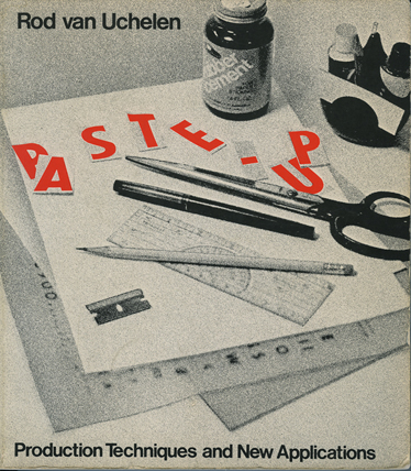
Collected Words was designed and produced using a layout method known as “paste-up” – sort of commercial artist’s version of collage – and Collected Words’s cover bears more than a passing resemblance to the self-reflexive cover of designer Rod van Uchelen’s 1978 primer on the subject, Paste-Up. (The two books are also identical in size and internal layout and typesetting.) The paste-up method, van Uchelen writes in the introduction, is simple but essential: “It’s like learning to use to use the typewriter.” Hamilton was certainly aware of it, and, because of past difficulties, very hands-on by the time of Collected Words. In his note to “An exposition of $he,” Hamilton writes, “This text was edited for its first publication – cuts have been replaced. A paragraph was pasted up incorrectly at the layout stage, that error is corrected.” The earlier version of the essay Hamilton refers to appeared in Theo Crosby’s Architectural Design in October 1962, the cover of which is shown toward the top of the back cover of Collected Words. In Paste-Up, van Uchelen warns editors and paste-up artists against errors of this sort: “Once it is with the platemaker, mistakes are costly to correct. The content of a paste-up is usually not the artist’s responsibility, but the sizing and graphic reproduction are.”
Hamilton’s interest in paste-up methods was more than simply technical, however. Toward the end of the essay he observes,
The ad for the Westinghouse vacuum cleaner demonstrates an endearing characteristic of modern visual technique which I have been at pains to exploit – the overlapping of presentation styles and methods. Photograph becomes diagram, diagram flows into text. This casual adhesion of disparate conventions has always been a factor in my paintings.
- See also: Droste effect, X
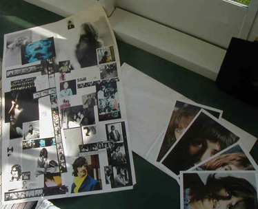
White Album
Paul McCartney and Hamilton worked closely together to desisgn both the cover of the album and a poster insert slipped into the double-disc set of the Beatles’ ninth album, officially called The Beatles (1968) but known informally as the “White Album.” While it’s likely that the “White Album” is included on the cover of Collected Words, it is also almost impossible to prove. Hamilton does explain the genesis of the project on p. 105: “Robert Frasier, my swinging art dealer, was friendly not only with Mick Jagger and the Stones but also with the Beatles.” Hamilton explains that he was drawn to the job both because of “the power of the Beatles” and “the size of the edition, potentially in the region of 5,000,000,” a mass scale that suited Hamilton’s popular sensibilities, “the ultimate multiple image, as far as numbers were concerned.” The twist, then, was how to make such a mass-produced object feel rare, and Hamilton staked his whole design on achieving this effect:
I suggested a plain white cover so pure that it would seem to place it in the context of the most esoteric art publications. To further this ambiguity, I took it more into the little press field by individually numbering each cover.
The poster insert was where Hamilton spent the majority of his design time. He selected a sampling of personal photos from the Beatles and created a collage only slightly more controlled in feel than if the photos were to be strewn across a tabletop. He explains his process:
Because the sheet was folded three times to bring it to the square shape for insertion into the album, the composition was interestingly complicated by the need to consider it as a series of subsidiary compositions. The top right and left hand square are front and back of the folder and had to stand independently as well as be a double spread together.
Collected Words’s front and back covers are conceived in exactly the same way.
- See also: Green Box
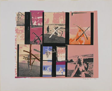
X
Hamilton’s painting and corresponding screenprint My Marilyn (1965) – sometimes credited as My Marilyn (paste-up) – appropriates contact sheets from a photoshoot by George Barris for Town magazine showing Marilyn Monroe at the beach. The contact sheets, released after Monroe’s death, carry her markings and edits: the star routinely demanded photo approval before publication. Hamilton explains,
She made indications, brutally and beautifully in conflict with the image […] crosses and ticks, notes for retouching, instructions to the photographer, even the venting of physical aggression by attacking the emulsion with nail-file or scissors.
Of particular interest to Hamilton were Monroe’s “X” marks, recreated fastidiously both in paint and screened ink. Hamilton notes their ambiguity: “There is a fortuitous narcissism to be seen for the negating cross is also the childish symbol for a kiss.” The X is a contradictory symbol; while Monroe meant her Xs as a rejection, the mark’s cultural meanings also include both the lover’s kiss and the treasure’s home. Monroe hated, was loved, and Hamilton strikes gold in the process.
My Marilyn shares a great deal compositionally with Hamilton’s poster insert for The Beatles, which also a collage of publicity images and personal stills. My Marilyn, dating three years earlier, is
unlike previous pictures in that there is an avoidance of a unifying perspective. The individual shots are spread across the panel like a comic strip, four photographs, each represented three times on a different scale – perspective is respected only within each frame.
Collected Words’s cover takes this perspectival jumble even further: each cover creates the frame-within-a-frame effect, but unlike My Marilyn these overlapping frames are shown in three dimensions rather than two. Several of the covers shown cross at oblique angles, a cascading series of invisible Xs tumbling through space, similar to his abstract 1950 compositions Chromatic spiral and Induction study.
- See also: Ames Room; Droste effect; Van Uchelen, Rod; White Album
Young (aimed at youth)
One of the terms on Hamilton’s table titled “Pop Art is:” from a letter written to Alison and Peter Smithson, fellow members of the Independent Group, in January 1957 a few months after This Is Tomorrow. The table also includes the words “Popular (designed for a mass audience), Transient (short-term solution), Expendible (easily forgotten), Low cost, Mass produced, Witty, Sexy, Gimmicky, Glamorous, and Big business.” After his success with the “tabular” painting Just what is it…, Hamilton advises this list “is just the beginning. Perhaps the first part of our task is the analysis of Pop Art and the production of a table.”
- See also: Just what is it…; Newspapers
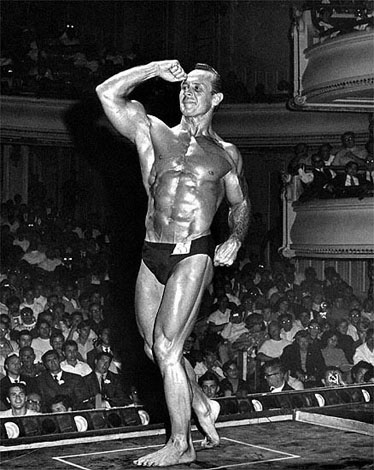
Zabo
An image of California bodybuilder Irvin “Zabo” Koszewski was used by Hamilton as the “Man” holding the Tootsie Pop in Just what is it…, though the choice of Zabo himself might be attributable to fellow This Is Tomorrow collaborator John McHale, who probably saw Zabo as part of Mae West’s burlesque review when it passed through New Haven in the mid ’50s while McHale was studying art at Yale. Winner of “Mr. California” titles in 1953 and 1954, and a fair-weather Hollywood star of stage and screen, Zabo received the World Gym Lifetime Achievement Award in 2006 and commemorated the honor by giving over three thousand of his personal photographs to Graphic Muscle magazine, which published them throughout the year. According to Graphic Muscle, “Zabo was immortalized in 1956 by British Pop artist David [sic] Hamilton” as part of “one of the landmark images in the history of art.”
- See also: Just what is it…