Default Systems in Graphic Design
When writer/designer Rob Giampietro approached me a few months back with the idea to write an article about graphic design in the ’90s, he brought up an unrelated topic during our conversation that I found intriguing; he mentioned the term “Default Systems Design.” He said it was the topic for another article he had been working on for the past few months. It’s curious how certain ideas reach critical mass. In Emigre 64 a number of contributors, independently from each other, each made note of the emergence of a new kind of graphic design that seems to rely heavily on the use of systems and defaults. Just when you think graphic design is in a coma, something’s taking root. Reprinted here is how we arrived at the topic, as well as edited segments of the rest of the dialogue. —Rudy VanderLans, editor, Emigre
Rudy: If the level of graphic design criticism is at all a gauge for the state of design today, then design is as good as dead. We saw a surge of critical writing within design in the early ’90s. To some degree this had to do with the times; there was a significant change in technology (the introduction of the Macintosh computer) which coincided with (or caused?) the bankruptcy of the Swiss International Style. But, after many debates, everybody settled down and went about their business. I guess it’s difficult to forge a revolution (for lack of a better word), every ten years or so, or maintain a critical opposition indefinitely.
Rob Giampietro: While I understand your frustration, I would say such times of boredom and stagnation are times in which critical opposition is most crucial. It’s easy to be righteous when everyone thinks you’re right. It’s much harder when they’ve changed their minds.
Rudy: And that’s what you think has happened? Designers have become more conservative again, more in line with the status quo? Which is not surprising, of course. In times of economic and political uncertainty, when the future looks bleak, there seems to be a tendency to look back, to chose safe solutions. Within graphic design we’ve seen an upswing in retro themes, nostalgia, and the return of the Swiss International Style.
Rob: The look of graphic design today is evidence of the pendulum-swing back to more conservative and fiscal-minded times. It is a counter-revolution of sorts, and its assumptions are troubling, and real, and on MTV, and in Emigre itself.
Rudy: Why are its assumptions troubling?
Rob: Because this kind of work self-consciously positions design as stupid and trivial and says that documents of importance needn’t rely on design to shape them. Default Systems are machines for design creation, and they represent design publicly as an “automatic” art form, offering a release from the breathless pace at which design now runs, as clients ask for more, quicker, now. Default Systems are a number of trends present in current graphic design that exploit computer presets in an industry-wide fashion. They are a quasi-simplistic rule-set, often cribbing elements from the International Style in a kind of glossy pastiche, a cult of sameness driven by the laziness and comfort of the technology that enabled Emigre’s rise, the Macintosh.
Rudy: Do you think this was perhaps an obvious reaction to the hyper-personal, customized messages of early ’90s design?
Rob: Yes, in some part. What’s interesting is how much Default Systems owe to early ’90s design. The rejection of all systems by these “hyper-personal” designers was itself systematic. Fussiness for its own sake in the early ’90s is the same as reductivism for its own sake in the late ’90s and today. Designers from Cranbrook and those mentioned in Steven Heller’s “Cult of the Ugly” article were nothing if not brash and dogmatic. Their ideal of “beauty” was nothing if not relative. Their models, like those of designers using Default Systems, were found in “low” forms, and the ceaseless glorification of these forms was as self-indulgent then as it is now. The stylistic methods of Default Systems Design arose from the methods of Ugly Design and they are tactically one and the same. Both are based on different kinds of proliferation and limitation. The distinction between the two is largely formal, which is of interest to designers, but their social observations are largely similar, which is of interest to critics.
Rudy: This raises a few questions. First, what do you mean by “Both are based on different kinds of proliferation and limitation”? Secondly, how are the social observations of “Ugly” design and “Default Systems” design similar? What is it that they have in common?
Rob: These two questions are related. The use of terms like “proliferation” and “limitation” is self-conscious on my part. These terms sound as if they come from a Marxist critique rather than a design discussion. I’m not trying to make this discussion overly academic; rather, I am trying to provide design critics with a model for positioning design within a broader social context, which doesn’t always happen. The most interesting designs are critiques of the conditions of their own making, and Marxist language is useful for discussing the means of production and consumption because it was developed for that purpose.
I still haven’t answered your question, however. If, as I said above, the most interesting designs are critiques of the conditions of their own making, then both Ugly design and Default Systems design qualify as “most interesting.” Both exploit certain opportunities presented by the computer as a tool while suppressing other opportunities. Some tactics are allowed to proliferate while others are deliberately limited. For example, the computer is a tool that allows for incredible customization. Typefaces – even individual letterforms – can be altered to a user’s tastes. Ugly designers let this kind of customization run self-consciously amok. This was done in the name of a kind of democracy (every user is different) as well as a kind of authenticity (ugliness is pure and therefore true). What’s interesting is that although Default Systems design looks so different from Ugly design, its interests are still tied to being authentic and being democratic. Default Systems design claims, “This is how the computer works with minimal intervention.” It also claims, “By keeping the designer from intervening, this design language is made available to all.” So Default Systems look new, but they arise from the social concerns of the old. I’d call this “Hegelian,” but I wouldn’t want to make this discussion any more academic…
I suspect that Default Systems arose from a kind of shame that plagued designers after accusations that their work had become overly self-indulgent in the face of the limitless possibilities of desktop publishing and a certain version of Postmodernity. This notion finds its first theoretical articulation in Summer 1995, when Dutch critic Carel Kuitenbrouwer wrote in Eye of “The New Sobriety” creeping into work of young Dutch designers at that time.
Rudy: Can you describe some of the features and characteristics of this type of “Default Systems” design?
Rob: Defaults, as we both know, are preordained settings found in common design programs such as Quark, Photoshop, and Illustrator that a user (or designer) must manually override. Thus, in Quark, all text-boxes have a p1 text inset, unless one enters the default settings and changes this. Put simply, defaults automate certain aspects of the design process.
Default typefaces in contemporary design include all Macintosh System Fonts: Arial, Chicago, Courier, Times New Roman, Verdana, Wingdings, etc. Hallmark faces of the International Style that are seen as “uninflected” are also in this category: Helvetica, Akzidenz Grotesk, Grotesque, Univers, etc. Although the latter typefaces are far from meaningless, their original context is as neutral communicators, and this position is simultaneously supported and undermined by Default Systems Design.
Defaults also appear in terms of scale. Sameness of size downplays hierarchy and typographic intervention, forcing the reader to form his own hierarchical judgements. Default designers argue that this emphasizes reading over looking, making the audience more active, more embodied.
Default placements include centrality as a kind of bluntness and bleeds as a kind of eradication of layout. The center is a default position. One “drops” something in the center; one “places” something off-center. Asymmetric placement is embodied; central placement is disembodied. To bleed a photograph is to remove the page-edge as a frame and emphasize the photograph itself. Placements (or non-placements) such as these allow images and texts to function as such. They are expected. Computer templates and formats that employ Modernist grid aesthetics are also included here.
Default colors are black and white, the additive primaries (RGB) and the subtractive primaries (CMY). Default elements include all preexisting borders, blends, icons, filters, etc. Default sizes are 8, 10, 12, 18, 24 pt. in type, standard sheet sizes for American designers, ISO sizes for Europeans, etc. With standardization, it’s argued, comes compatibility. Objects (particularly printed objects) are reproduced 1:1, and images and documents are shown with minimal manipulation.
Rudy: Who stands out for you as Default Systems designers?
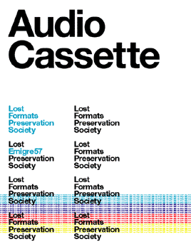
Rob: Experimental Jetset, and issue 57 of Emigre that they designed. To publish their work in Emigre served to direct the attention of others to this undercurrent in design, but to mistake their work for anything more than a saccharinely ironic version of the International Style (shaken, not stirred) is to give it a kind of seriousness that their name itself eschews. Set entirely in Helvetica and using only process colors, standard sizes, and arrangements, the art direction of that issue is the epitome of “default.” The tone of its essays is jargony and somewhat academic, and the anti-design of the issue provides them with a “serious” backdrop from which to make their points. Included is an archive of data-storage formats that have now fallen into disuse, arranged according to their forms. In the center, bracketing the product catalog, Experimental Jetset sets up a bland joke: “Q: How many Emigre products does it take to change a lightbulb?” After leafing through 17 pages of products, the reader finds the punch-line: “A: Never enough.” The joke falls hopelessly flat, humorless. Other variants of the “lightbulb” joke repeat throughout the issue and are presented in ceaseless repetition, like lines of computer code. All are equally disjointed, equally unfunny. Though the joke is a format, the humanity of the joke format has been drained. It, too, is a lost format in need of preservation. Its unfunniness here manipulates us into feeling a kind of consumerist guilt over desiring the Emigre products within the bounds of its set-up and punch-line.
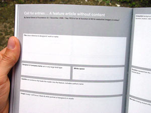
Daniel Eatock’s “A Feature Article without Content,” also comes to mind. The piece mocks a portfolio magazine feature article, demonstrating that expected placement is itself a kind of content.
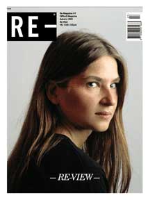
Another example of Default System design is issue 7 of Re-, dubbed “Re-View.” It is a self-described “review of a magazine and its formats”: cover, contents, review, short story, agenda, fashion, interview, and letters. “Re-View” aims to expose the expected and renders it available to all. The magazine itself has no content: it is an engine for content. “With texts to be written, not to be read, and pictures meant to be taken, not to be seen,” it is prescriptive and programmatic while it is descriptive and programmed. Rather following the traditional route of content leading design, here design leads content because the content is an admission of design’s role in generating meaning within the context of a popular magazine. Tactics such as art direction are removed from their everyday associations, and presented in a tone that may be mocking, gravely serious, or both. “Re-View”’s Art Director – capital “A,” capital “D” – is eerily similar to a Conceptual Artist – capital “C,” capital “A” – a “brain in a jar,” generating visual ideas via programs that are meant to be executed by others. This elevates design while dehumanizing it.
Rudy: You lost me here. How do you both elevate design and dehumanize it?
Rob: The linking of design and Conceptual Art is an attempt to elevate design to the “High Art” level of Conceptual Art. There is a difference between “making” and “generating.” By saying the role of the designer is to “make” an object, you are saying one thing; by saying the role of the designer is to “generate” a program by which objects can be made by others, you are saying something else. You’ve elevated what design produces – ideas, not things – but you’ve dehumanized it by taking the Maker out of the equation and substituting him with a Program. This is a natural leap for design that’s interested in the role the computer plays in the production process, because, at some point, the program is what’s making the design. But there is a spectrum, certainly. Design that veers closer to Conceptual Art than Computer Science strikes me as being less dehumanized. I may be oversimplifying, however.
Rudy: While I understand how you have come to use the term Default Systems Design, I can imagine that designers would have a problem calling their design methods “default.” The term has many negative connotations.
Rob: In most contexts, “to default” is to fail. To be “in default” on a loan is not to pay it; to “default” in court is not to appear; to win “by default” is to win because the other team did not play.
The only arena in which the definition of “default” is not entirely negative is in Computer Science, where a default is “a particular setting or variable that is assigned automatically by an operating system and remains in effect unless canceled or overridden by the operator.” Defaults, at least in terms of computers, are the status quo. Theirs is not the failure to do what’s promised but exactly the opposite. Theirs is a promise kept in lieu of an “operator’s” (or designer’s) intervention. To view a computer through its default settings is to view it as it’s been programmed to view itself, even to give it a kind of authority. Naturally, “a default” is produced by systemic thinking – the definition mentions “operating systems” specifically – and “defaults,” taken cumulatively, could be defined as the system by which the machine operates when no one is actively operating it. The system makes assumptions that, unchallenged, become truths.
Rudy: The use of default systems is not exactly a new phenomenon. It’s been a known process to generate work within the world of art. It seems graphic design, again, is coming to the scene late.
Rob: Well, yes and no. Design punishes itself for not being “on trend” too often and to no end. To do so is to be obsessed with style (which is a shallow effort) or to be obsessed with making design the same as art (which is a pointless effort). Anyone would be hard-pressed to identify a governing principle of a new aesthetic movement that wasn’t presaged in some form by a prior movement, especially if you include any genre you want. That said, defaults have been used to create art for a long time. In writing, the work of OuLiPo (Ouvroir Littérature Potentielle, “Workshop of Potential Literature”) comes to mind. Oulipian poetics ascribes a default system accommodating a series of constraints and then challenges the author to create a product from those constraints. Oulipian poetics are both emulative and emergent. Their constraints arise from mimicking other constraints, but they still manage to be original and meaningful. The texts of OuLiPo are built both by humans and by the systems that humans build. In the realm of visual art, ’60s Conceptualists like Sol LeWitt are helpful in identifying the underpinnings of “default” working procedures because of their twin interests in failure and systems. Many of these artists use strikingly similar working methods, harnessing non-intervention to generate solutions.
Non-intervention is also significant in contemporary film. Gus Van Sandt’s film Gerry and his recent Palme d’Or winning Elephant are based on site-specific improvisation and camerawork. His films are informed by those of Dogme 95 (which arose from the same countries as “The New Sobriety”), and Dogme 95, in turn, is informed by the French New Wave.
Rudy: In the hands of graphic designers, to what degree are these default systems a sort of critique of design?
Rob: In the end, the most potent critiques offered by designers using Default Systems seem to be linked to guilt and loss. Default Systems, and the formats that they include, comment not just on the mechanics of systems but on systemic thinking in general, and on the new life of man in the networked Global Village. The computer has changed design, but it has also changed our process of thinking and making. Formats and systems govern everything from our weaponry systems to our guidelines for citizenship.
Rudy: That’s not as much a critique as it is an affirmation of our current situation. Or is it?
Rob: That’s the question. In the face of eroding history, vanishing citizenship, bulging landfills and sprawling consumerism, what is the critique that Default Systems offer? Are they resistant, complicit, or both? Are their strategies effective or cliched? The answers to these questions will not come from the designers themselves, nor should they. They will come from the critics and from the critical language they derive. To render their forms and tactics available is to open them up for discussion. This discussion is a powerful first step. As design’s visual codes become more widely understood, they become more pliable to the designers who employ them. As the assumptions of systemic thinking become popularized, societies may choose more actively to absorb or combat them. Design will play a role in this selection process.
Rudy: How come so little has been written or said about the use of these Default Systems, which we both acknowledge are widespread?
Rob: Because Default Systems are deliberately invisible. To articulate them and the conditions that enable them is an important first step in the critical process. To evaluate their message is an important second step, and this has not been done. The lack of this evaluative mechanism betrays a snag in the fabric of design production with regard to its criticism. The language of criticism must employ its own forms and tactical instruments. Design is still in need of an external critical language, rigorously defined. The development of this language will almost certainly alter the climate and context in which designs are made both now and in the future. The problem is not that Default Systems are bad and haven’t been opposed. The problem is that not even designers really understand what they mean. And that problem – along with the irresponsibility that it suggests – is far worse.