Graphic Design & Critical Thinking
How do ideas become visual? How do emotions take shape? What do we assume about the things we see? What do we take for granted? What are our expectations for communicating with others? How do they communicate with us? How should information be organized? In what form does it pass from one person to the next? What are the boundaries between the precious and the everyday? How do we evaluate beauty? When do visual things become ideological? Which kinds of communication are information and which are propaganda? Which kinds of communication are ethical and which are unethical? Who decides? What should learning about design require? How should we do it? What does criticism have to teach us? Who can make design? What kind of rights and authority can those people lay claim to?
In any discipline, the ability to ask questions of what you do will help you to do it better. And in any creative community, there must be a time for making and a time for thinking about what’s being made. This class will help you with both efforts, and it will help you to coordinate between them. It will help you ask better questions of what you see, which will help you to make better decisions about what you make. It will also help you to better analyze what your classmates make, and in so doing it will help to build a common critical language between you.
Thus the twin roles of critical thinking are clarified: critical thinking gives tools both to the individual maker and to a community of makers. As a result, this class is only as good as your enthusiasm for participating in it. It does not exist in a vacuum. Some of the knowledge you will gather here is book knowledge, but a greater part of it is self-knowledge and shared knowledge within your community of peers. You will do projects together as well as separately, and your group discussions will be every bit important as my lectures and insights. To put it very simply, I am only an experienced guide: you will learn in large part from one another.
Philosophy
One way of thinking about this course is as a very hands-on introduction to the “philosophy” of design. For the sake of simplicity, I have built the class around its assignments, but it could just as easily have been built around the six major branches of philosophical inquiry. Since it’s useful to have some familiarity with these as we start the class, I’ve included them below. They are:
- Aesthetics: What’s beautiful and what’s ugly. Why something is one thing and not the other. The philosophy of formmaking.
- Epistemology: How we know what we know. How we learn what we don’t know. How much we know and where our knowledge ends. Includes criticism and education.
- Ethics: How we decide between right and wrong, good and evil. Includes morality and professional ethics.
- Logic: The structure of arguments. Includes classification and syntax.
- Metaphysics: The structure of the universe and our perception of it. Being, time, reality, consciousness, etc. The relationship of worldly objects to one another.
- Politics: How scarce resources are allocated to the community. The structure of liberty, justice, property, rights, and freedom. The dynamics of power. Includes ideology and authority.
The assignments, the class itself, and (of course) the real world will blend these areas together, but often it helps to be able to take a thought or visual gesture apart using these general branches of philosophy.
Forms of Design
Another way to interrogate the things you see is by considering the assumptions that come with how they were made. Designers are asked to have a tremendous number of technical and analytical skills at our disposal to communicate information that is unfamiliar to us. Borrowing from Alice Twemlow’s What Is Graphic Design For?, a few of these the forms that designers regularly use include:
- Typefaces
- Motion graphics
- Music and sounds
- Games
- Signage and wayfinding systems
- Posters
- Magazines and periodicals
- Books
- Information graphics
- Interactive systems
- Identity systems
- Advertising
- Writing
- Software programs
- etc, etc.
All of these forms require very different skills for making them, different critical tools for understanding them, and different expectations from audiences in terms of which forms favor certain kinds of content when others do not. Successful designs and designers not only understand these problems themselves but manage to make them relevant to their audiences.
Class Formats
This class will adopt a variety of formats including lectures, discussions, presentations, critiques, and in-class exercises. I will often lecture with slides and will try to provide slide lists when appropriate.
When discussions are scheduled, I generally like to focus on a specific reading or comparative set of readings. I will notify you of these in advance and will expect in return from each of you an email that includes some ideas you’d like to bring to our discussion in class. This email can outline points of agreement, points of disagreement, points of discussion, offhand comments, questions for me, questions for others, or a mix of all of these.
Because our time is limited, I plan to use the workshop technique of breaking the class into two groups, A and B. Some weeks both groups will present their assignments to the class for discussion, but most weeks it will be one group or the other. You will get your group assignments the first week of class. If it is your week to present, please come to class with your assignment prepared as specified. If it is not your week, I will still expect your assignment in a form that can be turned into me for my review. Please be mindful of the weeks you are scheduled to present your projects.
Evaluation
This class will truly reward those who enthusiastically embrace its assignments and discussions. As such, the majority of your grade (75%) will rely on your cumulative performance from week to week. The remaining portion (25%) will be based on the strength of your contribution(s) to the final class project.
Assignments
The assignments I give in this class may turn into graphic design assignments in the future, but I ask each of you for now to focus on them as opportunities to write, think, debate, gather evidence, and conduct original research. They are content-generating assignments first and foremost, and creative responses to our discussion topics second. The content I ask you to gather may be visual in some cases, but none of the assignments should be interpreted as design assignments, so prioritize your time investment in them accordingly.
Record of a remembered event
Gift giving
Studio tour guide
A list, a deck
In the library
Supermarket wall plaque
Beautiful and ugly
Two descriptions
Color propaganda blog
Ethics poll
50 footnotes
Final journal project
Record of a remembered event
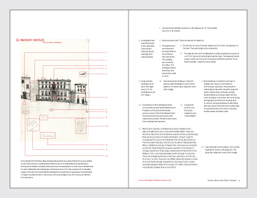
Above: Jen Magathan’s response to the assignment, which re-examined a set of drawings made along a street in Assisi, Italy during the course of a single day. Spread from “This Is Not a Manifesto.”
Make a record about an event from your life that you have a particularly strong memory of. Gather visual evidence and secondary supporting information as well. The record should fit entirely in the manila file folder that I’ve provided for you.
Gift giving

Above: Huy Vu’s response to the assignment, which includes the hamburger recipe he used to cook for his group and the decorative bags he designed to present the meal. Spread from “This Is Not a Manifesto.”
Form four small groups and spend time together this week. For next week’s class, give a gift that will evoke an emotional response when given.
Studio tour guide
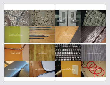
Above: Hoon Kim’s response to the assignment, in which he provides a tour of the studio based on specific textures from outside and in. Spread from “This Is Not a Manifesto.”
Write and photograph a simple tour guide to your studio for a stranger who is coming to meet you for the first time.
A list, a deck
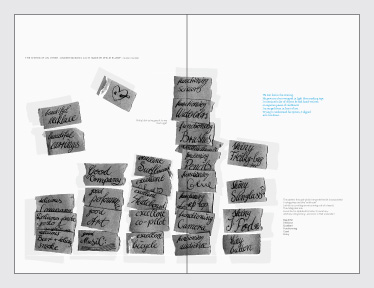
Above: Lauren Mackler and Philipp Rumpf’s response to the assignment. Lauren took an inventory of items in her schoolbag. Philipp returned the inventory to her with his own set of six modifier adjectives and asked her to make sense of his choices. Spread from “This Is Not a Manifesto.”
Find a partner. Over several days, generate a list of ordered items that are significant to you. Keep this list a secret from your partner. At the same time, generate a deck of cards where each card contains an item from your list. Give this deck to your partner, and take your partner’s deck for yourself. Make a new list using this deck. Come to class ready to compare your lists and your experiences.
In the library
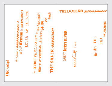
Above: Talon Gustafson’s response to the assignment involved picking books whose titles could be used for making a concrete or Dadaist poem. Spread from “This Is Not a Manifesto.”
Pick 12 books from the library by intuition and write an essay which relates them.
Supermarket wall plaque
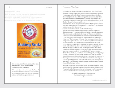
Above: For his response, Philipp Rumpf offered a detailed Marxist reading of the Arm & Hammer box. Spread from “This Is Not a Manifesto.”
Select an object available at the supermarket and write a museum-style wall plaque to describe it. Include artist, nationality, life dates, official title, year of creation, materials, purchasing information, and a 250-word description of the object in an art historical context.
Beautiful and ugly
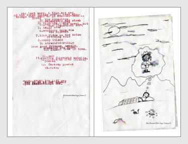
Above: Two of Elana Wetzner’s beautiful objects. Pages from “This Is Not a Manifesto.”
Bring in a box marked “Beautiful” and another marked “Ugly.” Place five graphic design artifacts in each. Come to class prepared to explain your rationale for the placement of the objects.
Two descriptions

Above: Hoon Kim’s visceral response to the assignment. Pages from “This Is Not a Manifesto.”
-
Describe a FedEx slip through the eyes of a Modernist in 250 words.
-
Describe the same FedEx slip through the eyes of a Postmodernist in 250 words.
Color propaganda blog
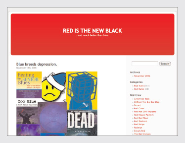
Above: The red team’s blog, “Red is the New Black.”
Divide into two groups and create a blog each. One blog supports the color red. The other supports the color blue. The two are competitive. Create 10 new postings per day, minimum. Information need not be accurate and will likely be propagandistic. When possible, use Alexander Theroux’s essays from The Primary Colors to construct your posts.
Ethics poll
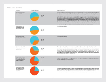
Above: Meg Dreyer’s response to the assignment, in which she compiled the data on the designers and then put the same questions to a professional attorney. His answers were often surprising. Spread from “This is Not a Manifesto.”
In 2 days, work together to compile 100 responses to Milton Glaser’s 12 steps. Ask for yes/no responses and ask respondents to provide additional comments where they’re willing. Prepare a results report using the quantitative data, an condensed set of qualitative responses, and supporting real-world examples of Glaser’s hypotheticals.
50 footnotes
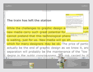
Above: Michael Trovela’s response to the assignment, which made use of on-screen PDF footnoting software. Spread from “This is Not a Manifesto.”
Using one of the essays from this week, add 50 footnotes (or annotations) derived from your personal experience of design education at RISD. Your notes may be visual, verbal, sonic, cross-referential, etc.
Final journal project

Above: Detail from the cover of “This is Not a Manifesto.”
Work together to produce 16 copies of a printed journal. Each of you will get 1 copy. Send 1 copy to me at the address below by the due date. The remaining copy will be filed with the office.
The journal’s pages will be in 6 x 9 inch format, tape- or glue-bound. Each student will be responsible for 12 pages plus a short contributor bio with email/contact info. The content of your pages must include at least 2 and not more than 6 of your individual assignments from this class. You may also use portions of your reading responses, graphic/visual experiments from other classes this semester, and other students’ assignments from this class with their consent.
One student will be nominated and voted by the others as the Publisher. The Publisher’s primary responsibility will be to publish and distribute the journal accurately and on time. The Publisher must be someone you trust to accomplish this task. To ensure the task is completed, the Publisher may choose to submit fewer than the total number of pages required above. The only way I will accept your final assignments is in a bound journal from the Publisher by the due date.
As you complete your pages, please file 16 identical copies at the Publisher’s desk. All pages submitted to the Publisher must be double-sided and trimmed. You must also email the Publisher PDFs with crop marks of your pages as you submit them. The Publisher will publish pages in the journal in the order they are received. You do not need to file all 12 pages at the same time, but you must file all 12 pages by the Publisher’s deadline. You may collaborate with one another on the time of your filing so that groups of pages appear sequentially. The Publisher may reject pages that are not in the appropriate format or quantity.
The Publisher’s decisions are final.
When all the pages have been filed, or when the Publisher’s deadline arrives, the Publisher will do the following:
- Paginate the journal’s content;
- Create or assign someone to create at Table of Contents;
- Create or assign someone to create a Contributors’ page and Colophon;
- Name or assign someone to name the journal; and
- Design or assign someone to design the cover of the journal.
The Publisher will also write a short introduction to the journal. Once the content of the journal has been finalized, the Publisher will do the following:
- Assign a Treasurer to handle funds either from the office or from participating students for the journal’s binding;
- Assign a Printer to oversee the binding and finishing of the journal; and
- Create or assign someone to create a digital version of the journal from the PDFs provided. The Treasurer and Printer may be the same person.
The Publisher will also write a cover letter advising me of problems with the journal, including missing or rejected pages, incomplete contributions, etc. That letter and 1 copy of the journal should be sent to me at my studio address.
Good luck.
Schedule and readings
Certain readings are starred (★) for in-class discussion, and it is for those readings that I will expect an email from you (see “Class Formats”). Please bring copies of the reading to class that week as well. When an (A) or (B) group is noted, that group should plan to present its response to that week’s assignment during the review.
Class 1: Introduction
- Victor Papanek: “Edugraphology – The Myths of Design and the Design of Myths” from Looking Closer 3.
Class 2: Emotion, Memory, History, Symbolism
Review Record of a remembered event (A)
-
Stefan Sagmeister: “Is It Possible to Touch Somebody’s Heart with Graphic Design?” from Made You Look.
-
Tibor Kalman, J. Abbott Miller, and Karrie Jacobs: “Good History/Bad History” from Looking Closer 1. ★
-
Alberto Manguel: “The Last Page” from A History of Reading.
Class 3: Clients, Authorship, Production, Rituals
Review Gift giving (A and B)
-
Lewis Hyde: “The Commerce of the Creative Spirit” from The Gift. ★
-
W.A. Dwiggins: “A Technique for Dealing with Artists” from Looking Closer 3.
-
Misha Black: “The Designer and the Client” from Looking Closer 3.
-
Michael Rock: “The Designer as Author” from Typotheque.
-
Ellen Lupton: “The Designer as Producer.”
Class 4: Tours, Travel, City
Review Studio tour guide (B)
-
Georges Perec: “Notes Concerning the Objects that are on my Work-table” from Species of Spaces.
-
Robert Smithson: “A Tour of the Monuments of Passaic, New Jersey” from Collected Writings.
-
John Berger: Chapters 1 & 7 from Ways of Seeing. ★
-
Rem Koolhaas: “Prehistory,” pp.13–27 from Delirious New York.
Class 5: Classification, Ordering, Lists
Review A list, a deck (A)
-
William Gass: “I’ve Got a Little List” from Tests of Time.
-
Georges Perec: “Think/Classify” from Species of Spaces.
-
Karl Gerstner: “Writing and Language,” pp.10–33 from Compendium for Literates,. ★
-
Paul Elliman: “My Typographies” from Eye 27. ★
Class 6: Archiving, Indexing, Analogy, Metaphor
Review In the library (B)
-
Georges Perec: “The Art and Manner of Arranging One’s Books” from Species of Spaces. ★
-
Nicholson Baker: “Discards” from The Size of Thoughts.
-
Walter Benjamin: “Unpacking My Library” from Illuminations.
Class 7: Everyday, Readymade, High/Low, Art/Design
Review Supermarket wall plaque (A)
-
Ellen Lupton and J. Abbott Miller: “Low and High” from Design Writing Research. ★
-
Robert Venturi and Denise Scott Brown: “Ugly and Ordinary Architecture, or the Decorated Shed” from Learning from Las Vegas. ★
-
Norman Potter: “Is a Designer an Artist?” from What Is a Designer?.
Class 8: Aesthetics, Visual Ideology
Review Beautiful and ugly (A)
-
Steven Heller: “Cult of the Ugly” by from Typotheque. ★
-
Beatrice Warde: “The Crystal Goblet.”
-
Andrew Blauvelt: “Towards a Complex Simplicity” from Eye 35.
-
“The Vow of Chastity” from Dot Dot Dot 2.
Class 9: Objecthood, Modernism, Postmodernism, Style
Review Two descriptions (A and B)
-
Jan Tschichold: “New Life in Print” from Looking Closer 3. ★
-
Ellen Lupton and J. Abbott Miller: “Deconstruction and Graphic Design](http://elupton.com/2009/10/deconstruction-and-graphic-design/).” ★
-
Mr. Keedy: “Design Modernism 8.0” from Emigre 64
-
William Strunk, Jr. and E. B. White: “An Approach to Style” chapter 5 from The Elements of Style.
-
Raymond Queneau: Selections from Exercises in Style.
Class 10: Perception, Psychology, Propaganda, Manifestos
Review Color propaganda blog (A and B)
-
Susan Sontag: “Posters: Advertisement, Art, Political Artifact, Commodity” from Looking Closer 3.
-
Tibor Kalman: “Selling Out” from Perverse Optimist.
-
Bruce Mau: “Incomplete Manifesto for Growth.” ★
-
Dean Allen: “An Annotated Manifesto for Growth.” ★
-
Robert Greene: “48 Laws of Power.” ★
Class 11: Ethics, Morality, Professionalism
Review Ethics poll (A and B)
-
“First Things First Manifesto 2000” from Emigre 51. ★
-
Rick Poynor: “First Things First Revisited” from Emigre 51. ★
-
Michael Bierut: “Some Footnotes on the Manifesto” from Looking Closer 3. ★
-
Milton Glaser: “The Road to Hell” from Metropolis August/September 2002.
-
Herbert Spencer: “The Responsibilities of the Design Profession” from Looking Closer 3.
-
Stefan Sagmeister: “How Good is Good?” from Typotheque.
Class 12: Design Education, Writing, Criticism
Review 50 footnotes (B)
-
Lorraine Wild: “The Macramé of Resistance” from Emigre 39. ★
-
Rick Poynor: “The Time for Being Against” from Typotheque.
-
Michael Bierut: “Why Designers Can’t Think” from Looking Closer 3.
-
Paul Rand: “Intuition and Ideas” from Design Form and Chaos.