Identity and the Arts
Later this month, Dexter Sinister will present “Identity,” an exhibition that, in the words of its description, “charts the emergence and proliferation of graphic identity since the turn of the twentieth century, with particular reference to contemporary art institutions — museums, galleries, and so called alternative spaces.”
Initiated by Artists Space, the project has been run by Dexter Sinister in cooperation with a variety of colleagues for over two years. In the fall of 2009, I was asked by Dexter Sinister and Stefan Kalmár of Artists Space to give a talk to an invited group of 20 or so guests. Part of a series of informally titled “How do we look?”, this initial lecture carried an aim that was deeply reflexive, examining the history of the organization’s own visual identity in the context of both arts-related identities and the somewhat woolier world of branding and visual culture. To facilitate the talk, I was given special access to Artists Space’s archive of printed ephemera — my thanks to Amy Owen and Jessica Wilcox at Artists Space for their help and guidance.
The tone was informal, with people asking me to expand upon one point or another, as we sipped some whiskey with conversation. Rather than adhere to a strict chronology of Artists Space’s identity development, I chose to group its marks around a loose taxonomy that included IMPRINTS, SYMBOLS, MONOGRAMS, LANDMARKS, and LOCKUPS so that perhaps a new story could emerge.
The talk was, for me, foundational to many projects and assignments that followed and informed both the structure of my SVA course and our recent identity work for SALT Istanbul at Project Projects.
The writing below is loose and rough, assembled from my notes and fuzzy memory of the evening — but, truth be told, it’s a story better told through visuals, anyway. Even if the below serves as nothing more than a prompt to visit David and Stuart’s smart and inventive show, then I’m glad to have shared it here. — RG
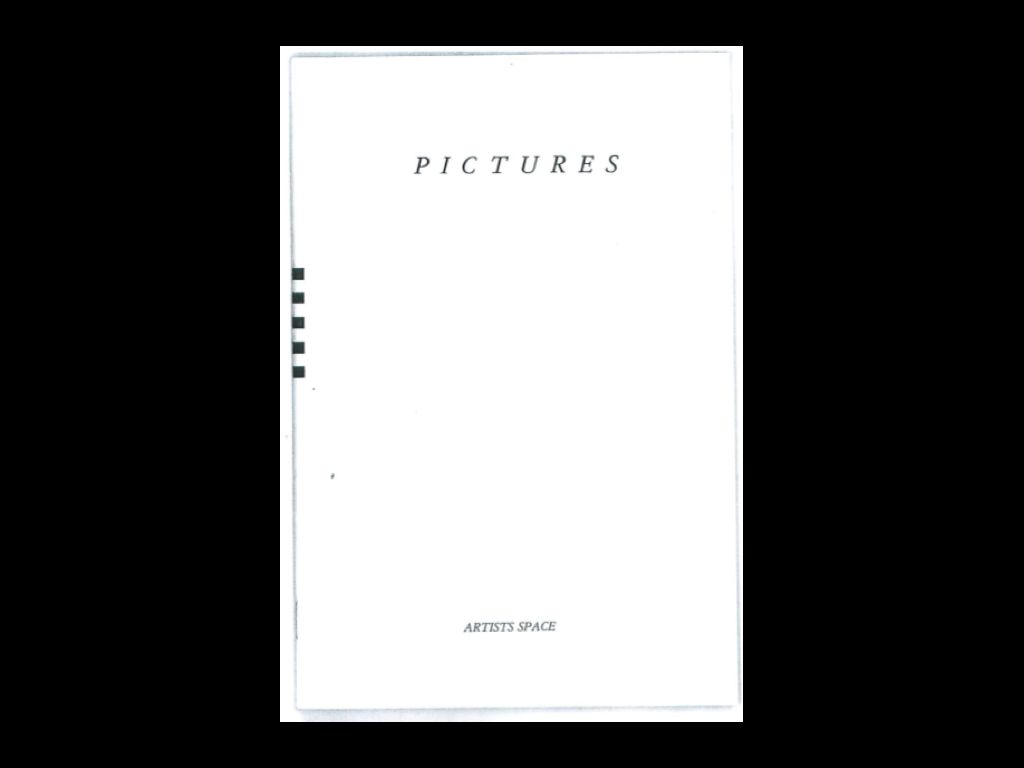
I thought I’d start out tonight with one of Artists Space’s most important early shows, the Pictures exhibition from 1977. And if you look at the booklet of the show here, you’ll see that at the bottom the name Artists Space has been typeset to match the look of the overall booklet. No standalone mark, nothing too systematic — in the early days things changed a lot from one exhibition to another. Reading this, the analogy seems to be that the gallery thought of itself as a kind of publisher. It’s presenting these things, but it’s not imposing its own external identity on anything. It’s initiating creative projects and then allowing its own identity to be mutable, to change with those projects.
And so with that idea in mind the first group of marks I’d like to look at is IMPRINTS. Imprimatur means “to sanction” or “to give formal and explicit approval,” and this is what I was describing before. Rather than a visual identity the emphasis is on the provenance: on where an exhibition came from and who initiated it.
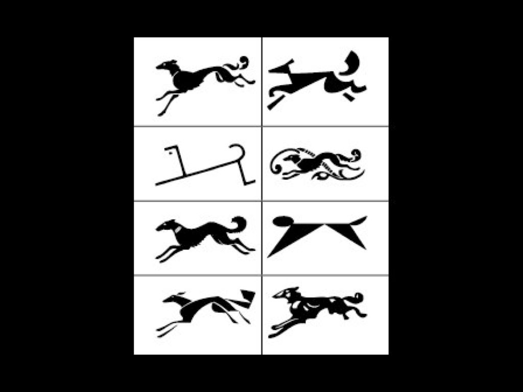
Publishers have long relied on this mutability. Most famously and illustratively, Knopf has a whole broad set of Borzoi dogs that change to compliment a book’s cover design, tone, and setting. There is no single Borzoi. Instead, there are many simultaneous possibilities. It’s almost Platonic: it’s not a specific book with a specific dog but the idea of a book with a dog on it that assigns the book as a Knopf book. It’s more descriptive, really, than symbolic.
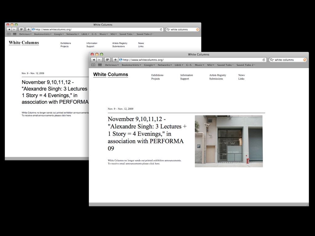
This website for White Columns, designed by Project Projects, works in much the same way. When you reload a page the style sheets refresh, and the site goes from serif to sans and back again. So it’s like the Borzoi dog, in that it opens up the possibility that White Columns can take on a variety of formal details but still remain, essentially, itself. The formal “idea” of the site doesn’t change, just its visual expression.
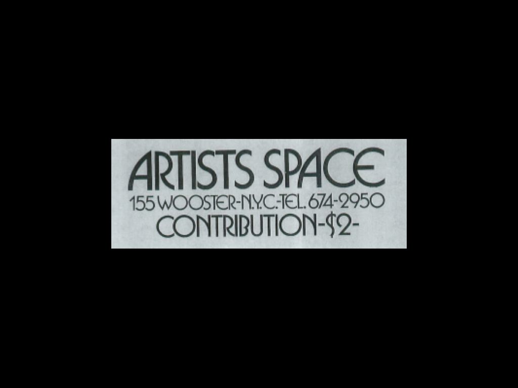
The more you rummage around the archives, the more you see a range of materials in which the Artists Space identity acts in this way. Here is a a flyer for some film programming from the mid-‘80s, looking very theatrical indeed. And this strategy wasn’t continuous, either — between the Pictures show and the design of this flyer different, more formalized marks emerged and were then discarded.
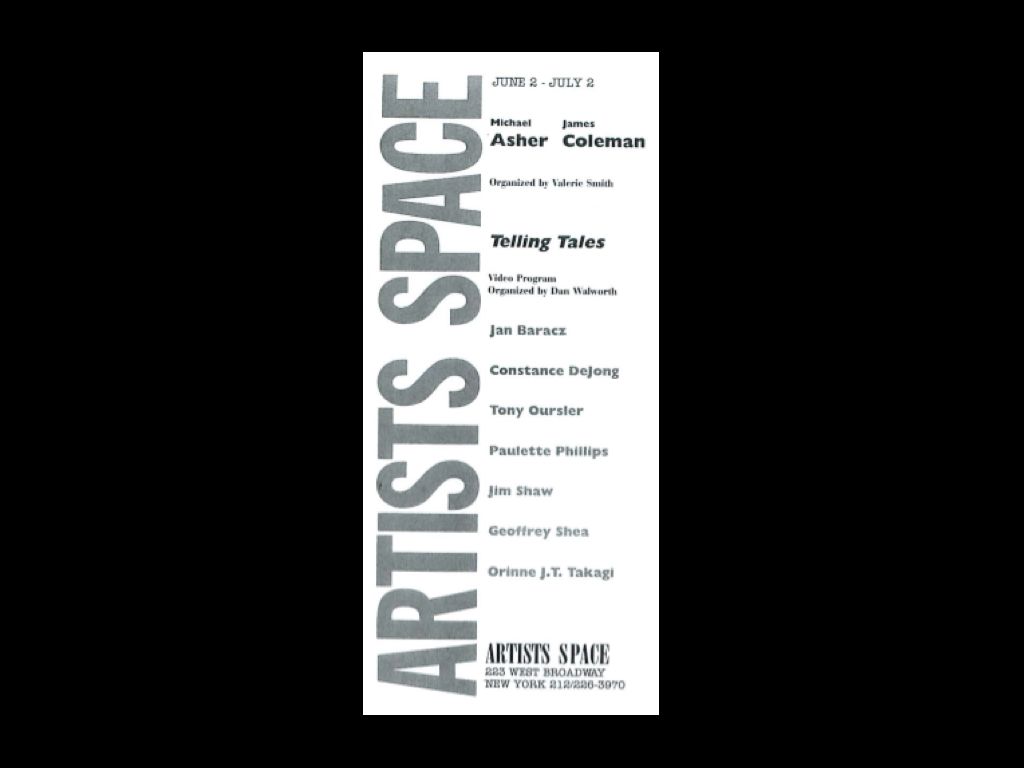
Sometimes there was even variance within a given piece. Here’s a great example from 1988 for a show called Telling Tales. There’s literally one “super” logo, which is set in one typeface, and then there’s a smaller “logo-sized” logo in another typeface.
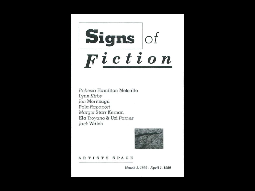
By the late ’80s the impact of design’s postmodern tastes were readily apparent, and the hybridity of a given graphic system set to the max. Even within the artists’ own first and last names there is variance and expressivity. This piece is from 1989.
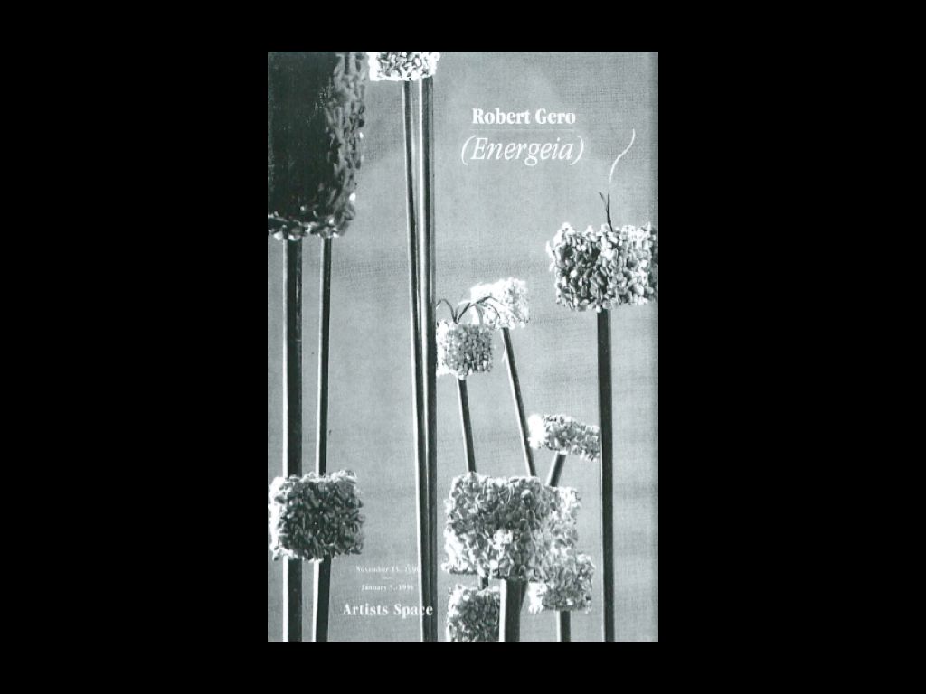
At other points around this time, zine culture and DIY publishing became more apparent, as in the booklet design for this Robert Gero show from 1990. Here Artists Space acts as the publisher once again, with the form of its name subordinate to the larger aesthetic system of the booklet.
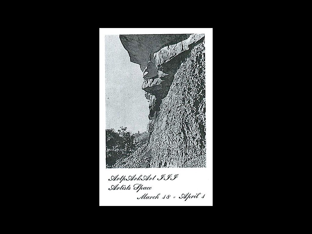
Here, too, in this small photocopied pamphlet from the ’90s, this vibe is apparent. What’s important to understand here is that imprints don’t need to be large or institutional in tone — they can be homemade, grassroots, inventive, and unmonolithic. Quite casual, really.
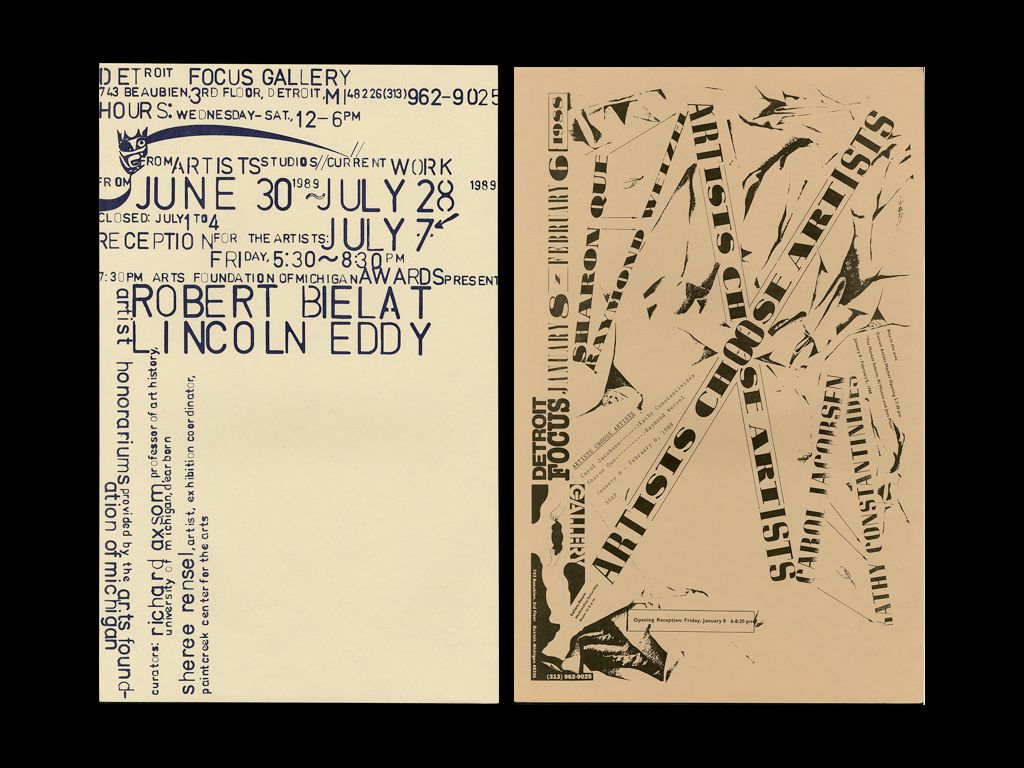
And in this casualness I’m reminded of Ed Fella’s wonderful posters for the Detroit Focus Gallery, made over a number of years with great inventiveness. Each poster treats the logo differently, and yet the set is coherent and identifiable, offering a kind of aesthetic consistency that supports the range of activities housed at the gallery. Willi Kunz’s ongoing posters for Columbia’s GSAPP program are another example of this kind of identification strategy. Rather than impose a system that can be executed by anyone, they create a highly particular set of responses that can be recognized without being formulaic.
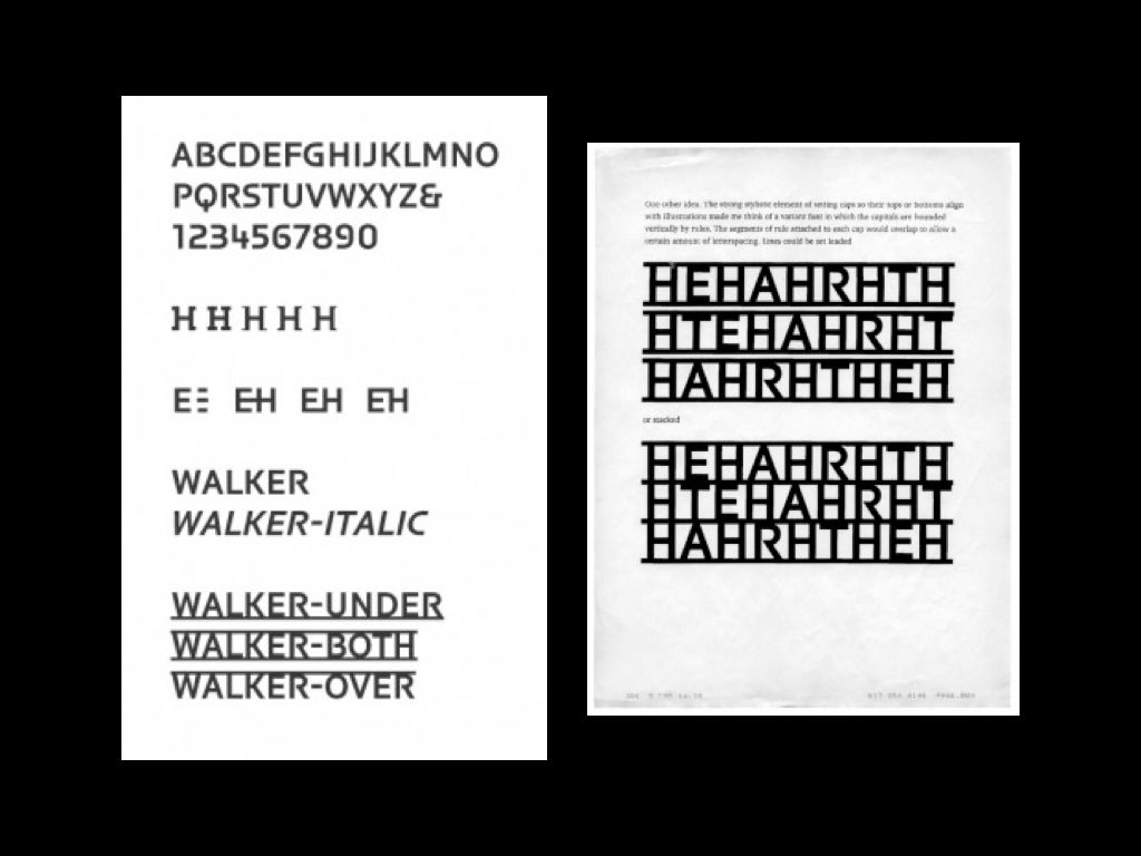
Imprints can be achieved through the use of an institutional typeface. One of my favorite examples is Walker, designed by Matthew Carter for the Walker Art Center in 1995. By allowing serifs to be “snapped on” in a variety of positions and styles, Carter created a single typeface with a variable identity. He presented the initial idea to the Walker through a series of faxes, shown here.
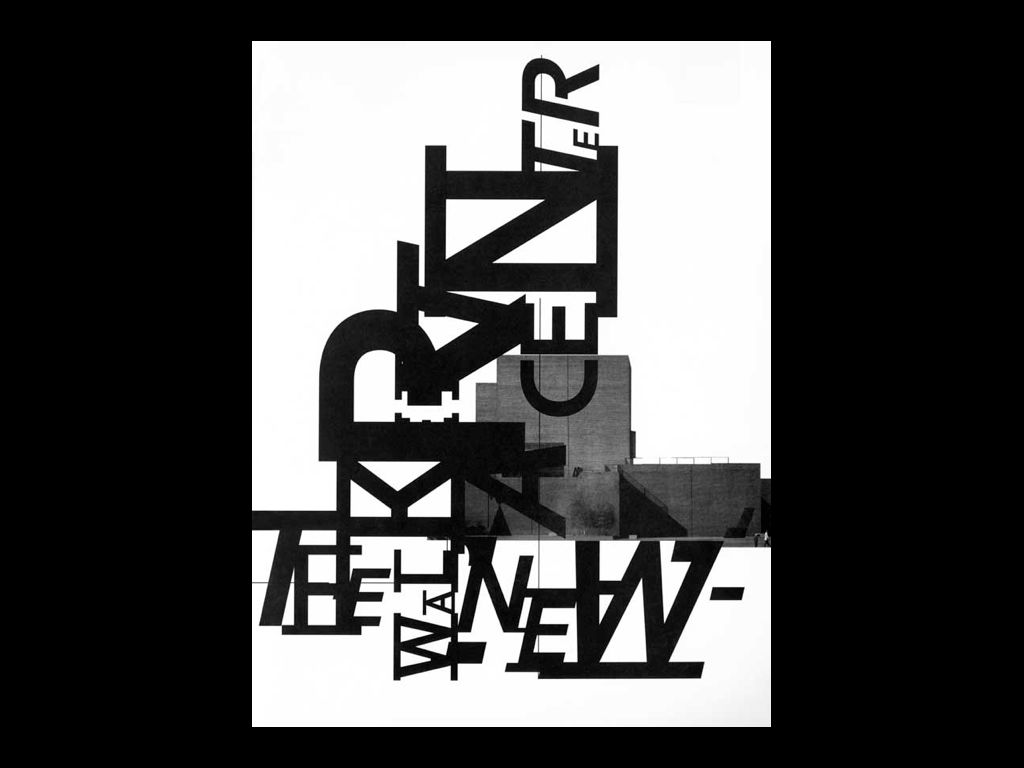
In the hands of P. Scott Makela and Laurie Haycock Makela, the typeface soon became expressive, yielding promotional materials like this one. Much like Fella’s work for the Detroit Focus Gallery, this distinctive touch defined the Walker’s print materials for several years.
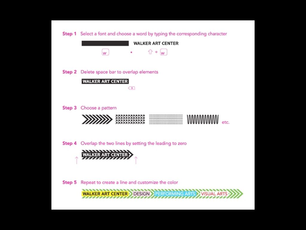
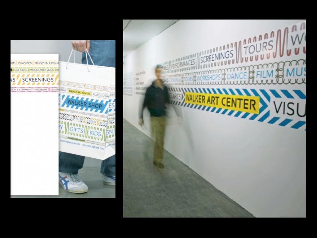
A few years later, the Walker introduced a new identity with a similar spirit. Once again the solution was a typeface with variable formats, only this time instead of letters it includes words and patterns that can be assembled on a tape-like strip. It is the work of Eric Olson’s Process Type Foundry.
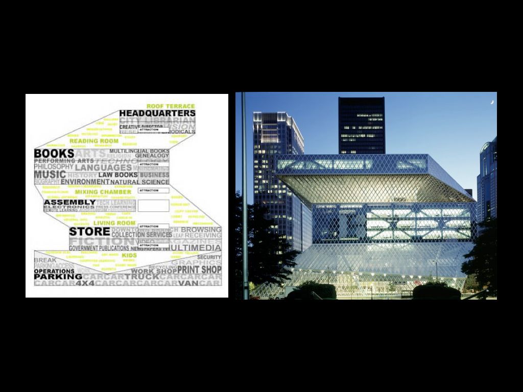
This new identity reminds me of OMA’s work for the Seattle Public Library, which takes its form from the building’s program and allocation of space. I’ve heard the gesture of the glass skin referred to as “throwing a net over the brief,” which is a metaphor I quite like in this context. The Walker’s ever-present ticker-tape keywords play out in much the same way.
In its simplest sense, a SYMBOL is something that stands for or alludes to something else. It is “this” but also “that.” It’s a doubling device and a shortcut in one.

One of the most iconic symbols for Artists Space was this one from 1983–4. It appeared on the cover of a booklet and soon became adapted to a variety of uses. It works in a symbolic way…
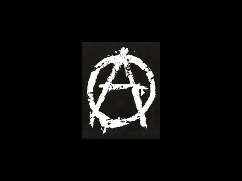
…doubling the anarchist symbol, the circled A, meaning “Anarchy is order,” a double letter. This symbol dates back to 1868 when it was used by the Federal Council of Spain of the International Workers Association, an organization set up by Italian anarchist Giuseppe Fanelli in 1868.
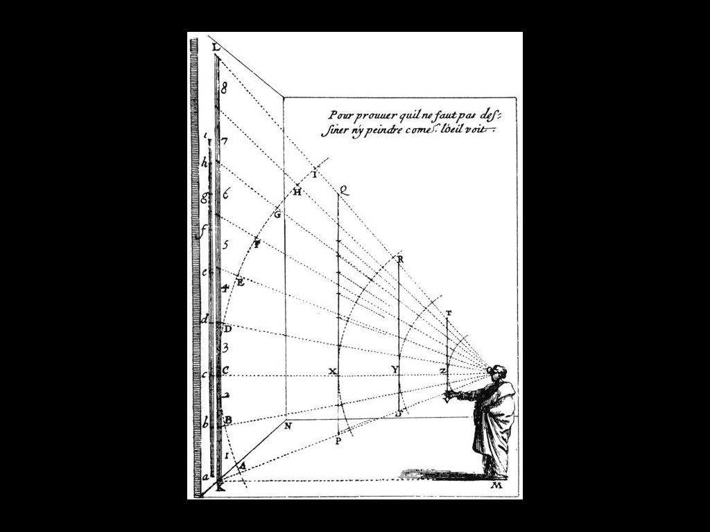
The emphatic triangularity of the A also reminds me of the triangulation involved in perspective and sight…

…which is perhaps why the all-seeing eye, the Eye of Providence, is also inscribed in a triangle. The symbol has been in continuous use since antiquity and has been used by Egyptians and Masons alike. Perhaps because of the Masonic connection, it has also come to be known as the Great Seal of the United States and makes a well-known appearance on the back of the $1 bill.

The circling of the A also reminds me, in some ways, of the circled C in the copyright mark. The circle here forms a kind of barrier, a protection.
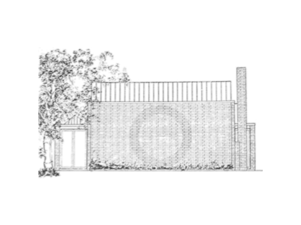
The circle alone makes an appearance in Josef Albers’ identity for a private club in New Haven from 1959–60, shown here in an elevation subtly inscribed in the masonry of the building itself, designed by architect King-lui Wu. Albers also notably used a black circle in his seal for Black Mountain College several years earlier.
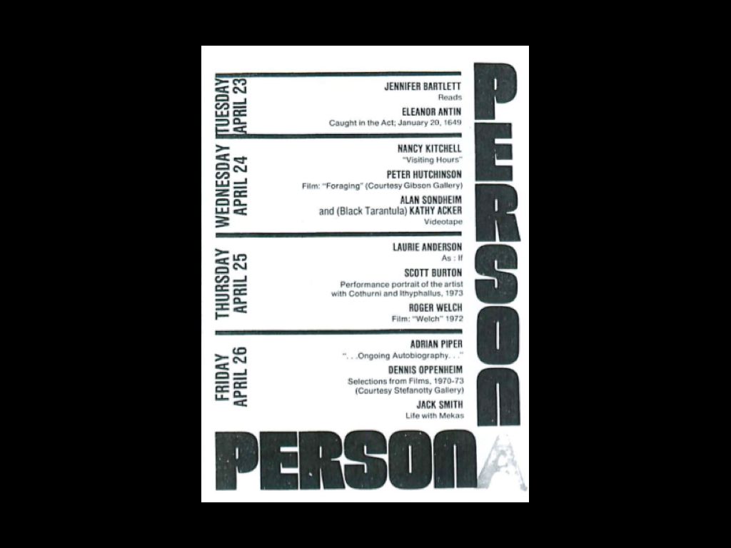
The A can also double itself, serving as both logo and headline copy, as in this flyer from the early ’80s.
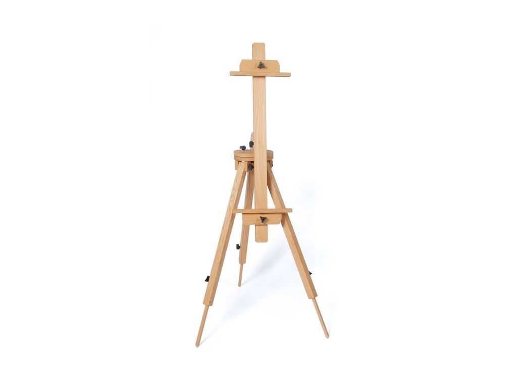
The A is also reminiscent of an engineering form — triangles are known to be the strongest shapes, used in bridges and buildings. In this way it is reminiscent of an easel or prop.
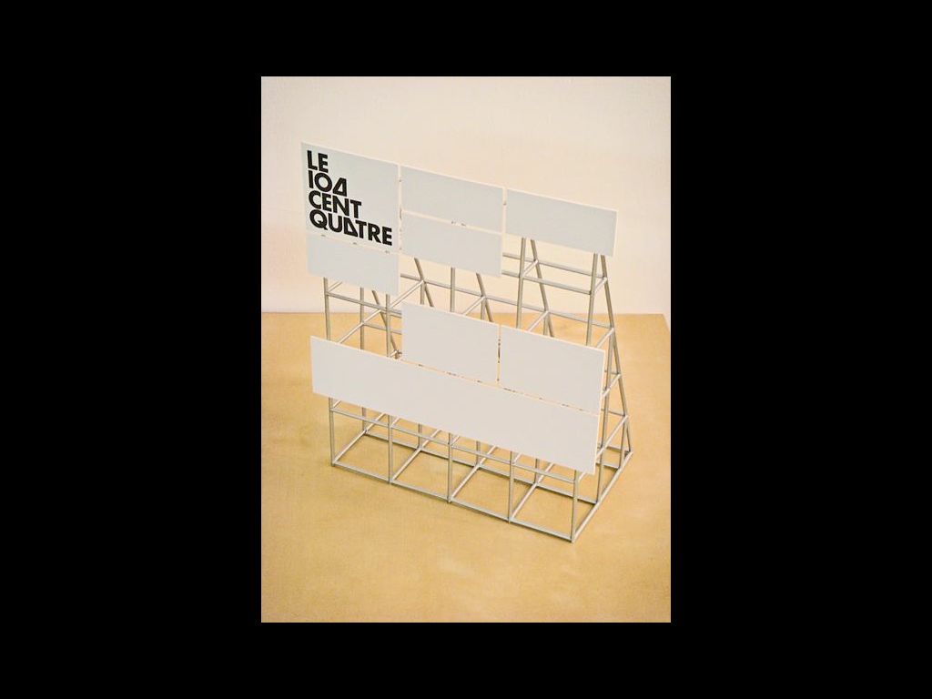
Experimental Jetset used the A this way (though in an isosceles rather than equilateral configuration) in their engaging identity for 104 (La Cent Quatre), a French cultural institute.
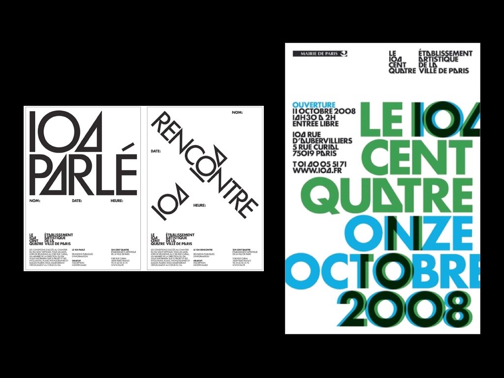
Similar to the flyer we saw earlier, the A here can serve as both logo and headline. It is a letter, a symbol, and a prop for 104’s cultural platform.
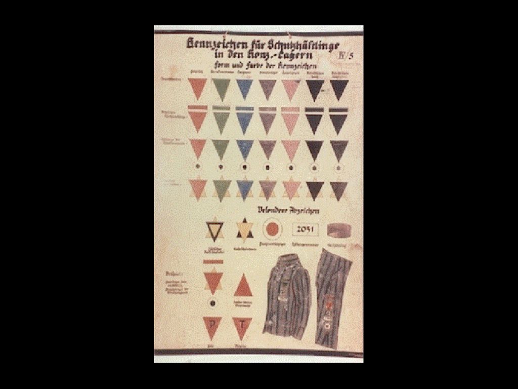
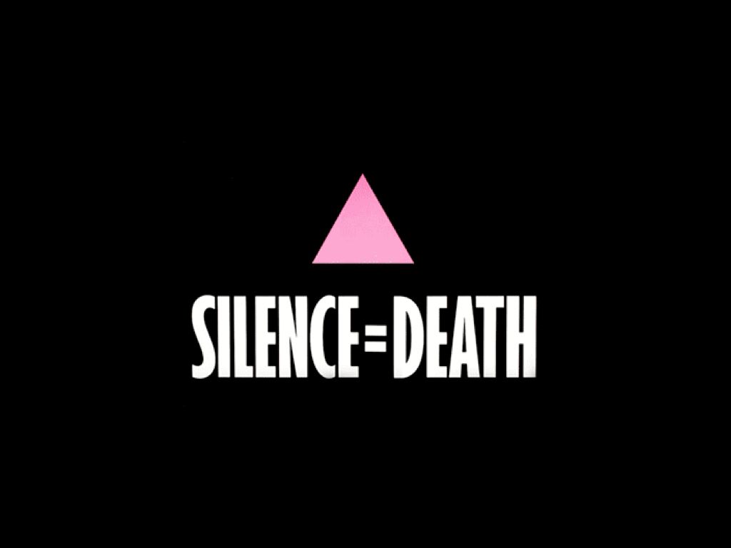
It’s also well-known that the certain aspects of the triangle’s history as a symbol are more difficult. In the Nazi concentration camps of WWII, people were marked with color-coded badges like the pink triangle, which represented homosexuals. The group ACT UP later appropriated the symbol, transforming it from a emblem of hate to an icon of protest. Turned right-side up, it sits on a more stable base and points more optimistically skyward.
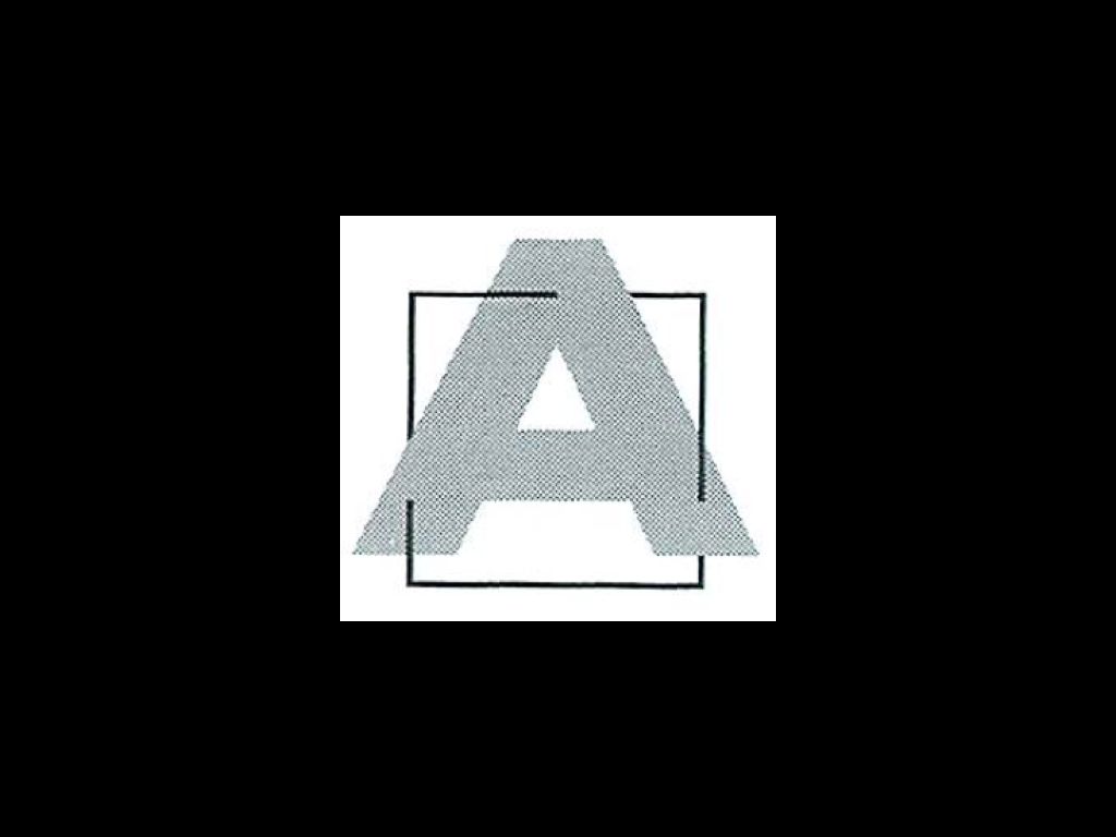
By 1984-86, the A had morphed into the mark seen above…
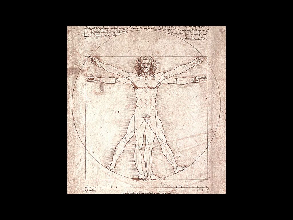
…a kind of squaring of the circle, and, in the way that it breaks out of its geometric frame, a bit reminiscent of Da Vinci’s Vitruvian Man.
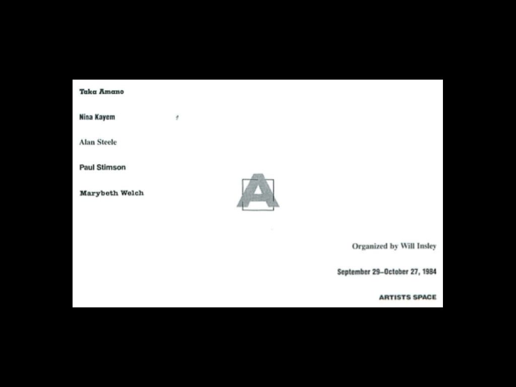
In this card produced around the same time, the A has moved to the center, a focal point or hub around which the other elements circulate. The name of each artist in this show is set in a different typeface, mixing individuality with system.
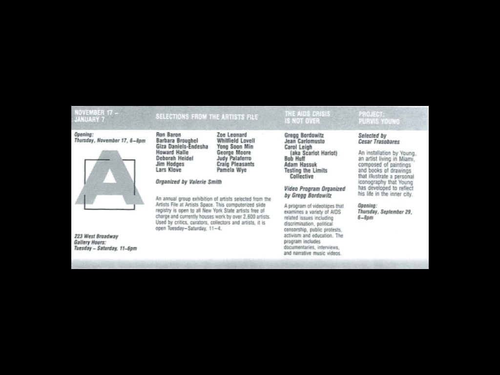
In a later card, the A moves from the center but becomes even larger and more systematized.
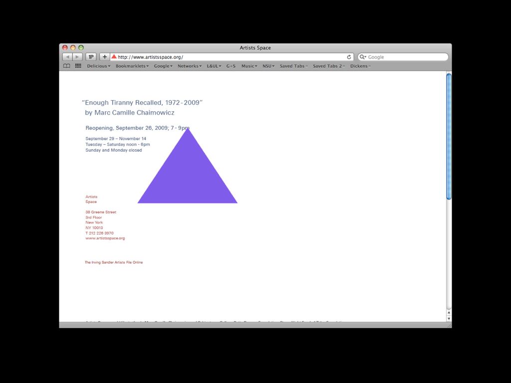
Artists Space’s new identity, designed by Manuel Raeder, collapses many of these themes into a single open mark that is a triangle, a protest mark, a support structure, and a monogram all at once
Speaking of MONOGRAMS — monograms are when one letter stands for the whole.

Obviously, as we’ve seen, it’s here…
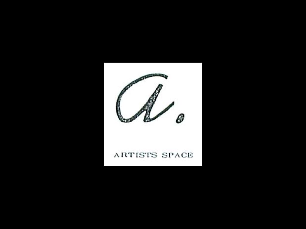
…but it’s also here in this earlier monogram from late ’70s.

These days we see monograms too. Here is one for the newly-opened X Initiative project.
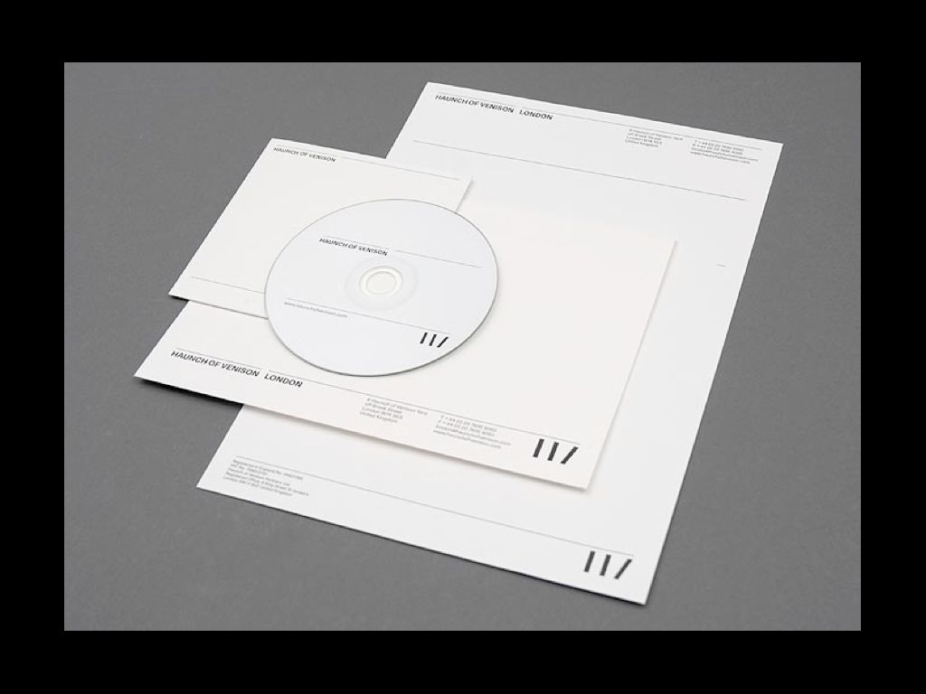
And a few years ago Spin in London made one for Haunch of Venison gallery.
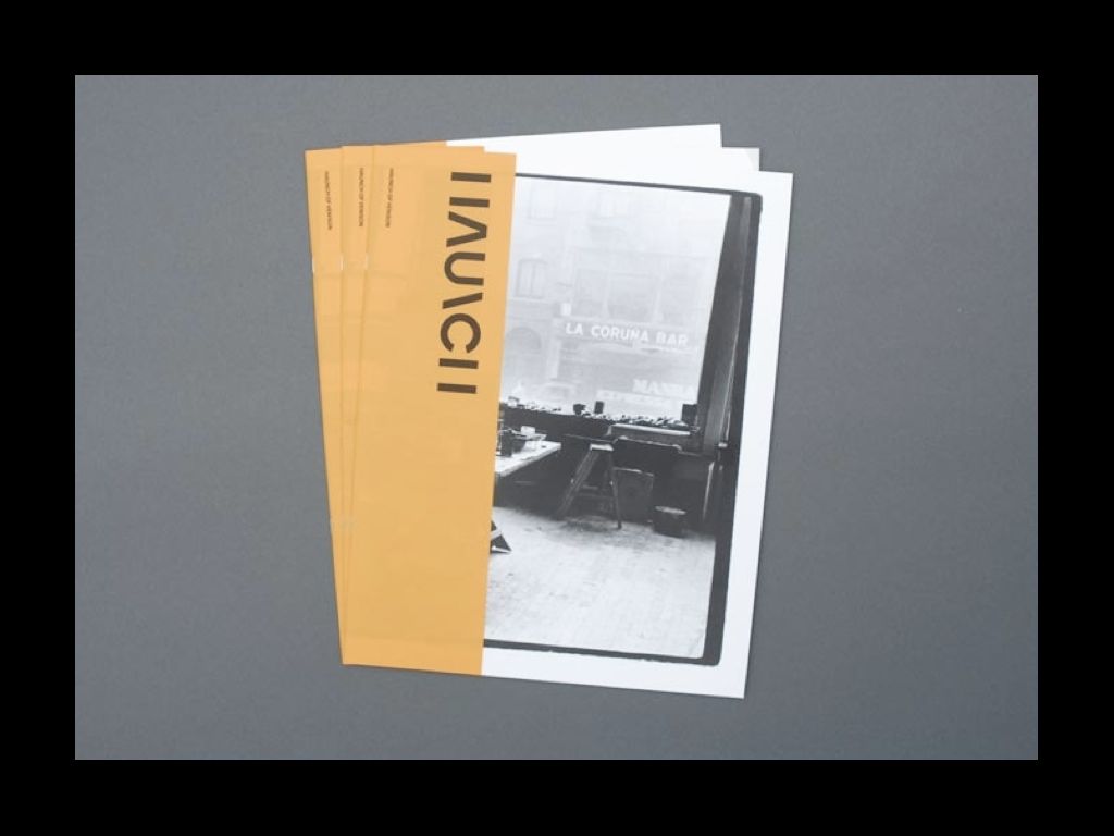
Here as before, this monogram gets inserted into words as a letter itself. It’s on the verge of being a custom typeface, which underscores how blurry the boundaries are between all these approaches. Art institutions mix and match these approaches all the time.
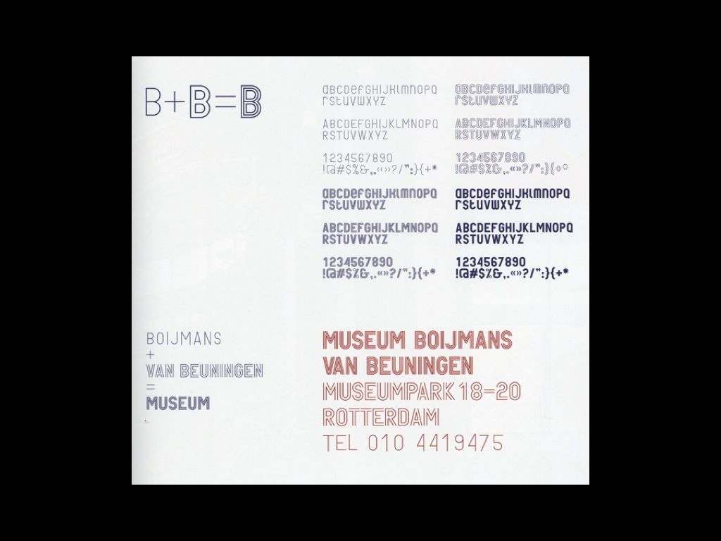
The monogram and typeface for the Museum Boijmans von Beuningen, designed by Mevis and Van Deursen, is a good example of this. Carrying inline and outline styles, the two letters come together to form a double monogram, a B within a B. Formally, it gives the B’s a sense of energy, they seem to radiate.
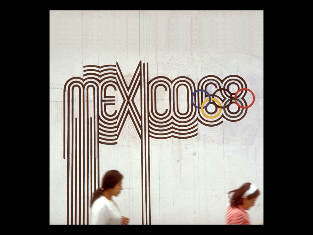
It’s a similar feeling, though in a different cultural context, to Lance Wyman’s work for the Mexico ‘68 Olympics. Wyman’s identity was derived from a mix of the Olympic rings, Op Art, and Huichol patterns. By recycling or reinserting these forms back into culture, Mevis and Van Deursen’s double-B becomes symbolic and suggestive in other ways, too.
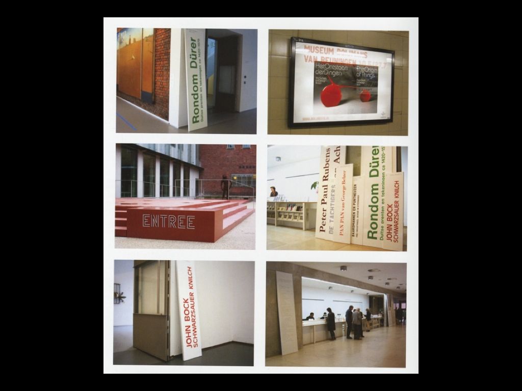
Inside the museum itself, the prop returns, here shown leaning against walls within the gallery space to form a loose set of triangles. In this identity, museum and signage don’t so much cohere as collide or collapse into a kind of mutual coexistence. Rather than using fonts on brochures in a hybrid way, here the museum transforms itself into a heterotopia, a forest of signs, a system that tends toward individualization.
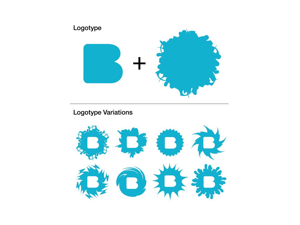
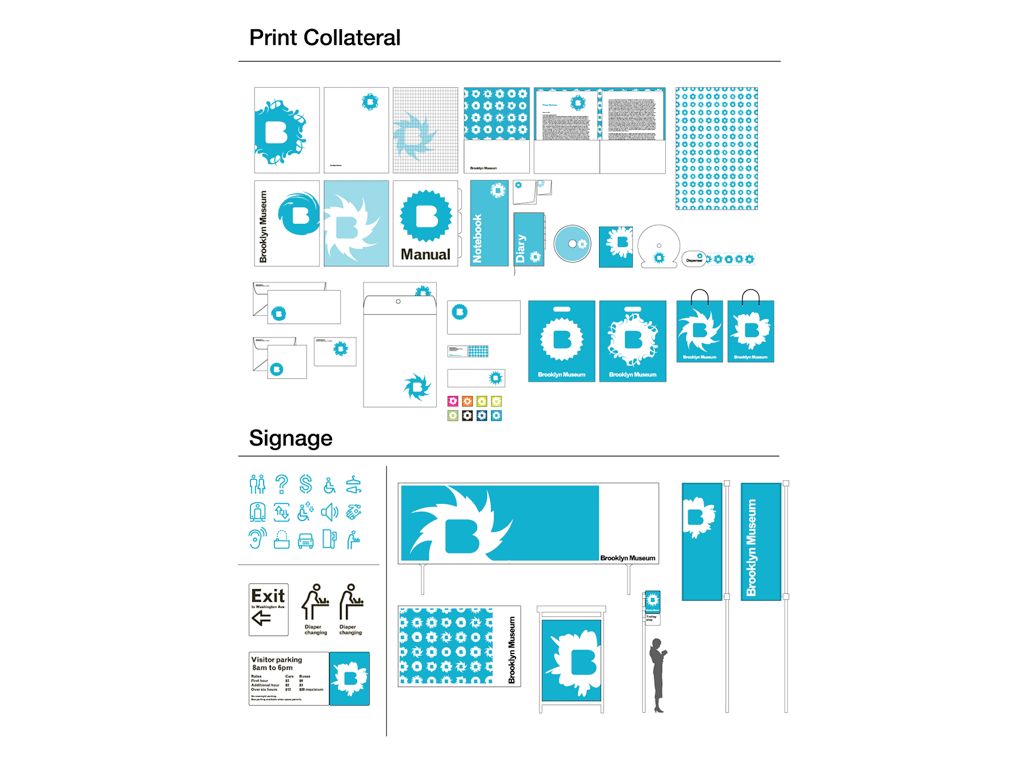
Mass customization surrounds the monogram form in 2x4’s identity system for the Brooklyn Museum. Here, the museum can generate a wide array of logos using a highly structured kit of parts. As diverse as these forms are, however, the result feels very systematic — from any given input comes a nearly identical output.
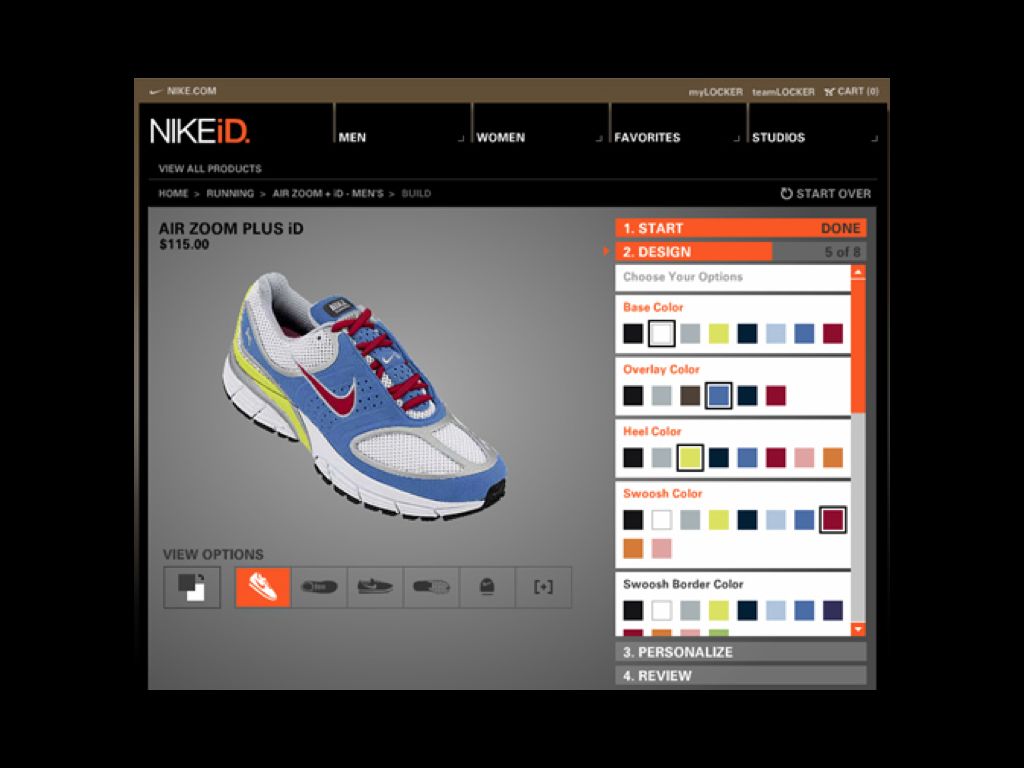
In this way, it reminds me a bit of NikeID, Nike’s recent foray into the world of custom footwear. It too, is a mass customization project, allowing the buyer to change colors at nearly every level but retaining its “Nikeness” nonetheless. It’s impossible to break the system, to inject something into it that feels out of place. This is what makes it a durable consumer process, but it is also what makes it feel like the product of an assembly line, something that is mass produced despite its claims of individualization.
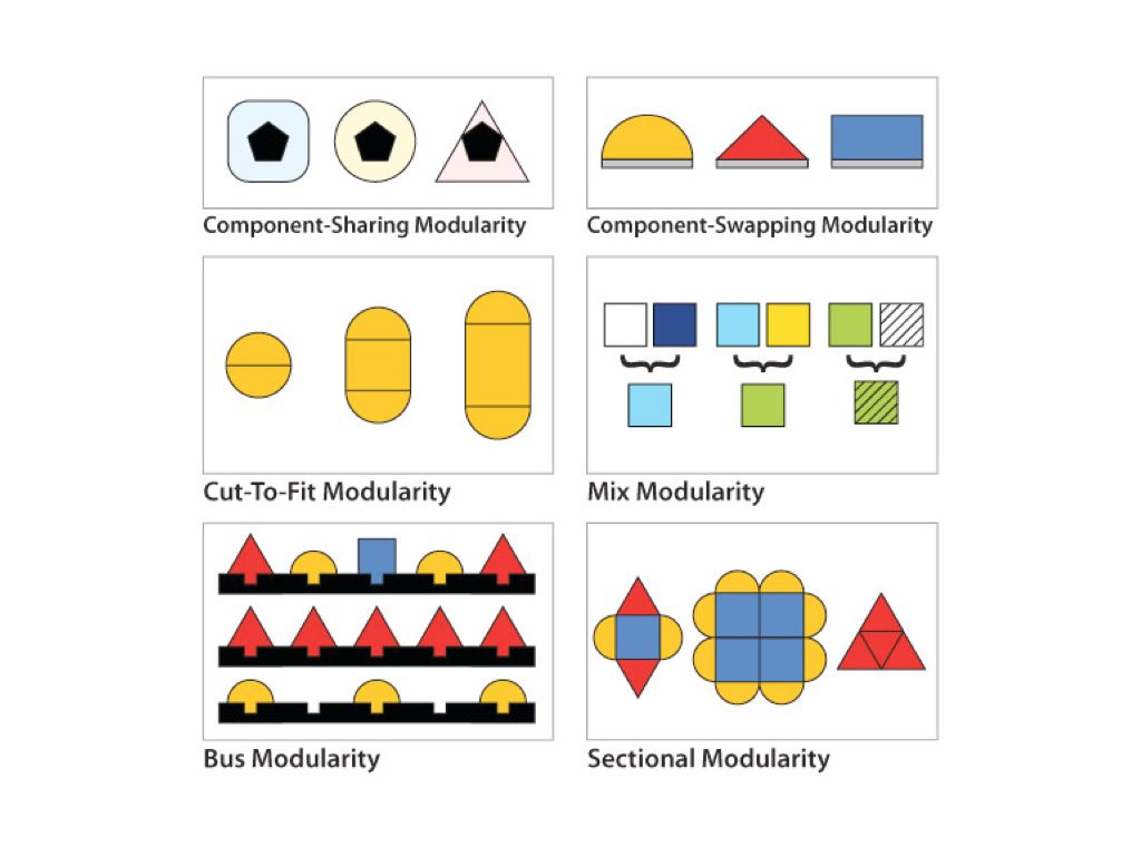
In my research of mass customization processes, I dug up this chart detailing the various modes of mass customization, and I have found myself referring to it many times since. It’s interesting how much shape and contour can define a sense of change or transformation — it almost harkens back to our earlier discussion of Platonic forms earlier. You can’t, after all, call a square a triangle, or a circle a square. Looking at the chart, cut-to-fit and sectional modularities feel differentiated while mix and bus modularities feel unified.
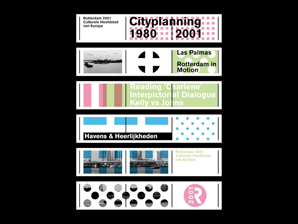
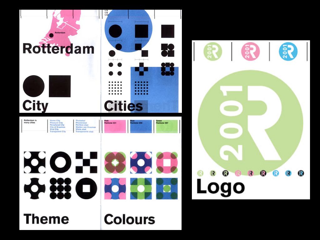
At least four of these modes are in play with Mevis and Van Deursen’s 2001 design for Rotterdam’s turn as the European Capital of Culture. Here component-sharing, mix, bus, and sectional modularities come together in a single system.
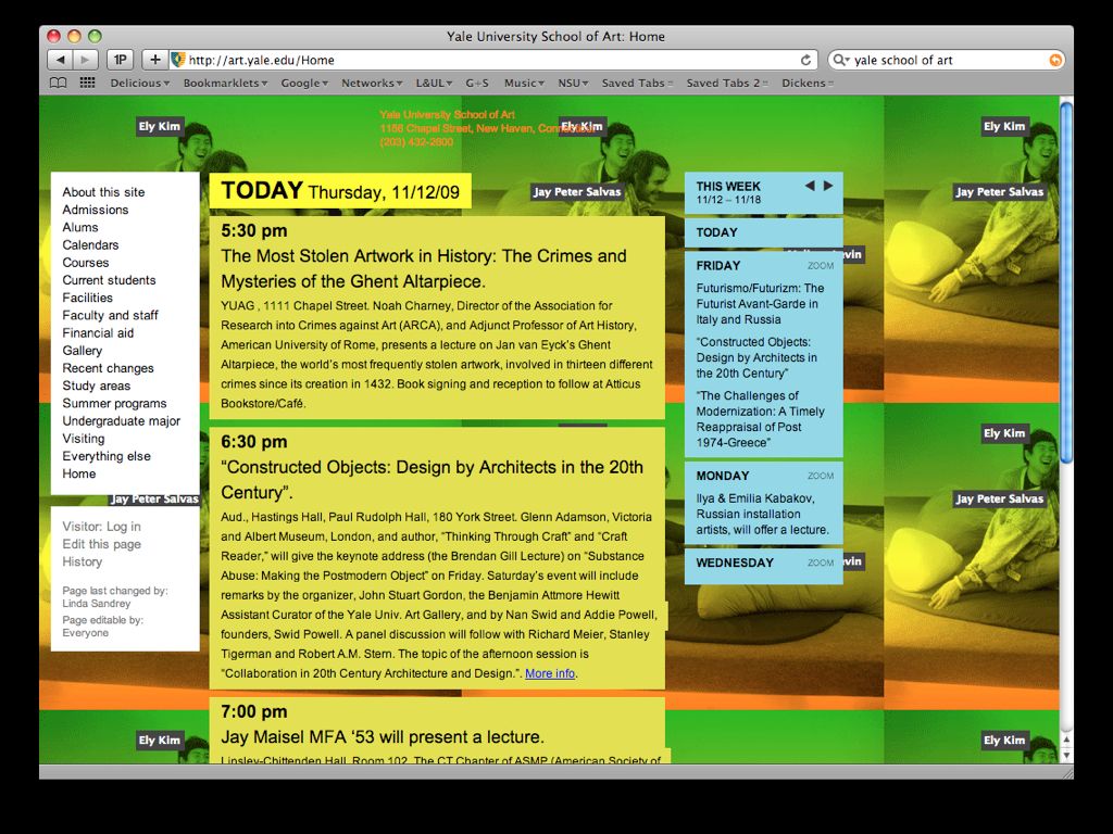
The Yale University School of Art website, designed by Linked by Air, is also modular, but in allowing users to become involved in constructing their own pages and insert their own content it becomes both customizable and participatory. Its many pages feel truly hybrid, active, and individual despite the overarching system.
LANDMARKS are building — they are marks on geographic space.
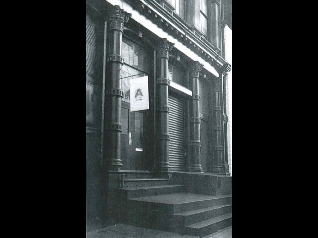
Here’s a photo, used as the cover of a 1985 catalogue, which shows the now-familiar Artists Space squared A as a sign hanging in front of the gallery.
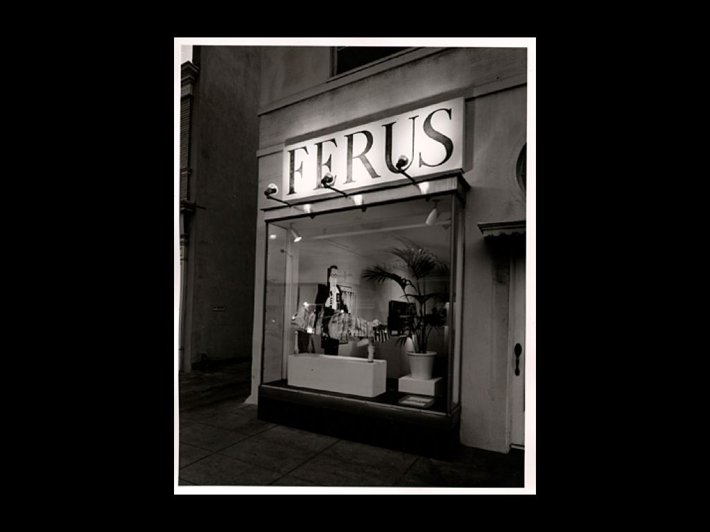
This image reminds me of the Ferus Gallery’s sign, shown in this photo from 1958, which is as much the “logo” of that institution as anything I can think of.
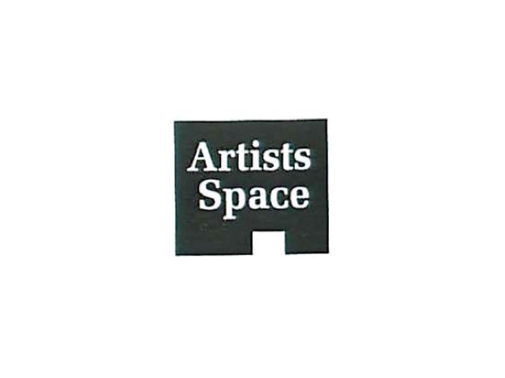
Logos that suggest buildings emphasize the gallery as a kind of shop or site. Here’s one from the late ’70s where the typical “white cube” has become a “black house” instead. Simplified, almost childlike, it’s hard to tell how to read it. Is it a plan or an elevation? Does it depict an artists’ space from above or from the side?

Weirdly, it reminds me of the Pizza Hut logo, which may have appeared around the same time. Pizza Hut is also a decorated shed, a branded building, and the logo takes its form from their iconic red roof, visible from a distance, while driving down roads and highways. Architecture and identity are one.

“Chains” like Pizza Hut, McDonald’s, and others create an unusual set of landmarks in the landscape. While our experience of a city may differ widely from one to the next, every fast food restaurant is identical and consistent. They almost form a kind of networked place within another place, like a set of corporate embassies whose interior space is unaffiliated with the context surrounding them. They are mass customization writ on a much larger scale, component-swapping atop the simplest possible type of building.
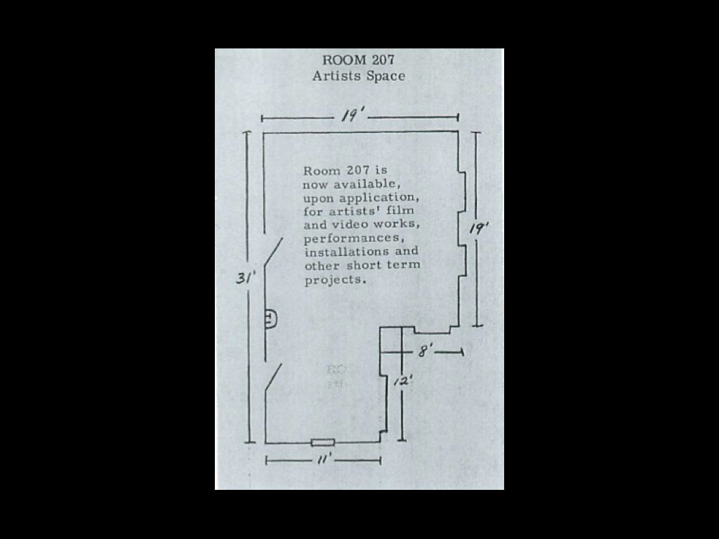
Here’s an early flyer from Artists Space that uses the floorplan directly, initiating an invitation or offering. Artists were invited to make projects in this space and the invitation to this program provided the specifications for these proposals to be made, open-sourcing the project.
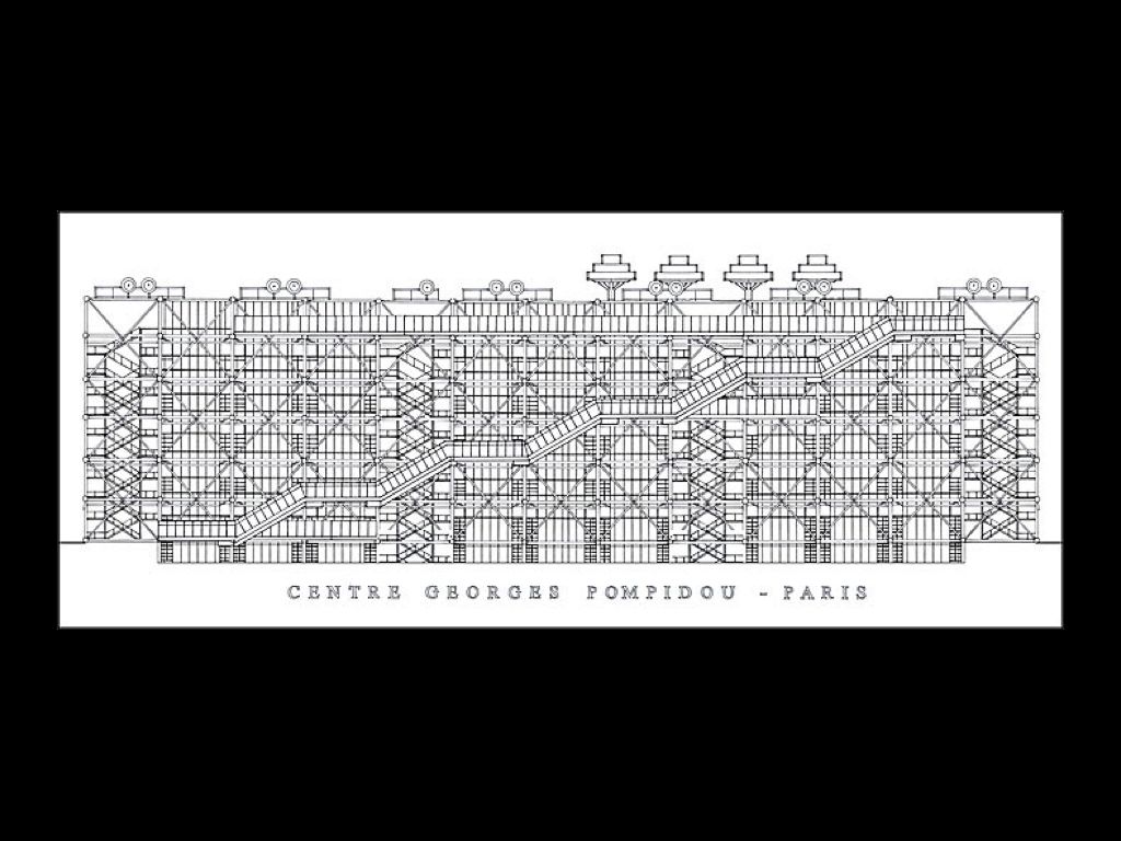
The building as diagram is a well-known form — a discussion of it will recall our discussion of OMA’s Seattle Public Library from before. Here’s an earlier example, the Centre Georges Pompidou, designed by architects Renzo Piano and Richard Rogers. The design evokes many things, but among them it specifies the museum as a kind of organ within the body of the city.

And while the Pompidou has a logo, really the logo for the Pompidou is the building itself. A proper logo is almost unnecessary because the building is so iconic, every photograph that includes it is, in a sense, branded. The Eiffel Tower plays a similar role, as Roland Barthes writes in his famous essay, “Wherever you are, whatever the landscape of roofs, domes, or branches separating you from it, the tower is there; incorporated into daily life until you can no longer grant it any specific attribute, determined merely to persist, like a rock or the river […] the moment I begin writing these lines about it, the Tower is there, in front of me, framed by my window.”
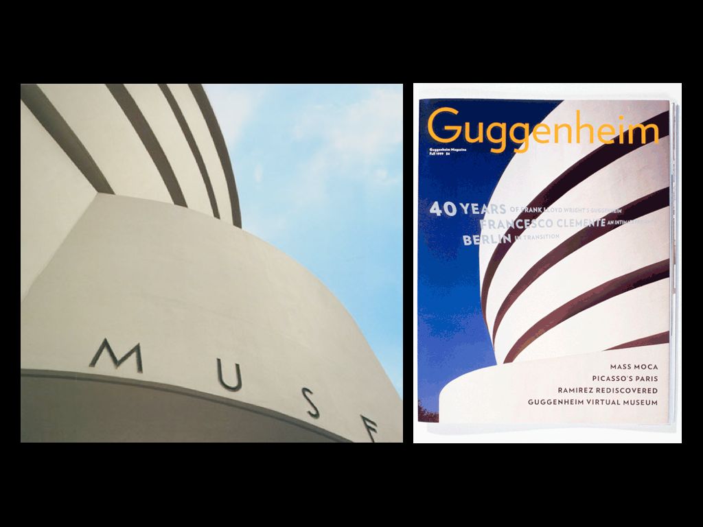
Here’s an equally iconic building, photograph here to show the type that’s been applied to it and derived from it.
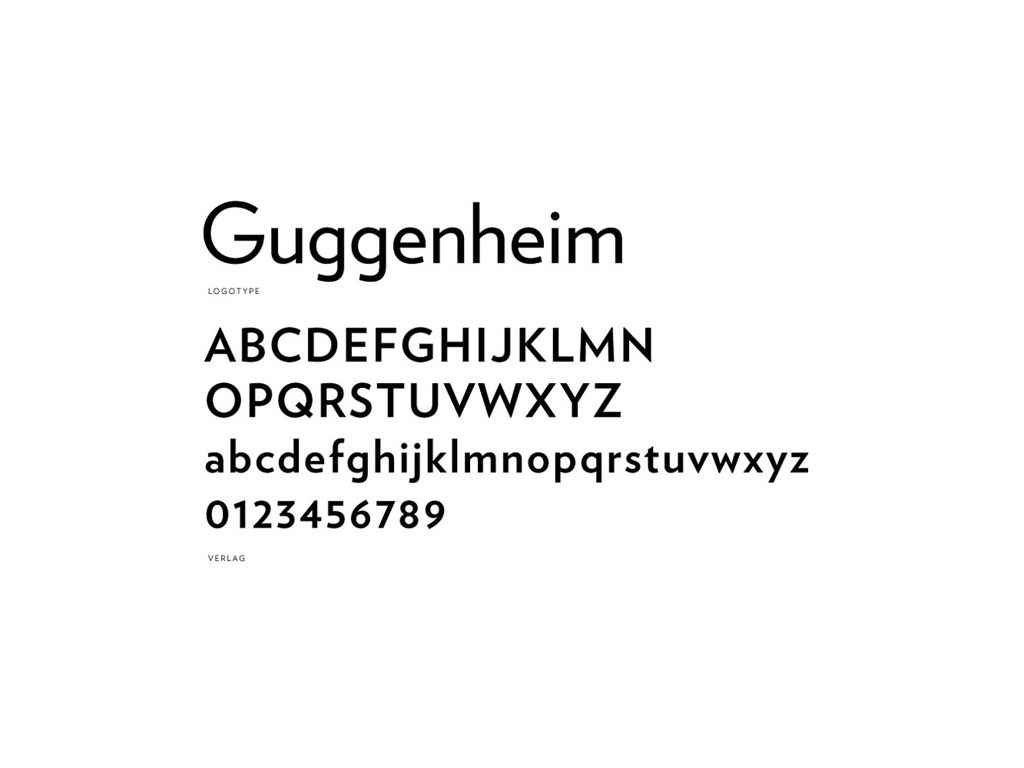
Employing the institutional typeface in yet another away, Hoefler & Frere-Jones’s Verlag for the Guggenheim both revives the building’s Deco-era face and extrapolates it into the present day. It is an act of “historic preservation”, but with an intent to modernize. It’s not a break from the past but an extension to it, a bridge.
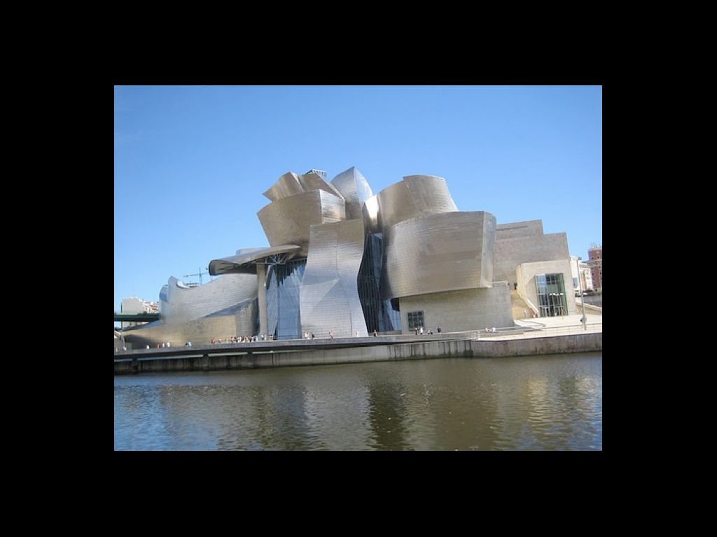
Here is another Guggenheim, Frank Gehry’s iconic Guggenheim Bilbao. Its form is contextual — Gehry has likened it to a boat on the water — but also iconic, like the Pompidiou from before. It exists within the same institution as Frank Lloyd Wright’s building, but type is applied to it in a very different way…
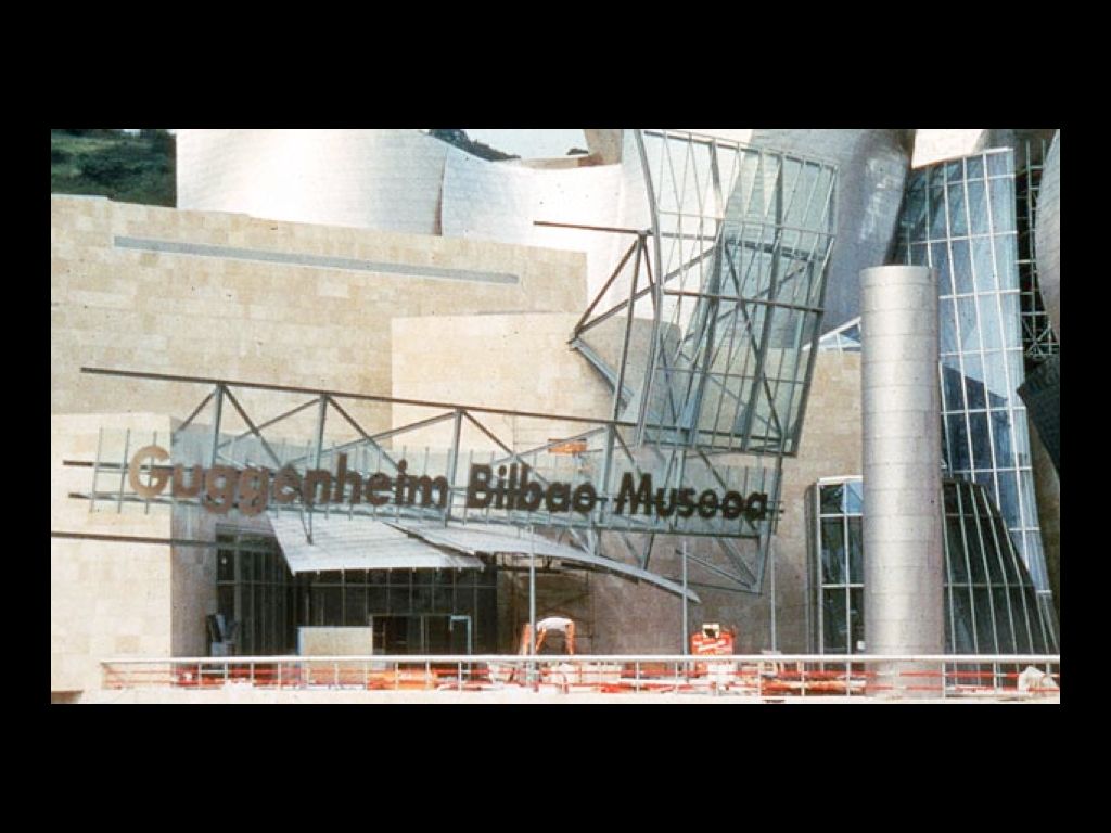
…and somewhat awkwardly. Instead of Verlag, it uses Futura Bold; instead of a surface application, it uses a scaffold. The type here, unlike the New York building, feels more applied than rooted in the building itself.
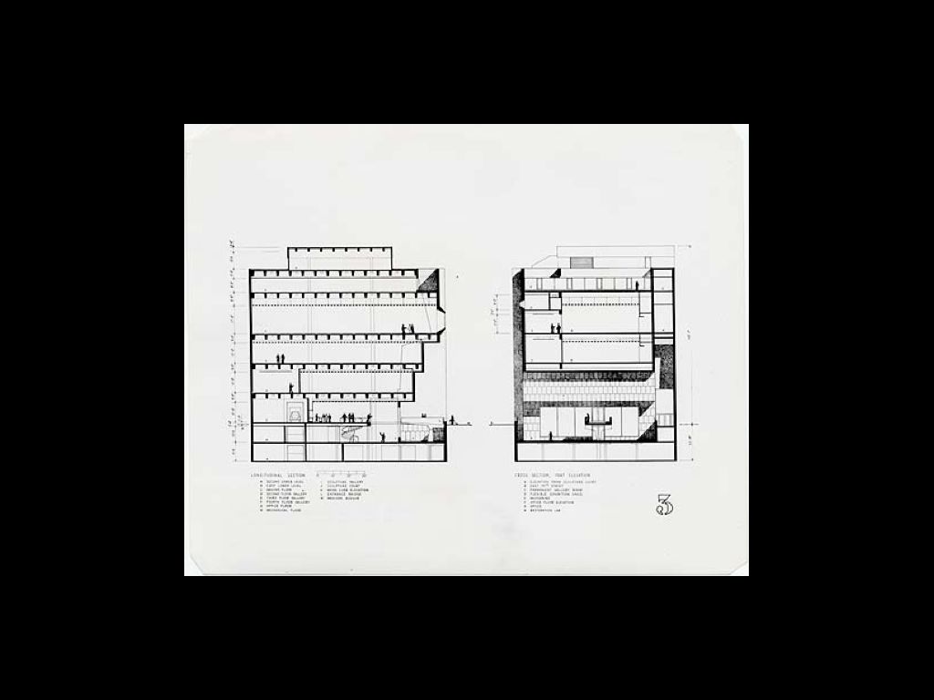
In a more recent example, the right angles of Breuer’s Whitney Building…
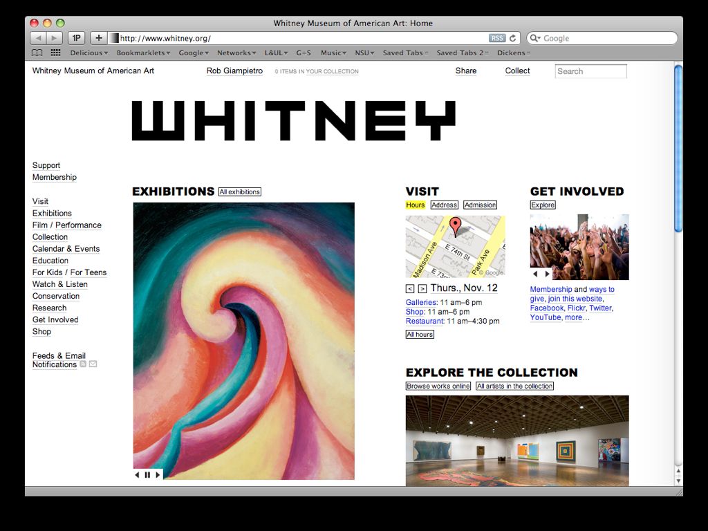
…became the right angles of the institution’s new typeface and logo by Pentagram’s Abbott Miller.
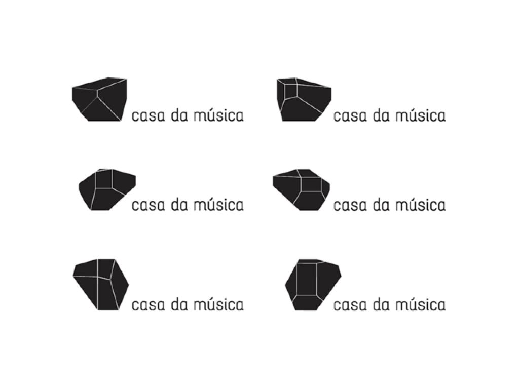
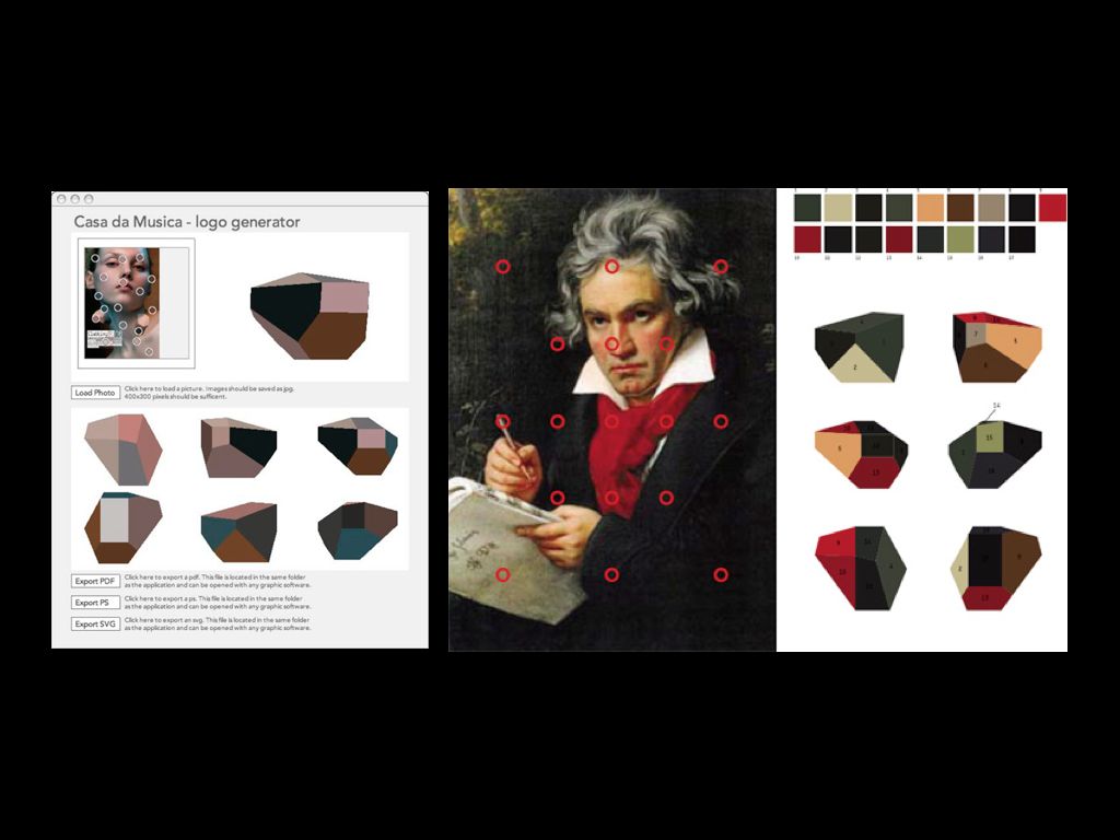
Stefan Sagmeister’s identity for Portugal’s Casa de Musica identity represents the building, designed by OMA, directly — but it adds a bit of mass customization in the form of mix modularity as colors from various images can be applied to the building’s gemlike surfaces, which appear quite different depending on position and perspective.
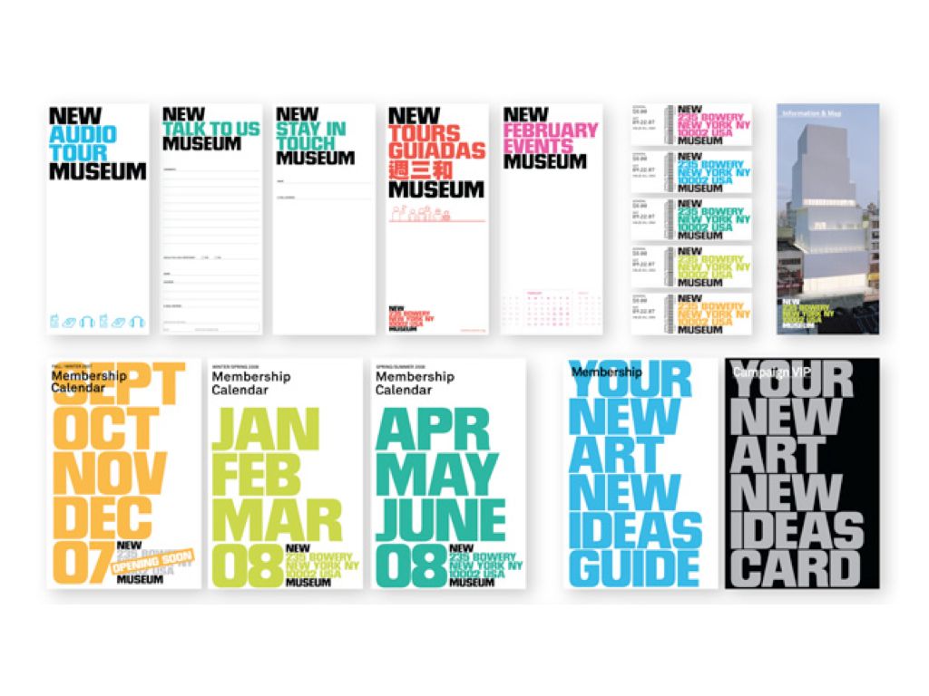
The role of architecture in defining the identities of arts institutions is seemingly continuing to expand. Another recent example is Wolff Olins’s “stack” system for the New Museum, which uses the museum’s base and roof as a set of brackets into which varied activities and phrases, set in Fred Lambert’s bold Compacta, can be swapped and exchanged. Part of its effect comes from the stack’s similarity to the shape of SANAA’s building, but part of its effect also comes from the font’s ability to imbue an art institution with a more casual, even industrial flair befitting its location among the restaurant supply shops on New York’s lower Bowery.
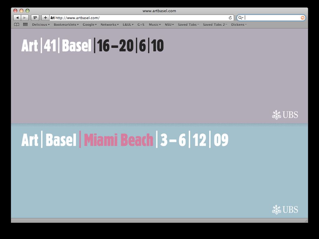
Art Basel doesn’t depict a building in its identity, designed by Müller+Hess, but its typeface — Heinz Hoffman’s Block Berthold Condensed — has a similar effect.
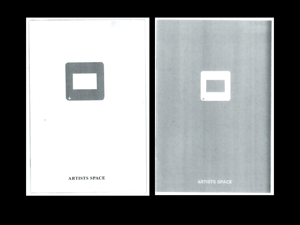
For a period of time, Artists Space drew inspiration from within its walls rather than directly from them. The gallery has a huge archive of artists’ slides and for a time made regular catalogs with selections from this archive. To represent this program, the slide was used. The booklet on the left is from ‘82, and on the right, ‘83.
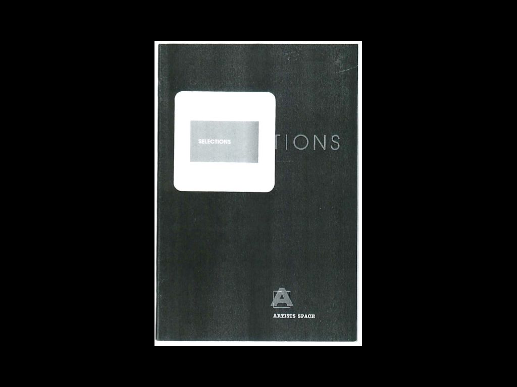
Playfully, the slide is used as both an emblem and an object. Its properties of compression are retained in its graphic expression, as seen on this catalogue from 1984, where it’s used in conjunction with the squared A that represented the broader institution.
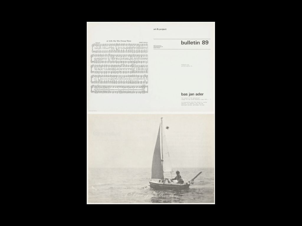
The more I saw these slides in Artists Space’s archive, the more I was reminded of Art + Project Bulletin’s attempt to extend the gallery to the mailbox. In many ways these mailers were a kind of distributed gallery space rather than a representation of its built form. Here, the White Cube is transformed into a Tabloid Sheet, a portable art space. This Bulletin from 1975 is by Bas Jan Ader.
The final system I want to look at is the LOCKUP. “Lockup” is a term designers use to describe how information is laid out or arranged on a 2D surface. It’s often consistent — “locked up” — but it doesn’t have to be, and many identity systems accommodate varied lockups for more horizontal or vertical scenarios.
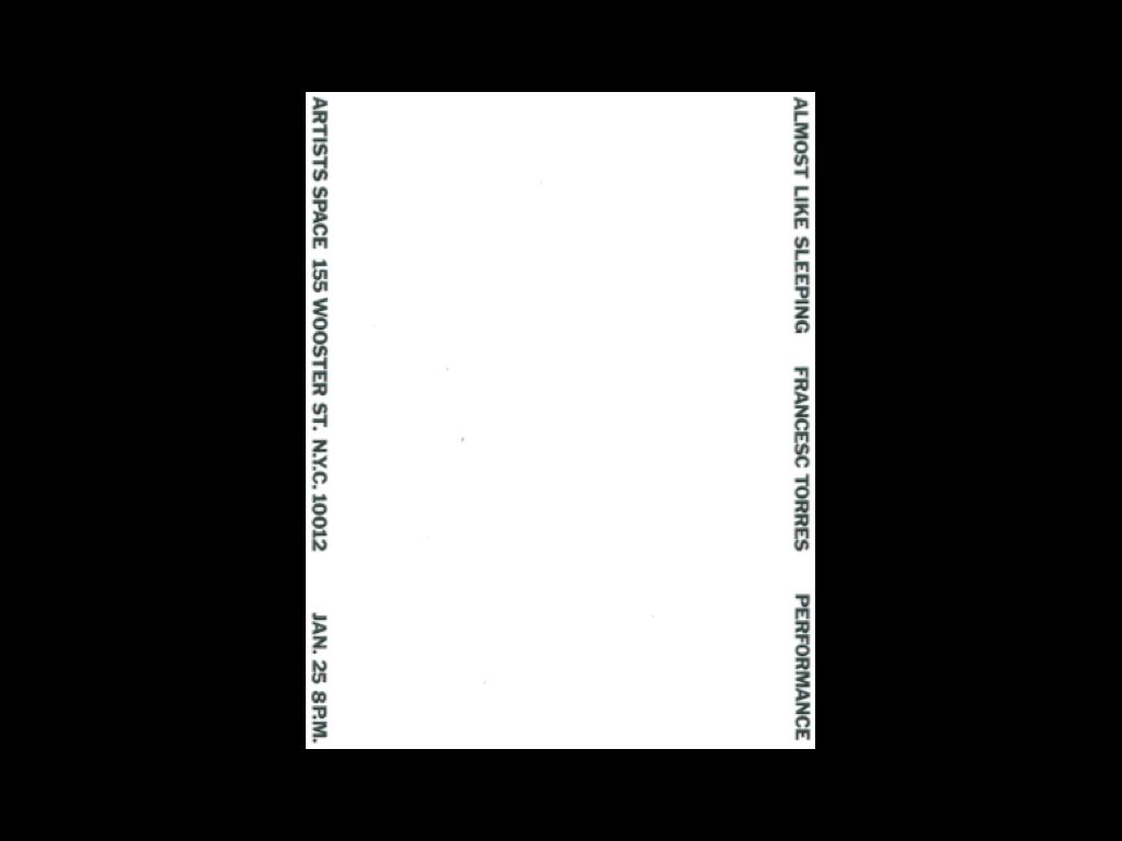
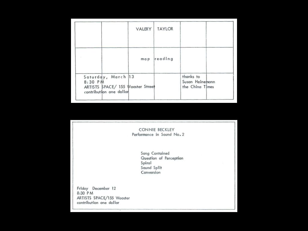
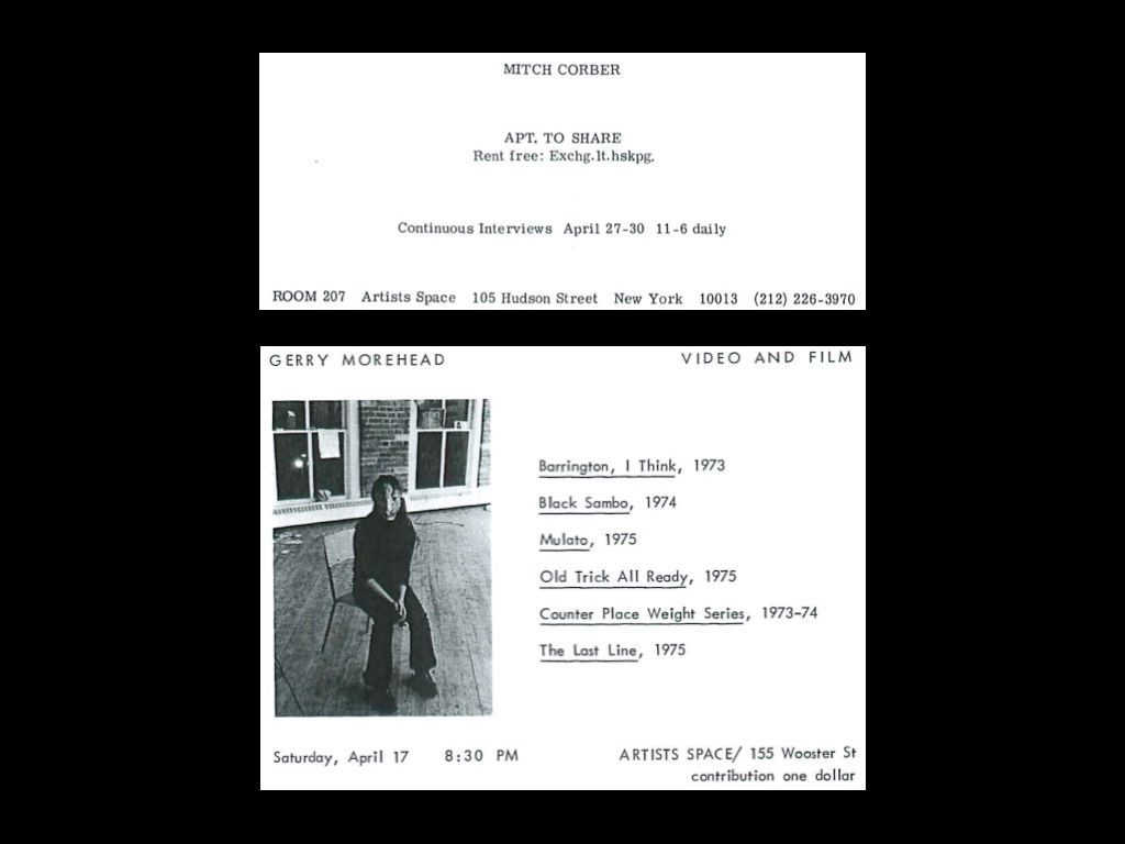
Beginning in the 1970s, Artists Space’s print materials had very expressive lockups, often pushing the gallery information to the absolute edges of the paper, and leaving as much “space” — the “artists space,” presumably — as possible. Here are a few other examples. In one, the type playfully engages a rather heavy grid; in the other, basic info is pushed more typically to the corner and the center of the card is cleared for the exhibition information. More examples from the mid-‘70s follow.
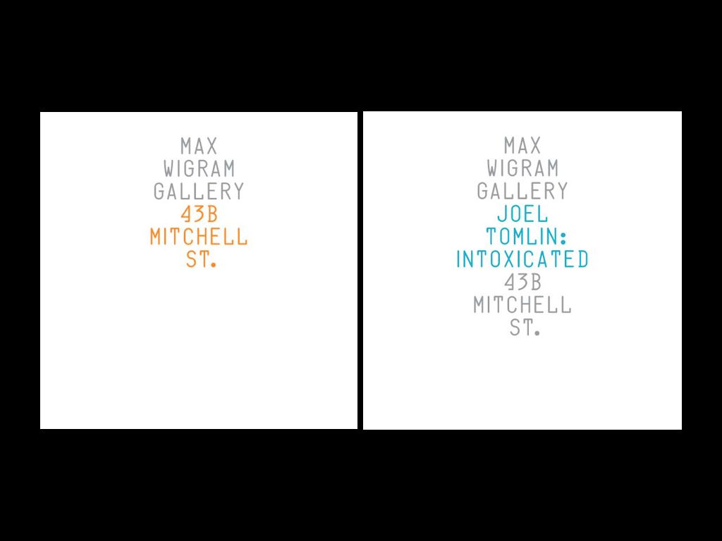
GTF’s identity for the Max Wigram Gallery is a kind of lockup as well. Centered with a custom color and typeface, it “expands” with the gallery’s programming and “contracts” when it needs to represent the gallery alone.
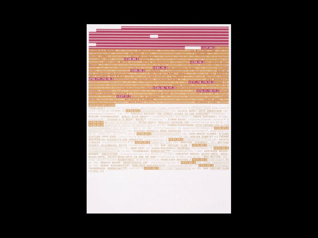
Müller+Hess have used the lockup as a kind of palimpsest in their printed matter for the Kaskadenkondensator Art Space, from 1996–1998. The entire yearlong roster is printed in advance, and then overprinted as events are completed. When the sheet is full, the season is over, but the residue of past projects is left behind.
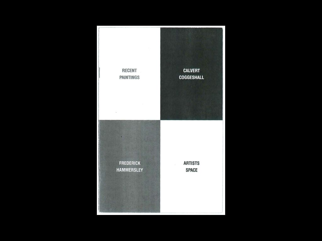
This Artists Space catalog cover from 1987 creates a lockup system as well, as everything, even the gallery name, is systematically slotted into the grid and made equivalent.
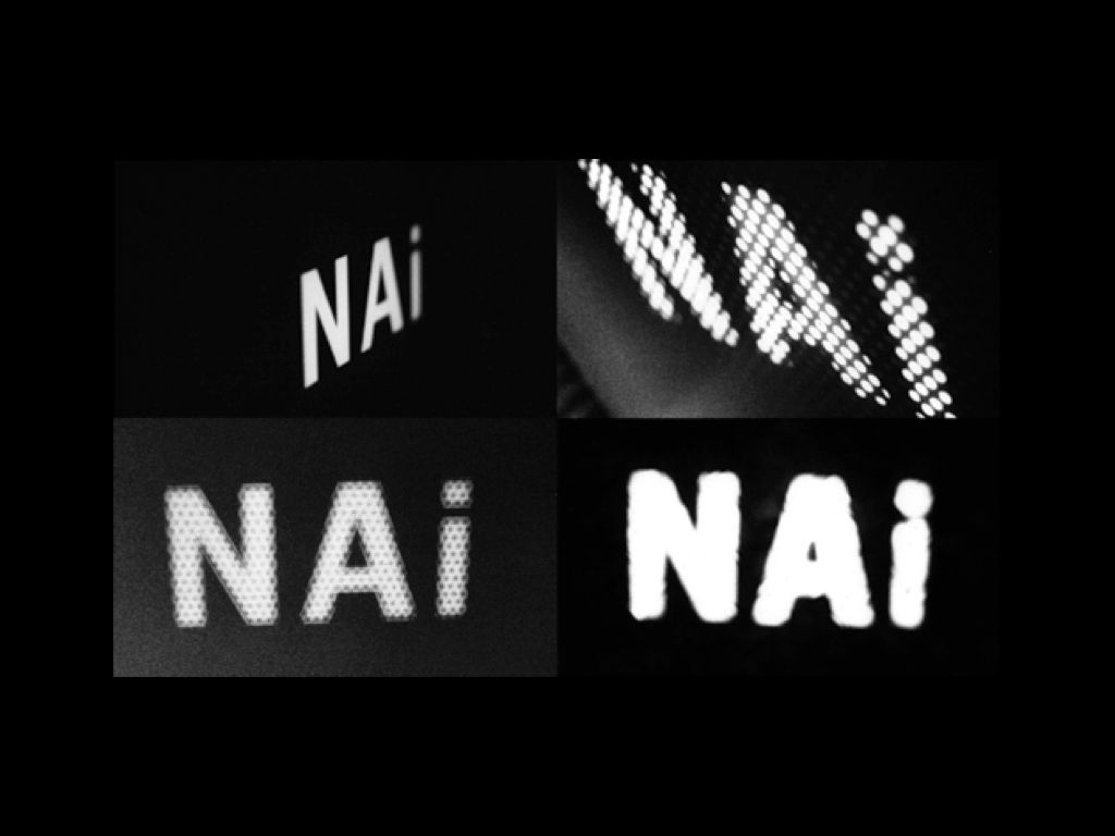
Instead of 3D becoming 2D in the case of the landmark examples I showed earlier, Bruce Mau’s 1993 identity for the Netherlands Architecture Institute (NAi) projects 2D type into 3D spaces to suggest architectural surfaces and built forms. Like a flash of light, its forms are fleeting and ever-changing, varied from one printed piece to the next as they are taken from 2D to 3D and back again.
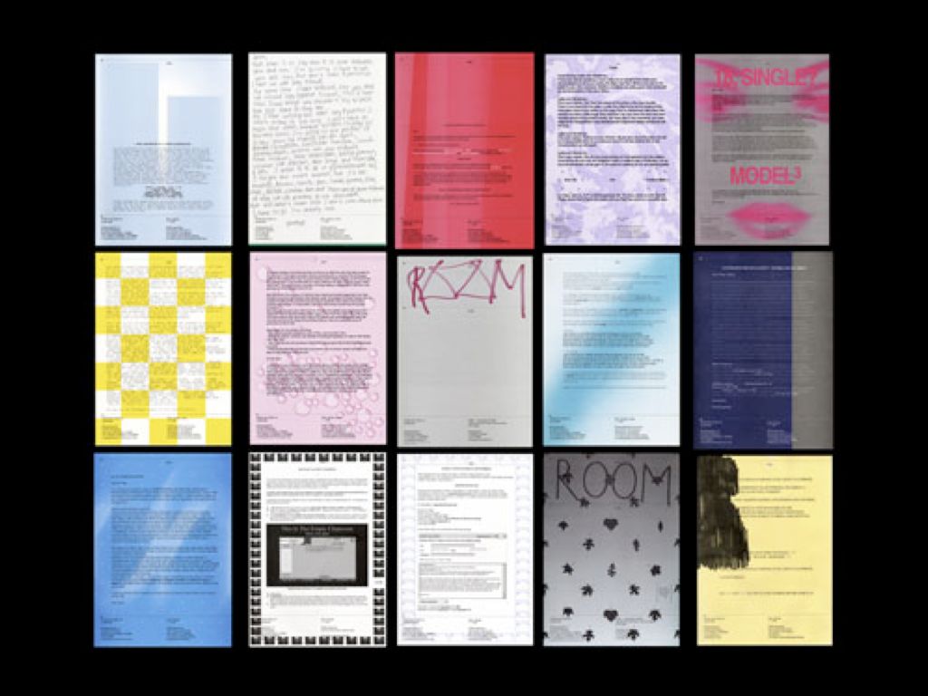
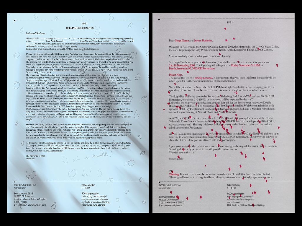
In the context of narrative space, lockups take on yet another meaning. In Maureen Mooren & Daniel van der Velden’s work for ROOM gallery from 1999–2003, press releases were used to “lock up” information systematically into various narrative genres. Here the press release is a kind of visual/verbal readymade, available for reuse and reappropriation by each artist using it. Here form is given not through typography but through language itself, shaping our ideas about art objects via the stories we tell and are told about them. In the second image, there is a more lyrical system of marks, dots, doodles, and squiggles applied on top of the press release, and these marks, at least to me…
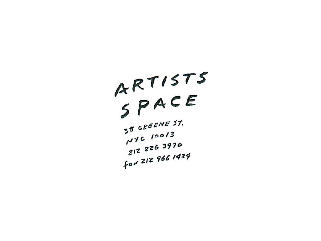
…represent both the press release’s mundane office-bound origins and the artists’ touch or signature. The final identity for Artists Space I’ll show tonight is this lockup, lettered by John Baldessari and used from 1994–2001. With echoes of the artist’s signature, perhaps the original artistic mark of identity, I guess I’ll sign off there. Thanks.