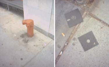
In or Out?
Like a lot of designers, I’m fascinated by photography. But, like so many designers that entered the field after the computer had become the norm, I initially thought of myself more as a technician than an artist. I didn’t think of what I did on the computer as being informed by photography; I thought of it as being informed by itself. Design of the past, I thought, legislated design of the present. But if design in the last few years has become more self-referential, this is because its means of production have become more distinct from those of visual art and visual culture as a whole.
Up until a few decades ago, this was not the case. Design and photography as disciplines were commonly taught in the same department. Part of the reason for this was technical – in order to make design, design students had to understand photographic processes – but part of the reason for this was pedagogical. “Graphic design” became distinct from “fine printing” due to the efforts of the Bauhaus, the founders of which equated design with the democratic possibilities of the machines that were reshaping their societies. The ultimate image-making machine at the start of the 20th Century was, of course, the camera. László Maholy-Nagy – himself a designer, photographer, and Bauhaus professor – was not the first to join design and photography, but his playful essay “Typophoto” from 1925 is probably the best articulation of this idea. Essentially, design and photography were like two boys growing up on the same block: everyone just assumed they were brothers. This essay celebrates that assumption. You’ll find no argument here; just a story about how design and photography, for me, came back together again. The writer Lawrence Weschler has a name for these kinds of visual comparisons: he calls them “convergences.”
On a chilly winter several years ago, I enrolled in “Introduction to Photography.” Within three weeks, I was failing the class resoundingly, having shot 40 or 50 rolls of film and not a single photograph of substance. Like many of my fellow verbally literate and visually illiterate undergrads, I could talk about photographs, but I didn’t know how to make photographs worth talking about.
Working this out on a walk with a friend one snowy day, I tried to explain how I thought that mastering the alignment of forms was the first key. When he looked puzzled, I made a frame with my fingers, tilted my head backward to face the blank February sky. Branches littered my view above. “The photograph is not here,” I said, viewing the hastily-cropped tree. I took a few paces forward. “It’s here.” The sky was a page, and, faced with the forms above, the typographer in me moved to arrange them and give them meaning. And while this inclination toward celestial ordering is as old as humankind, it is still very contemporary. Novelist Italo Calvino writes in Invisible Cities that “In the shape that chance and wind give the clouds, you are already intent on recognizing figures: a sailing ship, a hand, an elephant….” I had now learned this with my eye. Later that week, a grad student showed me Lewis Hine’s photographs of the construction of the Empire State Building from 1930-1931. Motivated by impulses similar to the Bauhaus, Hine’s images brought the workers from heavy industry and the abstract shapes of early 20th-Century design into the a single frame. Against the foggy backdrop of the city, girders became playful diagonals and scaffolding became a modernist grid. There was suddenly, in my mind, little difference between Hine’s workers, miles above the ground, and the Suprematist paintings of Kasimir Malevitch: they were shapes tumbling through space, airplanes in flight. And Hine, later the chief photographer for Roosevelt’s Works Progress Administration, had given these shapes a tremendous social value through the new medium of photography.
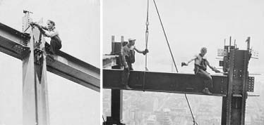
Above: Lewis Hine.
These initial “convergences” – first the episode of the tree, then my introduction to Hine – were formative. As I tried to work out what they meant to me, my teacher continued doing slide lectures on the French photographer Henri Cartier-Bresson. Cartier-Bresson coined the term “The Decisive Moment” to describe the instant in which the disparate forms of the outside world organize themselves in the camera’s viewfinder to create meaning. The fewer elements in the frame, I reasoned, the easier it was to understand how this moment was created. I began collecting photographs that stunned me with their blankness. Richard Avedon intensified the character of the assorted drifters he encountered in the American West by photographing the forms of their bodies against a stark white of a bedsheet. Walker Evans found the stark blankness of the Southern sky a frame of fitting sobriety for his studies of churches commissioned by Hine for the WPA. With books piling up around me in the photo collection at the art library, I found the German photographer Karl Blossfeldt, whose work surveyed the natural forms of plants. Blossfeldt’s images reminded me of another German photographer, August Sander, whose work surveyed the forms of the German people themselves. Sander, who followed Blossfeldt, seemed to be followed by Bernd and Hilla Becher, whose work surveyed the industrial architecture created by many of the workers that Sander photographed decades earlier. I finally realized that the relationship between Hine and Cartier-Bresson was not a unique one: photographs everywhere began with forms. Russian photographer Aleksandr Rodchenko, like László Maholy-Nagy, was a designer and photographer, and the compositions of his photographs were directly influenced by Malevitch’s paintings. Edward Weston’s pepper reminded me, suddenly, of Blossfeldt.
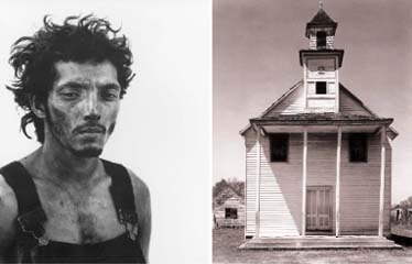
Left: Richard Avedon. Right: Walker Evans.
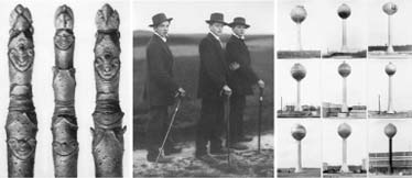
Left: Karl Blossfeldt. Center: August Sander. Right: Bernd and Hilla Becher.
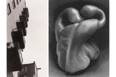
Left: Alexsandr Rodchenko. Right: Edward Weston.
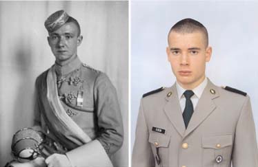
Left: August Sander. Right: Rineke Dijkstra.
I had started to develop a working method for myself based on principles of inclusion and exclusion. First, exclude verbal descriptions from my visual process. Writing about what I wanted to take pictures of would produce a lot of essays and not too many pictures. It’s a visual medium: respond visually. Second, exclude the visually unnecessary. Empty the frame somehow and reintroduce elements to compose as I would if I were starting from a blank pasteboard. Found visual situations were controlled by composition. Constructed visual situations were often inspired by it. Being a designer, composition was a principle I responded to; I naturally began constructing more images. My collection was beginning to swell with works of a different sort. Alfred Hitchcock’s production stills from Psycho had found their way into my file. These images were controlled, blank, but also part of a larger narrative, pieces to a bigger story. Cindy Sherman’s self-portraits referred to these Hitchockian constructions without including the story. More recently, Gregory Crewdson has done for Spielberg what Cindy Sherman did for Hitchcock: appropriated him.
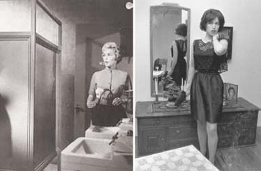
Left: Production Still from Alfred Hitchcock’s Psycho. Right: Cindy Sherman.
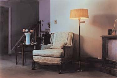
Above: Gregory Crewdson.
In the end, I survived “Introduction to Photography,” barely, and fumbled my way into “Intermediate Photography” with Catherine Opie, and outstanding teacher and photographer in her own right. In that class, I met two designers who were also in the process of coming to terms with photography in similar ways. Kristin Tomsits saw in lawns what I saw in Lewis Hine’s sky and Walker Evans’ churches. One of her photographs shows the pristine edge of a lawn as it meets the pavement. It is a photograph, on one level, of the way a line divides a plane into two distinct colors. On another level, it is a banal observation of Suburbia. Another of her photographs depicts the electric green Astroturf of a Mini Golf course, complete with a cookie-cutter bench that’s as fake as the grass it’s sitting on. The bench’s fakeness reminded me of Thomas Demand’s photographs. Demand builds miniature recreations of famous sites out of paper and photographs them to look real. When the photograph is complete, the construction is destroyed, giving the photograph an imperceptible sense of loss, which is tied to its referent. Tomsits’ bench looks like Demand’s photograph of his reconstruction of the diving board from the 1936 Olympic Games held in Nazi-occupied Berlin. Tomsits’ photographs, though, had a sense of loss that differed from Demand’s: full of flat, unvarigated surfaces, textural, and tonal bump-ups, all set at sporting sites in wintertime, they spoke to the lonliness of winter and the suburban landscape.
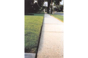
Above: Kristin Tomsits.
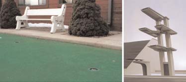
Left: Kristin Tomsits. Right: Thomas Demand.

Above: Kristin Tomsits.
Leslie Tucker, the other designer in Opie’s class with me, took photographs of abandoned building walls. These great, flat walls were venues for typographic observation within a constrained formal set. So in the same way that Tomsits’ photographs shuffled elements like “Lawn,” “Pavement,” and “Goal,” Tucker’s photos shuffled “Wall,” “Tree,” “Fence,” and “Window.” Against a blank sheet of wall, Tucker made squares with windows, lines with trees, tones with fences. The photographs brought beauty out of overlooked urban space, and, as in Tomsits’ suburbs, these spaces were uninhabited. These were photographs in the literal sense. These were picture-writing. They were graphic, sometimes even typographic, like Tomsits’ later photographs for the class, deadpan renderings of signs for “Syosset Lanes” and “Oasis Food.” Tucker’s depictions of used glassware at thrift stores, the patter of forms on lines against a moiré of pegboard, like the Bechers’ watertowers against blank German skies, were a study of sorts, a typology, a reading. Both designer/photographers in my class owed a huge debt in their work to the American color photography pioneer Stephen Shore, whose deadpan observations of walls, signs, houseplants – and everything in between – left some of the nostalgic allusions of black-and-white photographs behind in order to show the present surreality of the everyday.
The designer/photographers in my class (and their visual forefathers) taught me that the process of inclusion and exclusion – really, of editing – was essential within the frame. As I broadened my view of designers taking pictures and the photographers that seemed to influence them, I began to understand how this kind of editing took place in the presentation of their images as well.
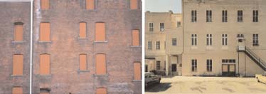
Left: Lesley Tucker. Right: Stephen Shore.
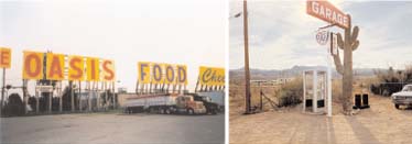
Left: Kristin Tomsits. Right: Stephen Shore.
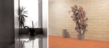
Left: Darren Kuhnau. Right: Stephen Shore.
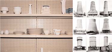
Left: Lesley Tucker. Right: Bernd and Hilla Becher.
Rudy VanderLans’ photo-fantasia Supermarket, a found word for a found landscape, folds together themes similar to those of Tomsits and Tucker over the course of a drive through Southern California. These photographs summon a familiar loss and lonliness and raise questions about the everyday and the banal. Here again we see lawns, deserts, skies, and flatness. Here again are some of Shore’s signs and plantlife. VanderLans includes snatches of his sonic environment in his presentation, a kind of audio typography. There is a radio playing in his car as he drives. The D-shape of his car window becomes a major formal element, a lens used to classify the anonymous landscape. In 171 pages, not a single human being is depicted. Instead the work is a catalogue of like forms, the grid of four into which the photos are slid a kind of compound view, like that of a dung beetle or a closed-circuit television. Quadrants sputter alive with speech or images and then return to a blank, sandy beige. Each drugstore snapshot is horizontal, uniform, consistent, like the frames of a film whizzing quietly by.
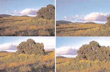
Above: Rudy VanderLans.
VanderLans’ project is a formal stepchild to Gerhard Richter’s Atlas, itself a catalogue of forms, of inspirations, of photographic brainstorming, a mapless map of a placeless place, Richter’s mind’s eye. When I first opened Atlas back in the art library years ago, it was like opening my own eyes to the world. Landscapes, seascapes, city plans, and foggy roads. The faces of dead white men. Daubs of colored paint in harsh light. Branches, flowers, and clouds. Glaciers, meadows, and country roads. There is almost no portraiture until the end, when Richter includes studies of his wife and child. It is an album not of people but of potentials, a viewbook and a vantage-point. Like VanderLans, Richter uses a system to organize his images: all are mounted on sheets of paper derived from a single size. This kind of photographic uniformity is aided by design in its conceptual thrust, so the debt in making Atlas is mutual. The clarity of Richter’s worldview is reinforced by its constancy, as it is in the Bechers’ work, image after image of incremental difference; and totality, as it is in Sander’s work, with a breadth that draws not just on the German landscape, but on that of all the world. Richter’s view includes everything we see and everything we’ve ever seen. It is Platonic: not a single landscape, but the idea of a landscape. And it is Socialist: each potential landscape is equivalent.
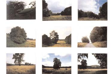
Above: Gerhard Richter.
John Baldessari’s work also uses this tactic. His photographs, like Richter’s sixteen different arrangements of a wine bottle and apples by a window from Atlas, show a process of arrangement either by movement of objects within the frame or by movement of the photographer himself, and, because of this legislated sequential movement, the photographs can evoke gameplay and even rudimentary cinematic montage, as VanderLans’ photographs do. Both are simple narratives in which a limited set of forms plays out in succession. In Baldessari’s “Choosing (A Game for Two Players): Rhubarb, 1972,” seven vertical color 35mm photographs represent a simple game. Three rhubarbs are shown, top-to-bottom. Player 1 chooses the center rhubarb. Top and bottom rhubarbs are replaced and it’s Player 2’s turn. The criteria for judgment are deliberately elided, but we can assume them to be formal, or at least aesthetic. Baldessari’s work helped me turn a corner in my own thinking about photography’s use and its reason for looking a certain way. His photographs were neither fiction nor documentary but evidence. The processes governing them were not illusory but arbitrary. Their aim was not to represent a reality but to represent the choice involved in all representations of reality. What, after all, could be more arbitrary, less nuanced, than a rhubarb? We have no sign structure for it. The rhubarb is an operand.
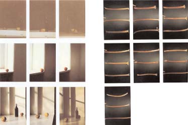
Top: Gerhard Richter. Bottom: John Baldessari.
Baldessari is upfront about this. His list of quotations from an introductory textbook on photography is telling:
- What the camera has done is to show us what to concentrate upon; and, consequently, what to leave out.
- The photographer can change his position, but the result would be another kind of picture.
- Without design a photograph will be but an announcement.
- In a mere photograph there is a real danger of losing a picture’s chief attribute, its design.
- At first glance a photograph will often appear to add up to the conditions of an adequate composition.
- Here is a typical case of a striking photograph that contains elements from which a good composition can be made; as it stands, it cannot be literally copied without asking for trouble.
Baldessari’s interest, like Richter’s, is not so much in photography but in the epistemology of photography, in which design plays an intimate role. What are photography’s limits? What constitutes a photograph in and of itself? And who gets to choose one from another, Player 1 or Player 2? Players 1 and 2 may have the agency of operators, but they are without identity. It is easy to build identities around them, however. Perhaps one is the viewer and the other the viewed. Perhaps one is the artist and the other the audience. Evidence photography, after all, is not found photography: it is made to look found, but still it bears a maker’s mark. Who is the maker? Who is the photographer? What constitutes a photographer, and how is the photographer involved in the pictures he takes? It’s a conceptual hokey-pokey. Do you put your whole self in or leave your whole self out?
These final issues, of identity and authorship, are dramatized in the American photographer Lee Friedlander’s self-portrait, “Albany, New York, 1967.” Taken five years before Baldessari’s “Choosing,” we find ourselves inside a similar-but-different game. The horizontal frame is split in half top-and-bottom. Below are Friedlander’s feet. Above are three portraits of young men, perched on the edge of a thrift store window. In this simple image, Friedlander raises the stakes of choosing: Are we choosing his identity? Is he choosing his own? Are we choosing ours? Is he choosing for us? In the moment of passing by a show window, Friedlander ties our most basic questions of self to the act of photographic consumption. If we’re playing this game by Baldessari’s rules, after choosing one of the portraits, another two would replace those we did not choose. The process of identification would be ceaseless, and the role of photography in the process would be increasingly essential.
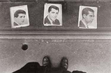
Above: Lee Friedlander.
August Sander chose to typify the people in his world by vocation, and in our world this standard has gained widespread acceptance. If part of who we are is defined by what we do, what is happening when designers photograph? The process of many art photographers is to use photographs to chip away at notions of self, and they are aided in this by the development of a body of work, of a life in pictures, constructed or otherwise. Designers do not have this benefit; photography is not the thrust of their life’s work, or they would be branded “photographers.” This is not to say that one cannot be both; it is only to say that in being both, in our world, you cease to be either. Photographs that designers take, like photographs that painters take, are consigned by their critics as sketches. “Here they are,” they say, “in the process of working something out.” And there is truth to this. But there is also a great deal of critical gerrymandering. Earlier, I sought to draw formal lines in the sand; now I wish to draw conceptual ones. If we make a distinction between photographs and Photographs, which may a designer take?
The answer to this final complication may not come from the individuality of our selves but from the ubiquity of our machines. Everyone’s a photographer, in other words, because everyone has a camera. Taking pictures, especially lately in the U.S., seems more a right than a gift. I now have a camera attached to my phone, a device no bigger than a chocolate bar. And with it, the city has changed for me. I use my camera to talk to objects the way I use my phone to talk to others. The format is a bit taller than square and never intended for making prints. The matchbook-sized images it generates are paperless, objectless, just data skimming through the air. I meet a friend in a café, and we trade stories through looking at things, like the Academics of the Balinibari School of Languages in Gulliver’s Travels, who speak by trading objects carried on the backs of hearty servants. I beam him a standpipe. He beams back a pumpkin and a floppy disc. My brother calls and his face appears. “Where’s your headshot?” he asks. With a mirror the size of a nail’s head mounted next to the lens, I take a portrait to send back. Back at home, Friendster’s JPEGs are supermarket of acquaintance. Ebay’s are a general store of the everyday. Our populist photographs are more syntactic, more typological. Not photography as such but photography as a thread in visual culture’s vast forum. Photographers are speaking in this forum. And, as they always have been, designers are speaking, too.
