Kafka & Typography
We get the word “koan” from Zen Buddhism, where in Japanese it translates literally as “a matter for public thought,” sort of an open-source philosophy for ancient times. Koans often demonstrated the inability of logical reasoning to produce enlightened thought, and, as a trained lawyer and insurance clerk throughout his life, no one knew the deadening effects of logic better than Franz Kafka. Writing was his escape, his meditation, and, fittingly, Meditation was the title of his first published work, released in 1913. While all 18 koans inside are very much worth enjoying, it’s the shortest of them all – the penultimate “Die Bäume,” or “The Trees” – that I’d like to read as a meditation on typography.
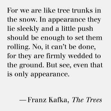
The first of its three sentences plays with our expectations, our human predisposition to empathize. Kafka writes from the first-person plural, “we are like tree trunks in the snow,” and we, the readers, picture ourselves as such. No sooner have we done this when Kafka shifts tenses to the third-person: “they lie sleekly.” We are no longer in the trunks’ position. The shift seems illogical. Looking more closely at the first sentence, it now appears to be only a fragment beginning with “for,” like the second half of a thought. And the thought itself is not explicit, but metaphorical. Everything is twice-removed, yet “wedded to the ground,” immobile.
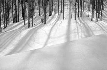
Kafka’s words are not intended to be logical, and they have as many interpretations as they do readers. But several readers have suggested that the “we” in the first sentence is not a human “we” but a set of printed letters. For many, including myself, the voice at the start of “The Trees” belongs to Kafka’s letters themselves, speaking directly to the reader: “we are like tree trunks in the snow.” Picture a field after a recent snowfall. Think of the straight, almost runic lines of the fallen boughs. Approaching them, they seem like characters from an unused alphabet. Just as with the wispy marks on a printed page, it seems as if they could be easily brushed aside: “a little push should be enough to set them rolling.” It is not, however, as Kafka reminds us, “They are firmly wedded to the ground.”
Historically, there is a direct relationship between our letters and the trees. Apart from having “leaves,” our word for “book” comes from the German word for beech trees, on which many runes were originally carved. Wood type, made by cutting letters from trees, is a practice as old as printing itself. As early as 2900 B.C., pictographic signs were influenced by the shape and rigidity of trees when Sumerian scribes began shaping styluses from the woody reeds that grew abundantly in marshy Mesopotamia. The blunted ends of these styluses were carved into a wedge Latin – giving the script Cuneiform its name.
A passage in George Jean’s book Writing: The Story of Alphabets and Scripts on Cuneiform gives a clue to the meaning of the final sentence of “The Trees,” where Kafka seems to remove meaning just as quickly as he’s hatched it. Jean writes that in Cuneiform, “each sign could have several different meanings, depending on context; the sign that represents a human foot could be understood as ‘to walk,’ ‘to stand up,’ ‘to move,’ and so on.” Our signs, so loaded with meanings, may conjure much in a single stroke. As soon as the picturesque image of a field in winter has entered our mind, Kafka is quick to remind us that it does not exist. It is merely an image in our minds, made by letters on a page and the writer who wrote them. The image’s existence is a metaphor for the shape of language, but it is only one of many metaphors. When Kafka’s letters spoke, they described not their true form, but a ghost of that form, an apparition, like a spirit in the trees.