On Arranging Books by Color

Left: Conway Library, London. Right: Witt Library, London. Photographs by Candida Höfer, 2003–5 (via The Nonist).
When it comes to the organization of knowledge, a lot is revealed by the system of organization that’s used. For most serious academic libraries in America, the organizational system of choice was invented in 1874 by Melville Louis Kossuth Dewey (or Melvil Dui, as he liked to spell it), who was an assistant librarian at Amherst College when his eponymous system was devised.
The Dewey Decimal Classification system (or DDC) is definitely widespread, however there are some notable exceptions. The Library of Congress, for example, has its own system, known as LCC. And The New York Public Library has not one, but two, arcane systems: One is the Billings Classification, a broad subject classification created in the 1890’s and recently retired in favor of LCC; the other is a fixed-order scheme arranged by the size of books.
So that’s how the pros do it. But what about the rest of us?
Before I consider that question, let’s get back to Dewey for a second. A trailblazer in many ways, Dewey was the founder and editor of Library Journal, a cofounder of the American Library Association, and an outspoken advocate of spelling reform, a 19th-century movement which suggested changing odd-looking British words like “catalogue” to more familiar-looking American ones like “catalog.”
One of the words that would have caught Dewey’s eye was “colour” – or, more patriotically spelled, “color” – and on this subject Dewey’s opinions were perhaps a bit unorthodox. Later in his life, Dewey sponsored several pamphlets about Ro, a language created by Rev. Edward Powell Foster in which words are constructed using a categorical system similar to Dewey’s own system for books. In Ro, words starting with “bofo-” are color words, as in “bofoc” for red (c=crimson?), and “bofof” for yellow (f=who knows?). Doesn’t exactly roll off the tongue, does it? Replace the color words of this lovely final line from Robert Haas’s poem “The Problem of Describing Color,”
Red, I said. Sudden, red.
with the Ro equivalents,
Bofoc, I said. Sudden, bofoc.
The poetic effect is not really the same. It’s a bit like saying the hexadecimal color equivalent of medium goldenrod – “EAEAAE” – out loud. Like a computer language, Ro is not a language of nuance, it is a language of hard, driving logic. Such a regimented worldview may have also shaded one of Dewey’s other unorthodox color opinions: he was rumored to be an extreme racist and advocate of racial segregation.
Questionable personal beliefs aside, I have never found the Dewey Decimal Classification system to be an accurate reflection of how books are organized in my own mind – or anybody else’s for that matter. Certainly I understand the DDC’s advantages when it comes to large-scale collections, but if how we choose to organize our personal effects says something about who we are, then an arbitrary numeric system says very little about me. My library is, to borrow from Georges Perec, “a sum of books constituted by a non-professional reader for his own pleasure and daily use.” Perec’s definition comes from a wonderful essay of his titled “Brief Notes on the Art and Manner of Arranging One’s Books” and includes such other quoteables as “The problem of the library is shown to be twofold: a problem of space first of all, then a problem of order.” I am well aware of both.
Perec lists several possible ordering schemes in his essay, and in practice I have used a number of these, sometimes alone and sometimes in combination with one another. Randomness (or chance) has dominated certain shelves of mine for a while. Loose categories governed by architectural constraints was a working method of mine, too, with a large wall grouping my novels and a side table sheltering the smattering of books I have on the dramatic arts. Sometimes the size of the books themselves is the governing agent: I have ganged up a set of cheap paperbacks on a squat shelf because they fit there splendidly. A book’s value can govern my placement of it, for example, I keep my expensive books away from the sun. In other cases, time is the reason for a book’s placement, with older books piling up in a dark corner of my studio while newer books are proudly displayed on my coffee table. “None of these classifications systems is satisfactory by itself,” warns Perec, and he is right. But one idea from his list, “ordering by color,” seems to be gathering a small following of late, particularly among the visually-inclined.
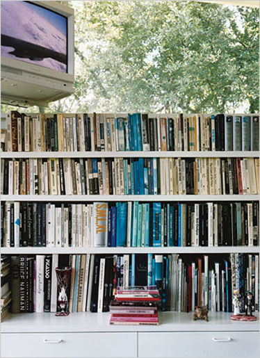
Recently, I stopped by a design studio in my building called Thumb to see my friend Luke Bulman. He’d just reorganized his books by color, and I asked him why he did it. A few reasons resonated with me, and helped to illuminate his logic.
Above: Luke Bulman’s studio.
For one, books he’s purchased or received as gifts are books he knows and often loves, and the color of these books is a major part of the experience of interacting with them. He’s not the only one. When I glance at my own bookshelf, I immediately react to the black spine and stacked caps of Tibor, the metallic silver heft of a monograph on Frank O. Gehry, the austere white backdrop of Sol LeWitt, and the optical orange punch of the 15th edition of The Chicago Manual of Style.
Another of Luke’s reasons is this: organizing his books by color allows him to discover new and unexpected relationships between books he knows well already. When two unrelated books are forced to occupy the same shelf simply because of their spine color, the shelver is asked to think about whether they have ideas to share between them. Perhaps the designers of these chromatically-related books saw something in the books’ content that even their authors did not. Maybe their ideals share a common hue.
The orange of my Chicago Manual of Style (which in my own theoretical color-coded library would be shelved next to Alberto Manguel’s A History of Reading) seems to support this romantic notion about the color of ideas, which has been explored more fully by Dmitri Siegel in his short piece for Dot Dot Dot 8 entitled, “Why Are All These Books Orange?” Siegel shows four books at the start of the piece: An Introduction to the Principles of Transformational Syntax, Metacritique: The Philosophical Argument of Jürgen Habermas, Adorno and Horkheimer’s irresistible Dialectic of Enlightenment, and, last but not least, The Meaning of Contemporary Realism. None of these, despite their common sunny color, are exactly what you’d think of as beach reading. In thinking over the titular question, Siegel decides that “I search out these books because their relentless orangeness speaks to the relationship between theory and visual practice. Just as the designer enforces a uniform surface to market this genre, the content of the genre – theory itself – is used by savvy designers to add a marketable mystique to their work.”
This “marketable mystique” may also be a part of Luke’s final reason for organizing his books by color: pleasure. Our bookshelves often take up a good deal of space in the places we live and work, and organizing them by color transforms them from a banal backdrop into a poppy, rainbow-colored focal point. Books organized by color are cool to look at. Just ask designer Mark Owens, who transformed a photograph of color-coded binders in at a European office supply store into a 15-second bumper for the MTV show “Video Clash.”
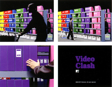
Above: “Video Clash” by Mark Owens. © MTV Networks, 2003.
Or artist Chris Cobb, who (along with 20 volunteers) recently reshelved the 20,000 books at San Francisco’s Adobe Bookshop according to the color wheel.
Above: “There Is Nothing Wrong In This Whole Wide World” by Chris Cobb, in Adobe Books, 2004. (Photographs via Tomas Apodaca.)
Even the The New York Times Magazine’s style section recently featured the home of art collector Andy Stillpass, which houses a number of site-specific works by leading contemporary artists in a wide variety of media, including Stillpass’s own books, which were rearranged first by Dominique Gonzalez-Foerster to form “The Blue Vein” in 1993 and then further juggled by Rirkrit Tiravanija to form “The Red Threat” several years later.
Above: Photograph by Jason Schmidt for The New York Times, 2006.
“The Red Threat” indeed. Ours is a color-coded age, and the prime example is the Department of Homeland Security’s Advisory System, where the highest rating on the scale, “SEVERE,” is colored red. The more you look, the more you see an enthusiasm for color-coding in every corner of our culture. A cursory glance at Flickr does well at articulating the range. Users there are sharing photos of color-coding systems they’ve observed on everything from condiments to bike racks, from dress shoes to trash cans. In addition to books, I know a number of people who’ve organized their records by color, and this makes lots of sense too. The many moods of music seem well-suited to color-coding, as does the indescribably abstract quality of the artform itself.
So, will Pantone’s numbers replace Dewey’s decimals anytime soon? Probably not. But don’t let that discourage you. To rearrange your books is to see them afresh and to investigate yourself in the process. Even if you make a terrible mess, Perec reminds us that “Disorder in a library is not serious in itself; it ranks with ‘Which drawer did I put my socks in?’” and your sock drawer is probably color-coded already.
Update
I was thrilled at the response this piece got from the readers at Design Observer, and their sharp minds were quick to point out few oversights on my part and additional points of interest. Ann noted that “the cataloging system most widely used by research and university libraries … is, indeed the Library of Congress system. DDS is mostly used in public libraries, not academic libraries.” Very correct. Prem spoke of the contributions of Willy Fleckhaus, who, when he “designed the paperback line for German publisher Suhrkamp in 1963, set up a color coding system for every title based on subject.” Parts of Fleckhaus’s project are visible here (spines visible) and here (covers visible). —RG