Remarks from The New School
This talk was given at the Tishman Auditorium, The New School as part of the event “Project Projects Project Projector,” sponsored by AIGA/NY. As a prompt, Adam, Prem and I were asked to speak about how our passions informed our practice. My comments about “computational poetics” (for lack of a better phrase!) follow below.
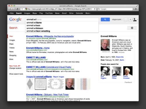
I want to start with this familiar image of Google auto-complete. It’s interesting how the web is a kind of machine for generating and organizing text – you put text in, you get more text out. And there are algorithms that structure the text output, so when you make a search, you expect something specific to happen as a result.
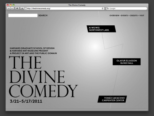
Here’s a website we made last year for an exhibition at Harvard that takes its name from Dante’s famous epic poem – it has a different kind of search bar.
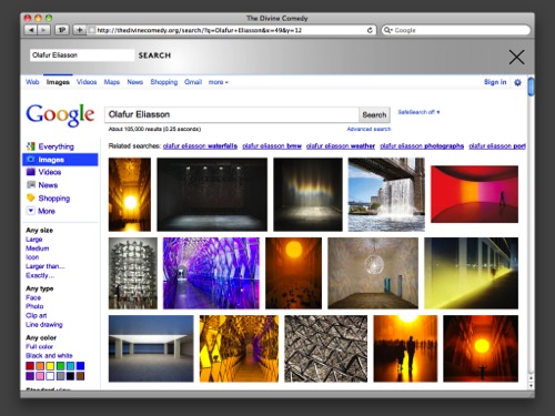
You input text, but the field doesn’t behave as you’d expect – rather than searching the site, it searches the entire web. And rather than behaving consistently, its behavior changes, cycling through a series of searches from Google Images…
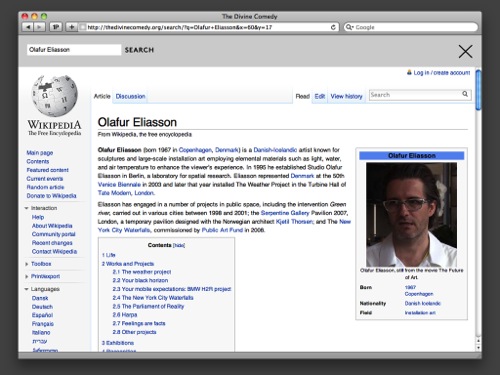
…to Wikipedia…
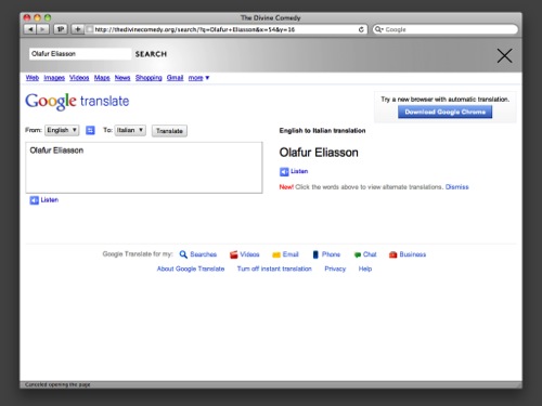
…to an Italian translation of your search phrase.
This isn’t anything new – machines have always changed the behavior of text, and the creation of a new tool often alters the usage of an existing one.
This is a great interest of mine, especially in my critical writing. This is a slide of a series of re-printed artefacts I organized for the Italian magazine Mousse last year all about how machinery affects the speed at which we read – it was called “Time Warp.” The article started with idea of time as a pliable, formable material.
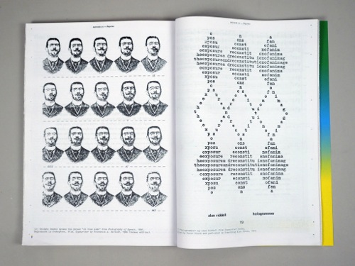
On the left we see how photography altered language. This image depicts George Demeny, one of the early experimenters in chronophotography mouthing the phrase je vous aime in an effort to teach deaf patients to speak.
On the right we see how the typewriter altered language, and specifically poetry, in a poem by Alan Riddell. The poem is called “hologrammer,” itself a new technology, from Peter Finch’s collection of Typewriter Poems – the poem consists of one phrase “the exposure and reconsititution of an image” blasted into particles and then recombined.
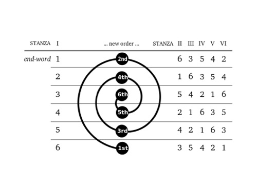
The sestina is a poetic form dating back to 12th Century Provence that works in a similar fashion to Riddell’s poem, breaking apart a fixed set of parts within the poem and then reconstituting them – it’s composed of six six-line stanzas and one three-line stanza. The words that end each line of the first stanza are rotated algorithmically to complete the endings of each line for the following five stanzas. All six words are then used, two per line, in the final triad of the poem. This is a diagram of the sestina algorithm.
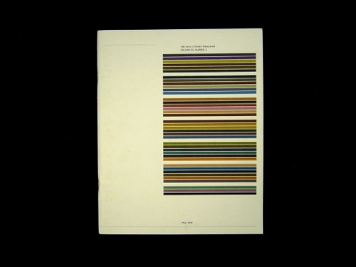
This is a different kind of diagram of the sestina, which I designed for the Yale Literary Magazine, where Prem and I first met, in fall 2000. It’s a color sestina in which the black values of CMYK are rotated according to the sestina algortihm – in the final triad, two black values are added together, which is why those lines are so dark in color.
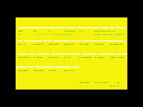
I made this poster a few months after the color sestina. The headline of the poster, “Senior Project Exhibitions,” is made from the names of the artists who are part of the show – one letter from each name is installed on a wall-like elevation.
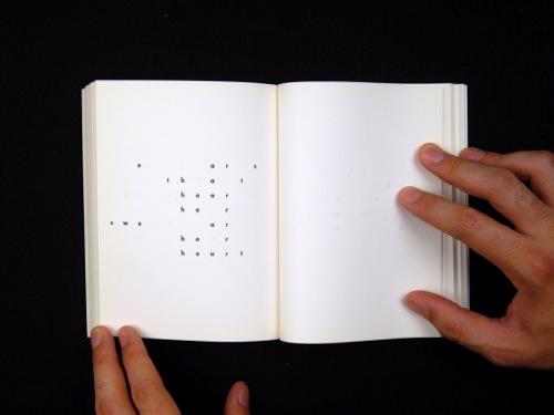
Though I wasn’t yet familiar with it, this poem was destined to become a major influence – you can see the similarities to the poster I showed a moment ago.
This poem is called “sweethearts” and it’s written by Emmett Williams, who was a Fluxus artist, a Concrete poet, a theater critic, and a publisher. Williams was the editor of Peter Finch’s collection of Typewriter Poems that we saw earlier, where “hologrammer” was from.
“sweethearts” behaves a bit like “hologrammer,” taking a single word – “sweethearts” – as its entire structuring device. But unlike “hologrammer,” where only one phrase is discerneable and the rest of the poem is more about pattern and shape, “sweethearts” is an entire book-length love poem about a “he” a “she” and a “we,” all of whom inhabit this single word. Because the phonemes are not rearranged, the words rhyme both verbally and visually – this page reads, “ears that hear her swear her heart.”
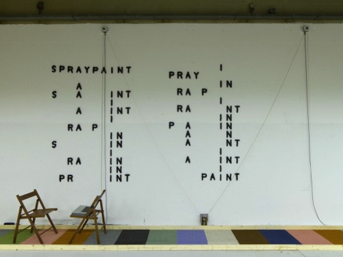
Williams used the form only once. When he passed away in 2007, I decided to continue his exploration of the form.
This is a Williams poem I wrote in 2008 based on the word “spraypaint” – last year, Jürg Lehni’s spraypainting robot Hektor installed the poem at the Utrecht Manifest Biennal for Social Design.
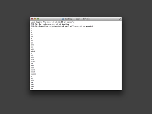
My search for words in a Williams poem begins with a very different sort of auto-completion exercize – another hacked search bar of sorts. This is a terminal window that shows the output of a Perl script for a given word, in this case “spraypaint.” I put out a call for a Williams Word Generator in 2008, and within 24 hours we had this up and running. There’s actually a lot of work that’s being done on computational poetics right now, but much of it focuses on the mechanics of screen reading and machine learning – I’m most interested, at least right now, on the computer as a kind of composition tool, like a typewriter.
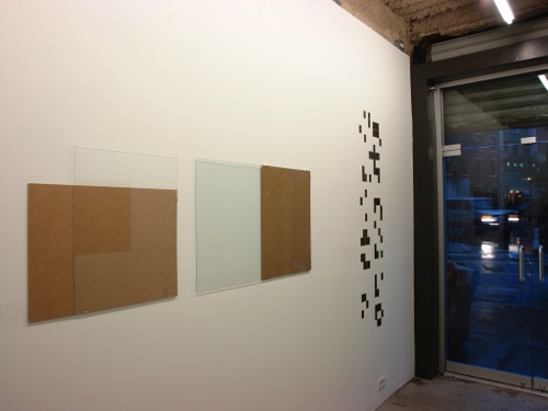
Two years ago, I installed a series of Williams poems at the W/— Gallery. the gallery usually shows pairs — one person with another person – I was paired with Dan Eatock, who installed a series of clipframes in various permutations.
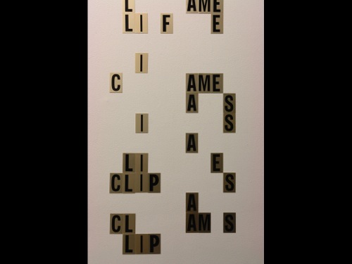
The source words for my Williams poems were the words used to describe Daniel’s piece: “clipframes” and “permutations.” The installations are site-specific – in this case, the words were installed using press-on letters scavenged from a dozen or so LES hardware shops.
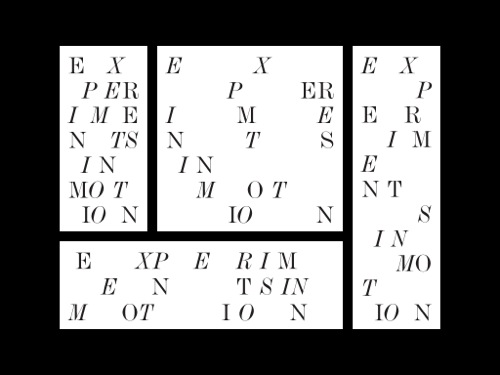
I like when these individual interests find opportunities to merge into client projects. This is an identity we made for a collaboration between Audi of America and Columbia GSAPP — it was called “Experiments in Motion.” The project asked students at the architecture school to explore how new technologies of mobility like driverless cars and programmable groundplanes will reshape the city, and how the city will reshape the car. Our identity explored a kind of “field theory” as the letters are allowed shift and reorganize themselves according to the bounaries of any space they inhabit, a meditation on nonlinear motion.
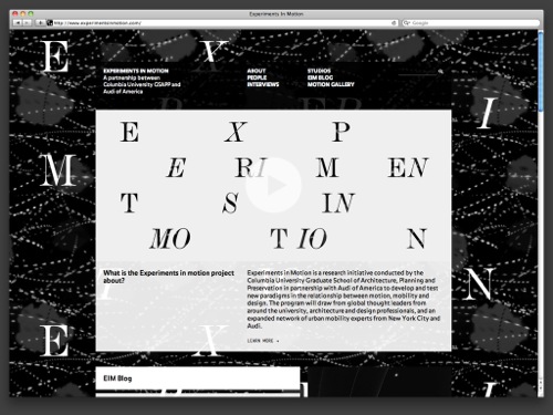
The website pushed this identity further, pairing the letters with animated GIFs by illustrator Santtu Mustonen and allowing each student to have their own customizable Tumblr theme, distributing student research onto a network that could be monitored in real time by the project’s two coordinators.
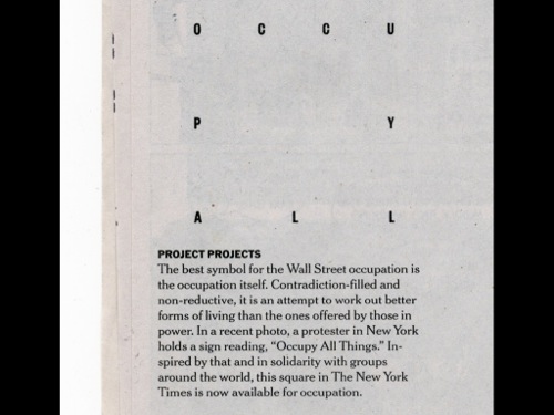
The opposite of this formless letter field is a letter space, a place of occupation – in this case, a square in the New York Times that was made available in support of Occupy Wall Street. The letters, drawn from a sign held by one of the protesters, read simply, “Occupy All.”
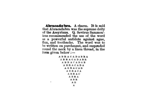
Letters in particular configurations have always been thought to have the power to transform our circumstances – here’s an ancient example, the “magic word” abracadabra written in the form of an equilateral triangle with A’s at each of its three points. This configuration could be worn as a slip of paper around the neck for protection. It summons powers that might not otherwise be there and reminds me a bit of that “hologrammer” poem we saw earlier.
The artist Paul Elliman writes in his essay “My Typographies” that writing can give the impression of things and things can give the impression of writing. The forms of clouds in the sky, the lexical structure of DNA – information often has a typographic flavor.
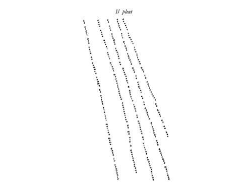
Elliman’s work is featured in the “Ecstatic Alphabets / Heaps of Language” show that’s on at MoMA now. In the show’s organization, it’s preceded by a hallway that includes Guillaume Apollinaire’s poem “Il pleut” (“It rains”), which is shown here.
Dating from 1930, these early types of concrete poems were known as caligrammes – poems that are in the shape of the thing they describe and made possible by what the wall text describes as “the kaleidoscopic environment of France in an age of technological and scientific innovation” – a new technological context.

New technologies change the shapes of buildings, too. How might we conceive of a caligramme to describe the work of a contemporary architectural practice?
This is the menu to our website for architects Weiss/Manfredi. It arrives onscreen at a scale equivalent to a building and structured with the asymmetry that’s characteristic in a lot of their work.

The site is organized to resolve the tension that’s often present in architectural websites, between large-scale visuals and large-scale graphics – the web allows for multi-state, modal experiences where both the visual and the graphic can collide and commingle.
As a result, my visual shorthand for the experience of the site is that the user is “on an elevator trying to read a poster”; that is, moving through a simulated architectural space, looking at a fixed graphic object.
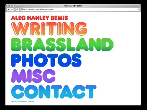
This poster-like menu idea comes out of work we did for a much earlier website for a different context – the music writer and Brassland label impresario Alec Bemis.
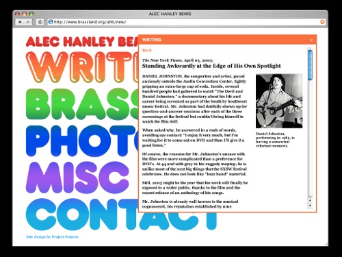
Here the psychodelic split-fountain printing of a rock poster becomes a kind of palimpsest on which content-specific postings are placed, layered, and removed – it’s website as poster wall.
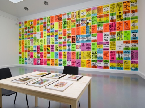
In feel and in structure, Bemis’s website evokes artist Alan Ruppersberg’s 2004 installation “The Singing Posters,” which are derived from Alan Ginsberg’s famous poem “Howl” and were made by Ruppersberg when he discovered how many of his students at UCLA were unfamiliar with the poem.
The wall shown here comprises a kind of guided tour through the poem in the style of the psychodelic posters I described earlier, with precise phrasings written phonetically in the manner of a dictionary speech aid — thus, through their text, color, and total occupation of the viewer’s visual field, the posters “sing.”
“Howl” has been described as “a jumble of images and buzzwords that vividly describe the social, political and historic state of America in the 1950s.” It’s a poem assembled with parts from other places. Ruppersberg cycles through this process once more, breaking the poem itself down into posters and phonemes in order to re-present it.
Both projects are about a kind of ignorance – ignorance on the on the part of Ruppersberg’s students with “The Singing Posters,” and ignorance on the part of the culture-at-large with “Howl,” 520 copies of which were seized by the U.S. Customs office in 1956, leading to an obsecenity trial that vindicated the poem in the following year.
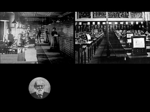
These images show an entirely different context – Belgium at the turn of the century – but an evocatively similar project. This is the Mundaneum, an institution started by the Belgian lawyer and librarian Paul Otlet. Otlet appears at the center of the photo on the left, and a later image of him is inset in the circle below. The card catalogues on the left held more than 12 million index cards at the Mundaneum’s peak, which disassembled bits of information from books and publications and filed it so that it could be retrieved electronically via telegraph by people at their homes.
The disassessembly I described was done in large part by the women surrounding Otlet on the left – just one case in which the integral role of women in early computer science has been under-historicized – the telegraph room is shown on the right. Like “Howl,” the Mundaneum was censored in its time, shut down by the Nazis when they invaded belgium in 1940. Google is now at work on preserving and reviving it along with the city of Mons and the University of Ghent.
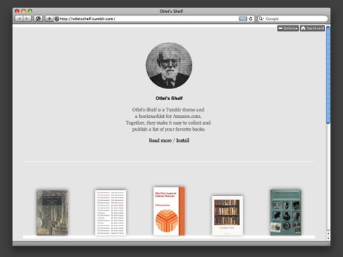
Otlet’s Shelf is an homage to Otlet and his work – it was created by Andrew LeClair and I at Project Projects last summer.
Otlet’s Shelf facilitates the sharing of libraries in the way that Otlet facilitated the sharing of information. Using a simple Tumblr theme and the Amazon Product API, we created a bookmarklet that allows users to easily add a book onto an infinite shelf for display. We have plans to expand beyond Amazon to Worldcat and other library databases soon.
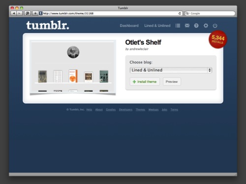
The growth of Otlet’s Shelf has been a nice surprise; there are thousands of Tumblr users and a growing range of applications – from normal book nerds like me…
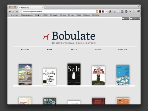
…to voices in the interactive world like SVA IXD’s chair Liz Danzico…
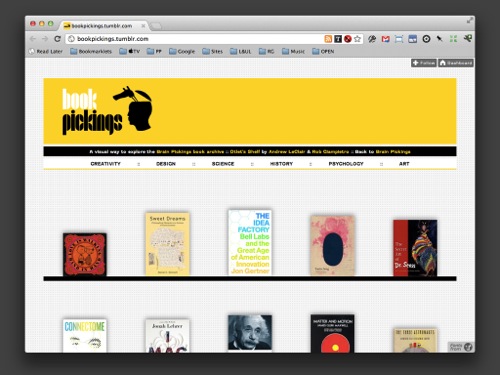
…and Brain Pickings’ Maria Popova. We’ve been in touch with a number of librarians as well.
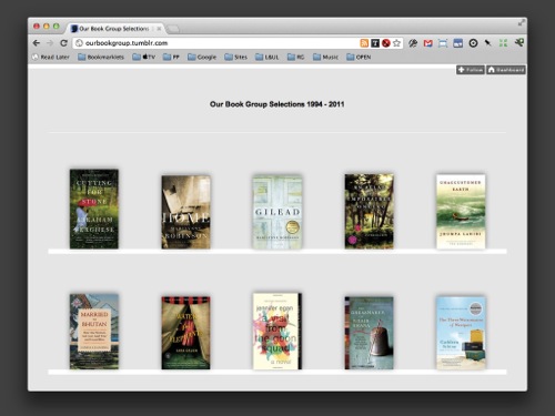
But one of the most graitfying uses has been by this book group, which catalogued its 15-year reading history for friends and family.
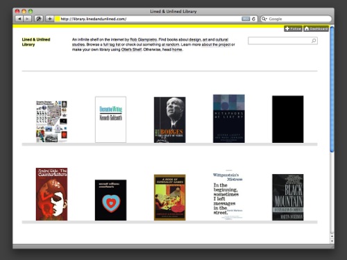
Tonight is about how our passions drive our work. Otlet’s shelf was born from our shared passion for reading and sharing books.
Here it is with my own library…
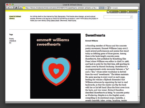
…and one of my own favorite books.