Road Trip
If you think branding a 120,000-square-foot store is tricky, try branding an entire state. While it may seem similar to institutional and corporate branding, the practice of “destination branding” is a tradition all its own. In many ways, it’s the opposite of a typical branding assignment. Rather than forging an identity that drives a new culture, the existing culture drives the new logo.
While states have branded themselves in many ways and forms throughout history – think flags, seals, and state mottoes – the concerns of a destination-branding assignment are tied more to commerce than they are to Congress.
These days, the state of Georgia may not be as much on your mind as officials at the Georgia Economic Development Department would like, which is why, a few weeks ago, it introduced a new logo – a stylized version of Georgia’s peach – and a new tag line that junks the Ray Charles classic “Georgia on My Mind” and, instead, summons each visitor to “Put your dreams in motion.”
With one of the fastest-growing state economies, Georgia nonetheless ranks 24th out of 50 states in terms of tourism spending, the lowest of all the Southeastern states other than Kentucky. So how does its new identity stack up against the rest? The Logo Doctors decided to take a virtual road trip across the USA – or at least across state websites – and find out.
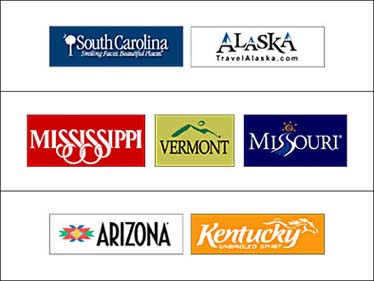
These seven logos are fairly typical of what we saw during our journey of state tourism websites. South Carolina combines the palmetto tree and crescent moon motif found on its state flag with horribly stale typography. Alaska transforms the peaks of its A’s into the mountains of the Yukon. The ss’s of Mississippi and Missouri suggest the rolling banks of the river on which the states sit. While Vermont adds a brushstroke of green hills, Arizona adopts a Native American motif, and Kentucky plays on the horse, its beloved state symbol.
While these logos do communicate a sense of place to a potential tourist, the facts they relay are probably already known. Put another way, these logos are more about what these states want tourists to know than what the tourists might actually want to know. They fail, in themselves at least, to offer what most tourists are seeking – the chance to experience the unknown. Otherwise, why travel somewhere in the first place?
Rather than flirting with and ultimately seducing these visitors, the states that use this straightforward word-picture tactic wind up delivering bland information and missing a critical opportunity – the first impression. Particularly in the case of an experience or destination, an identity must leave enough room for interpretation. Questions can be a lot more interesting than answers.
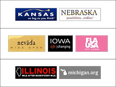
Traveling on, we saw a number of other trends as well. Versions of the clichéd “swoosh” were adopted, to particularly unfortunate effect, by Kansas and Nebraska – states whose flat, featureless landscapes are more problem than perk. Moreover, the swoosh suggests acceleration, like that of your car as it hurtles across these states at 80 mph without even stopping for gas.
Only a handful of logos went for simple type and a clean, almost modernist, treatment. Nevada’s logo feels somewhat mystical (note the Native American-inspired diacritical mark above the second vowel), Iowa rather cosmopolitan, and Florida less chintzy than usual.
Then there’s the tried-and-true method of showing the geography of a state, used here by Illinois and Michigan, whose geography is not exactly iconic. However, these states, too, have a refreshing, straightforward, modern approach that gives what some would call “flyover states” a bit more flair.
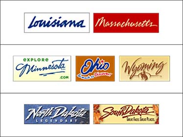
A logo technique we saw to an overwhelming degree was the use of stylized handwriting. Why? As we mentioned in our column about graffiti a few weeks ago, people think things made with the human hand are more “authentic” than things with perfect angles and machine-made curves. The handwriting in this case tries to give an understated sincerity to these states’ tourism campaigns. But because of the commonness of the execution and a distinct lack of nuance in the styles of handwriting used, these seven logos fail to deliver.
In the same way that we read graffiti as the voice of its individual scribe, we read handwriting as the expression of an individual, not an institution or a government. As a result, this logo execution suffers from the same problem as schmaltzy music over a Hollywood love scene: when we start to feel our emotions are being controlled, our emotional connection is broken.
(On a side note, the similarities between the logos for North and South Dakota are surprising, given the growing movement among North Dakotans, written about in The New Yorker by Mark Singer, to change their state’s name to simply “Dakota” in order to differentiate themselves from their better-known neighbors. It’s startling that a state that has contemplated something as fundamental as a name change would miss such a simple opportunity to differentiate itself.)
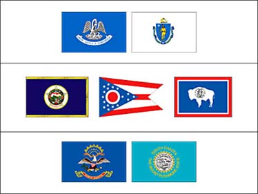
Before states had logos, they had flags. These seven flags belong to the states with handwritten logos shown (in the same positions) on the previous slide. While the flags are visually rather similar – mostly centered seals on blue grounds – the content is very diverse, showing everything from a pelican to a bison.
Very little of it feels contemporary, and none of these symbols are icons generally associated with these states, making the flags as superfluous in terms of branding as their similar handwritten logos.
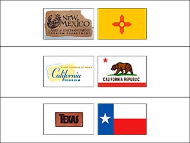
Other flags are more useful, however. The flags of New Mexico, California, and Texas (shown on the right) are all more graphic and more recognizable than their overly nostalgic logos (on the left). Texas’s weathered belt loop, California’s ’50s postage stamp, and New Mexico’s cave painting all champion the past rather than looking to the future. Their flags, in contrast, are striking and original. These states would be wise to cash in on them.
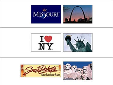
Images of national monuments can often be leveraged, since they’re already destinations for many tourists. The incredible symbol of St. Louis’s arch seems like the ideal choice to energize a cutesy logo – its shape is futuristic, welcoming, and dynamic.
Milton Glaser’s famous “I ♥︎ NY” logo, probably one of the earliest U.S. examples of branding a destination, is also one of the best known. As a symbol for New York, it stands shoulder to shoulder with the state’s other great symbols, like the Statue of Liberty, the Brooklyn Bridge, and Niagara Falls. But it’s personal, readable as both a statement and a graphic, and approachable – a key fact for a state whose main tourist city can be somewhat overwhelming. Instead of “authentic” handwriting, the letters are typewritten, and the logo’s unnamed speaker forces each potential tourist, in describing the logo, to utter the phrase for him- or herself: “I love New York.” Say it enough times, and you’ll believe it.
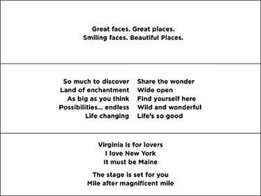
South Dakota’s sidelong reference to “Great Faces” in the tag line hints at the state’s greatest tourist attraction, the iconic Mount Rushmore. But what if, instead, the logo had taken its cue from the stone carving that so many tourists associate with the state? These great landmarks, and the associations we already have with them, offer the opportunity to build on the empathy of would-be travelers.
South Dakota’s tag line suffers further from an unoriginal sentiment, a problem we also find in South Carolina’s “Smiling Faces. Beautiful Places.” While these two tag lines may not have much to say for their home states, neither do most other tag lines. The assortment in the second row could describe almost any state.
The bottom row contains two groups of tag lines. The first combines the name of the state with its tag line, a novel idea. “Virginia is for lovers” is well known because it is offbeat, charming, and specific. “It must be Maine” isn’t well known because it is bland, dreary, and vague. “I love New York” is the only one to use the first-person voice. Other states might consider following its lead, if it had not set the bar so high in every other regard.
Finally, Tennessee’s “The stage is set for you” and Illinois’s “Mile after magnificent mile” both borrow South Dakota’s strategy of making quiet reference to well-known state icons in the tag line. Illinois’s makes reference to Chicago’s “Magnificent Mile,” also known as the “Mag Mile,” the city’s toniest shopping district. Tennessee’s tag line makes reference to the state’s country-music heritage, but also, more obliquely, to Shakespeare’s “All the world’s a stage.” The word “set,” with its overtones of tables, food, and hospitality, makes this tag line as good a choice as any.
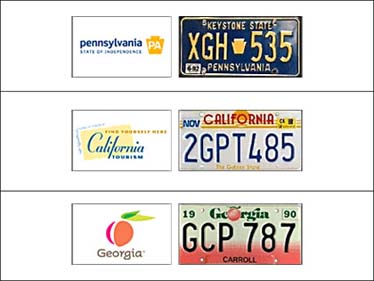
Last but not least, license plates might be some of the best advertisements a state has because they have a captive audience – drivers stuck in interstate traffic – and they’re found on every car crisscrossing America. They also have a built-in base of spectators, as drivers often try to spot cars from other states. Here are three of the most iconic.
Pennsylvania’s “keystone” shape, now used for all its branding statewide, was adapted from its well-known license plates. California’s Art Deco sunset is known as much from highways as from its place at the start of TV’s L.A. Law. And, finally, Georgia’s plate carried a peach design long before the tourism board officially adopted one as its symbol.
Diagnosis? The bland tag line aside, Georgia’s new identity challenges expectations and envisions a state that’s part of a fresher, more contemporary South. The identity reflects quite well both who Georgians want to be and whom they would like to have visiting. Having traveled the 50 states by web, we can say that puts Georgia’s new peach logo near the top of the barrel.