The Museum Interface (with Sarah Hromack)

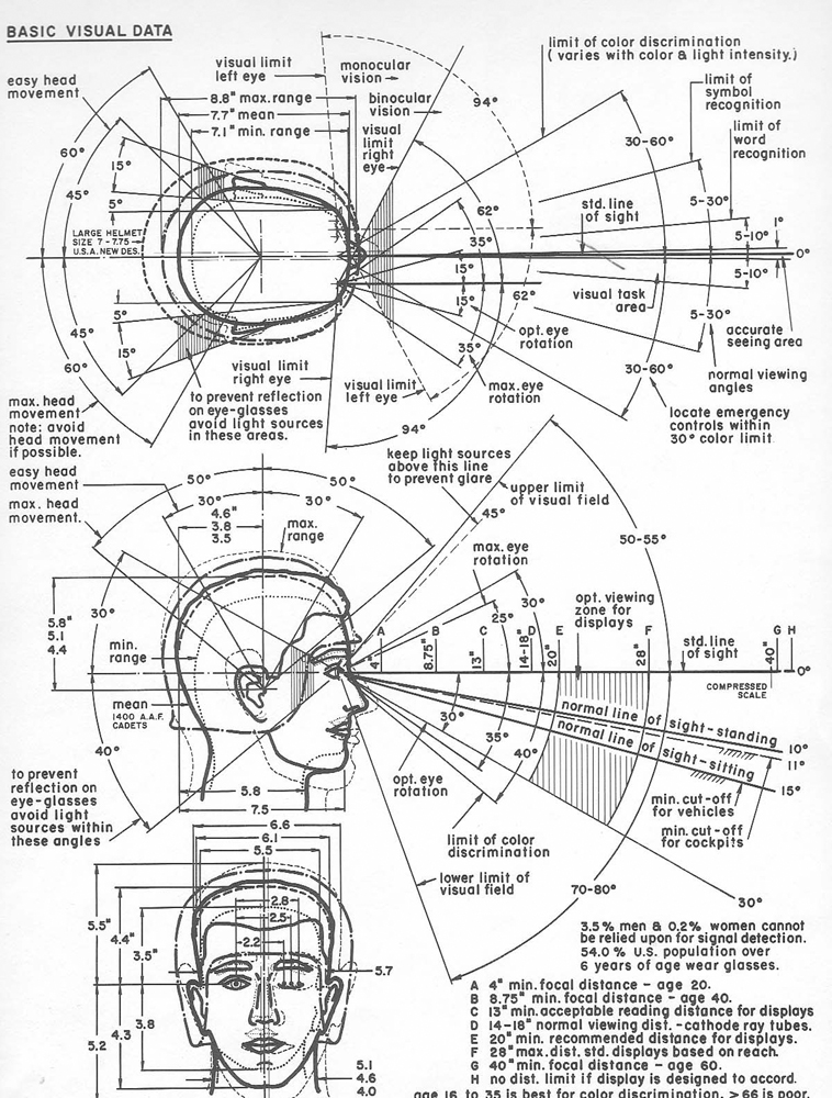
Above: Henry Dreyfuss, “Basic Visual Data,” from The Measure of Man: Human Factors in Design, 1959.
It’s no longer a question of whether art institutions should have a virtual presence. Rather, the onus is being placed on designers to facilitate meaningful interactions with art that might occur in the gallery, via web-based applications or in new hybrid spaces that merge the real and the virtual. Any attempt to augment an encounter with artwork using technological means invariably raises questions about the values we assign to certain modes of viewing. After all, isn’t visiting a museum inherently tied to a very deep, very primary real-life experience? The promises and pitfalls of new technologies are forcing museums to rebalance their traditional mandates to care for a collection of physical objects while enabling scholarship and providing the wider public an opportunity to engage with works of art.
Hromack While I currently work in an art museum, my personal engagement with art and digital media — online publishing, blogging and the social Web, in particular — has developed over the course of nearly 20 years. In that time, I have observed the ways in which the physical experience of looking at art has become increasingly mediated by technology, a process that has only intensified as the Web became constantly accessible via mobile devices. When considering the role of the so-called digital audience for an art institution, I imagine the individual who may never stand in a given physical site, yet may nevertheless engage with a work of art, performance or installation through the digital interface of a website or app. While museums sometimes make problematic judgments about what an art experience should or shouldn’t be — and enforce those pedagogical prescriptions through architecture, texts and other didactic materials, public programming and, of course, the placement of art works themselves — we simply have to acknowledge and even accept the ever-changing role technology plays in that experience, for better or for worse. In doing so, we can begin to glean a more nuanced and critical understanding of how people encounter art in physical and virtual spaces.
Giampietro I’ve worked as a designer on a diverse range of interfaces and websites for cultural institutions, artists, architects, philosophers and more. I find it fascinating how ideas from the physical world can be translated — crudely or elegantly — to the metaphorical space of the screen. I’m also interested in what could be considered native about this space, what the screen uniquely provides. In particular, I share the view of so many of the field’s pioneers that interactive technology is a branch of cinema
In his 1955 book Designing for People, industrial designer Henry Dreyfuss was one of the first to write of designing a “man-machine interface” — in that case, a more accessible cockpit for pilots in WWII. By applying techniques from the emerging fields of ergonomics and information theory, Dreyfuss and his team aimed to integrate controls, seating and instrumentation in order to close the gap between a pilot and his aircraft. Like the full-room scale of the first mainframe computers, the cockpit subsumed its human operator — it was an interface that was also an environment, operating at the scale of architecture. In the same book, Dreyfuss turns his attention from the hard lessons of war to the soft power of culture, evoking another bit of architecture that might be reshaped by the new logic of the interface: the museum. “A half-hour’s tour through a museum with a TV camera,” he wrote, “can bring to life a wealth of art and knowledge that could otherwise not be seen in months.” Once again Dreyfuss was aiming to close a gap, to give people immediate access to all the world’s artwork. Paradoxically, his scheme for facilitating this immediacy required the mediating device of broadcast television.
Hromack The camera still weighs heavily on our physical experience of the museum. Surrealist and Bauhaus-era exhibition designers first began to condition us for this, even though their gestures long predated the ubiquitous presence of screens in our everyday lives. I think of Kurt Schwitters’s Merzbau, an immersive environment the German artist constructed in the 1920s and ’30s, or the work of László Moholy-Nagy and Herbert Bayer. These artists and designers introduced radical spatial configurations and new conventions of display that altered the conditions for viewing art, prompting people to behave and interact differently. Now, our cameras are embedded in the smartphones many of us hold as constant companions; by presenting and circulating photography in still-novel ways, applications such as Instagram and Vine are also enabling new phenomenologies around the way art is encountered, experienced and considered.
Though written comments are still a primary form of online social interaction, the photograph now functions as a form of commenting, as we make implied statements by posting images instead of words. This is a complicated prospect when we consider how woefully prevalent miscommunication can be with words — imagine the vast room for interpretation a photograph offers. If we think about this phenomenon in the museum context we are faced with a difficult set of questions. For example, what does it mean for us to encounter an artist’s work for the first time via Facebook or Instagram or Vine?
Giampietro I’m sure that happens a lot! I wonder if we fast-forwarded a few years wether we might find other commercial Web platforms absorbing museum functions. For example, Etsy or Ebay might just as frequently be used for organizing and browsing object data as a museum website. I know curators of design objects and even librarians with non-book collections who’ve found the expert communities and the knowledge they’ve generated from these sites to be useful in filling in gaps in collection data.

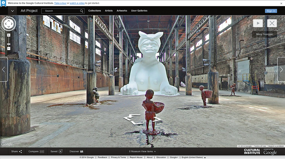
Above: From Google Art Project’s interactive exhibition of Kara Walker’s installation A Subtlety, 2014, at the Domino Sugar Factory, Brooklyn.
Hromack Earlier in the summer, I witnessed a conversation wherein a handful of New York-based arts professionals admitted to having willfully refrained from seeing Kara Walker’s recent installation,A Subtlety, or the Marvelous Sugar Baby — a magnificent larger-than-life sphinx made of refined white sugar — in Brooklyn’s Domino Sugar factory, because they felt that they had already sufficiently experienced the piece through images seen in others’ Instagram feeds.
Walker’s work was nothing short of monumental in scale and ambition. It addressed the history of the disused factory space and grappled with the legacy of an industry — sugar production — whose labor practices exemplified the vicious racial inequities that still plague our country. The images in question here — selfies and other pictures featuring visitors making sexually explicit gestures or striking juvenile poses with Walker’s sphinx-starkly illustrated many of the issues around art access that we’re alluding to here. Technology has given us the platform to document our experiences instantly and at will; the behavioral response is still unrefined and often hair-triggered, however. The issues surrounding photographic representation are by no means new, either, even if the methods of image replication and distribution have changed: we’ve been arguing over the representation of race and ethnicity in photography and its relationship to exhibition display for quite a while. Many of the questions raised by the social media response to Walker’s project echo the debates surrounding The Family of Man, Edward Steichen’s 1955 exhibition at New York’s Museum of Modern Art, which drew a quarter of a million people to view images of people from around the world.
To think that now, in 2014, we would allow ourselves to be dissuaded from a physical experience by the effects of a digital interface is sad, given that we can ostensibly control our consumption of the Web. Seeing an image pop up over and over again in various social media feeds might make me feel a sense of familiarity with the work, but it cannot approximate my sensorial experience — and I say this as a person that has experienced augmented and virtual reality in military-grade computer labs! The Google Art Project can document a work by creating a 360 degree interactive panorama, as it did with Walker’s project, but that high-resolution image cannot supplant the physical object. It is crucial that we keep looking at and experiencing works of art in the real world.

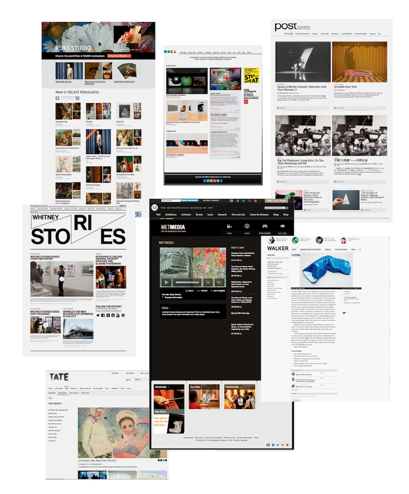
Above, clockwise from top left: Rijksmuseum, Amsterdam; Museum of Contemporary Art, Los Angeles; Museum of Modern Art, New York; Walker Art Center, Minneapolis; Metropolitan Museum of Art, New York; Tate Modern, London; Whitney Museum of American Art, New York.
Giampietro I noticed that many of those who posted about the Walker installation online noted the specifics of its scent. It’s tempting to portray the contemporary installation — spectacle as an image-making machine, producing dozens of similar images. In Instagram’s interface, pictures of Walker’s installation appear stamp-sized on a phone’s screen, flattened in all dimensions, their likers and commenters quantified. These images may document the installation, but they also document and identify each photographer’s individual presence in the space. In that way, these pictures assert the primacy of the photographer’s direct experience as opposed to an Instagram user’s mediated one. Those discouraged from visiting Walker’s installation in person because of its ubiquity on social media may have been discouraged not by what the installation itself offered but by what its flood of representations removed: the sense that an encounter with the work could be personal or transformative. The new hyper-visibility is difficult because it can transform a unique installation into commodified image; the work’s lasting political power could easily be mistaken for a fleeting trend.
The person who logs on to a museum’s website, however, has a different sort of experience because the entire collection appears to be at his or her fingertips. Digital images on a museum website can’t offer transcendence any more than an Instagram feed can, but institutional websites do tend to offer the illusion of control, the sense that visitors can curate a museum’s collection by arranging images to their liking.
Hromack What role does design play in suggesting that illusion of control? In developing museum-specific interfaces that focus on the delineation of time, designers seem to be “performing” art history in a sense: if you look closely at all major online museum collections, you will see a very similar, and yet remarkably limited set of interactive possibilities. A person can often sort a collection of images by the date the artworks were created, for instance, or click through an illustrated timeline as a means of parsing art history. And yet, regardless of how vigorously designers and institutions strive to imbue a user’s experience with a sense of history and academic accuracy — of physical space, even — no one can stop the proliferation of those images onto the wider Internet where they are collected, stacked, starred, liked, reposted and regrammed by people into other, unknown narratives. By granting digital access to its collection, whether through images, metadata or other assets, the museum also opens itself to new forms of public interpretation. This is a true form of institutional vulnerability.
Giampietro I think it’s also worth considering how the term “platform” — software that powers a wide community of networked interactions, devices and experiences — may function in relationship to the question of access. Platform is a euphemism for control: build the platform and you rule the territory by granting or restricting access to people, places, things or data. Software platforms are to some degree institutional, but museums also function and describe themselves as platforms, in a broader sense. Sometimes this description of the museum-as-platform is conceptual, other times it is describing the walls themselves and the art they display. The museum building, you might say, is a certain platform for social interaction organized around viewing art. Transferring this concept to the Web is more complex: what if certain artworks from a museum are stolen, damaged, sold or repossessed? If these works disappear from the museum’s walls, what are the implications for that museum’s digital audiences? These works could still be displayed on its website. But something would be different.
In other cases, though, there doesn’t appear to be a problem or contradiction at all — a museum hosts a traveling show with works on loan and displays those works on its website. Afterward, they are logged as part of the museum’s exhibition history. And what about works that the museum chooses to write about on a blog? Or show as comparisons? You could imagine situations that are more restrictive or permissive along this spectrum, but it’s clear that a museum platform that can accommodate any image is not restrictive enough. The more wall-less the museum becomes, the more its website might start to resemble other websites.
Databases are powerful tools for collectively producing knowledge about the world and its objects because they make gaps in knowledge evident, fillable and comma-separated. Expert communities dedicated to visual artifacts inevitably resemble museums. I have an artist friend working with insects who has just stumbled onto a whole Internet subculture where rare bugs are traded, bred, photographed, logged and trafficked. Ad-hoc online expert communities that include professionals and “prosumers” may even provide some benefits to museums: Etsy’s data might be better structured, for example, or its design objects might be more comprehensively documented than those same objects in a museum’s collection. Via its API, Ebay might have a better method for connecting with other platforms to create a more networked collection of certain objects. In other words, Ebay and Etsy excel at being databases that can be related to other databases. Within the database, facts are isolated, checked and then related. The expert community curates collectively.
Even as they build ever-more complex databases, some museums have resisted this trend and look for other metaphors to explain the role their digital interfaces play. Most common is a metaphor favored by French critic and scholar André Malraux. In a 2012 Metropolis interview, the Walker Art Center’s Andrew Blauvelt explained that,
The new Walker website is a completely different model for museums. It has become a publishing platform and ideas hub, not just a place where you get info on how to visit or what to visit. That information is, of course, there and available still. What is new is that we are now developing our own editorial content.
MoMA’s POST website, which is described as an “online resource devoted to art and the history of modernism in a global context,” is overseen by an editorial team and appears accordingly less like a database than an online magazine populated with full articles about international modern art. Of course, the Walker and MoMA, like many museums, have acted as publishers for quite some time: they produce and distribute exhibition catalogues, membership magazines and other publications. These institutions are seeking to develop scholarship, criticism and interviews designed to be shared across social media with the aim of generating conversation online. The interface brings the operator as close to the operation as possible while designating a site of mediation between them. If we understand art primarily as a form of cultural discourse, it’s possible to envision a museum’s interface as essential to closing the gap between its art and its public.
Hromack The Walker’s model is very interesting to me and has been for years. Reading from afar, I often wonder about the relationship between the museum and its local community and whether the same model would work in New York, the city where I live and work. Museums consider the notion of public engagement very carefully, and the social web provides an ideal space for the institution to project its own feelings about how openly or generously or successfully it interacts with people-whether those notions are functionally true or not.
I am not entirely convinced that museum-run publications-as-social-spaces — the Whitney Stories publication and video series that we run out of my department, for instance, or MoMA’s Post project — can unilaterally engender genuine, self-selected digital communities, regardless of how much we hope and believe otherwise, on an institutional level. At this point in the history of the Internet, the major social media platforms command a sheer level of user engagement that individual, organization-specific platforms simply cannot, unfortunately; it’s our job to figure out how to harness that monopoly, both socially and technically, through smart social integration and interface design.
Researchers such as Sherry Turkle (MIT) have worked for decades to both understand and caution against the complex psychological relationships people develop with their devices.
Yet, the future of museum visitor engagement will continue to mimic current technology trends: smartphones, “wearables” and proximity-based technologies such as the iBeacon. MoMA’s most recent mobile application, Audio +, is a strong example of an institution recognizing a now-natural human behavior — in this case, the propensity of in-gallery photography — and designing for that behavior rather than sanctioning against it. Likewise, the soon-to-reopen Cooper Hewitt will proffer an interactive pen, co-designed with Hewlett-Packard, to each visitor who will in turn be permitted to “collect” objects throughout the institution by scanning museum labels, thereby “capturing” their visit to the museum for later access on a web address printed on their admission ticket. These digital experiments don’t always work, and they certainly challenge still-held ideas about how people should and shouldn’t behave in museums. But art institutions aren’t churches, and the enthusiasm we see among visitors for bringing digital technology into the gallery suggests that we’re witnessing a transformation in how the museum relates to its public. The assumptions and biases that will be overturned in that process remains another question entirely.