The Problem with Posters
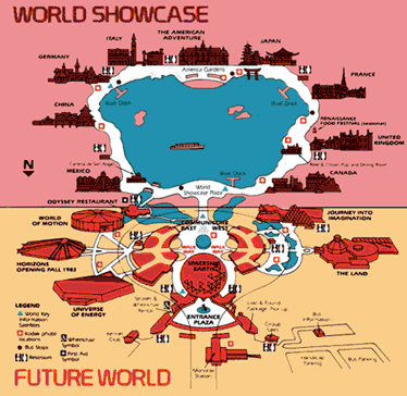
It would not be unfair to compare the thematic architecture of this year’s Venice Biennale with that of Walt Disney World’s EPCOT Center. The 50th Annual Biennale, called “Dreams and Conflicts: The Dictatorship of the Viewer,” was staged in two primary exhibition venues: the Giardini della Biennale, built in 1895, and the Arsenale, a former shipbuilding yard located on the outskirts of town. The Giardini house the enormous Italian Pavilion and 29 other national pavilions built by the participating nations themselves. The recently restored buildings of the Arsenale are home to independent satellite exhibitions and other large-scale shows. Thus, the Giardini, with their bevy of national pavilions, are like EPCOT’s “World Showcase,” the northern half of the park, where landmarks and typical structures from nine countries are presented around a lagoon in a miniature world tour of cultures and cuisines. And, with the inclusion of “Utopia Station” – an exhibition organized by Molly Nesbit, Hans Ulrich Obrist, and Rirkrit Tiravanija – the far end of the Arsenale has become an analogue to EPCOT’s “Future World.”
Disney & Utopia
“Future World,” as the southern half of EPCOT is called, functions as a showplace for possibilities presented by industry and technology. The central, circular plaza of Future World is flanked by low, bunkerlike buildings called the Communicore, and at the southernmost tip is a giant geodesic dome, called “Spaceship Earth,” after Disney’s original plans to have an air- and spaceship launching pad in EPCOT. The architecture of Utopia Station is similar in form, with low circular shapes and surrounding gardens, but it is in their missions – their thematic architecture – that similarities between the two spaces are found most significantly. Originally the crown jewel in his vast Florida Project, Disney wrote in his original mission that the “Experimental Prototype Community of Tomorrow […] will always be in a state of becoming. It will never cease to be a living blueprint for the future.” The complete plan for Utopia Station, as described by its curators in their statement “What is a Station?” is a similar kind of striving incompleteness: “The Utopia Station is a way station. […] It has been important to all concerned that the plan not present itself as a finished picture.” In short, the dividing line between Utopia Station as an international art exhibition and Utopia Station as a contemporary variation on the world’s most profitable theme park and tourist attraction is a very fuzzy one indeed, and this is because the aims of Utopia Station, like those of EPCOT, are not simply aesthetic, but also political and economic in nature.
While the creators of Utopia Station may share a suspicion with the creators of EPCOT about the ability of governments to enable the utopian project as well as a desire to circumvent the normal workings of the public sector, it is here that the ideologies between the two diverge – somewhat. Whereas EPCOT would have a global megacorp as its organizing arm, Utopia Station would have the global art market. “These activities imply an activism,” the curators’ statement instructs,
For many who come to the station, its invitation to self-organize speaks a political language already known to them. […] The proposal to build nonprofit decentralized units and make them become the underlying mode of production, fitting together through the real market […] has already been made.
There is an assumption made by the curators that this “real market” will function differently from “the monopolistically controlled world market of the present system” by companies like Disney. But if you’re willing to believe the curators’ claim in the context of the international art market, I’d love to sell you some swampland in Florida.
While my aim here is not to dissect the architecture or artwork of Utopia Station – indeed, I have not even been to Venice to see it – the EPCOT comparison, and the themes it introduces – of commerce and politics – will help in thinking about one of Utopia Station’s most important subprojects, the poster commission. As the curator’s statement instructs, “Each present and future contributor to the Station is being asked to do a poster for use in the Station and beyond: wherever it can hang, it can go.” These posters were densely layered atop Utopia Station’s many plywood surfaces and collected on a website hosted by e-flux.com – a New York-based company that, in the words of their mission statement, “is dedicated to worldwide distribution of information for contemporary visual arts institutions via the Internet.” There, you can browse the ever-growing selection of posters (158 at the time of this writing), download these posters as PDF files, and print them for yourself in European A3 and American 11x17 formats. “The posters,” the website informs, include new works by a group of more than 160 artists all corners of the world.” It’s the happy globalism of EPCOT combined with the placelessness and informality of that other “experimental prototype,” the Internet.
Sontag revisited
In 1970, one year before Walt Disney World opened its doors to the public, Dugald Stermer, the art director of leftist journal Ramparts, asked Susan Sontag to contribute an introduction to his collection of Cuban posters. Her resulting essay, “Posters: Advertisement, Art, Political Artifact, Commodity,” is arguably one of the finest, most literate pieces of criticism ever written about graphic design, and her complex analysis of posters’ cultural functioning is well worth revisiting in the context of the Utopia Station poster commission today.
At the start of the essay, Sontag historicizes the poster as a form that arose from the Classical tradition of the public notice, from which it is now distinct. “Posters are not public notices,” she begins, “A public notice aims to inform or command. A poster aims to seduce, to exhort, to sell, to educate, to convince, to appeal.” She contends that public notices are passive experiences, intent strictly on conveying information straightforwardly, while posters are active experiences: “The values of the poster are first those of ‘appeal,’ and only second of information.” This value system is in place because posters are necessarily in competition with one another, all crying for our attention in the “theater of persuasion” that is the modern city. The poster’s aim of consumption by a mass audience is precisely what requires its production by mass distribution: cheapness is a defining trait. The poster is a product for the masses. Its twin goals, as Sontag sees them, are to build consumption via capitalism and, later, to build nations via mass political participation. “It is capitalism,” she writes, “that has brought about that peculiarly modern reformation of the public in terms of the activities of consumption and spectatorship.”
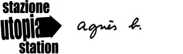
Utopia Station, an art exhibition that’s part of the largest public art exhibition in the world, visitors were given complimentary shopping bags as they strolled the Arsenale. Emblazoned on one side was the exhibition’s logo, designed by artist Lawrence Weiner. Emblazoned on the other was a sponsor’s logo, the familiar signature of the French fashion boutique Agnès B. The posters themselves, distributed for free via the Internet, may be posted in any city in the world by anyone wishing to print them, free to compete and seduce along with other posters, marketing their product, which is not art at all, but, instead, the lifestyles of their famous artists themselves. In an age where artmaking, like activism, is more a demographic than a duty, Sontag’s assertion that posters “serve to disseminate already mature elitist art conventions, […] popularizing what is agreed on, by the arbiters of the worlds of painting and sculpture, as visual good taste” seems truer than ever before.
Plagiarism, quotation, and curation
With this popularization comes theft of a kind, or “plagiarism,” more precisely, and “plagiarism,” Sontag writes, “is the main feature of the history of poster aesthetics.” In order for messages to be communicated without direct expression, the forms of the poster, and the relevance of those forms, must already in some way be known to us. Indeed, the vast majority of the posters commissioned for Utopia Station exhibit this tendency toward recapitulation. Matthew Barney displays his rich fabrics and waxes, his iconic beehive, and his familiar five-part Cremaster structure. John Baldessari uses stock photos and film stills from the past to comment lightly and ironically on the present. Thomas Hirschhorn gives us one of his typically sloppy, marked-up constructions. Harmony Korine gives us a disturbed image of childhood. Bruce Mau’s poster includes a URL for his project “Massive Change” in case we’re confused, and some charged language presented in an “uncharged,” knee-jerk documentary fashion. Yoko Ono reiterates an old statement of John’s, “Imagine Peace.” Elizabeth Peyton presents one of her washy paintings without comment. Ed Ruscha’s deadpan rendering of “UTOPIAN SLUMPS” is distinctly his own. They’re all doing themselves. Originality is not the order of the day; quotation is.
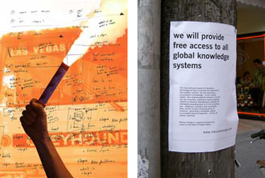
Even so, several posters rise above the familiar gestures of their makers and become something more striking and more real. Henrik Hakasson’s textless poster observes a loose grouping of blackbirds flying overhead. The image is related to that of Nikolaus Hirsch and Markus Weisbeck, whose image of a swarming flock of pigeons can only be from the Piazza San Marco, an emblem of Venice. These birds in their loose grouping remind us of heaven and of Wallace Stevens’s idea of heaven in “Thirteen Ways of Looking at a Blackbird,” where he writes, “I was of three minds / Like a tree / In which there are three blackbirds.” The plurality of viewpoints is close to heaven, or, less sacredly, utopia. Also striking is the simple photograph of artist Anna Barbara Cliostratt in a darkened room with glowing teddy bears and a globe: the child’s world is the closest to utopia. Deimantas Narkevicius also thinks about utopia in terms of light and space – in this case an outdoor hallway, the possibility of what’s at the other end, arching, rainbowlike, with the simple beauty of a grid of lights above. While each of these four posters use the poster form to generate works of art, they succeed because they back off. To see a poster without text is a striking thing, and you interpret it as something different, which, in this case, is required. My favorite poster from the show, however, is Doug Aitken’s, which works so successfully in both posterlike and nonposterlike ways: from far away, the prominent image is of a hand holding a burning flare, a charged image of revolution. As you approach, the flare is blocking an oncoming Greyhound bus to Las Vegas, a city that itself is like a theme park. Coming closer still, the scratchy handwriting of a sketchbook is visible, and it reveals Aitken’s doubt not just about his poster and its success, but about the entire nature of the curators’ implied brief.
But, unlike Aitken, most artists feel no need to reckon with the implied brief – make a poster about utopia – because, technically, it doesn’t exist. Instead, the posters mostly do what posters do best: advertise. Many of the poster-makers, such as Atelier van Lieshout and partners Leif Elggren and Carl Michael von Hausswolff, take to advertising their works from Utopia Station. Others, like Janus Magazine, advertise directly: their poster is a well-built, half-naked man with his pupils whited out and a jaunty product shot of the magazine in the corner. Nearly all the posters are executed with a certain art-world chic and a distinct bent on “antidesign” design. And, in the end, the posters fulfill the unwritten brief of shameless self-promotion, which is all most international art-parties such as this one are about, anyway. It’s the artists’ notoriety, after all, that is their reason for inclusion in Utopia Station. Each poster’s authenticity as an art object is legislated by the same mechanism that legislates a Coke bottle’s. The artists have packaged themselves, as commissioned, for display, and it is the great magic trick of capitalism that limitation creates desire. In this way, art and democracy are necessarily at odds. Were the poster project to be a truly democratic one, a poster could be made by anyone for Utopia Station, but the website contains no such “submit” link, no means for the common man to participate in this utopian project. Perhaps it’s for the best. What do you have to advertise, anyway? You haven’t even had a show.
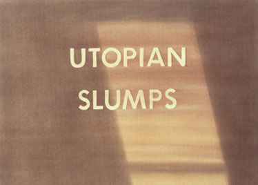
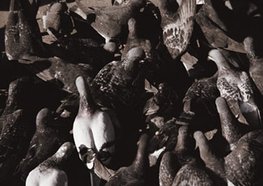
Utopia Station posters, from top: Ed Ruscha, Nikolaus Hirsch & Markus Weisbeck, and Harmony Korine.
Travel agents
Sontag begins with the notion that posters were a way of selling and ends with the revelation that posters themselves are for sale. “Capitalism,” she writes, “transforms all objects, including art, into commodities,” and nowhere is this process more evident than in the collecting of posters as such. The reasons people might collect and exhibit collections of posters are varied, but Sontag’s characterization of posters as “cheap, unpretentious, ‘popular’ art” pretty much sums it up. This is not where her interest lies. Instead, Sontag is interested in the criteria for collection, and, more importantly, the claims and assumptions that govern those criteria. She observes that while earlier poster collectors focused solely on posters from around their homes and cities, the new breed of collector seeks posters that are “ostentatiously international.” “It is hardly accidental,” she writes, “that the beginning of the craze for collecting posters, in the mid-1950s, coincides with the rising tide of postwar American tourism in Europe.” The fact of capitalism and its promise of limitless acquisition is part of what links them – she writes that “modern tourism turns traveling into something more like buying” – but the formation of a postwar identity is equally a part of the equation. Worldliness was newly desirable, and, with posters, you didn’t even have to go somewhere to seem like you’d seen it. “Posters furnish a portable image of the world,” Sontag observes, and, unlike photographs taken by present travelers, posters are “substitutes for experience.” Thus, users (like me) who log onto the Utopia Station website are consoled by its curators that “If you can’t make it to Venice, or don’t want to wait for the Biennale this summer: we are pleased to present the first installment of Utopia Station at e-flux right now!” With posters, I can seem like I went there.

More Utopia Station posters, from top, left-to-right: John Baldessari, Matthew Barney, Doug Aitken, and Bruce Mau.
If the simple practice of modern poster-collecting strives toward worldliness in general, then the juxtaposition and selection of these worldviews by consumers seems to imply a more sophisticated process of identification. Do you prefer the default stylings of Superflex or the grungy antistyle of Uglycute? But this choice is an illusion. Pushed far enough apart, the opposites converge, and an “eclecticism” forms without “any notion of compatibility.”
Removed far enough from their context, posters become not just diluted, but toxic. In her assessment of Stermer’s collection, Sontag writes that his posters are now “several steps away from [their] original use,” and Stermer’s catalog, in her judgment, amounts to a “tacit betrayal of that use.” The major difference between Stermer’s collection then and Utopia Station’s now is that Utopia Station’s posters resulted from a commission, not a revolution. As a result, the project drifts ever more loftily from reality and relevance: it is a Macy’s Thanksgiving Day Parade, and its artists are larger than life, full of hot air, and more than delightful to their many rosy-cheeked, monied hangers-on.

This effect – that in commodifying their posters the artists commodify themselves – is one disturbing result of Utopia Station and the increasing number of exhibitions like it. Shortly after the Utopia Station went up on e-flux in May 2003, Jens Hoffmann’s “The Next Documenta Should Be Curated by an Artist” was posted in late June. The project, which continues through October 2003, involves about 25 artists, many of whom were part of Utopia Station, all of whom sought to question the fact that “curators occupy a more noticeable role in the process of producing an exhibition than some decades ago.” Of the ten sample comments available on e-flux, John Baldessari’s is the most interesting and the most prophetic. He writes,
Curators seemingly want to be artists. Architects want to be artists. I don’t know if this is an unhealthy trend or not. What disturbs me is a growing tendency for artists to be used as art materials […] to illustrate a curator’s thesis. A logical extreme of this point of view would be for me to be included in an exhibition entitled “Artists Over 6 Feet 6 Inches,” since I am 6 foot 7.
His comment reaches the core issue: that, today, the artist is more and more a salable object, like a pop star. As in so much of Baldessari’s work, the observation from a fine-art point of view speaks to graphic designers as well, because the tools and gifts of design are continually required to make such kinds of celebrity exclusivity possible. The reason more artists are exploiting design techniques in their work is because being an artist has become more like being a brand, and exhibitions like Utopia Station are more like halftime shows at the Super Bowl.
The aestheticization of protest
The political leanings of the Utopia Station project color its otherwise strictly commercial purpose, and, critically, they are impossible to ignore, even though most of its contributors seem to have successfully done so. This is not to fault them. Artists may always, must always make what they wish. But the question remains raised by “What is a Station?” and it remains worth asking: though they are few, how do the political posters of Utopia Station function? “Ours is not a time of continually same todays,” write the curators in their final paragraph, “When we met in Poughkeepsie in mid-February, around the world vast crowds marched for peace. Seven weeks later, when we met in Frankfurt, the Coalition forces were entering Baghdad.” These statements and others like them position the Utopia Station project as one of protest and make its posters the mouthpieces for this brand of political insurgency. But what is the message? “Up with Utopia”? And whose? And where? And how? The posters’ cry to “eliminate the priority given to the endless accumulation of capital” is a socialist one, but it’s undermined by their setting in an art world built on the endless accumulation of precious objects or even-more-precious commissions, prizes, and fellowships.
Sontag offers an explanation: “Posters have rarely voiced the avant-garde of political consciousness, any more than they have been genuinely avant-garde aesthetically.” Then she goes on to question whether what’s at Utopia Station may rightly be called “posters” at all. “Good posters cannot be an object of consumption by an elite,” she writes. “What is properly called a poster… excludes work, like the pseudoposters of Warhol, produced directly for the fine-arts market.” The artists of Utopia Station have tiptoed around this issue by substituting one kind of eliteness for another. No longer acting as individualized private artists for the few, these artists are now a ruling order for the many. And while this is done in the name of a new kind of artmaking practice, a revolutionary spirit, Sontag is the first to warn that the absorption of this kind of political terminology by aesthetic groups is necessarily conflicted.
[Groundbreaking work] is defined as revolutionary, even though, contrary to popular standards by which the merits of politically revolutionary acts are measured – popular appeal – the avant-garde artist’s acts have tended to confine the audience for art to the socially privileged, to trained culture consumers.
In other words, this revolution is not for everyone. (Are you beginning to sense a theme here?) And “this co-option of the idea of revolution by the arts,” Sontag warns, “has introduced some dangerous confusions and encouraged misleading hopes.” The poster is a form whose history is soaked with propaganda. The German publisher Taschen, in a move similar to Dugald Stermer’s, has just issued photographer Michael Wolf’s collection of Chinese propaganda posters in book form. In the introduction, historian Stefan R. Landsberger writes,
Once the People’s Republic was established in 1949, propaganda art [was] one of the major means to provide examples of correct behavior. […] The political message of the posters [was] passed on in an almost subconscious manner.
This same form – the poster – is used in 2003 as a “revolutionary” art object by an exhibition with a political ideology as its organizational backdrop.

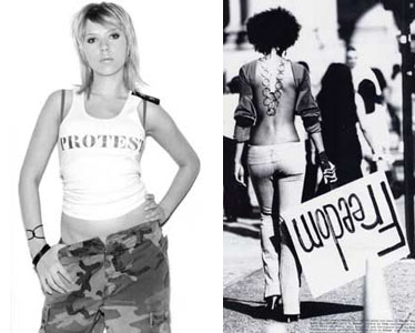
This snarl of ideas gives rise to the most troubling contemporary effect of the Utopia Station poster project, namely, its contribution to the aestheticization of protest. As I said earlier, being an activist – like being an artist – is now a kind of ownable lifestyle, a way of marketing oneself. Nowhere is this more recently evident than on p.107 of the Fall 2003 issue of BlackBook Magazine, a New York fashion quarterly, which depicts Scarlett Johansson, star of the new Sofia Coppola film Lost in Translation, staring lustily out at the viewer. Johansson is dressed in a “PROTEST” tank top designed by Cynthia Rowley and unbuttoned army fatigues. The image appears again on p.88 of the 2 October “HOT” issue of Rolling Stone. It is sexual, startling, and utterly confusing. One assumes “PROTEST” refers to the Iraqi war, but the army fatigues align Johansson with the military. The context of the image – an edgy fashion magazine – erodes any claim it might make on being serious political discourse, just as it allows the fatigues to be read as a kind of ironic quotation, even aligning Johansson with a countermilitia. With its possible readings positioned squarely at odds, the photograph’s imperative to “PROTEST” is ultimately intransitive. That is to say, there no object of protest, it is just protesting itself that is important.
Other stories in BlackBook take a similar tone. One particularly irritating fashion shoot is set at a peace march, where mascaraed models stride sexily about with bullhorns and made-up signs. Threaded throughout the issue is a project curiously similar to that of Utopia Station’s: in his introduction to the issue, editor Aaron Hicklin writes,
Now, during our own time, diverse forms of protest are again at the forefront of youth culture’s consciousness – a phenomenon BlackBook celebrates with “The BlackBook 13”; 13 specially commissioned letters of protest from pop culture figures as diverse as Yoko Ono, Pink, […] David Lee Roth, Tracey Emin, and George Plimpton.
Thus, pop singers like Pink and former Van Halen wildman David Lee Roth are grouped with artists like Ono, who also participated in Utopia Station, and Tracey Emin, whose work was featured in Venice as well. Hicklin’s introduction continues,
The rally cry of protest unites us all. […] It is the common thread that ties together the controversial world dynamic we call pop culture. Protest defines the identity of young Americans. […] It is boycotting SUVs and buying Minis. […] It is what mainstream isn’t.
Note that in Hicklin’s formation, Protest may be nonmainstream, but it is still utterly capitalist: he doesn’t say “vote”; he says “buy a Mini.” As horrifically misguided as these statements might be, the “poster pages” commissioned for the issue are even more so. Alberto Korda’s famous 1960 image of Che pops up again and again and again: as himself, as Che(r), on Johansson in a different tank top, on skateboards. The greatest poster of revolution and protest is, in the hands of our aesthetic contemporaries, reduced to a high-contrast, low-concept, cheap Photoshop trick.
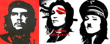
In a final Che über-remix for BlackBook, designer Scott King digitally adds the signature Nazi cap and mustache of Hitler to Madonna’s American Life album cover, which is itself a remix of Korda’s original poster done by the French design firm M/M. M/M also contributed a poster to Utopia Station with their longtime collaborator, the artist Phillip Parreno. That poster is a straight-faced parody of those two great bastions of pop culture, Coke and Disney. Screened in a Coke-can red, Mickey Mouse straddles a Coke bottle rebranded as Boing! cola. He’s dressed in a western outfit meant to evoke both the colonizing cowboys of the USA, and, more specifically, Slim Pickens’s nuclear bomb rodeo-ride from Kubrick’s Dr. Strangelove. The bomb, here, is not just the one that the U.S. was readying to drop on Baghdad, but also the metaphorical bomb of American pop culture and all of its toxic fallout. Donald Duck’s face caps the Coke bottle and winks at the film’s title, La Batalla de los Patos, or The Battle of the Ducks. Mickey Mouse, a warrior from outside the species, is off to save the world, but his eyes are crossed, his look deranged, his gun already fired. In a final touch, M/M has signed the piece by turning Walt Disney’s signature “W” on its head.
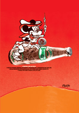
Above: M/M & Phillip Parreno.
Full circle
The image brings us full circle, back to Disney, to EPCOT, to pop stars and soda pop, to manufactured tourism, protests, and the like, and this is absolutely the point. It’s all related. In an earlier M/M project with Phillip Parreno, Parreno and the artist Pierre Huyghe went to Japan and purchased the copyright to a manga cartoon character called “Annlee.” According to the project description, she was cheap. M/M explains, “The price of a manga figure relates to the complexity of its character traits and thus its ability to adapt to a story line and ‘survive’ several episodes. ‘Annlee’ had no particular qualities, and so she would have disappeared from the scene very quickly.” Annlee was condemned to death. Parreno and Huyghe saved her life and set her to work, making her image available for any artist to use, free of charge. Whether the hell of an early manga death or a lifetime in image purgatory is preferable is left to the audience. The project title, “No Ghost Just a Shell,” drains Annlee of her soul in order to make her a vessel. While M/M concedes that “the ‘life-prolonging’ measures… raise some ‘melancholy’ humanitarian questions,” they also point out, wisely, that the project short-circuits fundamental assumptions about the artmaking process, and this is rare. The “same” image repeats again and again, but begins to articulate a kind of difference. Is an “Annlee” shell always the same? What is the role of the people who operate it? Are they subjective? How does identity come into being for characters in cinema and in art?
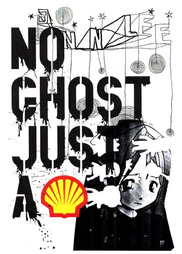
Above: M/M No Ghost Just A Shell, 2001, 120 x 176 cm. (Image courtesy mmparis.com.)
The Annlee of today is the Mickey Mouse of long ago, a commercial unit in a network comprising thousands of people in every part of the world. Her image is a poster for herself, which is a shell meant to be inhabited by others. There is nothing simple about her new life, but this may be what is beautiful and disgusting about it at the same time, what is so fundamentally true. As she stares longingly, sorrowfully out at us time and time again, we can not only stare back at her but also now through her eyes. Annlee is ours, and we are Annlee. She has been saved by culture in order to be exploited by it, and she has been invented by culture in order to fuel it. That great symbol of fuel, the Shell Oil trademark, an arbitrary sign, replaces the word “shell,” itself an arbitrary sign, in M/M’s poster for the show. Arbitrary, perhaps, but essential to remember: I mean, wasn’t our desire for oil part of what got us into this mess? And wasn’t controlling others in order to save them part of it, too? It’s hard to know, and it’s hard to say.
This is the problem with posters.