Unbuilding
Thanks to Andy McMillan and to everyone Build for having me here. I also want to start my talk today by saying thank you to Ethan Marcotte, who’s speaking today, for leading the charge on Responsive Web Design. There aren’t a lot of things that come along that really change the game for how you think about what you do, but, for me, Responsive Web Design was one of those things.
Before I started working on the web, I worked as a print designer. If you’re designing a book, there’s only one page size and everything comes from that. You spec the type, define the baseline grid, and shape the page. The format, in many ways, forms the design.
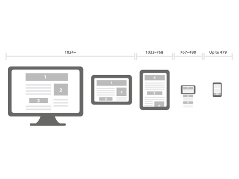
A responsive design for the web, however, is shaped by its context. It adapts to how you’re viewing it. Rather than assuming a fixed form, it embraces fluidity. It uses one code base to serve many different situations. It does this elegantly, even beautifully.
The practice of Responsive Web Design is shaped by its context as well. While it exists as an invention, it also exists as a critique. It critiques fixed-grid layouts, for example, since they cannot scale responsively — in fact, it critiques fixed presentation methods of all sorts.
Instead of seeking a lowest common denominator for a site’s presentation, or fragmenting it across several subdomains, Responsive Web Design says you can have it all: presentation needn’t be singular, and fragmentation needn’t be necessary. A site’s design can be both variable and total.
This is a really big deal. It seems simple when Ethan describes it, but it’s a fundamental shift in thinking about how things for the web are made.
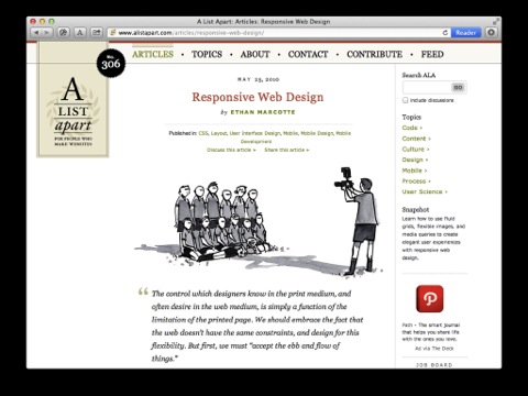
Ethan’s piece on A List Apart started with a quote from John Allsopp’s “A Dao of Web Design” about ebb and flow. In that article, Allsopp adapts a number of Taoist teachings into guiding principles for the web. Emptiness is not on Allsopp’s list, but he might have included it. Here’s what the Dao teaches about emptiness:
We pierce doors and windows to make a house; and it is on these spaces where there is nothing that the usefulness of the house depends. Therefore just as we take advantage of what is, we should recognize the usefulness of what is not. (Tao Te Ching, Chapter 11)


A house is the space it contains and the space it releases. Its windows frame space through absence. A house interacts with its environment through the portions that are either removed or never built. As much as a house is defined by its building, the Dao says, it is also defined by its unbuilding.
This is a talk about unbuilding.
When we think about building, we think about a lot of things. For example, we think about what we can build, and that takes knowledge. So building is about learning, building skills, building with those skills. But in order to learn, we must also take the world apart a bit, unravel it, examine it up close. In other words, we have to unbuild it.
To build anything revolutionary, we’ve got to be innovative. We’ve got to invent new strategies, new approaches, new tools. So building is about inventing, making new, even surprising our competition. But in order to invent, we must also shake things up, disrupt our normal process, reorganize. Again: unbuilding.
And building is undoubtedly about growth — making something bigger. Maybe scaling by a little or a lot, but bringing things to the next level. And doing that involves — you guessed it — unbuilding: disseminating your point of view, dispensing your product, diversifying your capital, all that.
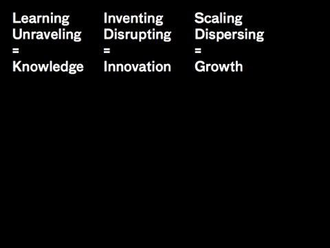
Learning and unraveling, inventing and disrupting, scaling and disseminating — you can’t have one without the other. If building is the call, unbuilding is the response. They are two sides of the same coin, each constituting the other. Far from opposite of building, unbuilding offers an opportunity to see what it means to build from a fresh perspective.
Let’s start by giving a little more depth to these concepts — here’s building on the left and unbuilding on the right.
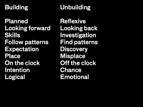
While building is planned, following a step-by-step path, unbuilding is reflexive. At last year’s Build, Wilson Miner reminded us of the Marshall McLuhan quote “We shape our tools and thereafter our tools shape us” — that’s a reflexive thought, it works in a circular way. Building looks forward toward progress while unbuilding evaluates and learns by looking back. Building involves skills and know-how; unbuilding requires inquiry and investigation. When we build we follow patterns; when we unbuild, we often find them. Building involves setting expectations, while the objective of unbuilding is often discovery. In building we place things where they’re supposed to go; in unbuilding we often try to misplace or creatively recombine them. When we build we build with intention; when we unbuild, we embrace chance. Building is a logical process; because of the element of surprise and wonder, unbuilding can often be an emotional process.
Earlier I said that while Responsive Web Design functioned as a practice, it also functioned as a critique of the practices that came before it and the culture that surrounded it. Art often functions this way too, and I want to take a look at some artworks today and see how we might learn from how they work.
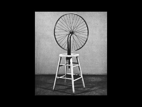
This is Marcel Duchamp’s “Bicycle Wheel” from 1913. Like Ethan’s idea of Responsive Web Design, Duchamp’s “Bicycle Wheel” hugely influenced the art that came after it — it is widely regarded as Duchamp’s first readymade, kicking off almost a century of appropriation in the art world. But, like Responsive Web Design, the Bicycle Wheel is also a critique of the culture that surrounded it — specifically the culture of cycling and mass production, which by 1913 was about a century old.
So it’s reasonable to stop and ask at this point: How did Duchamp create this totally new approach to art? What strategies is he using here? If we were seeking this kind of insightfulness in our work, how might we systematically approach it?
We’ve already talked about appropriation — he’s clearly doing that — unbuilding our concept of what is original. Duchamp also said reflexively that “instead of choosing his objects, his objects chose him” and this injects a bit of chance into the imperative of artistic choice. I’ve talked a bit about how “Bicycle Wheel” negates the conditions that surround it — about bicycles and about art-making — and it does so through a kind of removal of the artist himself. We have an expectation about the role of the artist, so the work seems incomplete — even its author can’t explain what it means. This failure — to be meaningful in a comfortable way, to even to qualify as something we understand as art — this is built in to the Bicycle Wheel’s efforts at unbuilding its context.
So, I’ve named a few strategies:
Appropriation
Chance
Negation
Removal
Reversal
Incompleteness
Failure
and to these we could add even more:
Speculation
Repetition
Comedy
Strategies like speculation: What will things look like in the future? Repetition: What do 100 of them mean? What about 1 million? Comedy: What does it mean if I laugh at this?
As we look at all these strategies that come out of unbuilding, I want to zoom in on four of them today — negation, removal, reversal, and incompleteness — and see how they function with examples in art, on the web, and elsewhere. A disclaimer: some of these strategies are complementary — a particular reversal might also be a negation of some kind, for example. My goal here isn’t to create rigid categories; I want to spark new ideas about how we work.
Negation as strategy
Let’s start with negation, and with the Canadian artist Jeff Wall.
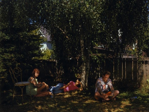
This is an incredible image by Jeff Wall, stunning and complex. It’s called, simply enough, “Tattoos & Shadows.” In an interview with SFMoMA, Wall describes his process using this image as an example. He says, “I begin by not photographing.” So, if he’s out on the street and he sees something that strikes him, he simply doesn’t photograph it — instead, he memorizes that scene.
This image was made a year after Wall first saw it. There’s a different tree, fewer people, different people. But in his re-creation, Wall enhanced what’s powerful about this image — the temporary pattern of the light laid atop the permanent, inked patterns on his subjects’ skin.
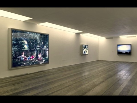
Here it is in installation.
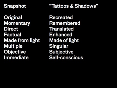
Let’s look again at how this image exists as a critique, how it unmakes the world of photographs, particularly everyday snapshots. Here’s two lists that work like readings on a set of dials.
I’ve already described how this work is re-created, remembered, and translated from life with Wall’s enhancements. As an art object, it’s also a lightbox, not a print, so it’s literally made of light. It’s large-scale and Wall does not edition them, so each lightbox is individual and original. And there is something controlled and knowing about the image that comes from Wall’s subjectivity and the year he spent thinking about it. It is self-aware and self-conscious, even though its source material comes from real life.
Negation works well on the web — you may be thinking of many ways already. There was an interesting project done last year by the artists Jonas Lund & Anika Schwarzlose called “This Too Shall Pass.”
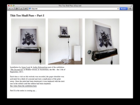
This work was included in a group exhibition about photography and performance called The Second Act. A photographic print has been placed on a shelf attached to a shredder. When someone visits the website for the project, the shredder is activated for a third of a second. After enough visits, the entire edition is destroyed.
Wall’s type of negation is non-action; Lund and Schwartzlose’s type of negation is non-preservation. Unlike Wall, they present their work as an edition, but they also display that edition in a way that destroys it. And, importantly, they make a normally passive audience consider the meaning of looking at something.
The internet places us in an economy of attention. Here, that attention is heightened, even quantified, until the edition is gone. “This Too Shall Pass” unbuilds our feelings about experiencing art in a mediated way.
Negation can also function in interactive and participatory situations beyond the web. Let’s look at unbuilding a working process.
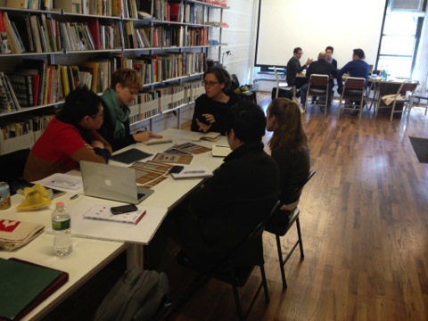
I am a thesis advisor in the grad program for graphic design at the Rhode Island School of Design. Last year, I led a three-week workshop called “Antithesis” — so negation was clearly on my mind.
The class came at a critical point in the year — in January between semesters. Thesis topics were not exactly new anymore, and yet there was a long slog ahead in the spring. Fatigue, anxiety, maybe even a bit of discouragement were all setting in. Clearly, it was time to twist some dials.
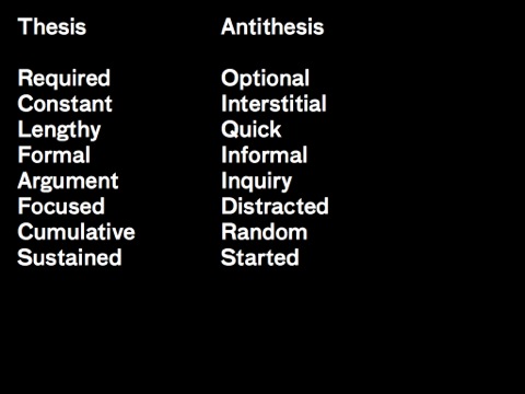
Unlike the thesis, Antithesis was an optional class. Instead of a constant, year-long process, it was interstitial, happening during a “down time” in the year. We didn’t really have class meetings — instead, I spent my time hanging out in the studio. Everyone loosened up. After thinking intensively about the thesis for 12 weeks, it was time to stop thinking about it — at least, consciously. The goal was not to keep pushing forward on the thesis but to get new projects started in parallel.
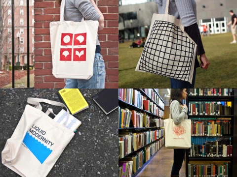
Part of shaking things up was offering new prompts. Instead of honing research essays, we made tote bags.
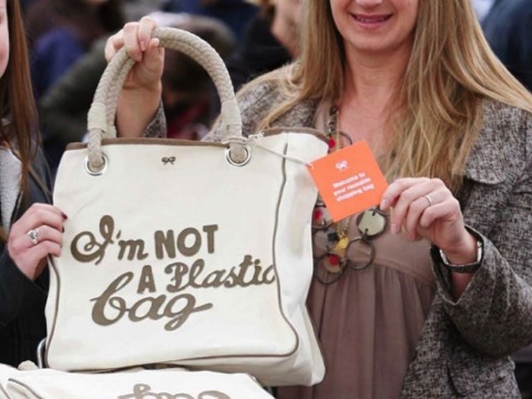
Tote bags been everywhere recently, gaining significance as a social signaling device, particularly Anya Hindmarch’s “I’m not a plastic bag” — negation again.
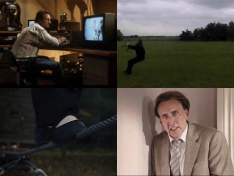
We also looked at ways of mixing scholarly research in time and space. We looked at the supercut as a new way of mixing found video.
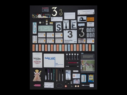
We looked at tabletops and “things arranged neatly” as ways of spatially organizing source materials and objects of design.

We finished our time together by making a website of our work.
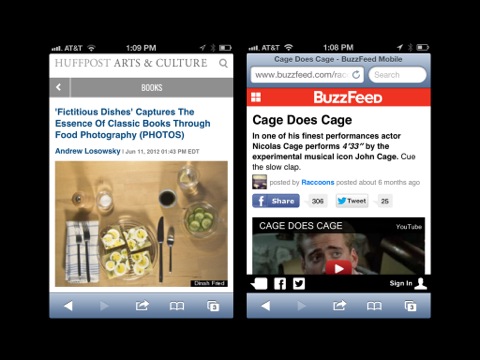
It was only online a few weeks when one project, a tabletop exploration that came out of thesis research on the aesthetics of the novel, showed up on the Huffington Post and ping-ponged around the web from there. Soon after that, a supercut called “Cage does Cage” showing 4:33 of silent looks from various Nicholas Cage films showed up on BuzzFeed. My students were never expecting this kind of response to their thesis work.
When you’re in the middle of something complex and lengthy like a thesis project, you often know a lot more than you think. My students thought they were struggling; yet their ideas proved tremendously resonant –not just to the design community, but to the culture at large. They were doing a lot better than they thought, they just needed to change their process — to get out of a standard educational process that puts one thing after another and get into a looser, more associative process that let them to use what they already knew in order to ask new questions.
There’s a very smart curator named Charles Esche who’s the director of the Van Abbemuseum in Holland, and he wrote an article that went back and looked at the history of avant-garde art programs along with documents about how artists should be educated. There were a lot of disagreements in those documents, but he found three common threads.
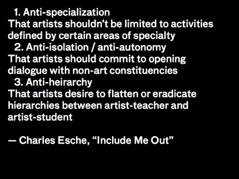
“Anti-specialization” basically says that sculptors can do things other than sculpt and painters can do things other than paint. “ Anti-isolation” or “anti-autonomy” basically says that art should matter, it should get out of the museum and touch the world in specific ways. And “Anti-hierarchy” basically says that making art should be available to everyone, not just to a certain class of people
Negation is in all of these — that’s where these disparate approaches to art education find common ground decade after decade. And every one of these ideas has already been applied to the web. When you think about anti-specialization, think about hackers and painters. When you think about anti-autonomy, think about doing things that matter. When you think about anti-hierarchy, think about the value of passion projects, startups, and all the amazingly talented amateurs online.
Removal as strategy
The next strategy — the strategy of removal — also connects to Esche’s threads. These threads don’t just negate certain conditions of art education, they also seek to remove the structures underlying those conditions. In order for anti-hierarchy to be a rallying cry, the hierarchies must first exist, and then they must be removed. So negation and removal are related.
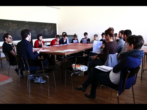
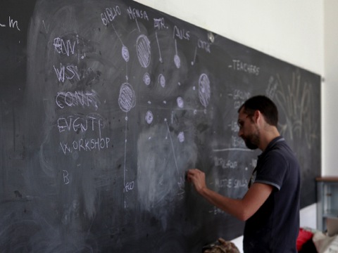
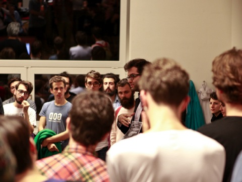
And I was thinking about this as I went into a workshop in Italy this September at the Free University of Bozen-Bolzano. The workshop was part of a symposium on design education. Like Antithesis, the idea for this workshop was really simple. Instead of supplying a syllabus, I removed it. And instead of hiding that fact, I drew my students’ attention to it, asking them to write one of their own.
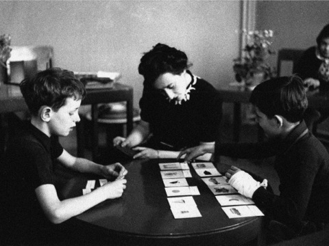
My model in this was Maria Montessori, who described herself as an anti-teacher — more a careful observer or a guide than a professor or instructor. What resulted over the next two days was a wide-ranging discussion about methods and models of education, educational debt, administrative hurdles to interdisciplinarity, and realizing the utopian dream of the open school.
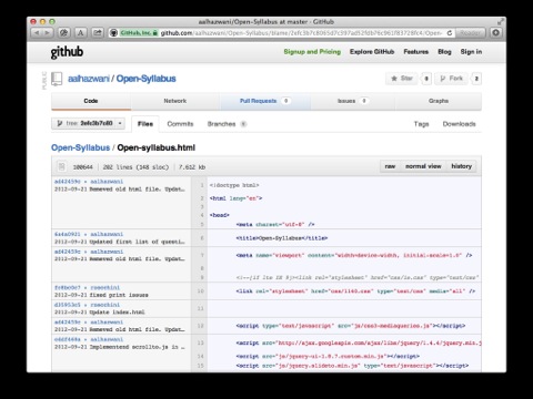
Within hours, one group had posted a syllabus for open-source learning on GitHub and started to discuss it via Git commits.
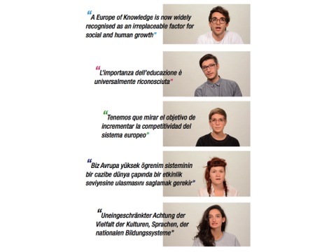
Another group went out to film international students who discussed of impact the Bologna Declaration, which calls for educational compatibility in Europe, on their everyday lives.
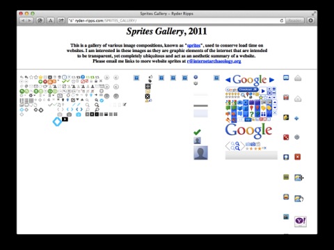
Online, removal as a strategy translates just as well. This gallery of internet sprites by the artist and OKFocus cofounder Ryder Ripps takes the sheets of tiny image sprites used by services like Twitter and GMail and archives them. The sprite sheets were created to speed up the sites by reducing calls to the server for small images. But in removing them from their original context, Ripps presents the sprites in another way. These tiny images organize and spatialize the way we interact with these powerful platforms. What’s allowed, what’s encouraged, the color and shape of selection and refusal — they are all contained here. Ripps’s work has found a huge audience online, and it’s this unbuilding process that gives it much of its force.
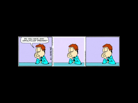
Here’s an Irish example — Dan Walsh, an IT manager from Dublin, started the popular site “Garfield minus Garfield” in 2008 after being captivated by discussions of how the strip might be different if its title character was removed. It quickly became a phenomenon — 4 months after it launched, Walsh was getting 300,000 hits a day. Without Garfield’s witty thought balloons, his owner Jon Arbuckle’s deep pathos is revealed. Questions that Garfield’s creator Jim Davis intended as setups for the cat’s punchlines instead serve to express the deep disaffection and existential uncertainty of everyday life. This is a different kind of humor for a different kind of time.
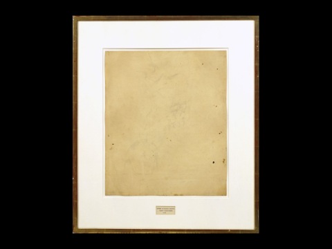
And this generational tension exists in the art world too, for example in the now-famous erased Willem de Kooning drawing by Robert Rauschenberg. After visiting de Kooning in his studio to introduce himself, Rauschenberg asked the elder Abstract Expressionist for a drawing to erase. De Kooning, unsure at first, eventually agreed — but only after selecting a drawing that he would truly miss, and one that would be very difficult for Rauschenberg to erase. The process took Rauschenberg two months and raises all sorts of questions. Who is the author of the piece? Is this a creative act or a destructive one? Has a work of art been lost or gained? These questions, of course, are impossible to resolve — such is the beauty of the piece. Rauschenberg’s act makes meaning by turning loss into a material. The drawing was once about what had been created — Rauschenberg has converted it into something that’s about what has been removed.
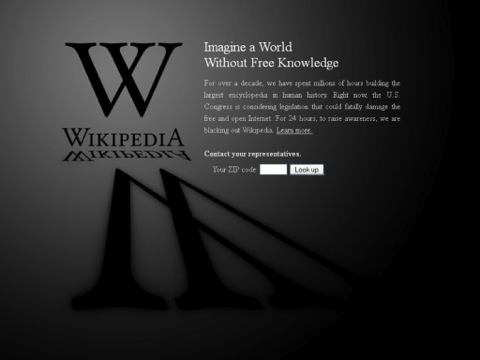
Earlier this year, Wikipedia performed an act of self-removal in the face of concerns that the Stop Online Privacy Act and the Protect IP Act would do serious harm to free speech and free knowledge exchange online. For 24 hours from January 18-19, the site went dark and invited everyone to consider a world without Wikipedia.

It’s hard to imagine a more powerful gesture — by January 24, Senator Harry Reid and Representative Lamar Smith announced the test vote on their bills would be postponed due to lack of support.
Reversal as strategy
With that legislative about-face in mind I want to look at a third strategy, which is, of course, reversal.

Wikipedia doesn’t work without the technology of writing and a literate public. Yet there was a long time in human history when literacy was the exception, not the rule. Culture spread through speaking and remembering, not writing and reading. Even though we may already know these facts, often we still think about Homer’s Odyssey as a written text that we read silently to ourselves, not something that was designed to be easily memorized, spoken, and listened to.
In his book Orality & Literacy, professor Walter Ong analyzes this transition and theorizes about the impact of literacy on human consciousness. In describing the impossibility of understanding a culture that is primarily oral from the point-of-view of one that is primarily literate, he draws a comparison to the automobile:
Imagine writing a treatise on horses (for people who have never seen a horse) which starts with the concept not of “horse” but of “automobile,” built on the readers’ direct experience of automobiles. […] Instead of wheels, the wheelless automobiles have enlarged toenails called hooves; instead of headlights, eyes; instead of a coat of lacquer, something called hair; instead of gasoline for fuel, hay, and so on. In the end, horses are only what they are not.
In a sense, Ong unbuilds the car to build a horse.


He ends with a negation: to unbuild the car to build a horse is not to build a horse at all.
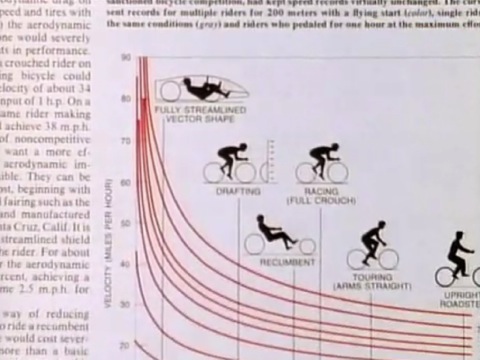
Metaphors about technological progress often reference transportation like this — think about Steve Jobs’s “bicycle for your mind.” Or Ted Nelson’s recent suggestion at Brooklyn Beta that “Computers that simulate paper are like ripping the wings off a 747 and driving it down the highway like a bus,” which is an image that, once described, is difficult to erase from your mind.
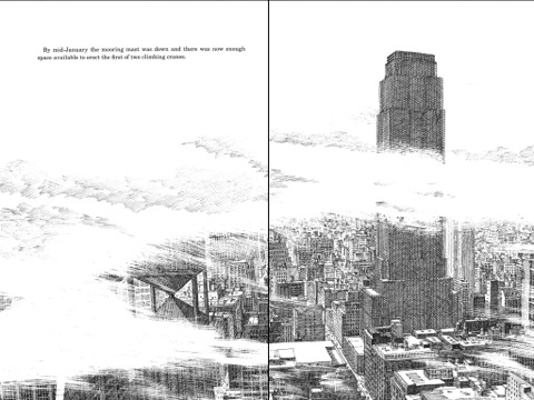
These metaphors are so memorable because they place progress in reverse, and the illustrator David Macaulay has done something similar in his book Unbuilding, whose title might be a namesake for this talk. For many years, Macaulay has drawn an incredible series of books that illustrate how everything from pyramids to castles to subway systems are built. But in Unbuilding, he describes a future in which the Empire State Building is disassembled brick by brick in order to be shipped across the ocean to a foreign buyer. Tragically, in the story, the ship is lost at sea.
Why tell the story this way? A clue might be in Macaulay’s dedication for the book, “To those of us who don’t always appreciate things until they are gone.”
What does a building mean to a city?
What does a website mean to a society?
What does a drawing mean to an artist?
What does a character mean to a story?
What does a photograph mean to a viewer?
These questions are difficult to answer, and more often we don’t even consider them. But again and again, unbuilding is a process that asks us to confront these questions about the hidden forces that shape our interactions with world.
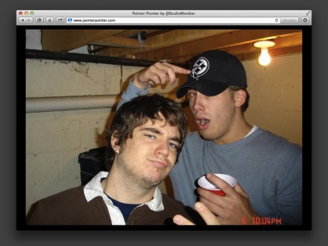
Pointer Pointer does this too. Using a large database of candid snapshots of people pointing in different directions, it tracks the movements of your mouse so that when you point, people point back at you. This simple reversal makes you eerily aware of the movements of your own mouse, while you’re confronted with goofy photos of strangers you never asked to see. Pointer Pointer raises questions about all sorts of things — big data, click tracking, and online surveillance, to name a few.

The personal website of the web designer Jake Dow-Smith asks a similar set of questions. What does a personal website really seek to represent? Is it a place to post ideas? Share photos? Link to external projects? Should it give a sense of who someone really is? These days, we do so much of our living through email, but how much of that process of living are we really allowed to see? When we log on to this site, we seem to be looking at Dow-Smith’s desktop, complete with incoming mail. Is this real? Are we supposed to be seeing this? Dow-Smith reverses what’s closed and what’s open on his site. Instead of portfolio materials, we get personal emails, grocery lists, even deleted spam. We’re left asking what we’d hoped to find, and what a personal website is really capable of sharing.
Reversal can be immensely appealing, too. When I originally dreamed up this talk, the first image of unbuilding that came to mind was this routine by Penn and Teller, which dazzled me on TV when I was younger. In this amazing sequence, they start with a pretty silly trick — Teller enters a rocketship and parts of him “blast off” all over the stage, until he is eventually recombined. It’s a pretty literal image of unbuilding in that sense, but what’s incredible is the reversal. Once they’ve shown the trick, Penn and Teller set about unbuilding it, brandishing a set of clear boxes to do the trick a second time, this time showing the secrets behind it.
The audience clearly likes the first version, but they love the second version. What’s so thrilling the second time around is not the trick itself — you already know what’s happening — but the process, the artistry, the craft of it. It’s like David Ogilvy telling you how to write an ad — it makes you want to hire him to write one for you.
Something in seeing this trick after all these years made me think of something I’d seen earlier this year, this incredible demonstration of the Kiva robot, which was shown by Kiva CEO Mick Mountz at TEDxBoston in June 2011. As you can see, the system literally unbuilds the warehouse, so instead of a worker going to the shelving, the shelving goes to the worker. At the core of this reversal is a human benefit — not only is the old method “an inefficient way to fill orders, it’s an unfulfilling way to fill orders.” In a single stroke, Kiva changes the warehouse’s architecture from fixed to emergent and the methods that it uses to choreograph shelves on the floor are now parallel, not serial. Kiva was acquired by Amazon in March this year.

Here’s another reversal I saw last year, this time by the architectural firm Interboro Partners. Every summer, MoMA’s PS1 invites a new young architecture firm to install a project in its courtyard. The installation offers shade, seating, and shelter during outdoor concerts that take place there throughout the summer. But while these concerts are well-attended by New York’s art and music scene, Interboro learned that many local residents of Long Island City had never visited PS1. A high wall around the courtyard only added more distance.
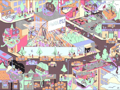
During the months leading up to the project, which Interboro called “Holding Pattern,” the architects surveyed the neighborhood, asking institutions what they needed.

The taxi drivers wanted a ping-pong table. The ballet school wanted new mirrors. The senior center wanted benches.
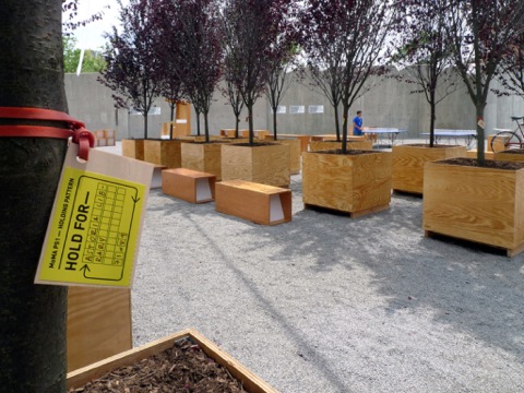
Interboro purchased or designed these items using the installation budget and held them in PS1’s courtyard for the summer.
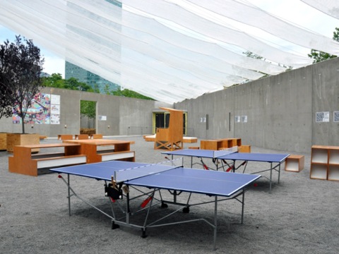
Their eventual recipients were invited in to use them, give performances, host readings, and take part in the cultural life of the museum.
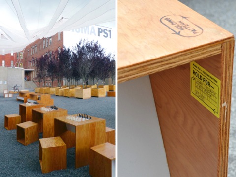
Interboro writes, “When Holding Pattern was deinstalled this past fall, we delivered 79 objects and 84 trees to more than 50 organizations in Long Island City.”
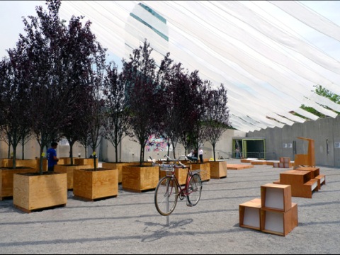
This is the best kind of reversal, of recycling, a social design process that works from the inside out.
Incompleteness as strategy
The last strategy I want to discuss, a bit more loosely, is incompleteness. We might call something unbuilt if it’s taken apart, but we might also consider something unbuilt if it’s never finished. And so to embed incompleteness into a thing is to leave it unbuilt — yet this is such a pervasive part of the web that it’s hard to even single out one example. What website isn’t being tinkered with all the time, changed, added to, improved? Isn’t incompleteness what makes websites dynamic, responsive, fluid, timely, adaptive, and all the rest? Of course it is.
One of the best places to see incompleteness in action is GitHub. This July, developer John G. Norman wrote a great post on his blog that described GitHub as “The Most Important Social Network,” and I’m inclined to agree with him. Norman explains how GitHub doesn’t just provide a decentralized method for collaborating on computer code, it also makes available and analyzable the very nature of human-to-human collaboration. GitHub unbuilds the way things get done. It assumes code is by its very nature incomplete, and in the process it gives us unbelievable access to the nature of work. Norman writes,
Yes, I know that conversations on Facebook and Twitter have their purposes, but at GitHub, there is real pressure to move a project along and keep it alive. If you’re a scholar interested in computer-mediated communication, you ignore GitHub at your peril.
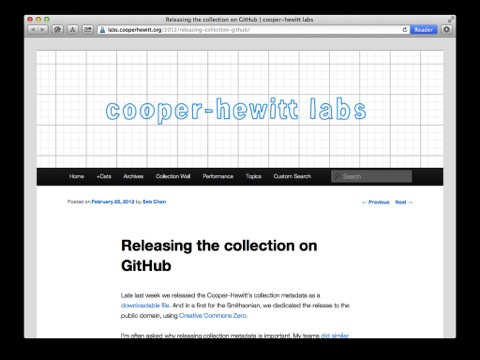
In February, the Cooper-Hewitt National Design Museum took the very exciting step of releasing its collections metadata on GitHub using Creative Commons Zero, the most permissive license available. In doing so, the museum’s Digital & Emerging Media Director Seb Chan hoped that offering this information would make it more discoverable, allowing it to be searched from outside the museum’s own website.
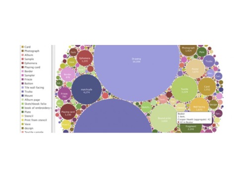
Even more, he hoped releasing the metadata would inspire to new forms of interpretation around the collection. The collections metadata is incomplete in two ways — for one thing, as Chan notes, it isn’t the objects themselves, only information describing them; for another thing, it is only as good as what you can do with it.
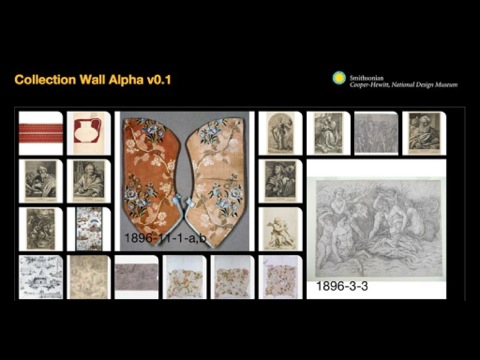
Incomplete metadata is made more useful only when it enables an item from the collection to appear in exhibitions, catalogues, or other experiences. Chan asks, “Could GitHub become not just a source code repository but a repository for ‘cultural source code?’”
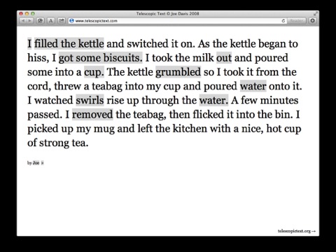
Langauge is a more direct expression of a cultural source code, and it’s being edited, tweaked, and extended all the time. Designer and illustrator Joe Davis’s website Telescopic Text takes a simple sentence, “I made tea,” and unfolds these three words, clause by clause, into a total of almost 200. In so doing, a simple documentary fact becomes an experiential, associative tone poem that’s as pleasant to play with as it is to read, as the words swirl around each other like milk in Davis’s teacup.

But much earlier, writer Jorge Luis Borges described this same kind of incompleteness in a lecture at Harvard titled simply, “The Metaphor.” In it, Borges shows how metaphors arise before language, before we find words to describe something. Then, as we share these concepts with one another, metaphors evolve into words. Borges jokes that “a word is a dead metaphor, which is a metaphor,” but then he returns to what metaphors can do and introduces the concept of openness, which is related to incompleteness — metaphors are open because they are incomplete. They make a suggestion we must complete in our own minds. Here’s Borges:
Remember what Emerson said: arguments convince nobody. They convince nobody because they are presented as arguments. Then we look at them, we weigh them, we turn them over, and we decide against them. But when something is merely said — or, better still, hinted at — there is a kind of hospitality in our imagination. We are ready to accept it.
And this idea of incompleteness is embedded in our legal system too — laws have amendments, precedents, arguments are overruled — the law is constantly unbuilding and rebuilding itself.
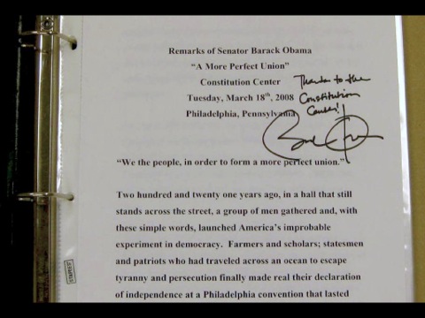
When Barack Obama ran for president in 2008, his iconic speech on race centered on a single phrase in the U.S. Constitution — the idea of “a more perfect union.” With this idea of progressing toward perfectability, the Constitution ensured its status as a living document, something that was simply a first draft, born incomplete, made more perfect with each generation, but never, truly, perfectable.
OK — I’ve covered a lot today. I’ve described a way that making things can critique the world around us, by unbuilding systems. I’ve described this kind of process as something that’s not opposed to building but instead catalyzes all knowledge, invention, and growth. And I’ve pointed to a few examples we can use in our own individual work.

But how about our collective work? I’ve described how you can’t build a house without unbuilding — but how about a community? Of course, unbuilding figures into that too. And in our creative community on the web, I believe unbuilding — how we look back on what we’ve done, reflect on it, find patterns, make discoveries, embrace chance and emotion as pathways to meaning — unbuilding is a tremendously important part of making our community stronger, pushing us further, and, most importantly, linking us to cultural conversations that are happening across disciplines.
A few months ago at our studio we met with a museum curator who was interested in bringing some of our work into her collection. And she looked at books, posters, identity manuals, exhibition diagrams, all these physical things, and that all seemed pretty easy to acquire, but when we talked about websites, she grew quiet. As we talked, I discovered that it wasn’t just the technology that made matters difficult for her, but the lack of a canon. “What websites have other museums acquired?” she asked. “It’s hard to start from zero.”
At that moment, I realized that we need to start building not just in a practical sense but in a critical sense. Together, we need to build a canon for the web.
This is a very hard thing to do. Our discipline is relatively new, it encompasses a wide range of skills and talents, its techniques are always changing — but with the publication of the late Bill Moggridge’s Designing Interactions in 2007, the discussion really seemed to get started. Soon after that Armin Vit wrote an essay asking “Landmark Web Sites, Where Art Thou?” and Khoi Vinh and many others promptly responded.
It’s tempting to say we don’t need a canon, but the curator who visited me, along with Bill and Armin and Khoi and all the others all have a point: canons are the sign of a maturing discipline. They build consensus, spark debates, establish throughlines and themes, and set the parameters for future critiques to undo. Web design may be a participatory practice, a political practice, and a commercial practice, but I also believe web design must consider itself an aesthetic practice — this is, after all, why many of us are here. And canons, problematic though they may be, have been the operating systems for aesthetic practices for a long time.
Andrew Blauvelt, one of our foremost critics of design and a curator at the Walker Art Center in Minneapolis, published an essay in 2003 called “Towards a Critical Autonomy” in which he wrote,
Graphic design must be seen as a discipline capable of generating meaning out of its own intrinsic resources without reliance on commissions, functions, or specific materials or means. Such actions should demonstrate self-awareness and reflexivity; a capacity to manipulate the system of graphic design.
So my question to you, today, is: Can the same be true for web design? Is web design a system capable unbuilding itself? I believe, and people like Ethan have shown us, that this is possible. What else is possible? When we think about what we’d like to build, let’s think about building a canon, even if it’s never complete.
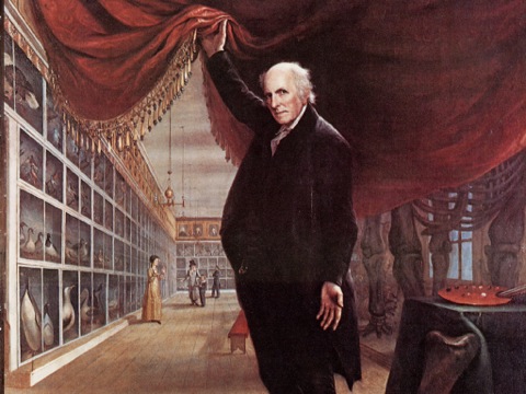
The critic Susan Sontag wrote that “A complete set of something is not the completeness the collector craves.” She’s saying that the collector really wants is to chase after completeness — not actually to get there. Seen this way, the ever-evolving nature of our work is actually a thrilling aspect of canon creation, not an impediment to it.
Critique is a complex instrument. It dissassembles the very things it wishes to knit together. If you’ve ever “viewed source” to see how a web page was built, you know exactly what I mean. If we “viewed source” on our collective efforts at making meaning in our work, how would this work be built?
That’s exactly what we should try to answer next.