No Goal
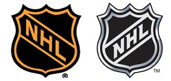
From left to right, above: NHL, then and now.
Last July, after millions of disappointed fans had endured a yearlong strike and a lost season of their favorite game, the NHL turned the lights back on in rinks across North America, and players hit the ice once more. The NHL was not the organization it had been a year earlier, but after being slammed against the proverbial boards it attempted to a brave face on the situation with – what else? – a new logo. The new logo is essentially the same as the old logo, except instead of orange and black it’s silver and black, instead of flat it’s 3D, and instead of sloping downward from left to right it slopes upward. “New,” indeed.
The Doctors may not know much about hockey, but one of the first rules in branding is that if something needs to change, it needs to change in a significant and noticeable way. The NHL was a company had spent the past year without offering the product that its customers expected, and it had done so because it didn’t want to pay its employees enough to keep them from walking off the job. If there was any question what fans were thinking, let the Doctors settle it now: things sucked for the League and visible change was necessary.
But change visibly they didn’t. By casting a slightly revised version of their old logo as “new,” the NHL cast itself as an organization that was not only unchanged but also somewhat self-deluded. They hadn’t changed, but they seemed to think they had. What had changed was comically insignificant. The change of color scheme, for example, like the change to 3D, was meant to associate the NHL logo with its primary icon of competition, the Stanley Cup. But the two forms look nothing like one another, and the Stanley Cup itself has been “logofied” on many occasions for all kinds of NHL merchandise, including, most recently, the “My Stanley Cup” campaign, launched this April, which features a player’s silhouette hoisting a Stanley Cup high above his head. While the whole thing is encircled by a regrettably unhip swoosh, the “My Stanley Cup” icon is otherwise effective: it shows a player (which the NHL has been accused of neglecting), with a trophy (which the NHL’s unfortunate lost season had failed to produce). With it, the NHL stands for its players and competitions, which is what it should stand for. Not the most groundbreaking logo we’ve ever seen, sure, but a step in the right direction.
In the case of the not-new new NHL logo, though, the visual allusion to the Stanley Cup is unsuccessful. To say that making something silver and 3D will help fans to associate a shield with a cup is not only counterintuitive, but it also sounds a lot like lip-service. If the NHL had chosen gold as its faux logo metal of choice, the Doctors are pretty sure that no one would have objected that it clashed with the Cup. Fans got it: the NHL wanted to show some bling.
This desire to swagger through some rather adverse circumstances was also the key motivator behind the NHL logo’s other – ahem – ”significant” change, from downward- to upward-sloping initials. While the Doctors don’t expect sports organizations to be bastions of artistic subtlety, the reason for this clunker is so obvious that it hits you right in the face mask. But the NHL’s press release points it out anyway, noting that the new logo “uses upward-reading letters to project a vibrant, optimistic image.” While the up/good, down/bad equation is simplistic enough for a 4th Grader to understand, it’s regrettable here, both for its one-liner lack of depth and for its probable lack of recognition. Since the new logo is so much like the old, most fans will think nothing has changed, reading up but remembering down, swapping good for bad, or, at least, more of the same. This is not to insult fans: the failure is the NHL’s. In the same way that we stop listening to stories that have no point, we stop seeing new logos that aren’t new logos. Diagnosis? In the words of the hockey blogger Razor with an Edge, “That’s It? Maybe I’m at fault for expecting something a little more radical.” The Doctors agree.