Anatomy of a Merger
On 2 September, more than 1,600 Sprint and Nextel stores opened their doors beneath new signs bearing a common logo. This marked yet another massive telecom merger, following Cingular’s buyout of AT&T last year and anticipating Verizon’s possible takeover of MCI in the weeks to come. Whenever two become one, a new logo is an inevitable offspring, and this merger is no different.
Will the monolithic new company be dubbed “Sextel,” as bloggers once giddily suggested? Hardly. The new branding doesn’t exactly get us all hot and bothered. Like that forgotten soda from the ’90s, it’s basically…O.K.
Then again, post-merger logos are seldom visionary or inspiring because they’re design-by-committee projects mired in politics. So if the committee is actually able to produce a logo that’s on time and un-ugly, they deserve a pat on the back.
And that’s exactly what a team of execs from Sprint and Nextel – along with branding agencies Lippencott Mercer, TBWA/Chiat/Day, Publicis, and Hal Riney – have done. Because a successful logo merger is always a challenge, the Doctors decided to take a closer look at this team’s decision-making process.
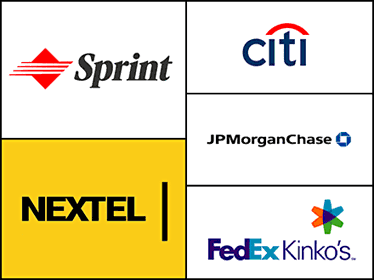
The trick to making a successful logo is keeping what works and ditching what doesn’t. In play are three key elements: name, mark, and color. In the case of Citicorp’s merger with Travelers Group in 1999, the name was resolved from the start: the new entity would be called Citigroup. In designing the logo, Pentagram wisely shortened the word to the very recognizable “citi,” keeping Travelers’ red umbrella, a symbol of protection, while playfully using a “t” as its curved handle. The lowercase “i”s are both human forms and points of connection. The colors of both companies are integrated in the new logo. A masterful merger.
JP Morgan Chase’s new logo is more straightforward. Both banks had great brand equity and name recognition, but Chase’s lovely emblem – designed by Chermayeff & Geissmar in the 1960s and still a classic – was preserved as the more recognizable symbol. They compromised on the colors and updated the typography. Well done.
Finally, when FedEx acquired Kinko’s in 2004, they scrapped the copyshop’s forgettable logo but kept the highly memorable name. Since FedEx has no logo aside from its name, Landor Associates (makers of the original FedEx mark) recognized the need for a logo to anchor the new brand and set it apart from FedEx’s. They devised an innovative asterisk made from three arrows coming together. Three of the colors – orange for FedEx Priority, green for FedEx Ground, and purple for FedEx – were already in use. The remaining color, an aqua blue, became the symbol for FedEx Kinko’s.
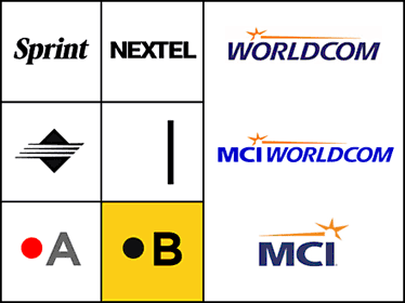
In the case of Sprint and Nextel, the left side of this slide shows the assets in play. On the top row, the names “Sprint” and “Nextel,” and the typography of those names: Sprint’s in outdated bold italic, Nextel’s in an all-caps, no-nonsense sans serif. In the second row, the marks: Sprint’s ungraceful diamond-pyramid thingy, Nextel’s mundane cursor. Finally, the color schemes: Sprint’s commonplace grey and red on a white ground is similar to Verizon’s, Nextel’s black on a bold yellow ground is totally its own.
The right side of the slide shows this process of combining existing brand elements as used by another telecom company. When WorldCom acquired MCI in 1997, the new company took MCI’s name but kept WorldCom’s branding. Later, post-scandal, the company ditched the “WorldCom,” but kept its more distinctive look.
This approach wasn’t an option for Sprint and Nextel: While Sprint clearly had the more recognizable name and Nextel clearly had the more recognizable color scheme, neither company had a mark worth getting excited about. The designers decided to create a new one.
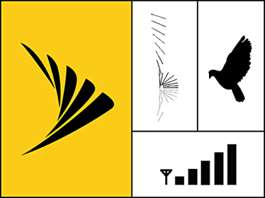
The new logo is a vast improvement over the previous two. It visualizes one of Sprint’s most memorable marketing claims – its network is so clear that you can hear a pin drop – to remarkable effect. In so doing, it also has overtones of Cingular’s “full bars,” a symbol of the completeness of their network. The new mark also resembles a bird’s wing, a symbol of the freedom of cellular communication.
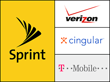
Here is Sprint’s final logo, with upper- and lowercase sans serif letters that hybridize the companies’ former typography. In virtually every graphic way, the new branding distinguishes itself from its competitors. We hope Sprint will wear it well.