Pro Ed

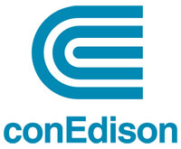
On 14 August, we’ll celebrate (although that might be the wrong word) the second anniversary of the largest blackout in recent memory. Which makes it as good a time as any to celebrate (and here it is most definitely the right word) one of the most unsung logos in recent memory: the Con Ed logo. It seems like such a classic solution, you’d never guess it’s only three years older than the blackout.
Created in 2000 by branding guru Peter Arnell—the mind behind identity campaigns for Reebok, Tommy Hilfiger, DKNY, and Samsung, among others—the logo aimed to reflect changes at Con Ed. The company was no longer in the business of generating energy; it was now in the business of moving it around efficiently. The new visual identity debuted in October with a city-wide ad campaign and a New York Times article by media columnist Stuart Elliott. A year later, what started as a simple consumer education effort gained momentum when Enron announced in October 2001 that its stock was overvalued by $1.2 billion. Suddenly the new Con Ed campaign morphed into a mission to restore consumer confidence in private energy firms.
It happens that Enron’s logo had been created by graphic design’s grandfather, the great Paul Rand, who also created IBM’s famous striped letters and the emblematic C of Cummins Engine Company.

If you merged these two classics, you’d have the Con Ed logo, which helps explain its timeless quality. Prior to Arnell’s innovation, the logo had been untouched since 1968, when the words “Con Edison” were stacked and emblazoned in sky blue Helvetica. Arnell kept the Helvetica, an impersonal, no-frills typeface that is right at home in the context of a multibillion-dollar utility company. He also kept the sky blue. Not only does the color make us think of unpolluted atmospheres and optimistic futures, it also makes us feel cool, which, in these sweltering summer months, is one thing we all need Con Edison to do. Imagine if Arnell had jettisoned the blue for, say, the bright red of a hot stove.
Arnell did a number of other smart things as well. He convinced the folks at Con Ed to spell their name “conEdison,” shifting the emphasis from a negative, “con,” to a symbol of innovation and ingenuity, Thomas Edison. The capped “E” also slyly signifies “energy,” which is what the company delivers, and “efficiency,” which is what the company plans to deliver it with. The logo itself literally “consolidates” the letters “C” and “E” into a single, coiled unit. Its spiraling quality suggests an emanating force or an infinite loop.
Its form initially struck us as similar to the “impossible fork,” a children’s optical illusion. It also look a bit like the sorts of symbols used by electrical engineers in their schematic diagrams.

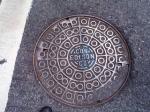
And it has the same sort of concentric rings as a manhole cover, which harks back to the 180-year-old company’s oldest trademark.

The first Con Ed logo wasn’t made by a designer at all: it was made by an ironmonger. Around the turn of the century, the words “Con Edison Co” were imprinted on the city’s manhole covers, just as the stacked logo that replaced them was. Prior to that, the manhole covers had been emblazoned with the name of their fabricator. In a project from the early ’60s, designer Anthony Robinson trolled London streets for these early manhole covers bearing insignias like “C. Whitley, Ironmonger, King’s Cross” and “Jelley Son & Jones, Grindstone Merchants, Blackfriars Road.” These stampings, either cast or branded into the soft molten metal, trace their history back to the earliest printed marks, including stamps made by Greek potters called “graffiti,” and marks pressed into Roman oil lamps that, before the advent of energy companies, once lit the way for citizens of the world’s oldest cities.
In enlisting Peter Arnell, a savvy interpreter of visual culture, Con Ed found a collaborator ready to both embrace the past and set a course for the future. Diagnosis? An elegant logo ready to last another 50 years.