Publication Design: Dispatches from the Future
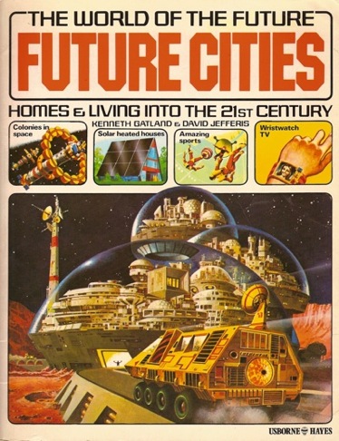
The last two pages of the 1979 book Future Cities: Homes and Living into the 21st Century describe what will happen on earth over the next 120 years. Reproduced below are the authors’ predictions for the first ten of those 120 years, from 1980–1990.
- Satellites in Earth orbit beam educational programmes to many countries in the underdeveloped Third World.
- Wind turbines – modern windmill designs – are developed which can supply electricity economically.
- Domestic computers run household equipment. Electronic chores include keeping accounts, ordering supplies, suggesting menus, cooking meals and keeping a diary for the people living in the house.
- Newspapers supplied to homes either via a computer print-out or in electronic form over the TV screen.
- First domestic robots used as household “slaves” to do simple tasks.
- Terrorists steal nuclear warhead from military base. Threaten to blow up a city unless their demands are met. General realization of the appalling risks of poor security promote measures to keep atomic weapons under proper “lock and key.”
- Nuclear fuel detector-satellite placed in orbit to maintain a watchful electronic eye on the world’s supplies of atomic material.
- Good insulation and other energy-saving features built into all new houses.
- Solar panels in general use to heat water in homes. Solar-electric cells used to generate electricity for some uses, such as recharging batteries.
- World tree planting programme begun. Aim is to restore the oxygen-producing capacity of the world’s plant life. Centuries of being chopped down have reduced the world’s forest areas to a fraction of their former size. Other benefits include the production of wood-alcohol to use as a substitute for petrol in cars.
I hope I’m remembering this right, but I think it was one of my favorite teachers, Paul Elliman, who once remarked that some classes start with a program and others start with a provocation. He was often fond of the latter approach, and in the case of teaching this class, so was I. The goal of the class was to introduce students to different kinds of publications, but I chose to focus on artists’ books, catalogs, and magazines. Simply designing these forms in a vacuum, however, wouldn’t do: what makes any publication great is its context and, more importantly, its content.
The future seemed like an ideal subject. First, everyone has an opinion about it. Second, it hasn’t happened yet, so it’s impossible to be wrong. Third, especially for a group of Juniors and Seniors about to begin their professional lives, it seems like something worth stopping at least for a little while to think about.
Students began the class by researching and then trying to convey some aspect of the next 10 to 20 years in the form of a loose artists’ book or zine. Parsons students have a rich background and interest in fashion and upcoming trends, so the subject of the future fit naturally into that way of looking at the world. Some students’ visions were aesthetic, some were practical, some philosophical, some even spiritual. All were lively and resulted in illuminating and spirted conversation.
This conversation continued as we passed content around and began reforming it into other publication types, first as a sales brochure and then as a full-length magazine. Throughout, we had discussions about not only the future, but about the nature of collaboration and about the many publications and periodicals that inspired us to think about what’s coming next.
Note: A “class crit,” where the whole class is involved in the critique, is useful because the critique not only refines the work being discussed but also becomes a teaching tool for the students listening in. As a result, everyone benefits from the ideas being shared. But repeating this format each week can also grow tiresome and counterproductive. Whenever possible, I have tried to use a variety of class formats to keep us all engaged and learning in the right ways at the right times. “Desk crits” are adapted from architecture classes: the instructor wanders from desk to desk and students share what they’ve been working on. on these days, please use your time wisely and bring things to work on during class. “Small group crits” are better for critiquing projects in the “first draft” stage and for students who find the full-class critique format overwhelming and are more comfortable with speaking in smaller groups. “Presentations” as students to prepare short slide talks on a given subject to share with their fellow students. Students are expected to be timely and prepared. Finally, “guest crits” will introduce some valuable new perspectives into our full class critiques. When guests visit class, your attendance and attention is essential and expected.
Grading: Please put all assignments in an envelope with your name on it for grading. This envelope should be well-organized and should include everything below (unless delivery by email is specified):
- Grid assignment
- List of blog permalinks (12 writeups and week 2 assignment by email)
- + 10 to 20 book (comp to be returned and PDF by email)
- Object of desire catalog (comp to be returned and PDF by email)
- Object of desire ad (PDF by email)
- Everything you did for Tomorrow today (initial pages, round 1 and 2 revisions, covers, etc.)
- Classwide final magazine project (PDF and print version)
Each of the three major projects (+ 10 to 20 book, Object of desire catalog, Tomorrow today) will count for 30% of your final grade. The grid assignment, blog posts, and class participation will count for 20%. This adds up to a total of 110%. That’s what you should always plan to devote to your work, especially during the time you’re in school. But it also creates a cushion: if one of your projects falls a little bit short in terms of its design, you can always make up for it by being an active contributor to class on the blog and during critiques. Think of it as built-in extra credit.
Assignments
Class blog
Language of forms
+ 10 to 20
Object of desire catalog
Tomorrow today
Class blog
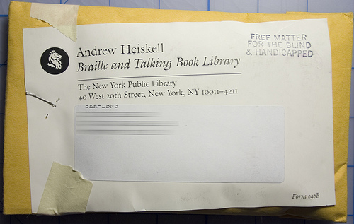
Above: As one of his magazine posts, Scott Kellum shared the Andrew Heiskell newsletter. Scott writes, “I receive this newsletter about four times a year. Unlike what you might expect, the content of this newsletter doesn’t come on paper but comes on a cassette for blind people. Accessibility is always something that interests me. […] When inserted into my government issue 4-track tape player a brief introduction about the library is red aloud. Later books and other recordings are listed around a specific topic. The beginning of this tape is focused on topics of personal finance. Then a overview of library events, and other events in the area is given. Then new and popular books are listed.”
Once a week, share a publication you like with the class. It could be something you see in a bookstore, something from your bookshelves at home, or something you’ve read about. Write a paragraph describing why you like this publication and post at least three images of it for the class to see. Remember, a publication is anything with multiple pages (books, catalogs, brochures, reports, magazines, etc.) These posts will count toward your final class grade. You will need 12 posts in all for full credit. When you send me your preferred email address, I will send you a login for the blog to use throughout the semester. I will also use the blog to post images related to our class critiques and brainstorming for our in-class projects. You should feel free to do the same.
Language of forms
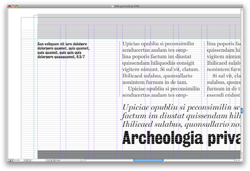
Above: Lecture slide
These are slides from the lecture I gave to my publication design students on the first day of class (PDF). The first half of the lecture was focused on craft. I basically looked at Case da Abitare, a beautifully redesigned Italian home magazine, and then showed my students how to take it apart. (There is a great interview with the magazine’s creative director Tyler Brûlé, art director Kuchar Swara, and photo director Stephen Ledger-Lomas.) I started with a heavily-gridded page, the Index, and reveal the magazine’s basic 12-column structure. I went on to show how lines and rules are applied to the gutters and outer margins of that 12-column grid. Then I showed how the type is sitting on a p3.5 baseline grid which governs the placement of all horizontal elements on the page. Basically, the height of any element on Case da Abitare’s pages is a multiple of p3.5. Then I showed students how to guess at type sizes based on baseline reoccurrance, and finally I showed how all of these templated elements play out across a variety of grid schemes.
The second part of the presentation is a set of “Notes on Magazines.” First, I asked students to consider magazines as a publication form by contrasting them to other types of publications. (For the sake of simplicity, I definited a “publication” as any object with multiple pages made available to the public.) This included newspapers, journals, brochures, books, and blogs. Then we looked at various “toggles” within the magazine form itself. These included timing (or frequency), scope, length, number of authors, quantity of advertising, makeup of audience, and different strategies for distribution. Finally, I sketched a “garden variety” three-act magazine. This is what most lay readers learn as the magazine form proper: front of book, feature well, and back of book, with all the content-driven and stylistic assumptions that come with those sections.
For this introductory project, we will learn how grids work in publications, including margins (2D), columns (1Dv), hanglines (1Dh), and baselines (1Dh). We will also learn the names and functions of a variety of parts of a publication and we will put this knowledge to use in a presentation to the class.
-
Pick two magazines with identifiable grids. Pick three pages from each and photocopy them. Trim your photocopies to match the magazine page so that they’re identical. Using tracing paper, sketch the margins, columns, hanglines, and baselines you think are being used. Make sure your grid is consistent for all three pages; if it’s not, make a second tracing. Select one of your sample pages and attempt to copy it using the grid you’ve traced. If you do not have matching typefaces, use the closest approximations. Make several printouts as you fine-tune your layout to document your process. Instead of dummy copy, name areas of the page after their setting, like “Headline Helvetica 16/18” (where 16 is point size and 18 is leading). Bring your magazines, your photocopied pages, your tracing paper grids, and your process printouts to class next week for review. I will conduct short “desk crits” with each of you indiviually so you will have some time to work in class. Revise and collect your designs in an envelope with your name on it for class next week.
-
Select a magazine you are passionate about and present at least five formal aspects of that magazine using terms we defined in class. Scan and crop slides as necessary to show what you’re describing. If possible, bring the magazine to share with the class as well. Presentations should be less than 10 minutes. After you’ve presented your work in class, post your slides and a short write-up of your presentation to the blog to get credit for your work.
+ 10 to 20
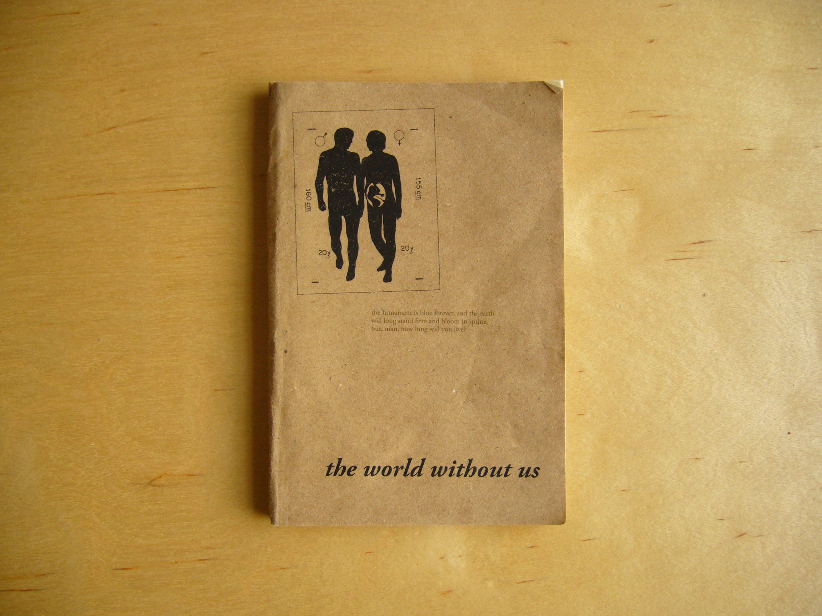
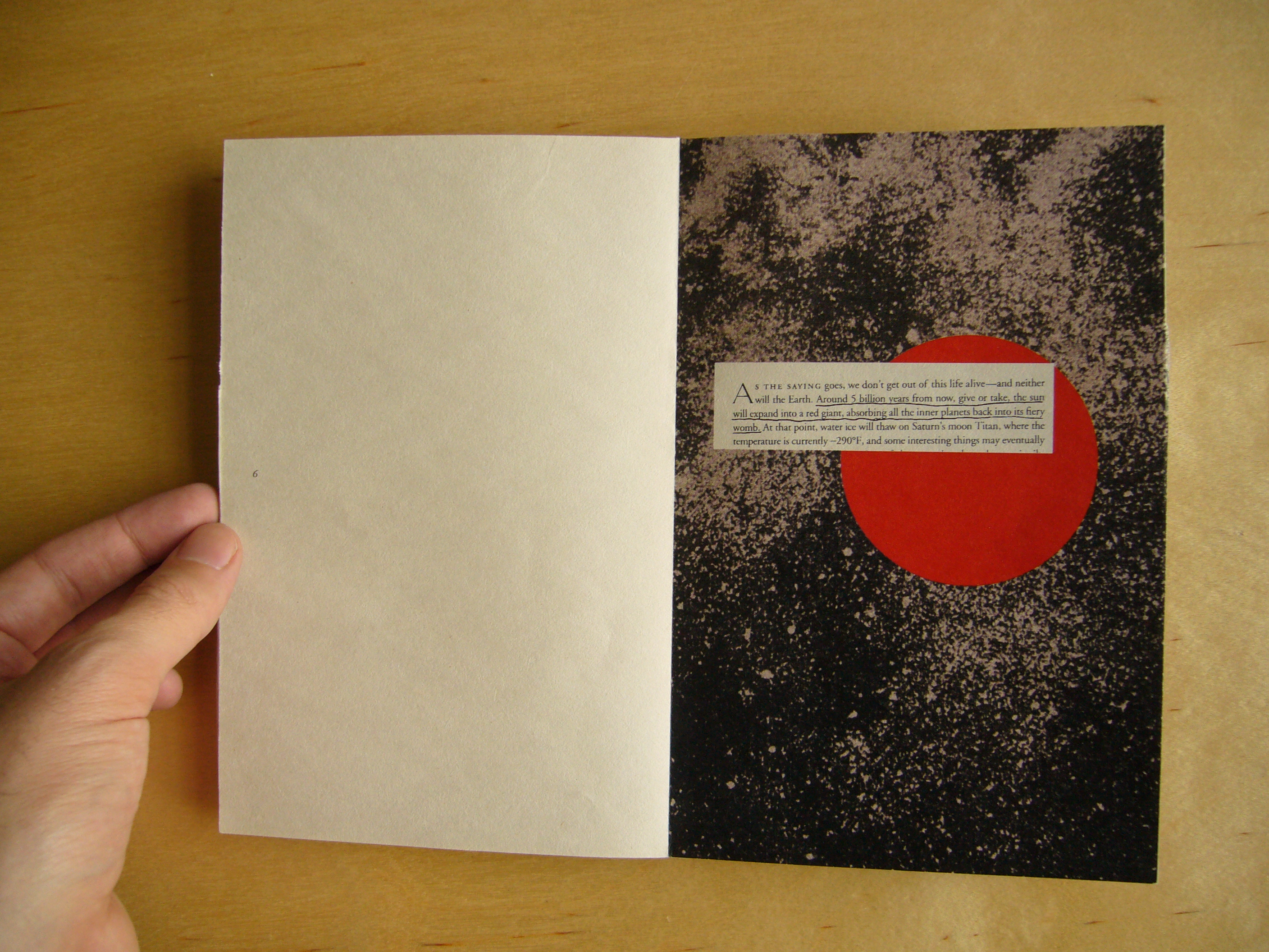
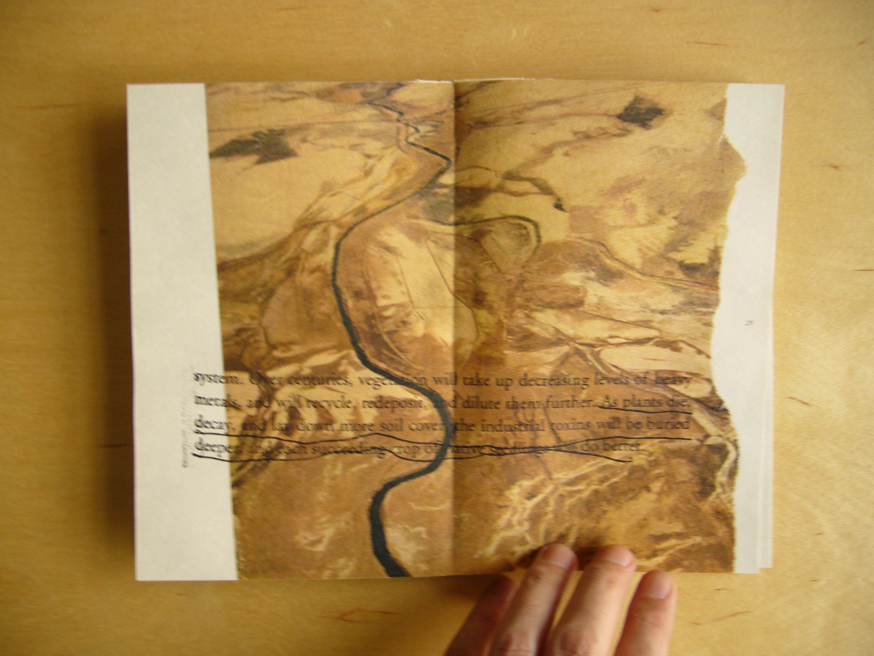
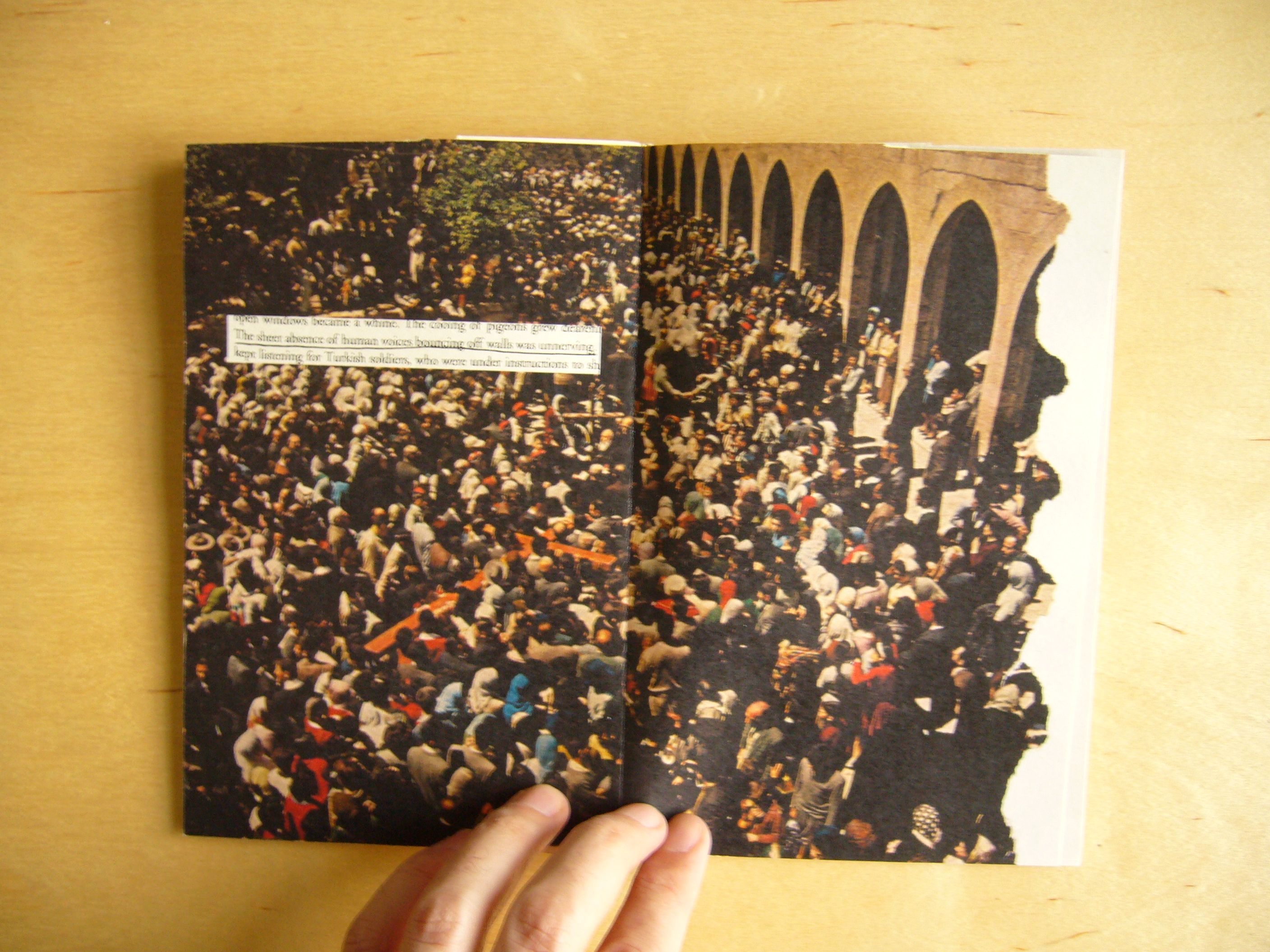
Above: Yelena Avanesova’s project focused on a book she decided to read for the class, Alan Weisman’s The World Without Us, which imagines our planet after the last human has died off. Yelena’s underlined passages combined with imagery from vintage National Geographic magazines in this unique presentation of a world and text remembered. More + 10 to 20 projects below.
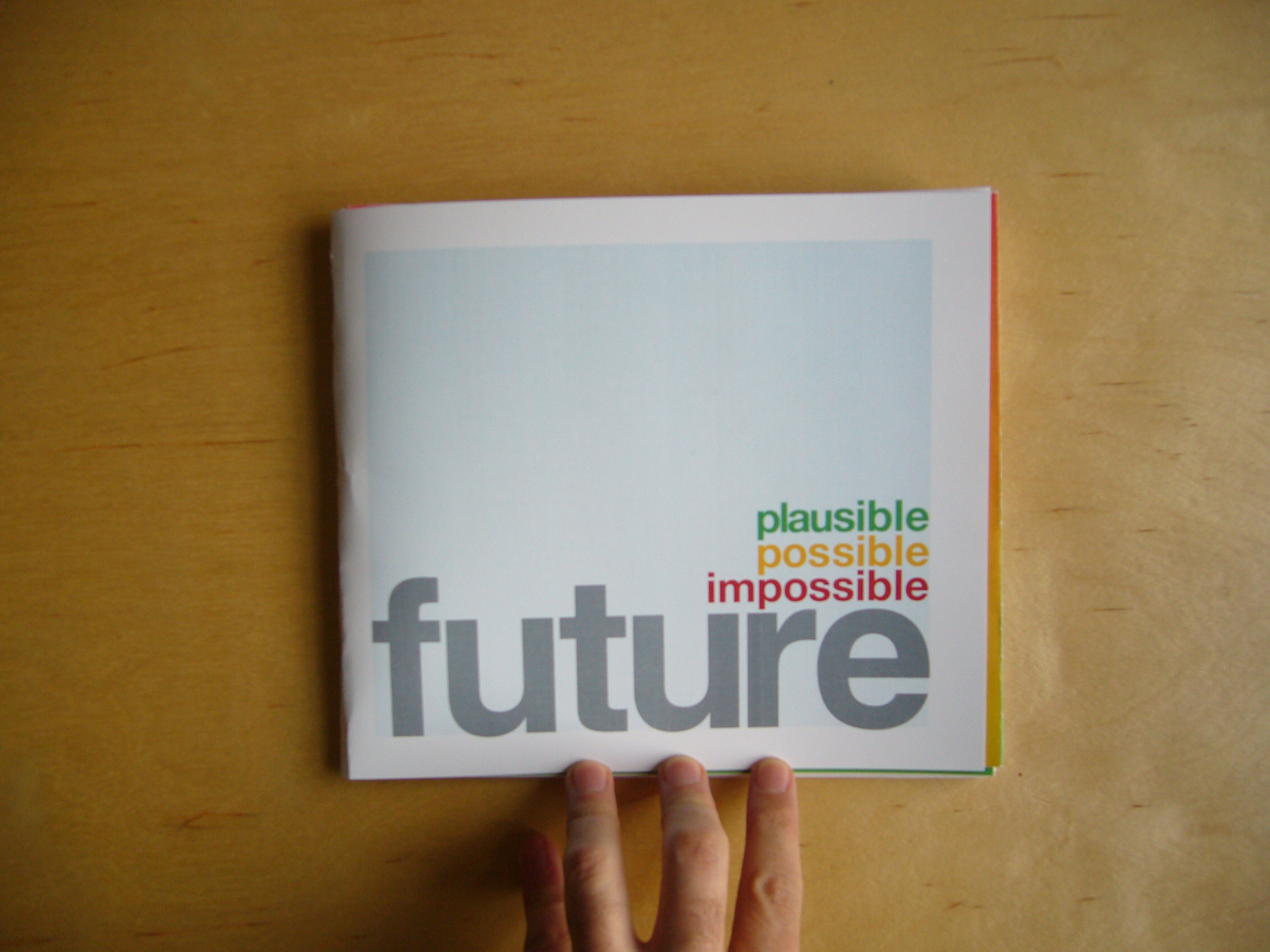
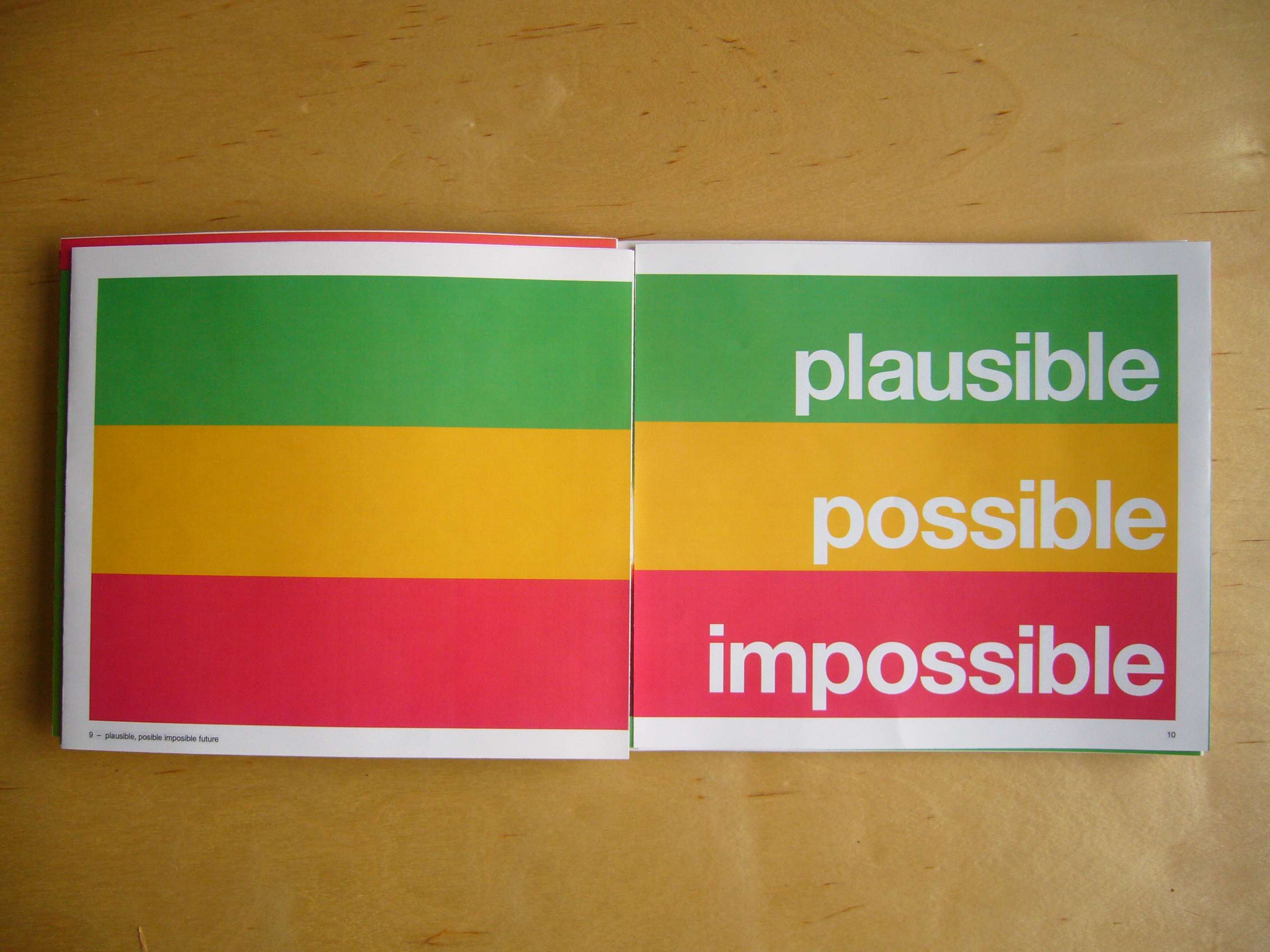
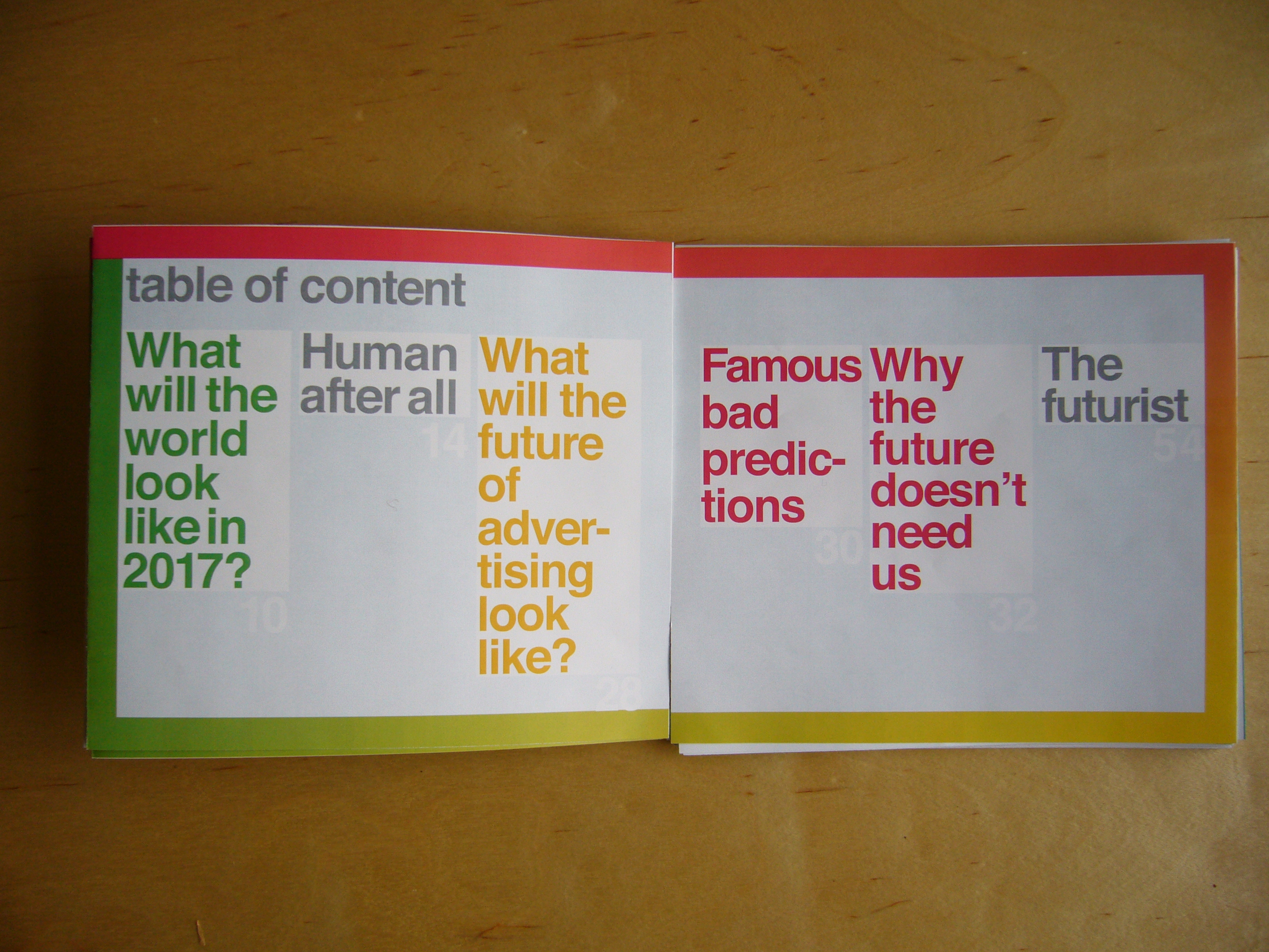
Above: Isaac Weeber’s book centered around sorting predictions about the future into three categories: plausible, possible, and impossible. These were color-coded and these colors showed up on the outer margins of all the content he chose to reproduce depending on his personal opinion.
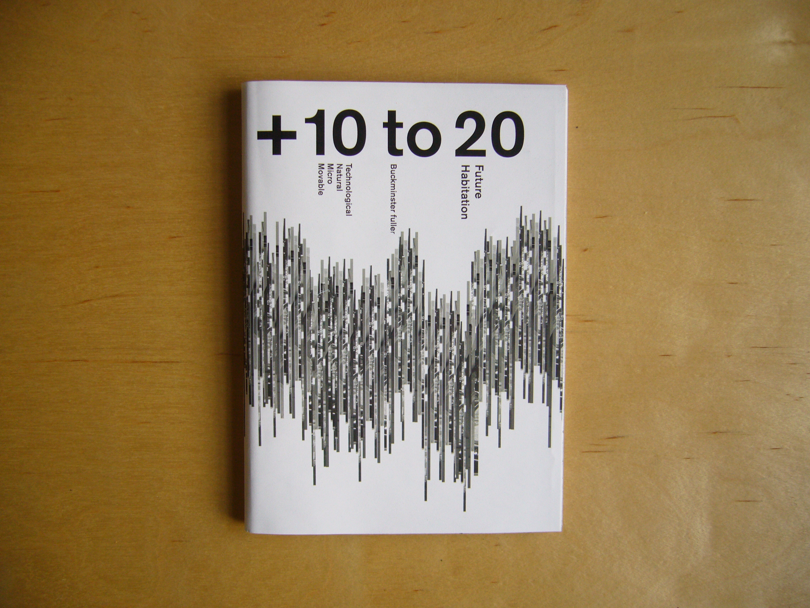
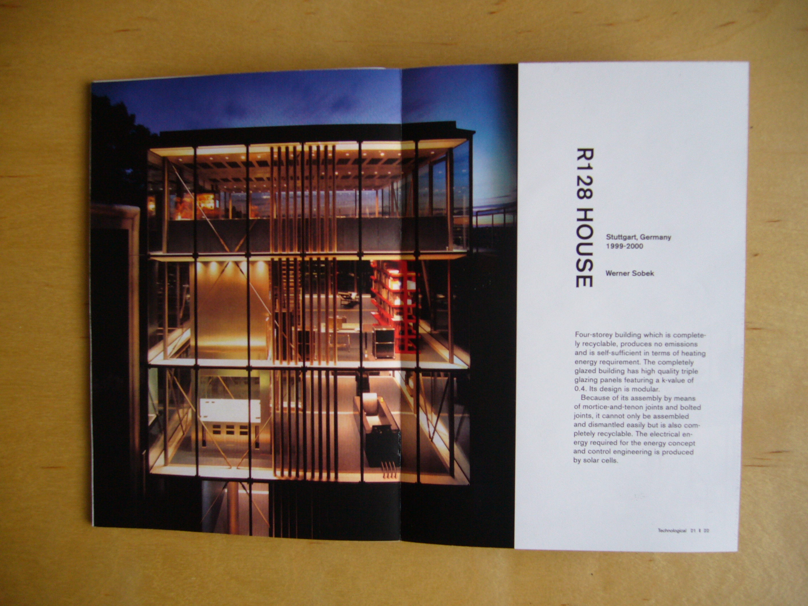
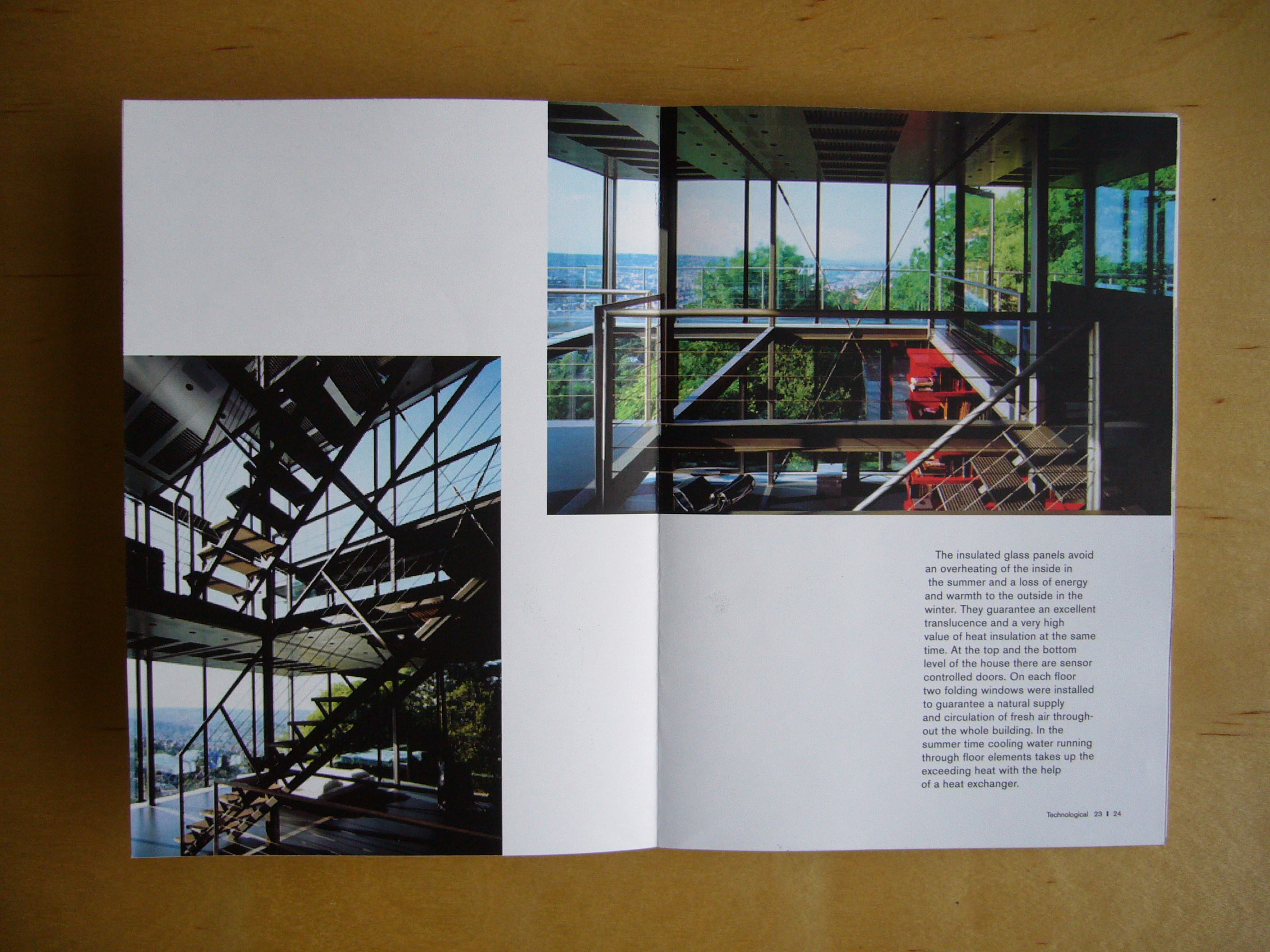
Above: Yu Chung Lim’s book was a catalog of existing experimental architecture projects that she felt pointed a way toward the future of building and urbanization.
Generate a book about the future. This future should not be hundreds of years away, however: I’m interested in what you think about the immediate future, within your own lifetime, no more than 10 to 20 years from now.
Some ideas on where to start:
Resources
http://www.massivechange.com/
http://www.ted.com/
http://www.poptech.org/
http://www.iftf.org/
http://www.wired.com/
http://www.longnow.org/
http://www.gbn.com/
http://www.kk.org/thetechnium/
Topics
Economies & work
Sensory perception & mapping
Imagemaking
Habitation & the environment
Politics, power & government
Religion & belief
Information, knowledge & computing
Biology, bioengineering & life science
Physics & the universe
Sociology & social organization
Prediction & legacy
Your book should be designed in A5 format. It may be color or black and white. It should be booklike in length, 60 pages or more, and it may begin by asking a question, picking a year, looking closely at an image, defining a topic, or some other technique.
It must include the following:
- A cover
- A table of contents
- A short statement written by you
- A sequenced set of images with captions and credits
- A collage
- A collection of quotes
- A list of words (nouns, adjectives, verbs, definitions, etc.)
- 3–5 supporting documents (articles/excerpts written by other people)
- Suggestions for further reading
-
Gather materials. Write a draft statement and print two copies. Print out images and tape captions to the back. Bring in quotes highlighted from their sources. Write lists. Print supporting documents. I will conduct desk crits this week so please bring things to work on as I make my way through the class. (Starts first week of class)
-
Continue gathering materials if necessary. Begin layout. Construct a grid and bring printouts showing the grid alone and the grid as used in several sample spreads. Using the edited materials you brought in last week, sequence as much of the book as you can, even if the design is very rough for now.
-
Finish layout and create a comp of the finished book along with flat spreads to share with the class for critique. Organize your materials as follows:
Images (all images in a folder along with image captions in a text file that correspond to image names)
Quotes.txt (all quotes in a text file)
Lists.txt (your lists in a text file)
Documents (your documents in a folder)
I will collate all these materials so everyone can copy or download them for later use.
Object of desire catalog
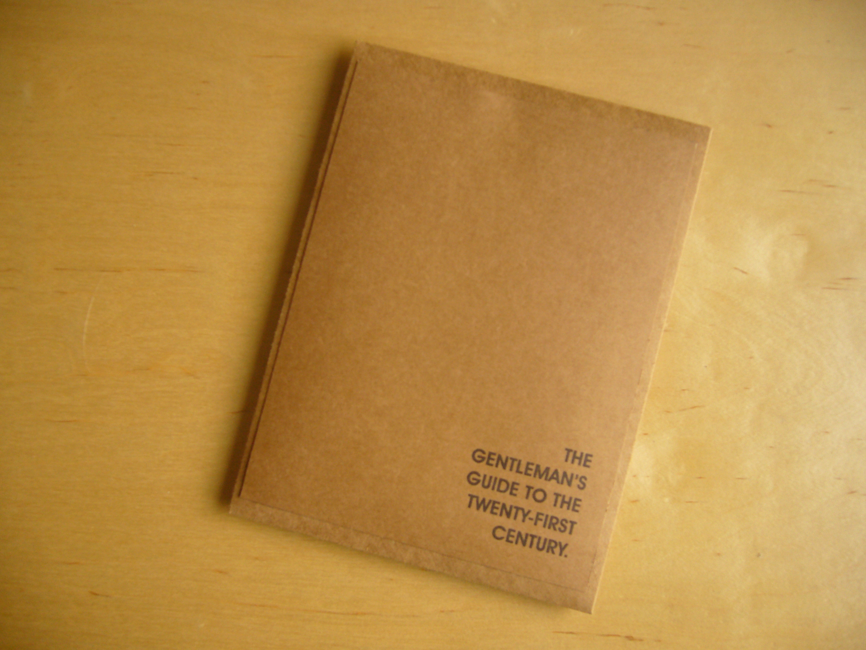
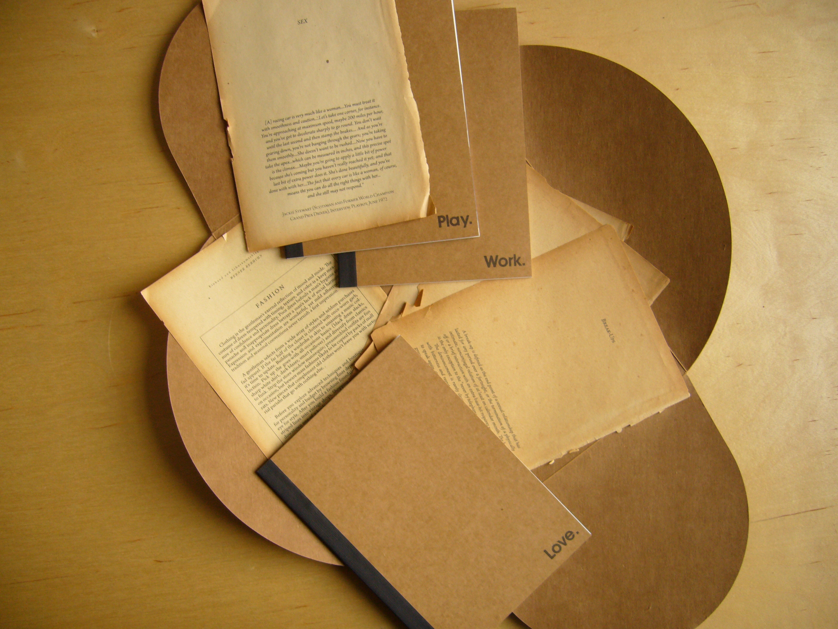
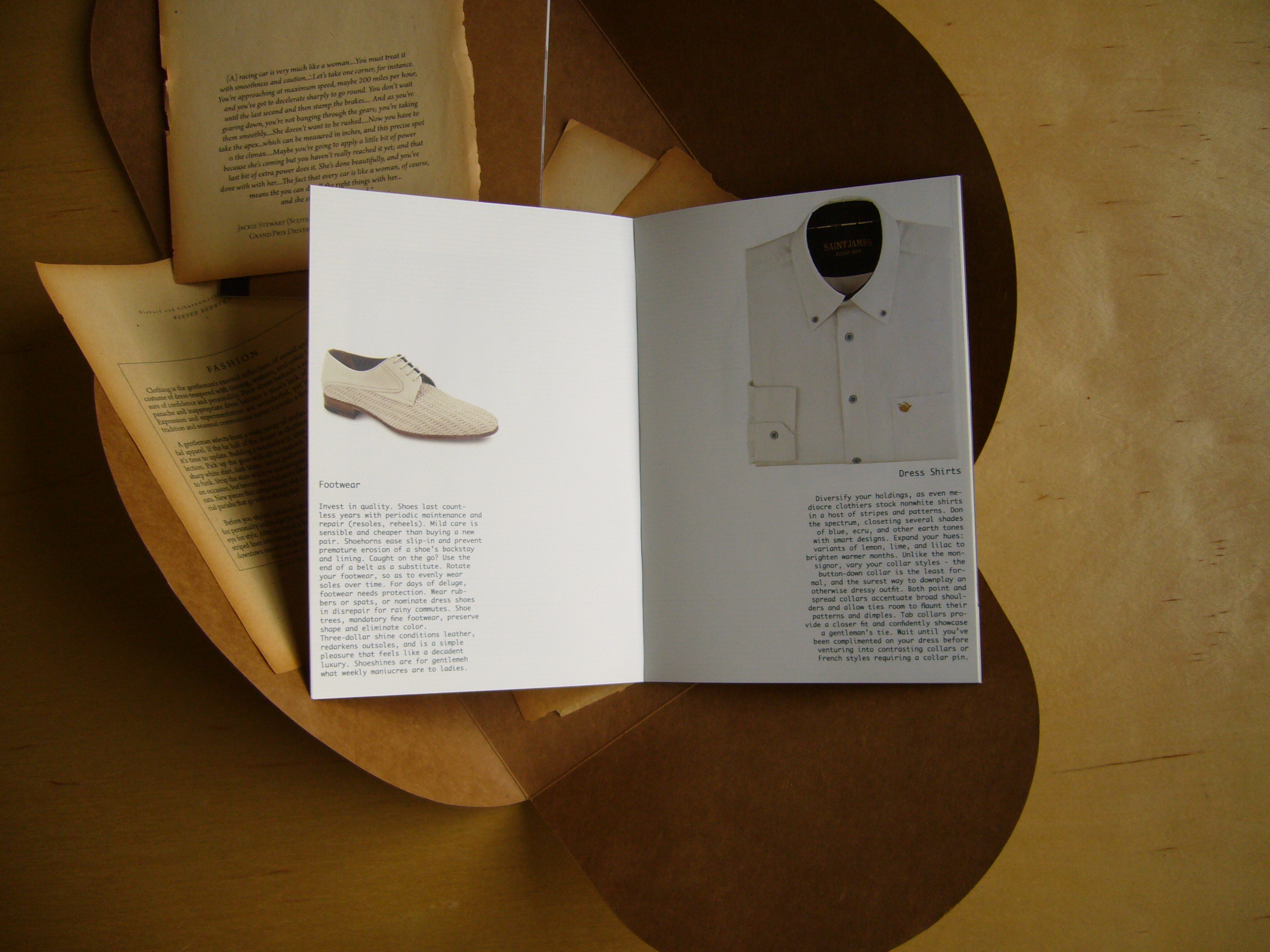
Above: Christopher Miller created “A Gentleman’s Guide to the 21st Century,” a buying guide divided into three booklets: work, play, and love. Inside, the guides mixed a kind of email informality with a nostalgia for the classicism of centuries past.
Create a product catalog for an object from the future. This should be an object that you will desire, but it may be anything from an overpriced luxury item to an essential tool for surviving 10 to 20 years from now. Use your imagination. The market for this product will be an important consideration. Your catalog should be largely image-driven and should use minimal text. It should pursuade, convince, and seduce us.
You may choose any format other than A5 for this project. Consider what is most appropriate for what you’re selling. It may be color or black and white, but should be no more than 24 pages in length including cover. It need not show the object of desire you’re marketing.
There is an additional requirement. The majority of the images and words in your catalog must be comprised of images, quotes, or lists developed by your fellow classmates for the “+ 10 to 20” project. You may add a few images and some new writing where necessary, but the best projects will make as much use of the existing class archive as possible.
-
Bring in a sketch of your catalog for critique. I will critique these sketches in small groups.
-
Bring in a bound, refined version of your catalog for critique. In addition, create a single- and double-page A4 versions of a magazine ad for your product.
Tomorrow today
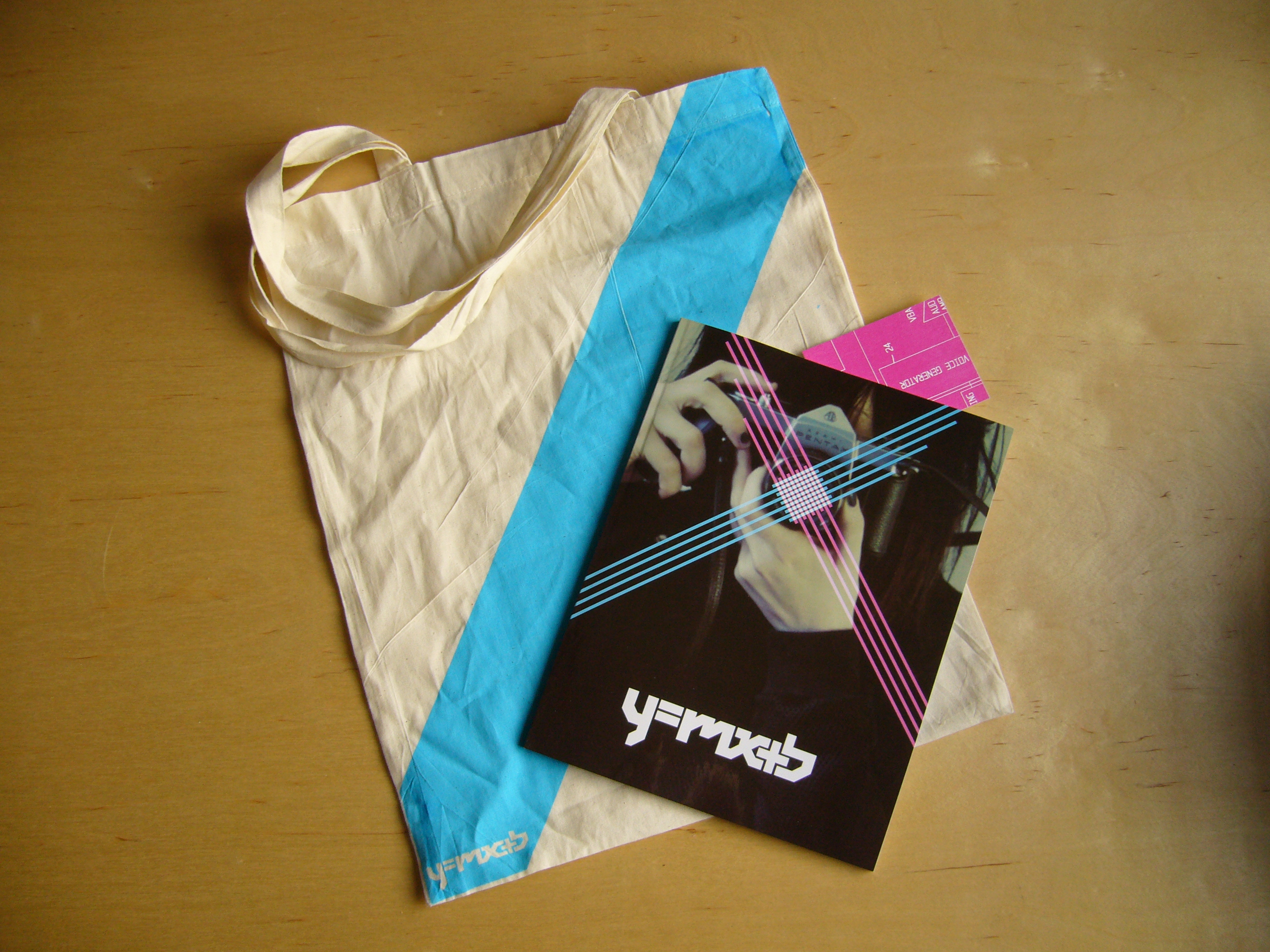
Above: y=mx+b magazine project. Custom tote bag designed and screenprinted by Yelena Avanesova.
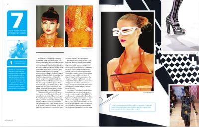
Above: A spread of Ryan Quigley’s well story, “The Future of Fashion,” from y=mx+b.
Using the research developed for the “+ 10 to 20” project, work together as a class to create a vibrant, compelling magazine about the future.
I will provide you with a grid and headline, body, and caption typefaces to use. (I offered Univers, Utopia, and Futura; the grid was the Case Da Abitare grid we studied in the first class. The format will be A4. The name and title design for the journal will be develped during the course of the project.
You will be split into three five-person groups: FOB, Well, and BOB. These groups will be responsible for the development, initial design, and final production of their sections.
-
A “lineup” is a list of what articles are appearing in a magazine, what they’re called, and who’s responsible for them. Each group should meet or email earlier in the week to come up with a list of articles they’d like to present in their section. If these sections include departments, they should be given slugs and structures as appropriate. In class, groups will be given an additional hour to meet and finalize their lineups before presenting to each other as a class. Groups should have first and second choices for stories in case there are conflicts. Lineups should be updated weekly and should eventually include slots for single- and double-page ads. Every group should also brainstorm names for the entire magazine and present their ten favorites. These lists will be posted to the class blog. On each group’s lineup, each article should be assigned a group member to manage it. This group member will handle the text editing, hed / dek / caption writing, photo editing, and page layout for their piece according to the grid provided.
-
Pages are presented in small groups by each group and those responsible for them. Multiple drafts and sketches of each page are encouraged. A title is chosen by class vote.
-
Pages are passed to another group for revision and refinement. FOB pages are passed to the Well group, the Well groups pages are passed to the BOB group, and the BOB group’s pages are passed to the FOB. These revisions are presented to the class.
-
Pages are again passed to another group for revision and refinement. FOB pages are passed to the BOB, Well pages are passed to the FOB, and BOB pages are passed to the Well. These revisions are presented to the class along with the prior two revisions and a final direction is selected.
-
Every member of the class presents 3 possible covers of their own design for review. Titles may be treated using “house” typefaces or custom lettering. Cover imagery is optional (type-only covers are also welcomed), and images may be drawn either from existing magazine content or new content that will be incorporated into the magazine the following week along with cover title treatment if desired.
-
Pages go back to their original managers for production, who will add crops, bleeds, standard colors, hi-res art, etc to their pages. Untrimmed color printouts of these final pages along with 25% scale “minis” will be brought to class. In addition, untrimmed color printouts and 25% scale “minis” of advertisements created during the “Object of desire catalog” project by each student will be brought in and collated into the magazine where ad pages have been held.
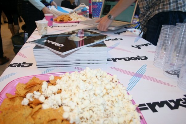
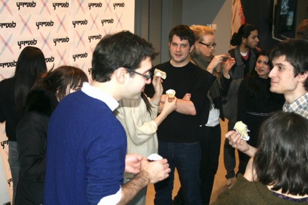
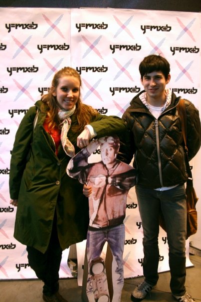
Above: Images from the y=mx+b Launch Party, including a few guests who paused with VIP Marty McFly to have their photos taken at the branded paparazzi wall.
Launch party: When the page order is finalized, students will work together to produce a launch party. Everyone should volunteer to take care of some aspect of the party: producing advance digital copies of the magazine, inviting people, posting to the blog about the project, taking photos at the party for the blog, making food / drinks to share with the class, decorating the classroom with blowups of the cover, etc.
Most importantly, several members of class should finalize the magazine into a PDF and printed version for my final review.