Fish Eye
Originally presented as a lecture at the Type Director’s Club, New York City, part of the “Type Salon” program on 21 April 2005.
Part 1

I want to begin, tonight, with where we are, a darkened room with a screen, and with the context of where we are, a slide lecture. This kind of gathering is not without a history, a set of expectations, and the first slide I’ve brought to share with you deals with that.
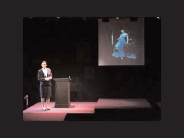
This is a photograph of the staging of a play called The Heidi Chronicles, by Wendy Wasserstein. It depicts an actor playing the woman we know as Heidi Holland, who is employed by Columbia University as an art historian. The prologue of the play finds Heidi in the midst of one of her slide lectures concerning three women artists that, while well respected in their time and by their societies, are virtually unknown today.
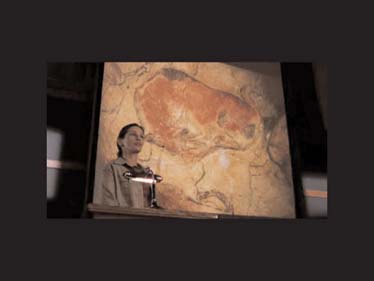
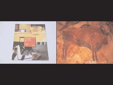
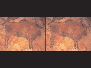
Here is a similar image, though much more recent. It shows Julia Roberts playing the art historian Katherine Ann Watson in the 2003 movie Mona Lisa Smile. Behind her is an image of a bison from the caves of Altamira in Spain. Created around 12,000 B.C., the markings on these cave walls are the oldest we have on record.
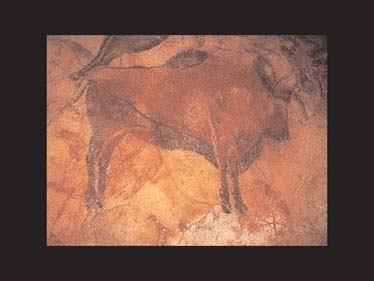
But part of what’s remarkable about Altamira is what’s not there: the caves showed no signs of soot. While the Paleolithic people whose designs are found at Altamira resembled other cave-dwelling tribes in a number of ways, none of these tribes made markings of this sort, and none, as far as archaeologists can tell, lived as deeply in their caves as the people that lived here lived in theirs. The absence of soot suggests two ways in which the people here might have been different. Some researchers believe that the tribesmen might’ve found phosphorescent chemicals or clean-burning materials to light their darkened caves. Others believe that the use of red zinc oxides in the coloration of the bison demonstrate that the people of Altamira had eyes that had not yet evolved to match those of their contemporaries.
Human beings could see the color red long before they could see the color blue. The early Egyptians probably did not see the lapis lazuli they used in their crafts the way we see it now. Newborns are blind to the color blue for the first six to eight weeks of life, and, like newborns, the blue-seeing rods and cones in the eyes of early humans were certainly the last to develop. Some anthropologists suggest that this emerging sense of the color blue is part of what drew our ancestors to be fascinated with the heavens.

Regardless, the red zinc oxide used in the caves of Altamira, perhaps on its own, or perhaps in conjunction with another form of light, would have glowed in the early-stage eyes of those who saw it, like light on a screen. A community gathered in the dark, reading its history on a glowing wall. We’ve gone a long way back in history to find ourselves here again. We’ll return to Altamira.
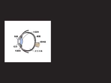
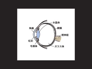
For now, let’s return to the human eye and to its evolution. The human eye is one of the most advanced mechanisms on earth, capable of taking in an enormous amount of information very quickly. The earliest “eyes” – if you can even call them that – were just light-sensing cells that helped early organisms to regulate their metabolic functions. Compound eyes, like those in insects, aggregate these light cells into a fine screen, resulting in an image that looks like the dots on a printed page. Eventually these cells evolved into rods and cones, capable of detecting color, which aids in flower recognition, which aids in pollination. As these cells increased in number, they moved to the back of a spherical chamber called a socket, and a lens evolved in the front of the socket to protect it and focus the light entering it. The light entering this eye is like the light entering a darkened cave, and some of the first animals to evolve this sort of structure were fish.
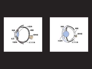
On the upper right is a fish eye, and, as you can see, it’s basically a lot like our own. There are two primary differences: the flatness of the front, for one; and the roundedness of the lens, for another. The lens of a fish eye, unlike our own, is solid and inflexible. So, while our lens can bend and adjust according to the amount of light our eye is taking in and the depth of the thing we’re trying to focus on, a fish’s eye cannot. Fish don’t need an eye with this degree of complexity. They exist in a limited-light environment (underwater) where, because of the properties of water, focusing is difficult. The purpose of a fish eye is to see as much as possible in as many different parts of a single environment at a given time, to maximize the amount viewed for safety’s sake, so that no one gets eaten without a decent head start.
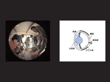
On the upper left is an image taken with a “fish eye” lens. It’s consistent with what a fish would see out of a single eye. The flatness of its cornea in front and roundness and inflexibility of its lens behind allows for a maximum viewing area, which is further increased by the way a fish’s eyes are positioned on its head.
This is a representation of what most of you are seeing right now. It’s created by your two eyes, mounted relatively close together, seeing slightly different images. Our brains use the minimal amount of difference between these two images to calculate depth. This is because, in a nonliquid world, there are lots of things to bump or fall into, and we wouldn’t want that.
This is more like how fish see. Mounted far apart, their eyes gaze out from the sides of their heads, like the opposing passenger windows in the front seat of a car with no windshield. Fish can’t see a small sliver directly ahead of them, but they can see a great deal more around them than we can. Where people have a viewing area of about 150 degrees, the viewing area of a fish is more like 270 degrees. Fish never see two similar versions of anything; they see two comparative versions of different things. They are constantly living a life of two images side by side that they cannot quite reconcile, but that are always related. This view, a fish-eye view, is a lot like the side-by-side slides on the screen behind me or the side-by-side pages in the spread of a book. The fish surveys a maximum area of the world in order to chart its path and relate its universe. Using this view as our guide, I’d like to see a particular moment in design’s history from the widest possible angle.
Part 2
That moment is in the early spring of 1997, when Emigre magazine published its 42nd issue. Emigre was initially launched in Sacramento, CA, by Rudy VanderLans (who was born in Holland) as a magazine to showcase the cultural contributions of émigrés like himself. But by issue 3, in late 1985, VanderLans had begun to experiment with his wife Zuzana Licko’s coarse-resolution typefaces, like this one.
The magazine continued to focus its efforts on design, and, with issue 10, produced in 1988, its transition into full-fledged design journal was complete. It will conclude publishing this summer with its 69th issue, and, in so doing, will join ranks with some of the most influential publications our profession has known. In 1995, the magazine shrank its size by half
and concentrated its efforts on charting the impact of graphic design and graphic designers on their culture, and vice versa. In the spring of 1997, where our story begins, it changed once more.
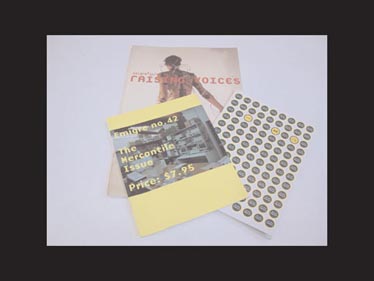
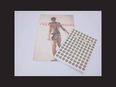
Emigre would now become a full-color glossy with full-page ads, and, with a circulation of 45,000 – 90 times that of its first issue – it would be given away free to subscribers and read by designers and nondesigners alike. In the spring of 1997, Emigre magazine had entered a new era. VanderLans dubbed the new issue “The Mercantile Issue.”
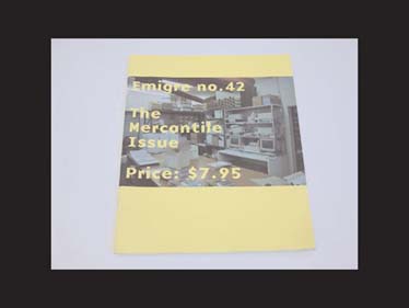
At last, the magazine could afford to showcase color photography, and VanderLans did not hesitate at the opportunity.
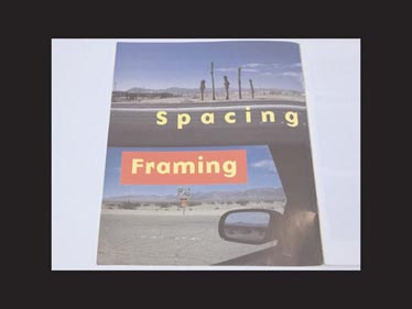
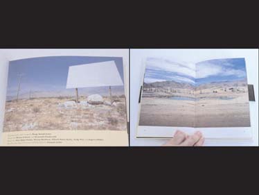
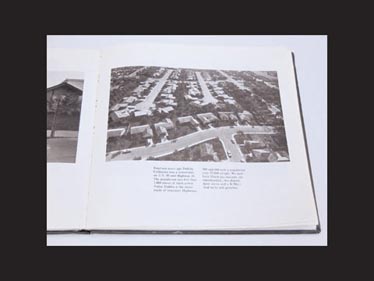
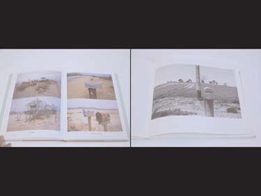
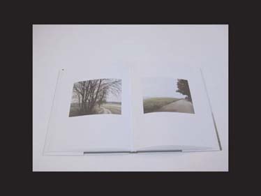
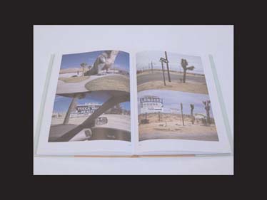
The inside front cover of Emigre 42 is split in half vertically, showing two 35mm color photographs top and bottom. On the top, a roadside median, and beyond, several Joshua trees along the road, equally spaced and of varying heights. The tracked-out yellow letters below read “spacing.” On the bottom, a landscape view out the driver’s-side window of a car, with a second landscape visible in the side-view mirror. Hovering above the mirror, a red box enclosing the yellow letters of the word “Framing.” On the opposite page, the first of Emigre’s new format, the credit reads, “This spread from the forthcoming book: More Principles of Typography by Emigre. Due out spring 2000.” The book never appeared. Instead, the photographs, which, though uncredited, must be VanderLans’s own, became part of a much larger project, running at least the duration of the next 20 issues and spanning at least five books that blend VanderLans’s photography with thoughts on the nature of design, writing, and music.
Before the books began appearing, though, there was a germination process in the magazine that is evident in hindsight. First an important shift in tone – Emigre 43’s title, “Designers are people too,”
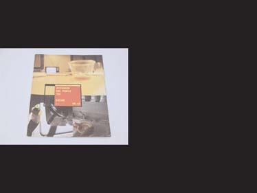
immediately put the magazine’s goals on a broader footing. The cover features three quotidian color photos of a TV from the dinner table, dirty dishes, washing up.
Again, on the inside front cover,
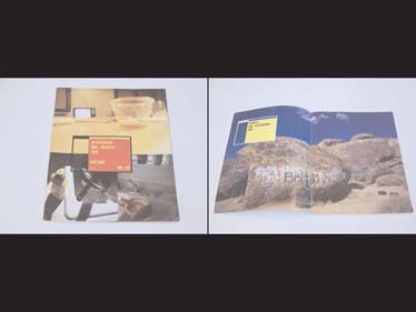
one of VanderLans’s 35mm landscapes looms large: this one, full bleed, depicts a cluster of desert rocks on which a great number of names have been tagged. They resemble the markings on the caves of Altamira. The letters above read, “People are designers too.” This pair of statements introduces a central theme in the work to come: designing is an intrinsic part of human life dating back to the caves of Altamira.
Likewise, the vocation of the designer is an expression of humanity, just as art, music, and writing are. People, from our earliest ancestors, have a will to name, to write, to print, to organize, just as designers do.
And designers need to rinse the dishes, just as people do. The activities are parts of a whole, needlessly separated, in need of joining.

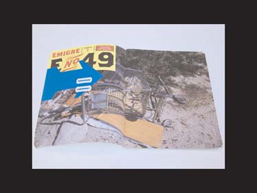
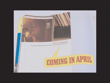
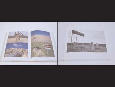
In Emigre 49, “Everything is for sale,” the collection of overturned grocery carts in desert brush, left by pranksters and vagabonds, suggests exasperation at the activities of shopping and moving while, at the same time, typifying them. In this issue, a book called Palm Desert is advertised for the first time, although a real taste of its content is only teasingly evoked.
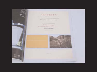
By Emigre 50, the experimentation had reached a new level. The title page

informs us, misleadingly, that VanderLans’s article is “A Type Specimen,” for “A New Series of Venetian Old-Style Printing Types Designed by John Downer.” In fact, the article is a challenge both to the notion of “specimen-ness” and “old-style-ness,” taking two ideas native to typography and giving them a more original, broader metaphorical context.
A “specimen,” of course, is what we call the showing of a typeface in use, generally in a commercial context, but a “specimen” is also a scientific term that describes something that represents a whole. The meaning here is ambiguous: yes, VanderLans is showing the typeface, but isn’t he also showing the desert?
The article includes a list of “Birds, Mammals, and Reptiles,” just as a field guide would, but it also includes a series of photographic grids documenting sprinkler heads, landscape lighting, and outdoor electrical switch-boxes.
Like Downer’s typeface Vendetta, we’re forced to ask the question: what do we have here? Is this an update or a regression? Beyond its form, what makes Downer’s typeface native to Venetian Renaissance printing?
And beyond its subject matter, what makes VanderLans’s photography native to the landscape of places like Venice, CA?
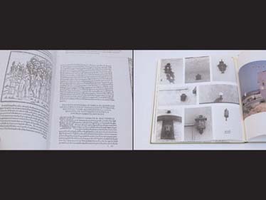
(On the upper right is a grid of porch lights published as part of a study on the town of Venice, CA, by architecture students in 1977.)
Matters are only complicated when we learn the running text for the “specimen,” first published in 1920, is an old text for a new landscape. Clearly things have changed, and yet it all feels so chillingly apt. The question is one of evolution versus invasion – has the landscape evolved into its current self, or has it been invaded by forces external to it? It is a question for émigrés.
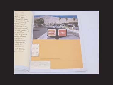
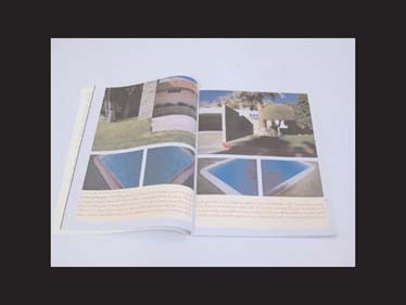
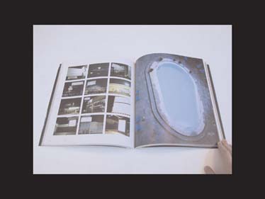
A Burger King drive-thru directional rises in the frame, but a table shows that average yearly rainfall has remained relatively consistent from year to year. VanderLans includes the government’s water analysis against images of a sprinkler and a tangled hose, along with lists for the Latin and Spanish names of trees growing in front of strip-mall signage. Then: we see photos of the ranch home, the last-gasp vista of the golf course, and the iconic Southern California swimming pool, home to fish of a human sort, a place we observe many times through many other eyes.
Part 3
Artist Doug Aitken tips the swimming pool on its side, throwing our equilibrium off like we’ve got water in our ears. Seen this way, the pool evokes the form of the numeral zero. Across from it, in this book, are a grid of billboards, and all of these billboards are blank. Let’s use Aitken’s structure – signs on the left, pools on the right – as we continue.
Here is Richard Misrach from his book Desert Cantos looking at a flooded Texaco sign and an emptied municipal pool.
Here is Stephen Shore looking at a billboard that duplicates the landscape and a swimming pool that interrupts it.
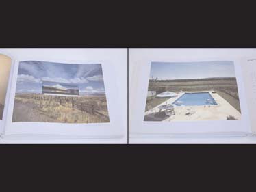
And moving back in time further still, here is Ed Ruscha, perhaps the quintessential California artist of the ’60s, looking at the sign outside an apartment building for his book Some Los Angeles Apartments (above left) and two of the pools in his book Nine Swimming Pools (above right). The great thing about Ruscha’s books is the way they work in opposition. By taking pools and signs as their subjects, for example, they seem to suggest they have an importance worth noting. But by ceaselessly reproducing them with banal, formatted images, he seems to remove their importance as quickly as he notes it.
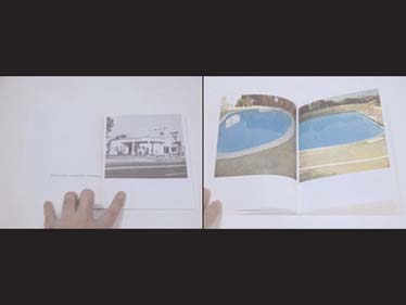
Another blank billboard (above left) and a man-made reservoir (above right) bring us full circle, back to VanderLans. These are pages from his first book, Palm Desert, which appeared in spring of 1999. The title, he writes in his introduction, comes from a song by Van Dyke Parks on the 1968 album Song Cycle and for the town of Palm Desert, which the song and the book attempt to document.
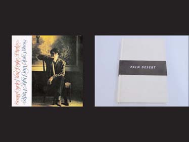
So the title is a simultaneous allusion to a representation of place and to the place itself. VanderLans writes, “I’ve always been intrigued by the idea of place, and in particular those places immortalized in song lyrics as they become infused with new meaning.” The good vibrations of a name is something to keep in mind.

The book, naturally enough, is both a kind of field guide to the town’s natural features and a Hollywood Homes tour in book form, as VanderLans retraces many of Parks’s steps during the time he lived in Palm Desert, preceding Song Cycle’s release. This idea of the “field trip” – and its relationship to the “field guide” – is something else to keep in mind.

VanderLans depicts a field guide in Palm Desert itself.

What prompts VanderLans’s trip, though, is not simply to haunt Parks’s old home; no, what prompts it is the hope of finding inspiration through mutual understanding. VanderLans writes, “Parks, who hails from the South, often reflects upon California with the keen eye of an outsider. Being an immigrant to California myself, it is easy for me to relate to Parks’s love for the mythological California landscape….” So, a last thing to keep in mind: the émigré’s migration.
The next two books in the Palm Desert trilogy follow like variations on a theme. Cucamonga takes its name from Rancho Cucamonga, a township close to where Don Van Vliet (a.k.a. Captain Beefheart) recorded Trout Mask Replica in 1969, the album to which the book is dedicated.
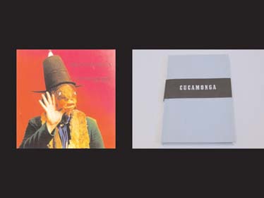
Again, the vibration of a name: “Whenever I see the name ‘Cucamonga,’ for instance, I think of Frank Zappa and Don Van Vliet… Zappa because he had a studio there and wrote a song called ‘Cucamonga,’ and Van Vliet because it sounds like one of those nicknames he would assign to The Magic Band members.” Again, the union of a “field trip” and “field guide,” here are even more explicit: “I remember as a kid in Holland going on field trips visiting the houses of Rembrandt and other historical figures…. Rembrandt’s house,
[which is] nearly 400 years old, is hardly different from hundreds of other old homes throughout Amsterdam.” In the same breath, the house, like Ruscha’s subjects, is both notable and banal.
And, once again, VanderLans discusses the émigré’s migration: “Gauguin moved to Tahiti, Van Gogh to Southern France, Pollock to New York, Byron to Italy. These are exotic places, conducive to getting the creative juices flowing.” But, whereas Parks was an émigré to Southern California, Beefheart was not. VanderLans closes his introduction by naming Southern California “Beefheart Country.”
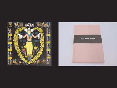
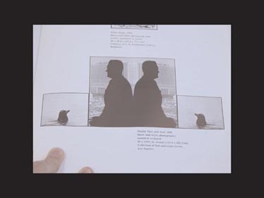
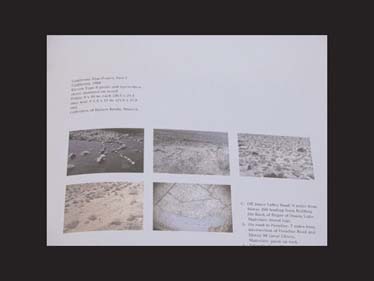
The third and final book, Joshua Tree, returns to an émigré as its subject – Gram Parsons, who joined the Byrds in 1968 to produce the album Sweetheart of the Rodeo – but it is darker and more reflective in tone. The book is named both for the tree whose shape the Mormons compared to the outstretched arms of the prophet Joshua, and for the town where Parsons died tragically at age 26. Once again, VanderLans originates his book in the power of a name, and, again, the field trip to match up place with name spawns a field guide, evoked even more strongly here by the use of animal silhouettes like those from Massimo Vignelli’s Audubon Society field guides from the mid-’70s.
More recently, silhouettes of the field guide sort show up in the work of Mark Dion, an artist whose work frequently confronts issues of cataloging the natural world.
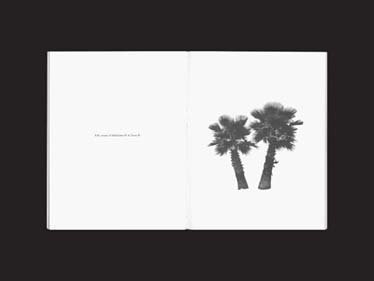
These silhouettes crop up far earlier in the work of Ed Ruscha, who was, like Parsons and VanderLans, also an émigré, and, like VanderLans, a maker of books. Ruscha’s book A Few Palm Trees uses silhouetting to show a few typical palm trees from Southern California.
John Baldessari, another quintessential California conceptual artist who was making work around the same time as Ruscha, used silhouettes to great graphic effect in his paintings and found photographs.
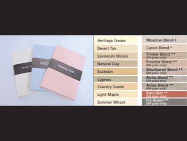
The sandy, sorbet-colored bindings of the three books in VanderLans’s Palm Desert series may well derive from Baldessari’s early “message” paintings, executed with the help of a sign painter,
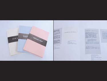
and the colors of these message paintings may well derive from prefab ranch-home siding colors.
Like VanderLans’s projects, many of Baldessari’s and Ruscha’s projects take the form of “capers” that blur the boundaries of performance, tour, and quest. Ruscha’s book Royal Road Test,
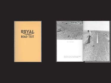
for example, documents the throwing of a Royal typewriter out the window of Ruscha’s car. Executed with the musician Mason Williams, (a.k.a. The Thrower), the project is similar in tone to Baldessari’s California Map Project: Part I,
also executed with a musician friend, in which the letters of the word “CALIFORNIA” are placed to scale in the state of California to correspond to their actual positions on a AAA state map. Both projects poke fun rather directly at a well-known typographic dilemma, namely, that language is easier to represent than the world itself.
Running past the site of Joshua Tree and through VanderLans’s introduction is Pearblossom Highway, the road whose name appears in David Hockney’s greatest photocollage.
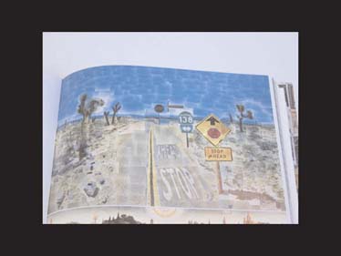
As Hockney shot tile after 35mm tile of his mosaiclike construction, he moved back and forth through space, just enough to produce a Cubistic sense of dislocation. In so doing, Hockney shows us that while the place may be realistically depicted, the camera may make it even more impossible to know the place at all.
Not only is this the great lesson of California, the Entertainment Capital of the World, a place where place is faked on an everyday basis, but it is also the great lesson of technology, of the man-made, which blesses and curses our perception of the natural world. In Joshua Tree, VanderLans uses Hockney’s back-and-forth technique to produce two images of a hill
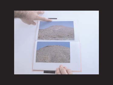
that are nearly identical, save for a few paces. But the hill is not the same. As I leafed through this book and experienced this effect, I thought of Wallace Stevens’s “Anecdote of the Jar,” a great parable of the relationship between the natural and the man-made.
I placed a jar in Tennessee
And round it was, upon a hill.
It made the slovenly wilderness
Surround that hill.
The wilderness rose up to it,
And sprawled around, no longer wild.
The jar was round upon the ground
And tall and of a port in air.
It took dominion everywhere.
The jar was gray and bare.
It did not give of bird or bush,
Like nothing else in Tennessee.
Stevens’s tale is a cautionary one: the man-made, though perhaps not as beautiful, will take root because of its promise of perfection. VanderLans sees this too: he observes the strip malls and housing developments that make up the contemporary sprawl along the freeways of Los Angeles and beyond. At the end of his life, Stevens would write of “The palm at the end of the mind,” a mental journey to a kind of paradise in which “The palm stands at the edge of space,” merely “being.” The palm – for Stevens and historically – is a great symbol of redemption, renewal, and return.
Part 4
Returning to the introduction of Joshua Tree – VanderLans writes, “It is an archetypically American experience to drive through the desert…. Like many artists who helped define and shape the cultural image of California, Gram Parsons was not originally from there.” The question that hovers above these statements, all the time, is deceptively simple: where was he from? The search for origins – a human drive as ancient as Altamira – informs not only VanderLans’s quest to know his rock heroes, but also, as all art does, the quest to know himself. Specifically, to know himself as a designer and photographer and as an émigré to California, and it is this quest, I think, that motivates his fourth and largest book, Supermarket.
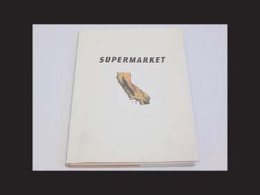
The title, unlike those of the Palm Desert trilogy, is not explained, but ripe for conjecture. How is the desert of California like a supermarket? Is it a site for an essential form of buying? A warehouse of multiples grouped together? A clearing-house? A life source? In flux? The answer is yes, and then some. The word gives a colored context and the suggestion of a great range of concerns and influences. Steering your way through Supermarket, this fact becomes clearer. It is like a viewbook of both California and the history of photography.
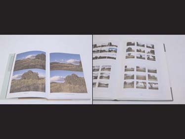
On pages 14–15, we zoom past a grid of landscapes like those from Gerhard Richter’s monumental study, Atlas.
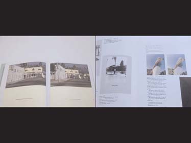
The game of hiding the Hollywood sign behind a thrift store building on pages 36–37 quotes Baldessari’s “Wrong” and “Alignment” series in the late ’60s.
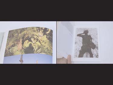
The photograph of VanderLans’s shadow on page 44 casts back to Lee Friedlander’s Self Portraits book, quoting his opening photograph from Canyon de Chelly almost directly. It also reminds us of the silhouettes we’ve seen before.
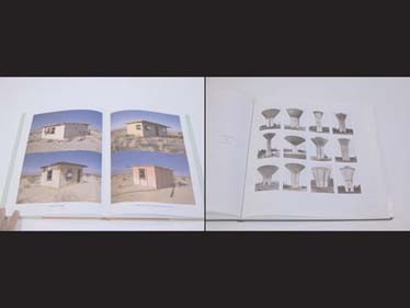
On pages 84–85, the desert dwellings are like a set of overlooked typologies from Bernd and Hilla Becher.
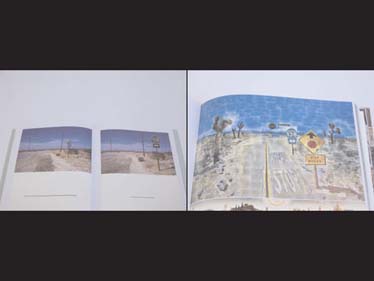
The photographs on pages 132–133 literally re-create Hockney’s famous “Pearblossom Highway” on site. VanderLans is haunting his masters’ haunts and attempting to find himself as a photographer in California. He’s looking for location. He writes, early on, “And when I look into the viewfinder all I see are Ruscha and Baltz and Baldessari and Hockney” – all of whom, save for Baltz, we’ve heard from before.
Baltz is as important, however. Part of the movement christened by the critic William Jenkins in 1975 as New Topographics, Baltz’s famous book, The New Industrial Parks Near Irvine, California, surveyed much of the same area as VanderLans in much the same way and to many of the same ends.
Also in this camp are others on VanderLans’s list, including Robert Adams, Henry Wessel, Joe Deal, and Bill Owens. Owens, born in San Jose, published Suburbia, his seminal work, in 1972. It was a book of short text interviews and photographs of residents in the new suburbs built in Southern California during the preceding decade.
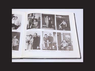
In looking through Surburbia, it seems many of Owens’s photographs glance downhill at real-estate developments taking shape below.

In so doing, Owens’s process of gazing down mines the specific relationship between the words “typology,”

or the systematic classification of types that have traits in common;

“topography,” or the surface features of a place, region, or object showing the relationships among its components;
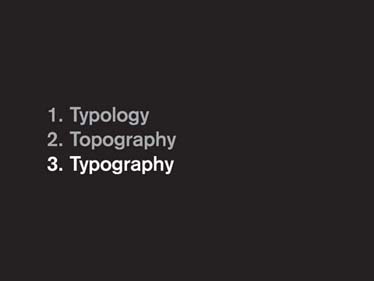
and “typography,” or the arrangement and appearance of letters to form words on a page. The page is a topographic view. Its letters are typologies. They are mapped by typography. Owens’s view, I could argue, is a designer’s view.
But people are designers, too, and the ownership of that viewpoint is no more reserved for a designer than it is for a photographer or a writer. What Owens and VanderLans have aimed to describe about the landscape of Southern California is also observed by Thomas Pynchon.
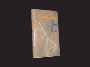
The first-edition cover of his 1965 book The Crying of Lot 49 reminds me of the markings from Altamira. Pynchon’s story begins with his character Oedipa Maas – named for the original origin-hunter, Oedipus – peering down a hillside. Keep in mind that Pynchon’s dad, Thomas Pynchon, Sr., was an industrial surveyor on Glen Cove, Long Island. By the time Pynchon, Jr. was writing Lot 49, however, he had emigrated to California, where Ed Ruscha had just completed his first book, Twentysix Gasoline Stations. As if gazing at another of Owens’s Suburbia photographs, Pynchon’s startling voice-over begins,
San Narciso lay further south, near L.A. Like many named places in California it was less an identifiable city than a grouping of concepts: census tracts, special purpose bond-issue districts, shopping nuclei, all overlaid with access roads to its own freeway. [… Oedipa] looked down a slope, needing to squint for the sunlight, onto a vast sprawl of houses which had grown up all together, like a well-tended crop, from the dull brown earth; and she thought of the time she’d opened a transistor radio to replace a battery and seen her first printed circuit. The ordered swirl of houses and streets, from this high angle, sprang at her now with the same unexpected, astonishing clarity as the circuit card had. Though she knew even less about radios than about Southern Californians, there were to both outward patterns a hieroglyphic sense of concealed meaning, of an intent to communicate.
From this alta mira, this high view, the world appears as flat to Oedipa as a printed page, and the forms that fill the sandy desert earth arrange themselves like bits of printed language, as type. In Pynchon’s description we find clues upon clues to unlock the photographs VanderLans makes and those he cites. Ways of looking according to number and multiplicity, according to value, according to movement. Metaphors for the “man-altered landscape” as agriculture, as technology, and as hieroglyphics, writing of the highest realm, seen here from the great objective perspective of above.
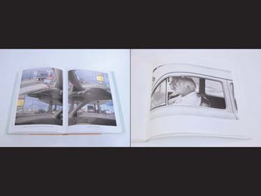
VanderLans continues his list of influence with Robert Frank. Born in Switzerland, Frank traveled throughout America producing a body of 35mm photographs that form the spiritual foundation to VanderLans’s work and perhaps the earliest evidence of a sea change in the history of photography in the United States. The Americans, a book that is a great deal more than the sum of its very beautiful parts, documents – as Supermarket does – signs,
mailboxes,
and views of the car and the highway.
The Americans is introduced by that great poet-émigré to California, Jack Kerouac. The image of the jukebox, of mediated music, runs throughout Frank’s book as it runs through VanderLans’s, as it runs through Pynchon’s. The radio is sonic typography, sound broken into bits, beamed, and recombined to communicate to us in our cars and homes.
VanderLans’s list goes on. He cites Walker Evans and Dorothea Lange, whose work for the WPA was an early template for Robert Frank. He cites Edward Weston, whose meditations on form and objects in the American Southwest are inescapable here. And he goes further back to the dawn of photography in America, citing William Henry Jackson and Timothy O’Sullivan, both of whom worked in the landscape of California. To this already extensive list, I would add Karl Blossfeldt,
whose typological work with plants informed the Bechers’ later work with architecture; Andreas Gursky, trained by the Bechers, and in whom we can see typologies as well, as in this Prada display of shoes;
Thomas Struth, also trained by the Bechers in Düsseldorf, with landscape studies similar to Richter’s;
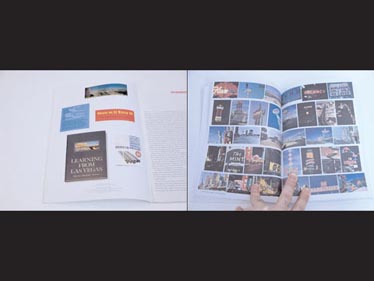
and Stephen Izenour, who took many of the photographs in Robert Venturi and Denise Scott-Brown’s seminal book, Learning from Las Vegas, which is shown on the inside cover of Emigre 52.
VanderLans’s most recent books, Bagdad, California and Pages from an Imaginary Book, are similar in content – both are, once again, about the Mojave Desert – but they begin to lead VanderLans down a different route in terms of their form. Bagdad, California begins, like Palm Desert, with the attempt to reconcile the name of a place with the place itself.
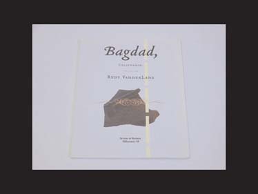
In this case, it is the charged name “Bagdad,” in opposition to a photograph that appeared in a book of landscape photography VanderLans had seen 12 years earlier.
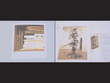
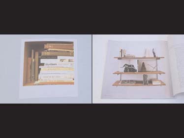
In addition to his photographs of “a nonplace like Bagdad,” VanderLans includes a photograph of influential books (above left), as Mark Dion often does in his artworks (above right).
The young artist Carol Bove, currently featured in Greater New York at P.S.1, uses this technique as well, specifically about books from the ’60s.
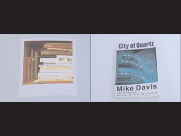
One of the books on VanderLans’s bookshelf is City of Quartz, by Mike Davis, which is, in very broad strokes, about the history of the city of Los Angeles. Listen to some of the first two paragraphs:
The best place to view Los Angeles of the next millennium is from the ruins of its alternative future. Standing on the sturdy cobblestone foundations of the General Assembly Hall of the Socialist city of Llano del Rio […] you can sometimes watch the Space Shuttle in its elegant final descent towards Rogers Dry Lake. Dimly on the horizon are the giant sheds of Air Force Plant 42 where Stealth Bombers (each costing the equivalent of 10,000 public housing units) […] are assembled. Closer at hand, across a few miles of creosote and burro bush, and the occasional grove of that astonishing yucca, the Joshua tree, is the advance guard of approaching suburbia, tract homes on point.
The desert around Llano has been prepared like a virgin bride for its eventual union with the Metropolis: hundreds of square miles of vacant space engridded to accept the future millions. […] Nuptial music is provided by the daily commotion of ten thousand vehicles hurtling past Llano on “Pearblossom Highway” – the deadliest stretch of two-lane blacktop in California.
In his cursory description of the desert, Davis catapults us into the stratosphere for the highest possible view, equates the price of that view with the price of dwelling in the desert, outlines the viral properties of the dwellings themselves, and reminds us about the roads that link them.
VanderLans also includes bits of scrap metal from along the roadside in Baghdad. One of the bits, shaped like the letter E, has been anthologized before by fellow Dutch designer Karel Martens, shown at the right, and by Paul Elliman in his Bits typeface.
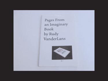
Pages from an Imaginary Book takes VanderLans down a more conceptual path. With a layout similar to City of Quartz,
Pages pairs laser-printed images of desert locales with their quirky names and a note from VanderLans about the form the book was to take. It is a concept, a scavenger hunt, an atlas, a poem, and an oasis, and the book illustrates that VanderLans’s work, like the name of his magazine, has strived to develop a conceptual framework around the émigré in all its varied forms.
Born in Holland, VanderLans is an émigré to America and to California. The landscape he finds there and heroes that landscape has attracted are émigrés too. All of this would be interesting in itself, but VanderLans resists it. Instead, the California he envisions, however foreign it might be, is made native by the creative act of his representation of it. It is his California. The state he is searching for is the one he inhabits. It is the palm at the end of the mind. California takes its name from an imaginary land described in a Spanish novel from the 1500s. It is an imaginary place and a place for the imagination, named in a real book and found again in VanderLans’s imaginary one. We’re all California dreamin’.
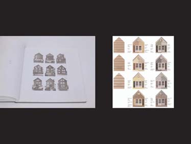
30 years before Emigre 42, the artist Dan Graham published “Homes for America” in Arts magazine and changed ideas about the presentation and context of art. The project sought to rationalize the system of housing developments that was just then taking hold in the gridded form of a popular magazine layout.
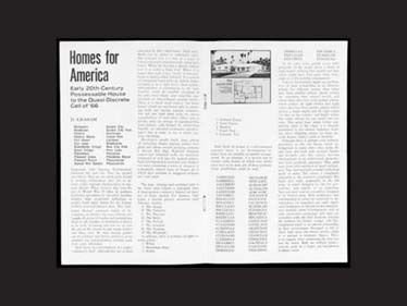
You can find grids of housing façades in the Bechers (below left) and in siding catalogs (below right), but, in the case of Graham’s project, as one critic notes, “the image of the suburban home, serialized like so many Minimalist cubes in space, finds its graphic displacement on a page layout, itself intended to be serialized in the form of a magazine.”
Graham’s project, explained as such, touches not only VanderLans’s photographic project, but the entire project of graphic design. By stirring conceptual art and photographic presentation in with design practice, Graham has made a whole new list of sources available. We may see his contribution arising not solely from Ed Ruscha or the New Topographics, but from Jan Tschichold,
Josef Müller-Brockmann,
Emil Ruder,
Karl Gerstner,
and Armin Hoffman,
to name just a few. By operating in a fine-art context as a commercial graphic designer, VanderLans has become the functional mirror image of Graham, expanding his émigré status to an additional level: his vocation. He is an interloper, a fish out of water. With a fish-eye view, he is not content to be native, as he is not content to be foreign.
Part 5
As soon as we’ve realized this, we turn around and see a trail of fish behind us. Fish in John Baldessari’s work,
fish in Mark Dion’s work,
piling up,
and, on page 101 of Supermarket, the name of a fish that’s the name of a town that I’d heard of before.
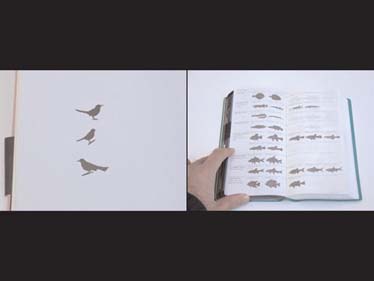
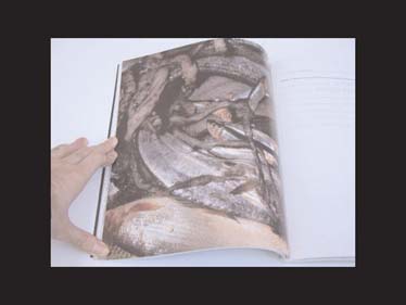
The town of Cabezon, CA, takes its name from this fish,
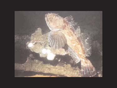
which inhabits the reefs in the nearby Pacific. It is entry 420 in the National Audobon Society Field Guide to North American Fishes, Whales & Dolphins, which notes that its eggs are poisonous to humans if eaten. Cabezon the town is notable for its Dinosaur diner – Cabezon fish, like dinosaurs, date back to prehistoric times – and the diner
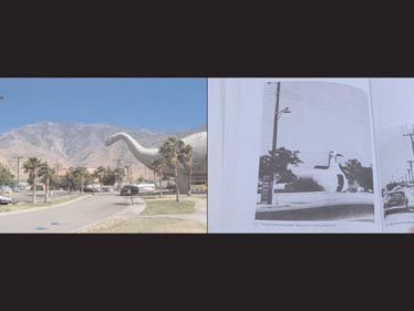
is a regular roadside attraction complete with a “life-size” dino (above left), like the diner animals Steven Izenour found on his treks for Learning from Las Vegas (above right).
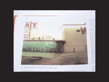
Richard Misrach snapped a photo of the murals that adorn the side of the diner for Desert Cantos.
In Supermarket, VanderLans gives us only the dinosaur’s giant feet.

The first time I’d ever heard the word “cabezon” was in Robert Hass’s first book of poetry, a slim volume called Field Guide, for which he won the Yale Younger Poets Prize in 1973.
Hass, like VanderLans and I, is interested in the aura of names. He writes in his introduction to Field Guide of “weird Spanish names for shopping centers contrived by people who knew no Spanish and had no sense either of the place or of its physical life” and explains that “the California landscape shows up so much in these poems because… I had, for whatever reasons, a passion for natural history, but also because it was a place for me where language did not belong altogether to desire, to human intention.” In our travels through VanderLans’s landscape of influence, we have seen this viewpoint expressed before, though never quite so elegantly.
We find the cabezon, or, in Italian, cabezone, in the first poem in the collection. Hass calls it “an ugly atavistic fish / as old as the coast shelf it feeds upon.” The fish is ancient, essential, and out of place today. Later in the poem, it’s caught. Hass writes,
But it’s strange to kill
for the sudden feel of life
The danger is
to moralize
the strangeness.
We seek our origins and we are of our origins. They originate us. What they do not do is offer a lesson. The act of living is not a story but a process, of which dying is a part, a process of aggregating experiences, of forming connections between things and places and ideas that gain in force as we form them.
The origins of design, art, and language itself are shared origins that we can trace back to caves in Altamira, Spain, only several miles from another Cabezon: the tourist respite known as Cabezon de la Sal, nestled on the northern coast. The more signs you look for, the more signs you will find. They are everywhere, teeming, and we struggle just to reel them in.
Today, the video game Katamari Damacy embraces this nonobjective model of making meaning. As you roll a sticky ball through the countryside, you are able to attract greater and greater-size things based on how many things you’ve already managed to attract. The game has no moral: a player simply must grow through the process of interacting with his surroundings, thereby connecting those things to himself and to one another through the interaction.
The danger is
to moralize
the strangeness.
This is our struggle, both as fish and as fishermen, captives of our chosen countrysides and capturers of it, and we struggle, as Hass does, to see things as they are. We have been struggling with this for centuries. But, in the end, things are what they are, and we are who we are, because of the act of looking itself. In what we’ve seen tonight, we’ve learned that a fish’s eyes look wider. I want to suggest to all of you now that our life as designers (and people too) depends on growth: by seeing more in what we know, by seeing more of what we don’t, and by always looking for connections between the two. We will transform ourselves in this process of working.
In his final moment with the cabezon, Hass is transformed in this way. He writes,
Holding the spiny monster in my hands
his bulging purple eyes
were eyes and the sun was
almost tangent to the planet
on our uneasy coast.
Creature and creature,
we stared down centuries.