The DC Spin
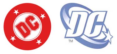
The design community erupted earlier this May when DC Comics unveiled its new logo, informally titled the DC “Spin.” Designed by Josh Beatman of Brainchild Studio in New York, it replaces the 30-year-old “DC Bullet,” designed by the legendary Milton Glaser, who is probably best known for his “I ♥︎ NY” logo, now omnipresent in the Big Apple.
Why the hullaballoo? Well, as DC, which is a Warner Bros. Entertainment Company, speeds into the vertically integrated world of tomorrow, its considerable array of characters must perform in not just the pulpy rags of its past but the movies, TV, merchandising, and games of today.
When designers start on an identity project, there is often something called a “creative brief,” which outlines what the company needs from the new design. It appears from reading DC’s various public statements about their motivations that the brief in this case is a reactive one: The folks at DC wanted a logo that looks more like the newer logos of companies started well after 1937 and without founding characters like British detective Cosmo, Phantom of Disguise. In short, rather than a logo that leverages the past, DC’s new logo liquidates it.
By contrast, Marvel Comics, in asking motion-graphics guru Kyle Cooper to animate its mark for Marvel Films, displayed a great deal more wisdom. The letters, which bear the hand-drawn feel of comics lettering from the ’50s, are filled with a “flipbook” of Marvel characters reproduced in the coarse Ben Day dots of early color printing. Everything feels old, loved, warm. The motion is created in a precinematic way. The characters are rendered in a predigital form. There is the stuff of legacy and legends here.
DC’s Senior VP and Creative Director Richard Burning had different ideas for DC’s update. In a Newsarama.com interview, he observes, “Due to the computerization of design work, embossed and three-dimensionalized company marks have become very prevalent.” So, instead of highlighting the role of printing in the production of the product, the Spin highlights the role of computers in the production process. In so doing, the Spin pulls a Clark Kent, disguised to fit in with the logos of competitors like Rockstar Games and allies like Electronic Arts. (EA just released a Batman Begins game and is working on another for the folks at WB on Superman.) These gaming logos themselves draw from those of professional sports teams. Not only do sports-related games routinely generate the biggest profits for these companies, but the visual reference to “gaming” helps clue consumers into what they’re buying. Quips one reader of Burning’s interview, “Doesn’t this new logo look like it would really fit as the band for a professional hockey team?” From the mouths of babes.
Sure, they kept the circle and a star. But they added a “glow effect”! The only time we’ve ever seen that work is when the Green Lantern was hurtling through space. Diagnosis? Come back to earth, DC. They don’t make ‘em like they used to.