On Memphis, Pattern, and MacPaint
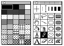
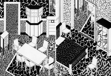
Above, from top: MacPaint tool palettes, designed by Susan Kare, 1983–84; George J. Sowden, interior designs, 1983.
Plastic laminates had been around for awhile. Cheap and cheery, the material has graced all kinds of restaurants and bars, though over time it could be most commonly found in corporate eateries like McDonalds and Baskin Robbins. Barbara Radice notes that “Plastic laminates today are still a metaphor for vulgarity, poverty, and bad taste.” Memphis sought to question this, bringing low-class laminates into high-class interior collectibles, and, in the process, paving the way for a reception in which their products were recognized as simultaneously avant-garde and ugly.
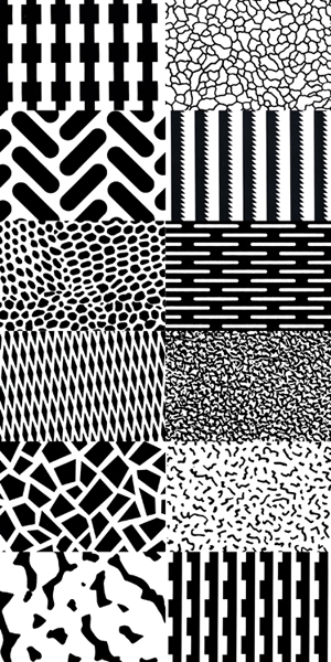
Above, left to right, top to bottom: Michele De Lucchi, “Fantastic,” 1981; Ettore Sottsass, “Rete 2,” 1983; Michele De Lucchi, “Traumatic,” 1983; Michele De Lucchi, “Micidial,” 1981; Ettore Sottsass, “Serpente,” 1979; Ettore Sottsass, “Lamiera,” 1983; Christoph Radl, “Isole,” 1982; Michael Podgorschek, “Argilla,” 1982.
The strong graphic patterns Memphis developed hardly helped people feel more at ease. Cartoonish and crude, they were graphic abstractions of posh surfaces like pebbled leather, cabana wicker, galvanized steel, or the craqueleured patina of an old master painting. Endlessly repeated, these patterned laminates upstaged dimensionality itself, flattening the surfaces they adorned. The effect was not dissimilar to one created by the GUIs of new personal computers like the Apple Macintosh, which debuted in 1984, just as Memphis was fully in the design spotlight. On a flat screen a deep “desktop” was modelled for users, but the coarseness of the screen meant using, for example, not shadows but graphic abstractions of shadows.
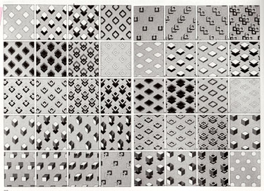
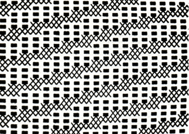

Above, from top: Patterns from Decorattivo design manual, 1975–77; Denis Santachiara, decorations devised on a computer, 1983; Memphis Logo designed by Valentina Grego, 1983.
MacPaint was the centerpiece of Mac aesthetics, where users could create their own graphics using tools designed by Susan Kare and her team. Kare’s patterns, created in 1983, are remarkably evocative of Memphis’s, and the amoeboid losenge and anvil-like trapezoid on MacPaint’s basic toolbar reveals a formal influence as well. Even Kare’s famous system font, Chicago, nods to Memphis by picking up the name of a famous American city for an arbitrary reason. In so doing, Chicago the font and Memphis the movement are rendered equivalent to places we know while not even evoking them in the slightest. So there’s a metaphorical flattening as well.
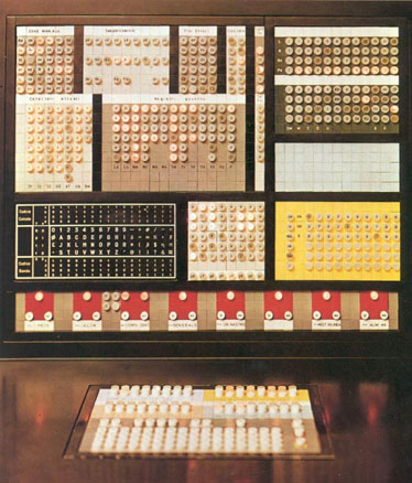
Above: Ettore Sottsass, Elea 9003/2 computer for Olivetti, 1982.
Interestingly, Sottsass had long had a relationship with computers, beginning with his famous design of the Olivetti Valentine typewriter in the Summer of Love, 1969. It was Camilo Olivetti who flew Sottsass to San Francisco to be treated for serious illness while Steve Jobs and others tinkered in their rec rooms and garages. When Sottsass returned to Italy, his first job was designing a supercomputer for Olivetti, the ELEA 9003. Many of his architectural sketches after the Mac’s release, including a design for the Museum of Applied Arts, appear to have been done in MacPaint.
Quoted from “Stuck Inside of Memphis: a Non-Linear, Associative, Ahistorical Meditation on Things Loosely Related to Memphis,” a pamphlet by Justin Beal and Rob Giampietro.