RE-THINK!
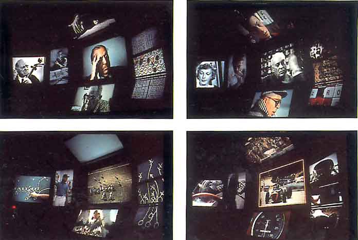
Eames Office, THINK! for the IBM Pavilion at the 1964–65 Worlds Fair
For this country’s first cultural exchange with Russia, he made a seven-screen film — each screen showing still and moving images simultaneously — that explained the American way of life to the Russians. Seven screens, he said, to present more fully the complexities of our problems (and delights) so that all might benefit from our experience without having to repeat our mistakes. After that, one screen was never enough.
— Sister Corita Kent on her “real teacher,” Charles Eames, quoted in Learning by Heart: Teachings to Free the Creative Spirit and reproduced in The World of Charles and Ray Eames
It’s tempting to see our contemporary circumstance — an environment of screens, covering one surface after another, competing for our attention, filled with different messages, all pointing toward an indefinite future — as unique. But what if we didn’t?
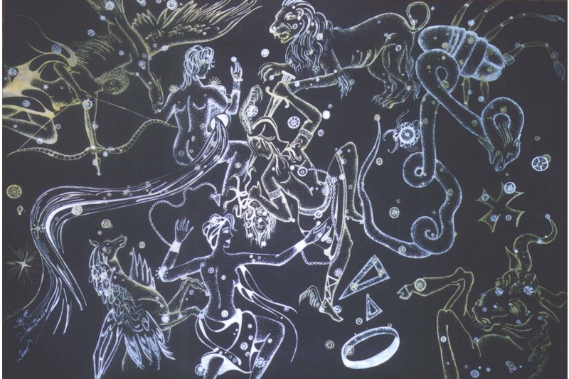
Night sky constellation chart for kids

Cave painting at Lascaux (ca. 15000–17000 BCE)

Diagram of Plato’s Cave
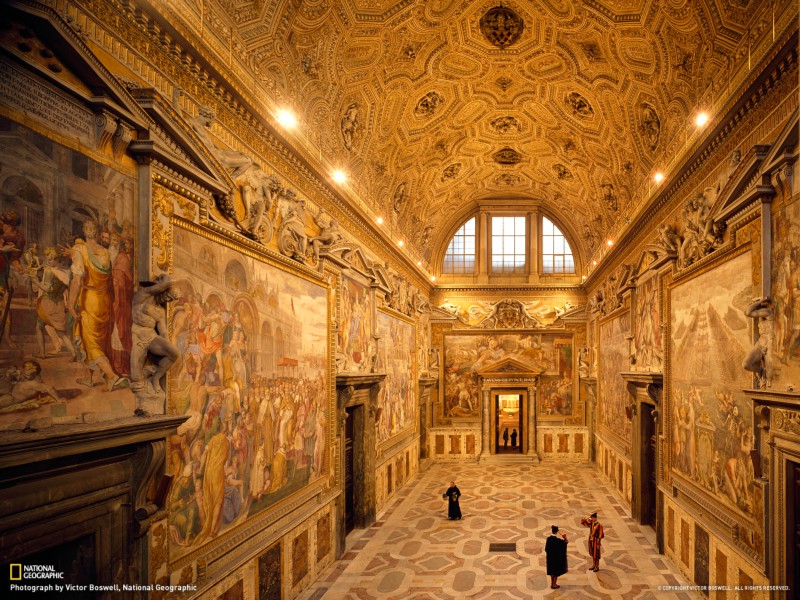
Sala Regia at the Vatican (completed 1573)
Our ancestors retreated to caves and painted hunting scenes by firelight to teach and entertain the next generation. They inscribed and immersed themselves in pyramidal tombs alongside detailed accounting to take them into the afterlife. They offered moral education and religious celebrity on the domes of Renaissance churches. From coliseums to circuses to cinematheques, the past is awash with strategies for the transmission of knowledge by totalizing means — overwhelming the viewer, harnessing her attention, displaying visually-driven entertainment, spectacles, or propaganda, and popularizing these messages. Here’s just one account, selected from W.G. Sebald’s book The Rings of Saturn:
At length I bought a ticket for the Waterloo Panorama, housed in an immense domed rotunda, where from a raised platform in the middle one can view the battle — a favourite subject with panorama artists — in every direction. It is like being at the centre of events. […] Across this horrific three-dimensional scene, on which the cold dust of time has settled, one’s gaze is drawn to the horizon, to the enormous mural, one hundred and ten yards by twelve, painted in 1912 by the French marine artist Louis Dumontin on the inner wall of the circus-like structure. This then, I thought, as I looked round about me, is the representation of history. It requires a falsification of perspective. We, the survivors, see everything from above, see everything at once, and still we do not know how it was.
For this workshop, we will spend time thinking about one of these environments in particular, developed over 50 years ago by a Southern California couple that are still best known for their lounge furniture: the Eameses. Earlier this year I was in London and had a chance to visit the Barbican’s exhibition The World of Charles and Ray Eames, curated wonderfully by Catherine Ince. In an interview with Vitra, one of the Eames’ furniture manufacturers, Ince describes the project that will be our focus:
For me, the IBM Pavilion at the 1964–65 New York World’s Fair is the most enthralling of all Eames Office projects. The Eames created a rich and layered total environment, which was a visual and intellectual tour-de-force and emblematic of their notion that “everything is architecture.” They collaborated with Eero Saarinen on its design, creating a garden of delights in which one could experience the latest computer technologies, discover the history of mathematics or simply enjoy the carnivalesque atmosphere of the Pavilion itself. The IBM Pavilion was a spectacle of epic proportion and, when viewed as complete entity, it conveys the essence of the Eames’ work: from experimental ideas about visual communication, learning, design, and technology, to performance, play, and pleasure.
The Barbican show included a reproduction and restaging of one aspect of this incredible project, the 22-screen film installation THINK!, which spoke to a general audience of fairgoers who were fearful, among many other things, of computers taking their jobs, or, worse, taking over the world. At its height, according to the Library of Congress’s Amy Gallick, THINK! was shown to 16,000 people per day. Following a variety of architectural maneuvering in the amazing Saarinen-Roche-Noyes–designed Ovoid Theater of the pavilion, IBM initiated what architectural historian John Harwood describes as “a vast, two-decadelong campaign in the late 1950s to naturalize the computer.” Its aim, he continues, was
to convince the public of two seemingly contradictory ideas, each a contradiction in its own right: first, that the computer was a wholly natural tool, capable only of what human beings would command it to do; and second, that the computer was a force that would radically and even magically change the world.
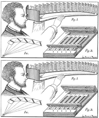
Francis Galton, Patent for a viewing device(ca. 1885)
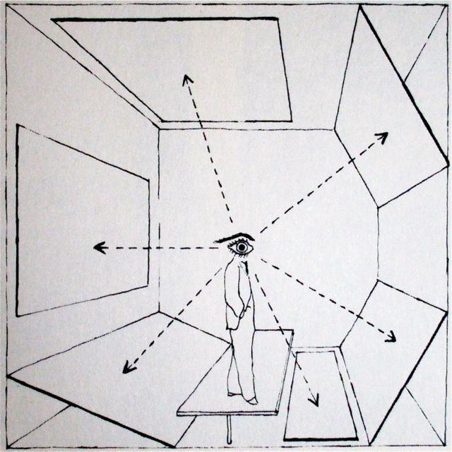
Herbert Bayer, diagram from Fundamentals of Exhibition Design (1937)
As we will learn, the ideas, strategies, and methods used by the Eameses for IBM were developed well before their commission by Eliot Noyes, IBM’s director of design, and the Eameses continued to hone these ideas for decades afterward, for clients including the RAND Corporation, U.S. Department of State, U.S. Department of the Interior, U.S. Navy, the Ford Foundation, Boeing, Polaroid, the Library of Congress, and others. And throughout this time, they remained at the forefront of the avant garde, making important, innovative work whose legacy remains vital and secure.
I’ll underscore this trajectory again: work was developed through independent research, applied to a diverse array of institutional interests, and continually improved and refined over a long period of time. This process, in many ways, is a possible mirror to your thesis. The Eames’ grandson Eames Demetrios describes it further in An Eames Primer:
[The House of Cards] was typical of the fractal nature of the Eames Office — each project seemed to evolve into another. Each iteration offered another opportunity to hone the material tighter and tighter and get to its essence. Such iterations were sometimes transformations as well. In exploring each project, new connections and reconnections of and to ideas were made.
I watched your thesis talks in October before I went to London. Each of you was attempting to articulate your ideas fully for the first time — what the Eameses, wise in the ways of setting clear expectations with their collaborators, might have called “a rough sketch,” “an early model,” “a loose proposal,” or something like that. Still, each of you wrote a script more fit for reading than hearing. Your visual material seldom moved, had sound, or depicted people. And the arguments, when I could discern them, seemed designed less to provoke, challenge, or even entertain as much as to safely align your work with current design practitioners and the interests and terminology of design culture.
And yet at our critiques in December, I began to see a glimmer of works that might break out of this earlier, more familiar academic format. My objective with this workshop is to foster these projects specifically.
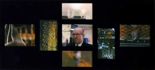
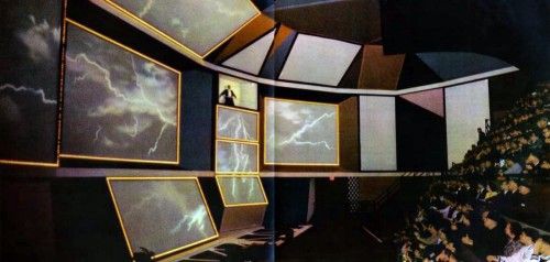
For Wintersession, your task is to to create an explanatory work for multiple screens. These might be laptops, cellphones, tablets, or something else. You may work alone or in groups. This explanatory content should be drawn from the interests of your thesis or theses. Be advised that I will challenge projects whose potential audience or beneficiaries are too narrow in scope. Projects should aim to benefit an organization of your choosing — a school, a startup, a nonprofit, or something else. Think about the intersection of your own interests and what these types of institutions might need to communicate or explain.
Your first sketches will be due when we will meet at Google’s Material Design studio in New York for a group critique on 01/15. The following day, we will visit two exhibitions:
- Silicon City at the New York Historical Society, which covers New York’s role as catalyst for the early days of computing, especially for Bell Telephone and IBM, and
- Mathematica, which was originally designed by the Eameses for the California Museum of Science and Industry before it was reassembled in Queens for the 1964–65 Pavilion where it remains to this day.
Following this we will have two additional critiques on the projects. I will offer scheduled office hours to discuss your thesis projects as well. Finally, the Eames Papers at the Library of Congress number over 1,000,000 items, a resource that has proved invaluable in evaluating their work and legacy. As you work, be sure to save all sketches, correspondence, and drafts — be meticulous about your process.
Our first session will be devoted to familiarizing ourselves with THINK! through an in-depth discussion of the readings below. Feel free to use the class email list to distribute other readings or materials of interest that you might find as well. If we have time, I will also screen selected Eames films at the end of our first session.
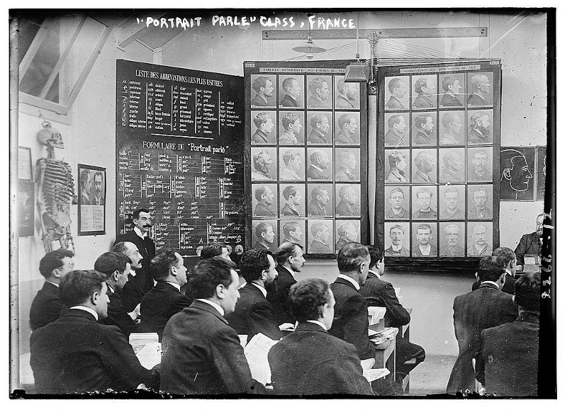
Class on the Bertillon system of classification in France (1911)
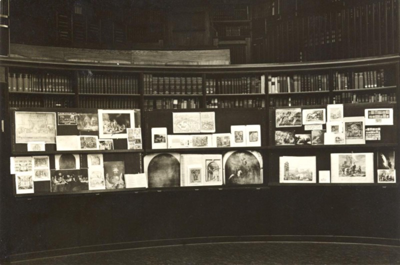
Aby Warburg, Mnemosyne Atlas (1924–29)
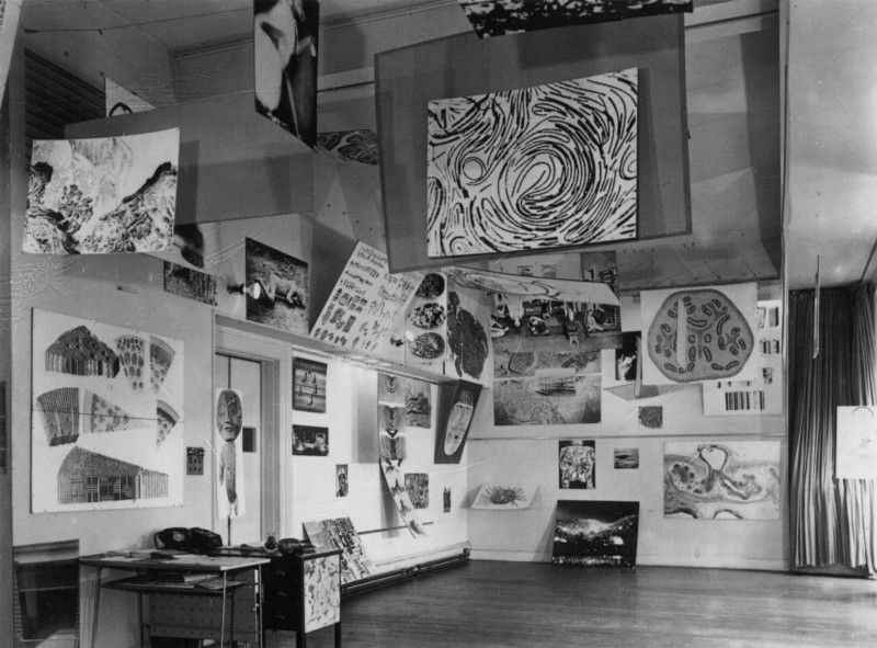
Alison & Peter Smithson, Parallel of Life & Art (1953)
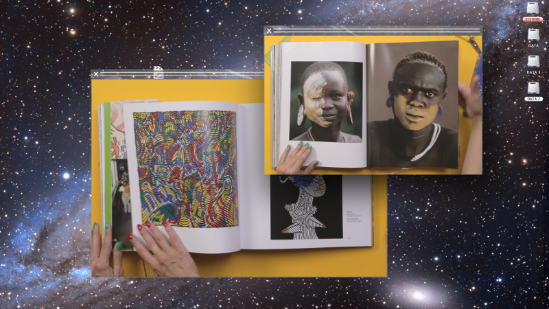
Camille Henrot, Grosse Fatigue (2013)
Readings and films (for discussion on 01/08/16)
- John Harwood: “Naturalizing the Computer: IBM Spectacles” from The Interface.
- Beatriz Colomina: “Enclosed by Images: The Eameses’ Multimedia Architecture” from Grey Room Winter 2001
- Paul Schrader: “Poetry of Ideas: The Films of Charles Eames” from Film Quarterly Spring 1970
- Eames Office: “IBM at the Fair,” “A Communications Primer,” “Glimpses of the USA,” “A Computer Glossary,” “View from the People Wall,” which is the closest online approximation of THINK!
- George Nelson: “Art X,” which offers a pedagogical pretext for the Eames’s work in exhibition and film
- Erwann Lameignère: “Camille Henrot ‘Grosse Fatigue’”
Further references
- Jason Cohn and Bill Jersey: Charles & Ray Eames: The Architect and the Painter
- John Harwood: “Introduction” from The Interface.
- Eames Demetrios: “Modeling” and “An Image Can Be an Idea” from An Eames Primer