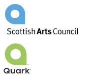
Unleash the Squircle

When your customers are designers, you know your new logo will get a full crit. But when publishing software giant Quark, Inc. unveiled its new identity, timed to coincide with the release of a beefed-up, feature-rich Quark 7, it got something else: a lesson in the difficulties of designing an original logo in a world more packed with logos than ever before.
The new logo seems simple enough – a circle-square hybrid that we’ve dubbed the “squircle,” resembling a very mod-looking uppercase Q, writ large in “Quark Green,” a.k.a. PANTONE 368, a color that Leatrice Eiseman, executive director of the Pantone Color Institute, equates with growth and innovation.
But “innovation” wasn’t the first word that came to designers’ minds when the logo debuted in early September. Shortly after its release, the design community erupted in accusations that the new mark had been ripped off. Admittedly, the logo is far from original. It’s very similar to logos promoting tourism to Toronto and the Bahamas, and easily comparable to those of Moen Faucets and AkaDemiks Jeans, not to mention a bevy of design-related logos for Sterling Brands, Artworkers, PhotoObjects, and the popular design blog The Designers Network. And color aside, it’s identical to the mark designed for the Scottish Arts Council by the notable Scottish firm Graven Images. In our checkup, we counted 15 logos we’d call highly similar.
Why, the Logo Doctors wonder, weren’t their fellow designers as outraged at the similarities between those existing 15 marks? More importantly, why have so many different companies chosen the squircle? And is Quark to blame for choosing such a common logo?
The answer to the first question is simple: Designers love to hate Quark, for both its limited functionality and its unhelpful customer service. (We happen to be Quark fans, for the same reason we type our columns in TextEdit – sometimes less is more.)
The rise of the squircle is harder to pin down. Like any abstract form, it can be rationalized into a solution for just about any brand. That creates a snowball effect: the squircle’s burgeoning ubiquity endows it with the familiarity that designers aiming to connect their clients with consumers will build on. Focusing on who unveiled the squircle first misses the point.
But try telling that to the Scottish Arts Council (SAC), whose reaction comes as close as we’ve seen to a logo street fight. The defensiveness is somewhat understandable: in 2001, the SAC’s new logo outraged Scots with its publicly financed $37,000 price tag, and the SAC must feel more than a little compelled to defend it tooth and nail.
While a Quark spokesman claimed to Macworld that the company conducted “extensive checks to discover similar existing logos,” this defense is a little tough to swallow. Not only did hordes of enterprising bloggers manage to track down so many within hours, but the shape has been used by multiple companies catering to the same market as Quark.
If you can pardon the company for its total ignorance, the squircle seems better suited to represent Quark than to represent many of the others. After all, it looks a lot like the capital letter Q. (And not very much like the lowercase letter “a” for “arts,” as the SAC claims.) By rationalizing the shape into a monogram, Quark may have used it more effectively than others have. Still, if any mark provokes customer outrage, you can do all the rationalizing you want and the logo is still a failure.
But whose failure is it? While Quark has to shoulder some of the blame and most of the embarrassment, we’d like to suggest that its collaborators at SicolaMartin, a division of Young & Rubicam Brands, should’ve stayed up a little later doing their competitive analysis homework. And we’d extend that advice to them in marketing their own firm. The SicolaMartin website uses the phrase “Good design is good business,” which is trademarked by the furniture manufacturer Knoll. Originality’s a bitch.
As Jeremy Hedley of the blog Antipixel observed, designers are paid as much for the quality of their thought as for the actual Illustrator file sent along at the end of a project. We absolutely agree. If you claim to deliver a blend of differentiating thought leadership along with visual acuity, as SicolaMartin does, then you have to walk the walk. Diagnosis? While the new identity may have its merits, its utter lack of originality is certainly not one of them.