On Canons
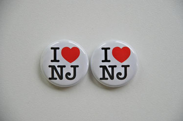
Above: I ♥ NJ buttons as seen on Flickr, from Triborough’s photostream.
EYE: What do you think is meant by “the canon of graphic design history?” For example: The Bauhaus? Beck’s Underground diagram? Alvin Lustig book covers? Swiss Modernism? George Lois’s Esquire covers? Wim Crouwel’s New Alphabet? Glaser’s “I ♥ NY”? Barney Bubbles? Ray Gun? Do you ever think about it, or buy design history publications?
RG: To be quite basic about it, the canon is a group of individual works generally agreed upon by practicioners and historians to be demonstrative of key concepts, techniques, or philosophical shifts in the profession. As a result, these works will be endlessly reproduced as the profession’s history is argued, augmented, and disseminated to new practicioners. These works suggest a kind of map for how the profession sees itself and invite those interested from the public to see its terrain in a similar fashion.
To draw from one of your examples above, the Bauhaus is significant for so many reasons: it constituted the multidisciplinary workshop, now a key organizing format for design studios; it helped define design as something noncontingent on advertising and separate from fine art; Bauhaus members were among the first to help aestheticize the tools of mass production being used to produce and disseminate design, and on and on.
Many of the examples above are also unusually iconic. Crouwel’s New Alphabet, for example, or Glaser’s I ♥ NY. They are, to borrow a phrase of Mailer’s, “advertisements for themselves.” They are also highly formal and their use of the English language is minimal. So, apart from being brilliant and significant for their own reasons, they also show what they mean, travel well to non-English-speaking places, and are relatively easy to copy, quote, or appropriate. Those who do copy, quote, or appropriate these works both amplify the influence of the prior works and signify that they themselves are part of the “in-crowd” who holds these designers and works in esteem.
If you made a list of qualities for a canonical work, “iconic” would probably be pretty high on it. (An aside: it’s interesting to note how many of the projects you cited above are, to varying degrees, self-initiated. This also seems to be an ingredient in canonical works, probably because they are the product of the designers’ efforts alone, rather than a designer plus a client.)
EYE: Does this kind of design history have relevance to what you do in your design practice?
RG: Every designer curates his or her own bookshelf and bulletin board. A mix of canonical and quirky references is probably really healthy and useful. The canon gives you models for certain kinds of things. Glaser’s I ♥ NY, for example, is something we think about a lot, both for its form and for the way its form and content become a unified and totally dependent whole. Or Swiss Modernism has a lot to teach about good typesetting. You could do a lot worse than to just copy Hoffman and Müller-Brockmann until you can set Helvetica or Akzidenz Grotesk right.
Being aware of design history also helps us with teaching immensely, as it gives us a common set of visual references we can share and discuss with our students. To the extent that we teach in the studio, this set of shared references is very helpful here, too. When we write about design, either for designers or the general public – which is something we view as part of our practice – design’s history and canonical works also prove very useful, since writing is kind of an extension of teaching.
EYE: Where did you learn about design history (if at all)?
RG: We’ve both been interested in design for a long time. We were readers of Emigre early on, we picked up a lot of design history in school, and we’ve learned a lot about design’s history from people we’ve worked for and from trying to write about it and teach it.
Contemporary students, we think, are confronted with an embarassment of riches in the form of the internet, blogs, and photo sites like Flickr. Our education is always ongoing, and we absorb as much of this great wealth of information as we can. The flood of interest in Penguin’s book covers lately has been fueled in no small part by websites like Ace Jet 170 and Flickr pools where collectors can share their libraries.
EYE: Does history have any relevance to the new technology and techniques you’ve had to master in your work?
RG: History is really useful in making new work because of the problem-solving models it presents and the assumptions about design values that it contributes to. In trying to work with the printing press, for example, members of the Bauhaus decided not to try to hide that fact but to embrace it and forge a new aesthetic from it. As a problem-solving model, you can see that idea popping up in design again and again. Or Swiss Modernists made an assumption that a certain way of making design was “best” in an almost Utopian sense, and that assumption carried with it certain implications for design that have been debated over the last half century or more.
EYE: If you were in charge of a design education programme, what aspects of design history (if any) would you teach to your students?
RG: Rob teaches a class at RISD called Graphic Design & Critical Thinking, and the class tries to blend some of the tools of literary criticism with some of the intense modes of observation and description drawn from Art History. One of the units in that class is called “Archives,” and in that unit we look at the way archives are formulated, accessed, subverted, and critiqued. We spend a lot of time looking at photographic archives, but we try to encourage our students to think of design’s history – and particularly its “canon” – through a similar lens. Teaching history as a set of facts is only half the story; history is a system, a process, and students deserve to spend some time thinking about that idea as well.