Typographic Research
This class was presented in a very informal workshop format. Its original title at Parsons was “Experimental Typography,” but I was determined to challenge my students on this designation. I wanted to know what made typography “experimental” to them, if this word was appropriate, and, if not, what a better title for the course might be. For more on this question see Peter Bil’ak’s great article, “Experimental Typography. Whatever That Means” (link below).
My feeling is that all typography falls somewhere on a spectrum between tradition and transgression, but what’s transgressive for one era is quickly traditional for the next. Jan Tschichold’s Die neue Typografie was groundbreaking when it first appeared, only to become fully absorbed as Modernist orthodoxy while Tschichold himself shifted back to more classical forms and techniques. Using this as a model, we can see Tschichold’s life as a life spent not in persuit of typographic experiment but in persuit of typographic research, first in and of his own time, and then through history.
By shifting the emphasis of the class from typographic “experiment” (whatever that means) to typographic resesarch, we were able to both broaden and deepen our activities as typographers. Instead of the misplaced oblgation to simply “break rules,” we could now examine the assumptions underlying typographic rules and traditions, making any disobediences more calculated, disciplined, and purposeful. We were also able to see how certain typographic practices – modular typefaces, for example – have always been categorically described as “experimental” (largely because of their form), and we were better able to connect our own work in this area to the historic tradition. Finally, we were able to examine the nature of written language itself, how it differs from speech, how it is represented through alphabets and ideograms, how the Latin alphabetic characters function as a formal group, and so on. We labored to examine the practice of typography through both philosophical and material lenses.
Rather than start the class with a lengthy syllabus, I decided to pay homage to an Intermediate Photography course I took with Catherine Opie and Laurel Nakadate years ago. Catherine and Laurel started our class by showing us 100+ contemporary photographs we should be aware of and telling us why we should be aware of them. Rather than start with words, they started with images. I had always wanted to start a class of mine in the same fashion. All of the images from my initial lecture, “100+ possible examples of experimental type, loosely grouped, in no particular order,” were posted to our class blog, beginning here. You can also browse them by group below.
The class blog was a new addition to my class environment. We treated it as a bulletin-board-like space where we could post images and ideas we wanted to share. It gave our class a virtual presence when we weren’t in session, and gave us a place to capture and share our ongoing typographic research. Its name, 2143, came from Parsons’ “Course Reference Number,” or CRN. This seemed like a more neutral way to name the class while we were debating between “Experimental Typography,” its official title, and “Typographic Research,” our preferred title. It is powered by the wonderful web application Tumblr. The beauty of Tumblr is that you can email images to it with captions, making it very easy for my students to post throughout the week.
The rest of our work was formulated as a group of eight one-week projects, functioning in much the same way as the projects do in my class Antithesis. The projects are assigned depending on how the class is doing, individual needs, and my own intuition. They tend to be very simple, short, and open-ended. We use them as development and discussion points to more fully understand some of the important issues in the contemporary typographic landscape. After making an initial one-week effort on all the projects, students select three to finalize and the class shifts to a much smaller, more tutorial-like format.
Class blog: Students are expected to make three posts to the class blog per week. You are encouraged to post images and typographic research that informs that week’s project (games, architecture, etc).
Grading: The eight weekly projects (P1-P8) will be graded as High Pass, Pass, and Fail. Each of these projects are worth 5% of the total grade, meaning that all eight are worth a combined 40% of the grade. From these eight projects, each student will select three to refine during the five refinement weeks in the schedule. These three “final” projects will be worth an additional 15% each, combined for a total of 45%. These projects will be ultimately be submitted to me as PDFs so each of us has a permanent record of your work in class. The final 15% of your grade will be based on attendance and classroom participation, particularly during critiques and on our class blog. When preparing final presentation PDFs, present projects as you would on your own website. Informational captions for all PDFs are mandatory. Use details, process development materials, proposed usage diagrams, and project-specific photography if necessary. Be succinct. For book projects, do not show the entire book unless you have to – a representative portion will do fine. These final PDFs are part of the project and will count toward the final project grade.
Assignments
Helvetica modified
Alphabetic behavior
Modular installation
Set match
Lyric video
Code conversation
Fischer vs Spassky
Architectural alphabet
100+ possible examples of experimental type, loosely grouped, in no particular order
Producing type
Modular type
Typology
Type and ornament
Type and the body
Type and language
Type and speech
Type and depth
Type and movement
Connections
Helvetica modified
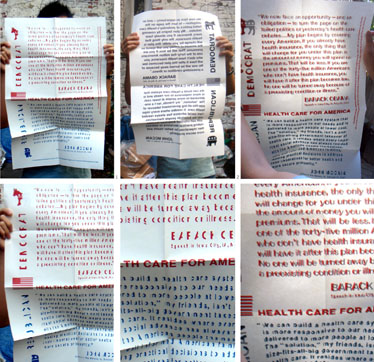
Above: Joanne Chew’s project played off the supposed neutrality of Helvetica by injecting it into our national political discussion. Splitting the typeface vertically, she produced “Helvetica Left Wing” and “Helvetica Right Wing” and set comments on health care from Democratic and Republican candidates on a large silkscreened broadside. Printed in reverse on the back in black is the full text of the broadside, which shows through to complete the characters and make them legible.
Make a new weight of Helvetica that is not simply a bold or italic, extended or condensed. Your weight should add to, complicate, or personalize Helvetica in some way. We will review your progress in next week’s class.
(Inspired by David Reinfurt’s Helvetica Neue R project for Contructs magazine. A few of the weights can be seen on the Constructs website. More weights by Project Projects and Apirat Infahsaeng.
Alphabetic behavior
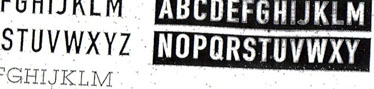
Above: Gabrielle Tigan became fascinated with the way that photocopy machines softened, garbled, and desanitized typefaces. Her experiments were finally catalogued in a self-initiated zine whose primary text was drawn from Walter Benjamin’s essay “The Work of Art in the Age of Mechanical Reproduction.”
Take a photo or find a photo in which type does not behave as you’d expect. Use this photo as the basis for a new typeface. Come to class with the photo, your sketches, and a specimen of the typeface in use.
Inspired by the article “Experiments in Type Design” by Tobias Frere-Jones.
Modular installation
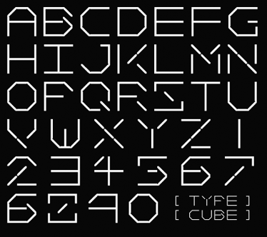
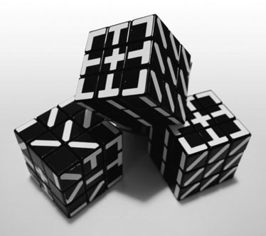
Above: Scott Kellum’s initial modular typeface design became the foundation for a modified Rubik’s Cube in which the alphabet could be more easily and more playfully produced. At Scott’s site, you can buy your own Typecube or download the font whose characters serve as its basis.
Working in small groups, construct an alphabet (A–Z, 0–9) out of repeated modular elements. Letters should be a minimum of 5x5 feet. Document your results.
Inspired by I ♥ Typeworkshop’s fantastic “Manual Pixelism” workshop.
Set match
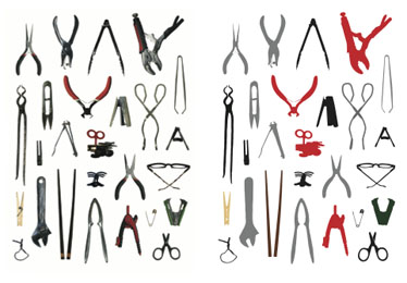
Above: Joanne Chew’s set was based on the form of a scissor with myrad variations and sizes.
Develop a non-alphabetic set of at least 26 formally-related objects and use these objects to design an A2 format specimen sheet showing the set in use.
Adaptation and simplification of my own set project from the class Typography I.
Lyric video
Above: Stills from Ryan Quigley’s lyrics-only video of Gang of Four’s “Natural’s Not in It.” Though Ryan’s treatment of the type is relatively simple, his aggressive misspelling of words helps to drive home the song’s rebellious message. Watch it here on YouTube.
Pick a song. Make a video for it using only words from its lyrics.
Inspired by a similar project from John Gambell.
Code conversation
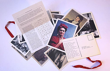
Above: Gabrielle Tigan devised a code that involved the intervals between letters in the alphabet. She used it to send her partner encrypted letters from famously separated lovers. The project took its final form as a collection of quotations from these letters in postcard form.
Find a partner and design a code, ideally one suited for a specific purpose. Pass messages back and forth throughout the week. Bring the code, your messages, and the key to class next week.
Fischer vs Spassky
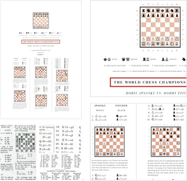
Above: For her project, Joanne Chew researched a variety of different chess notation systems and synthesized them into a single place.
Typeset the sequence of 27 chess moves for Fischer vs Spassky (Game 5). You may either visualize the board or use chess notation, but your goal in either case should be to present the information as clearly as possible to a non-expert.
Resources: YouTube commentary on Fischer vs Spassky (Game 5) explaining the game step-by-step, Interactive version of Fischer vs Spassky (Game 5) showing board and chess notation with clickable moves, Wikipedia on Fischer vs Spassky
Architectural alphabet
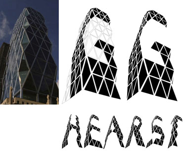
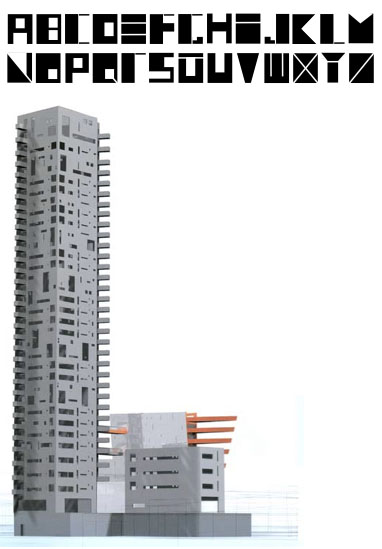
Above, top to bottom: Ryan Quigley used Norman Foster’s new Hearst Tower as a modular grid for his series of letters. Debra Pitel modelled her letterforms after Jean Nouvel’s distinctive window voids used in his unfinished Landmark Lofts project.
Design a full alphabet (A–Z) in response to a well-known building. Prepare a 17”W x 11”H ring-bound presentation book that explains your solution step-by-step.
Initial readings
- Peter Bil’ak: “Experimental Typography. Whatever that Means”
- Paul Elliman: “My Typographies” from Eye 27
- Russell Holmes: “The work must be read,” from Eye 29
- Tobias Frere-Jones: “Experiments in Type Design,” from Texts on Type: Critical Writings on Typography