Reflections on Recent Work
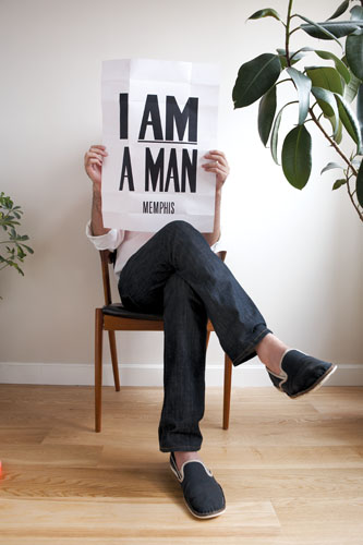
Above: Portrait with I AM A MAN (Memphis) poster. Photograph by Yoko Inoue.
I was really honored and excited when the editors of Idea Magazine asked me to be a part of their new issue, How does graphic design change? In the description that frames the issue, the editors write,
It is apparent that the line between the private and public domains of activity is blurring. The movement to acquire autonomy in client-oriented, heteronomous activities as well as the movement to gain a larger public audience for the products of self-initiated, autonomous activities are already underway. […] In a modern society, what mode of production will designers attempt to utilize and, on a daily basis, how will they attempt to construct the world in which they live?
The editors divide their attention into three areas: Everyday Life, Media, and the Commons. The contributors’ projects are a wonderful and inspiring array, including work by my friends at Thumb, Dexter Sinister, and Winterhouse, as well as wonderful projects by Zak Kyes, Metahaven, Will Holder, James Goggin, Mike Meiré, and more.
In a break from the usual magazine portfolio presentation, the editors asked each contributor to take time to write a reflection on the projects they were being asked to show. I found this to be a thoroughly helpful exercise. Many of the ideas in the passage below will be familiar to regular readers of this website, but I include it here as an introduction to some, a compact and easygoing synthesis for others, and,as usual, an archive for myself.
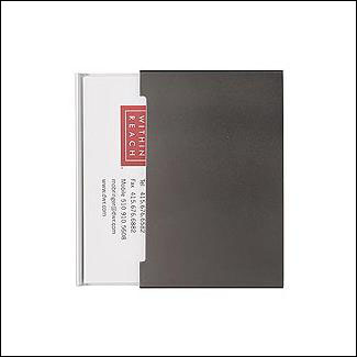
Above: The “Give-and-Take” Business Card Holder by Design Within Reach. With one side for incoming cards and the other side for outgoing cards, a pattern of exchange is designed into the object itself.
In the spring of 2006, I had been thinking a lot about gifts. In a meeting with a cautious client one day, I pointed out that I couldn’t really sell him a finished business card—it would only become his business card when he handed it to someone else, or gave it away. Somehow, even though the design process was finished, the client’s business card could not be fully realized as an object until it was distributed by him.
This offhand comment stayed on my mind for weeks, and the more I thought about it, the more interested in it I became. It seemed the card worked in a giftlike way. No one asked for it, and no one paid for it, it was simply given. In giving it, some kind of emotion was expected, or some kind of action was undertaken in response. Perhaps the receiver would be excited to have this new person’s contact information. Or perhaps he would pass the card along to someone with his recommendation. Whatever the case, distribution was an integral part in the design process, but it was one that designers seldom discussed openly. How does design enter the world once it’s been made? It seems like that question can be just as important as what the design itself looks like. Certainly that was the case with business cards.
Around this time I read an article in The New Yorker about the Shakers, which also mentioned gifts, and, in looking for a good book to read about the Shakers one day, I stumbled across a book called The Gift by Lewis Hyde and decided I had to read it. The Gift is not a book about design, but it fundamentally changed the way I think about design. I began reading it in the summer of 2006 and brought it with me everywhere I went.
In the meantime, I found myself thinking a lot about the work and writing of Milton Glaser, and particularly his thinking about the ethics of design and the role design plays in our culture. It seemed that – like all gifts – giftlike design could help to bring people together and feel a sense of shared identity, regardless of what it looked like. This idea transcended aesthetics and seemed critically quite important. Glaser, who I later discovered is also a fan of The Gift, put it quite well in a film by Hilllman Curtis:
[The] passing on of gifts is a device to prevent people from killing one another, because they all become part of a single experience. And [Hyde’s] leap of imagination occurs when he says this is what artists do. Artists provide that gift to the culture, so that people have something in common. And I think that all of us who identify with the role of artists in history want our work to serve that purpose.
When you look at design through the lens of gift exchanges, its objective shifts from making the world more beautiful to making the world more shareable, and its basis shifts from the production of forms by its practitioners to the production of actions by its recipients. The way things look is still important, but the creation of compelling things now serves to maximize appeal and shared experiences. New designs are not always necessary to do create these shared experiences, and in fact often the recycling of forms is more effective in spreading and sharing a message.
In the case of Glaser’s own work, we can see this with the many derivatives of his I ♥ NY logo (for more on this, see Andrew Blauvelt’s idea of “Open-Ended Processes and Generative Systems” here). That mark was a gift to the world, and one that everyone can share, understand, and recycle in their own way. The Shakers’ designs were recycled by Danish designers Kaare Klint and Borge Morgenson and formed the basis of the Danish design style we associate with midcentury modern furniture. A focus on gift exchange also inverts the traditional temptation to equate costly design with good design; often the best design is the cheapest, least wasteful, and simplest to produce so that it can be quickly and easily shared, stored, and passed along.
As a designer, I wanted to find some way to begin exploring gifts and gift-giving more explicitly in my work.
Pamphlets for friends
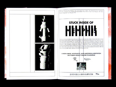
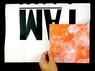
Above: “Stuck inside of Memphis” pamphlet designed, written, and produced with Justin Beal.
My first idea took the form of a project called “Pamphlets for Friends.” Around the same time I was finishing The Gift I sent an email around to ten friends offering to make them a 16-page photocopied pamphlet on a subject of their choosing. The idea was to avoid the typical types of “free” projects for friends—websites, band fliers, wedding invitations—and through the form force the collaboration to be more conversational, more open-ended, and very inexpensive to produce. The ten friends did not know each other and I saw this as a way to not just get to know each of them better individually, but to introduce everyone to one another. Each friend would get all ten pamphlets made for the project, along with ten copies of their own pamphlet to give away and share with friends whom I’d never met. At the heart of this was a simple idea from the designer Christoph Keller: “Books Make Friends.”
The mistake I made was in not giving my friends any deadlines. Everyone, I discovered, needs deadlines. One response I got, however, was from Justin Beal, an artist living in Los Angeles, but I was so taken with making Justin’s pamphlet that I consider the project a success. Justin simply wanted to document a recent body of work that deal with furniture, fruit, and the idea of produce as a kind of mass-produced good. Interestingly, both the Shakers and their fellow Scandinavian furniture-makers were interested in these ideas. Alvar Aalto put it best when he remarked,
The objective is standardization that does not force life into any kind of pattern, but rather, on the contrary, increases its variety. […] The blossoms of an apple tree are standardized, yet they are all different. This is how we, too, should learn to build.
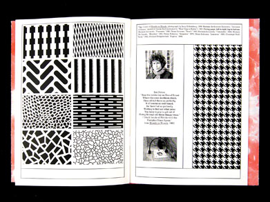
Justin was looking for all kinds of ways the production and transportation of produce was depicted in art. In Jules Dassin’s noir classic Theives’ Highway, the overproduction of apples is shown to catastrophic effect as a truck overturns spilling (and spoiling) its cargo all over the road. This is where the title of the book comes from, “The Un/happy Ending of Jules Dassin’s Thieves’ Highway.” Justin also found connections between the production of produce and the production of patriotism in the Concrete poetry of Eugen Gomringer, whom many consider to be the father of the movement. Gomringer’s famous poem reads, “americans and apricots. american apricots. apricots americans. apricots and americans.” We made 150 copies and gave them away to friends and fellow artists.
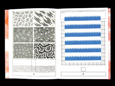
Instead of doing ten pamphlets for ten different friends, Justin joked we should just do ten together. We decided to collaborate again on “Stuck inside of Memphis,” which does for Memphis furniture what the previous pamphlet did for produce. The title refers to the Bob Dylan song from Blonde on Blonde that was playing on a record player when Ettore Sottsass and his colleagues decided to name their nascent movement. The pamphlet equates the pattern of Dylan’s houndstooth scarf from the cover with some of Memphis’s graphics and patterns. Those patterns in turn are compared to Susan Kare’s original graphics for MacPaint. And the city of Memphis is invoked by way of posters created for a Sanitation Workers’ Strike there in 1968 that read, “I AM A MAN” and have a strength and poetry all their own. 150 copies were produced and given away. Interestingly, both pamphlets focus on the idea of recycling and appropriation of forms to illuminate new ideas, both through Justin’s own work and as a way of looking at the Memphis movement.
Posts by post
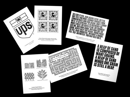
Above: “Posts by Post,” a set of six offset-printed, double-sided postcards mailed to Lined & Unlined subscribers over several consecutive days.
Recycling was very much on my mind when I was asked by Lauren Mackler, one of my grad students at RISD, to contribute something to a project she was doing about the role of authorship in the design process. I love lists and rules, and I had just posted a great example to Lined & Unlined. It was a quote from a New York Times Book Review article with rules for appropriate staff behavior from Thomas Keller’s famous restaurant Per Se in New York. It was so strongly worded, so constraining, and so limiting, it seemed to capture some of my frustrations about authorship in the design process perfectly.
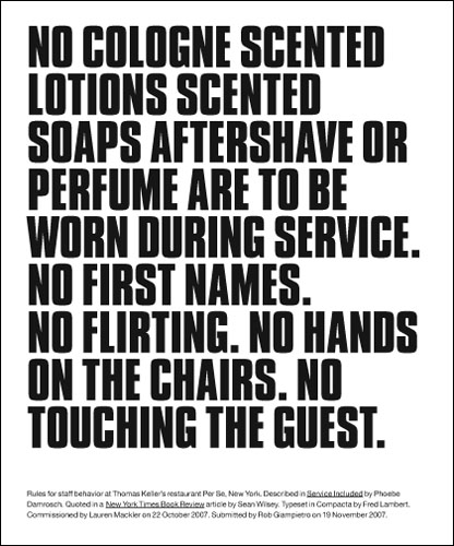
Though I made the gesture quickly and intuitively to simply typeset these rules and given them to Lauren for her project, I found myself returning to the little graphic a lot. I loved the fact that it used language as a material. Many of my favorite artists, including Lawrence Weiner, Ed Ruscha, John Baldessari, and contemporaries like Christopher Wool and Kay Rosen often use language in their work and I find it very affecting. I also loved that I was reusing something from Lined & Unlined, that the blog itself somehow was a running list of things that caught my attention, and when given the opportunity by someone like Lauren I could return to these things and explore them further.
Around this time we had a project going to print and the trim size was such that there would be a lot of wasted paper. I wanted to find a way to use it, so I arranged for the printer to make postcards. Since so much of the interaction online happens virtually, I had also been looking for a way to connect with my readers in a more physical way. I decided to select a week in May 2008 and “close” Lined & Unlined as a website and instead do all my blogging by mail. I invited people to sign up for the blog’s mailing list and about a few hundred people from all around the world took me up on the offer.
The postcards use the same technique used for Lauren’s project, they take posts from Lined & Unlined and recycle them. To decide which posts, I tried to think carefully about what these postcards were. They were mass-produced objects. This related to a post I’d done about the Sorites Paradox, which is a paradox of language in which a heap of sand is still called a heap of sand when you take one grain away, but if you keep doing this you will soon have no more sand and no more heap. Where exactly the heap disappears is hard to define, though, because the word “heap” is vague and there are are a lot of small grains of sand that comprise it.
The postcards were also sent by mail. I had done a post about “defictionalized” people, or people from fiction that were taken to be real. One of the best examples is Sherlock Holmes, to whom people still send mail at 221B Baker Street, even though he doesn’t exist. This reminded me of the idea of a website, which is a virtual thing, sending you a physical object through the mail.
The postal system, like the internet, is a complex network and messages need to make their way through it in a specific, choreographed way. To compliment this idea, I showed a shooting diagram of the hedge maze from Stanley Kubrick’s film The Shining, taken from this post. Networks were also represented by a diagram of espalier trees, which look like networks and also bear fruit more quickly than normal trees, and I had discussed espalier trees as part of a contribution to Craig Mod’s Hitotoki NY project. I liked this connection to Aalto’s quotation and Shaker design, both common references on the blog.
Finally, Paul Rand’s 1961 UPS logo, discussed in my Dot Dot Dot article on The Gift, was both an indicator of the giftlike distribution of these postcards and a reference to their arrival by post. Rand transformed an ordinary package into a present wrapped with string.
Williams Poems
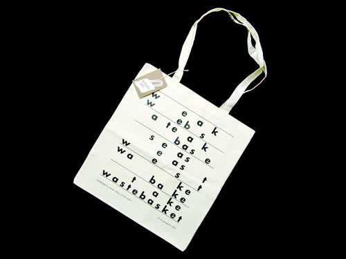
Above: “Wastebasket,” a Williams Poem supplied to Cindy Heller as part of her Wanderbag project.
I have always written poetry and been interested in poetry. Poetry has always had a lot to do with design for me, there is a logic and a a kind of creative economy in both. Poetry is also language at its most playful and its most precise. It is beautiful. My work with Justin Beal during the first of our pamphlets reintroduced me to the work of the Concrete poets, and during my research for another Dot Dot Dot article about the artist Richard Hamilton I found myself drawn into the Concrete poetry and artist books of Dieter Roth and Emmett Williams. Williams’s work in particular captured my imagination, as he was also a major chronicler and active organizer in the Fluxus art movement. He gave one of my favorite books, Donald Spoerri’s An Anecdoted Topography of Chance, its English translation, and he was also a key collaborator of Claus Oldenberg’s in another favorite book, Store Days. In addition to these things, Williams edited the seminal Anthology of Concrete Poetry and was the editor in chief of Something Else Press with Dick Higgins in the ’60s and early ’70s
My favorite of all of Williams’s poems was “sweethearts,” which is an epic book-length poem he published in 1966, and it was as foundational to Concrete poetry as Mel Bochner’s “Working Drawings” show, also from 1966, was to Conceptual art. The poem basically invented a form, which I have dubbed the “Williams Poem.” In a Williams Poem, the chosen word and its letters in their order become an engine to generate a whole world of possibilities. “sweethearts” specifically tells the story of two lovers and the progress of their romance. Like the sestina or the pantoum, two other highly structural and underused poetic forms, Williams’s form generates a tone and type of poetry all its own.
Williams passed away in February 2007, and right around that time my friend Cindy Heller wrote asking me to contribute a design to her Wanderbag project, which hopes to avoid the waste caused by disposable plastic bags by replacing them with lovely artist-designed tote bags. I was thinking about how a Wanderbag is a single thing that can be reused many times for many different things, and I was mourning the loss of Williams, and the two things came together very naturally. I decided to write a Williams Poem of my own as an homage.
The process of writing it was an intensely pleasurable experience, but “wastebasket” was definitely a rookie effort, and I was eager to try again. I got my chance when my friend and artist Hannah Cole wrote asking me to make a contribution to a collaborative project whose submissions are acquired by way of a gift circle among contributors. Naturally I was interested. When the circle turned toward me, I found myself looking at a short, silent film of a man standing on a windy bridge in the snow. I was asked to use the film in my response.
The result was snowflakes, my second Williams Poem and a more successful attempt. I hope to make many more of them as time goes on. It saddens me that Williams was the only one exploring this particular form as deeply as he was. I would like to see Williams’s form alive and flourishing, even in just a small way.