Remarks from the New Museum, 13 June 2009

Above: 1970s TDK cassette tray packaging. Cited as influential by Graphic Thought Facility’s Andy Stevens in an interview with the Design Museum, London.
This Saturday I took part in a panel discussion at the New Museum along with Marco Roth, Astra Taylor, and the panel’s organizer, Brian Sholis. We were asked to give a short lecture at the start of the discussion to outline some of our views on “generational coherence, generational self-consciousness, peer networks,” and other themes related to the museum’s Generational show. While I don’t usually script my talks, preferring instead to discuss images casually as I display them, I decided that this panel was a good opportunity to set images aside for a moment and get my thoughts together on this subject. My remarks follow below, and I hope they’ll be of interest. —RG
Most graphic design is easy to make, quick to produce, and not expected to last that long. If it lasts awhile, great, but it makes no claim to permanence. About the most permanent thing a designer can make is a book, and those often get reeditioned or go out of print. So graphic design’s relationship to duration is different than that of a painting or a building. I’m working on several projects right now that involve redesigning things that were just designed or redesigned in the last five years. Magazines come out and are thrown away, posters are put up and torn down, websites are built to change everyday. A new CEO takes over and wants to put a new stamp on something, so the logo’s changed once again.
In fact, the duration of most graphic design is closer to that of a song. I’ve heard that for awhile Stevie Wonder wrote a song every day. He’s a lot like a designer in that regard. It’s practiced creativity. And, after a few months, he selected a dozen songs or so to release as an album. That’s his portfolio, an edit of songs for the world to share.
There has been a lot of thinking done about design and art. Today, I’d like to do a bit of thinking about contemporary graphic design and music. In terms of our conversation here, music is a useful tool for talking about generations because it’s so defining for generations. I think design is defining, too. We identify ourselves with the songs we listen to but also the brands we buy, the organizations we support, the websites we contribute to, and the media we collect.
Like music, design relies on patterns to be accepted and understood. Some patterns inform the construction of a song itself. I’m thinking of Verse Chorus Verse structures or a I-IV-V chord progression. Compare these patterns to those that govern proper typesetting, the layout of a book, or the design of a letterhead.
Some songs employ cycles of sampling and reuse; they are built on top or with pieces of other songs. Design acts the same way. We see a typeface in use somewhere, or a color scheme, or an organizational strategy, and we use it like our own. Patterns, as the architect Christopher Alexander will tell you, help to orient us within an experience. We expect to see a logo on a business card. We expect to see a couch in a living room. We expect to hear a chorus after a verse.
Other patterns in music describe not the construction of a song but an audience’s relationship to it. The song a band chooses to release as a single, for example, tells us the band takes particular pride in that song, or they feel it will become popular, or both. Again, compare these to design. A paperback carries a different meaning than a hardcover of the same book. The version of Flickr we see on our mobile phone is not the one we see in our web browser. Our relationship to the site’s content is governed by our access device.
These patterns in design and music are not secrets, nor are they organic to individual musicians or designers; they are widely taught, easily available, and highly recognizable to audiences.
When music is performed, it creates the conditions for a shared social experience. When it’s recorded, it’s dematerialized and can be enjoyed by anyone, anywhere. A song’s length and its ephemerality are just two of its attractors; come now and take part before it’s gone.
Design plays a similar role. Design invites. Design asks for your participation. Design calls you to action. Design attempts to persuade you of its point of view. Design structures your experience with the object it’s applied to. For all of this, design is a present art more than it’s a lasting art. The ability of design to create mass experiences is contingent on its adaptability and ubiquity. We find corporate identity systems on trucks, on mobile phones, and on the credit cards in our wallets. Songs trigger memories; so do logos, posters, coffee mugs, and tshirts.
Music is often written and performed by many people, in collaboration with each other, in loose groups. Increasingly, design is created and performed that way too. Music is not organized by manifestos or movements but by scenes. Scenes almost operate with a tagging structure. Flattened out, they allow for a variety of overlapping, independent classifications. Nirvana, as we all know, was emblematic for the emerging “Grunge Rock” movement in the ’90s, but they also belonged to a distinct scene of bands from the Pacific Northwest, and to another scene defined by their record label, Sub Pop. The affiliated scenes of music are not normative, they’re networked. Some are more dominant than others. Most are subcultural variants. Subcultures, because of their size, are nimble, generative, and impassioned. These are good things.
The production of music today is highly dispersed. It can be made in a state-of-the-art studio or on an airline tray table. Its distribution methods are similarly destabilized. Bands needn’t seek the approval of labels to be released anymore, they just need bandwidth. Bootlegs, B Sides, Remixes, and Mashups are as official as the real thing. They’re all MP3s now. Even value has been upended; we don’t know what music costs anymore, or how (or even whether) people will ultimately pay for it. And yet the same technology that’s enabled the dispersion, destabilization, and devaluation of music has fostered of new songs, different songs, songs to define a generation.
On the same laptops that we use to write our songs we can make the graphics that package them. We’re all culture workers now. This isn’t something to glorify nor is it something to mourn, it’s just something to be aware of. The upside to the computer’s limitless uses are well-known. The downside is more subtle, but it will need to be reckoned with. From a New York Times review on the new book “Shop Class as Soulcaft,” Francis Fukuyama writes, “Unlike the electrician who knows his work is good when you flip a switch and the lights go on, the average knowledge worker is caught in a morass of evaluations, budget projections and planning meetings. None of this bears the worker’s personal stamp; none of it can be definitively evaluated; and the kind of mastery or excellence available to the forklift driver or mechanic are elusive.”
The computer that designers and musicians now use in their work is most comfortable as an emulative tool. It is not a guitar but it can emulate one. It is not a pen or an airbrush or an eraser or a paste up board or a type tray or an editing suite but all of these and a great deal more. Its actions are scriptable. Its plugins and system extensions are limitless. The computer turns real into virtual through the metaphor of use.
Our objects are becoming virtual as well. We order books not in runs of one thousand but in runs of one, made for us when we ask for it, or, more accurately, demand it. Or we can read them on a Kindle, with buttons that emulate turning the pages of an actual book. There was a time when no designer I knew would show work that hadn’t been produced. Today, it doesn’t matter if a work’s been produced, it matters if it’s been seen. Not printing, but page views. The issue is not legitimacy through production but attention through exposure. Students in design programs make posters for the purpose of photographing themselves holding them up for all to see on their portfolio site. In the rush of work that speeds through my RSS reader everyday, the community has become the other client. Our new canon might be crowdsourced.
Of course, canons have always been the products of selection, judgement, and exposure through reproduction. Flipping back through some design textbooks, the official history of design’s past generations emerges. Modernism, especially the Swiss International Style that arose in the 1950s, found its home servicing commerce or the state. Its practitioners organized themselves into hierarchical firms or bureaus. They wore suits and acted professionally. Their tools, like stat cameras and waxers, were rarefied to most. Their roles in culture were focused. Their objective was a totalizing legibility, clarity, and formal truth through structure. “Good design is good business” was a maxim and spurred many clients to invest in the design effort in hopes of building the bottom line. In the wake of WWII, a ravaged Europe and a rapidly growing America would restyle themselves afresh.
Design’s next generation of Deconstruction grew prevalent in the late ’80s and early ’90s in response to Modernism. Instead of commerce or the state, it was located primarily in the academy and the design press. Its practitioners were largely individuals, often making no claim to professionalism. Instead they envisioned the bohemian autonomy of the author or the artist. The self-initiated project was glorified. Their motivations, far from totalizing, were in the service of expressing their own identities. Texts, they inferred from writers like Derrida and Barthes, weren’t always meant to be legible. Forms, they inferred from architects like Gehry and Eisenman, weren’t always meant to be gridded. They didn’t want to be accepted, they wanted to be critical. They stood apart. They saw new tools like Mac as an opportunity to make design gestures that were impossible before. In the Photoshop layer they glimpsed a metaphor for the way meaning was encoded.
The designers I know now are Pragmatists. Their preferred site is not commerce, the state, the academy, or the design press, but the internet and the nonprofit organization. Neither hierarchical nor individualistic, the Pragmatists’ chief structure is the collective, the band, or the project working group. Their products are not forms but actions. Their world is not idealized but observed. Their solutions come not from truth but from effort and available materials. Their mode is not one of mass but of localized production. Their interest in the design object extends beyond its construction to encompass the circumstances of its distribution and circulation.
These designers accept the variability of display that is enmeshed in the browser window. Online, form and function are different filetypes. They see the computer’s system defaults as starting-points. There’s an increasing glorification of data for data’s sake: analytics and A/B testing contribute as much to formgiving as anything else. Just ask Google.
While Deconstruction feels like a generation that is all-too-recent and a little tuckered out, Modernism feels like lost world, or maybe, more accurately, like a bargain bin CD by a band that’s no longer performing. It’s been cast off for no reason and might hold the key to something its previous owner was intent on leaving behind. Discovery makes the old new again. Maybe we can save the past by playing it.
And it’s playing the past, those golden oldies, the hits, that seems to reassure this generation of designers. Call it a “performative Modernism,” or even a “visual karaoke.” Vitra editions a folk art blackbird from the Eames house as a mass produced object so we can all play Charles and Ray. Milton Glaser’s 1977 I heart NY becomes today’s I heart NJ or I heart Command Z or I shamrock ND or I lonestar TX. We’re riffing. We cover it in our own way. We do it to feel connected. We do it to get each other’s attention, form bonds, and share with a peer group. When designers I know reference the Modernist generation in their work, the gesture is less one of appropriation and more like that a hyperlink, or, more aptly, a song added to a playlist of favorites or shared with a friend.
I started a design studio when I was 23 with another designer and a pair of laptops in a spare bedroom. We designed our website quickly and sent it out to everyone we knew. It wasn’t all that different from starting a band in a someone’s garage. The website was our demo tape. Our first client was a nonprofit called Peer Health Exchange that taught college students to be health teachers in inner-city schools because schools were cutting health programs exactly when teenagers needed them most. The executive directors were our age. The whole experience felt a bit like “let’s pretend,” but we made them some books and a website, and they raised some money, and two years later they invited us to a snazzy gala at Chelsea Piers to celebrate the opening of their newest branch. In order to humanize the statistics they used in their materials, the logo we made depicted a silhouetted group of teenagers.
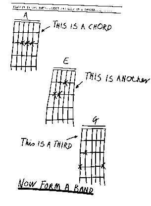
Thinking of this, and preparing for today, I was reminded of a graphic my friend showed me once, from the punk rock zine Sideburns. It showed three guitar tab illustrations, crudely drawn, and read: “This is a chord. This is another. This is a third. Now form a band.”