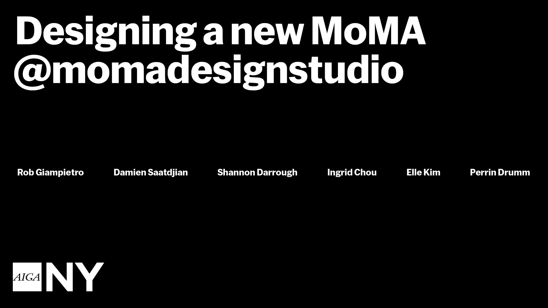
Designing a new MoMA
This talk was given at the John L. Tishman Auditorium, The New School on December 12, 2019. My co-presenters were Ingrid Chou (Creative Director), Shannon Darrough (Director of Digital Media), Elle Kim (Associate Creative Director), and Damien Saatdjian (Art Director). On the night of the event, each of us took turns narrating, riffing based on my draft remarks below. Our conversation afterward was moderated by Perrin Drumm (EIC, AIGA Eye on Design).
Welcome, everyone. Thank you AIGA NY for the gracious invite, and thanks to Stacey Panousopoulos and Rosie Garschina for putting this all together. We’re so glad to be here and glad to see you love MoMA as much as we do. We’re excited to take you behind the scenes for the next hour or so.
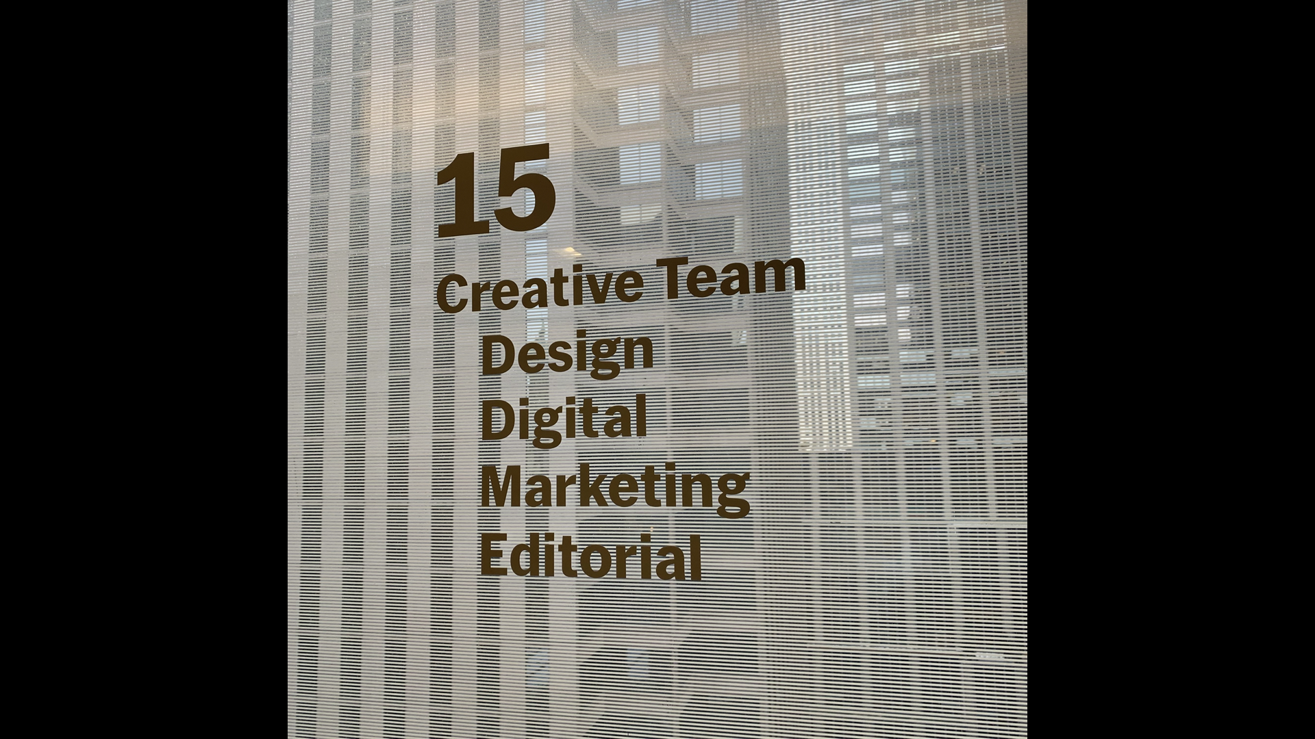
We’re part of a new department at MoMA called the Creative Team. It’s led by Leah Dickerman, who is Director of Editorial and Content Strategy, and Rob Baker, who is Director of Marketing and Audience Engagement. We’re about 50 people on the 15th Floor. Some of those people are writers, editors, strategists, producers, filmmakers…
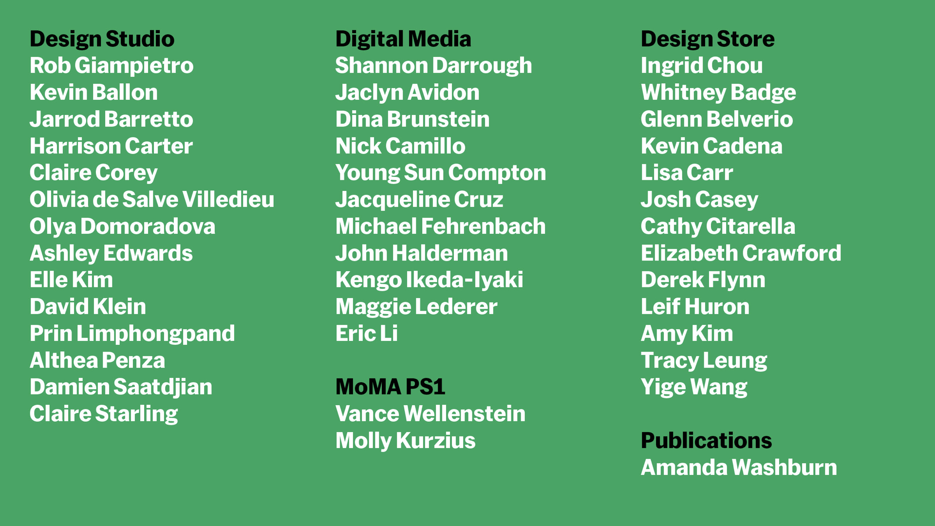
…and a lot of us are designers. This is everyone on our teams right now, but who is not here are our many vendors and former freelancers and MoMA staffers. To everyone involved in making a new MoMA, thank you for all your work, past and present!
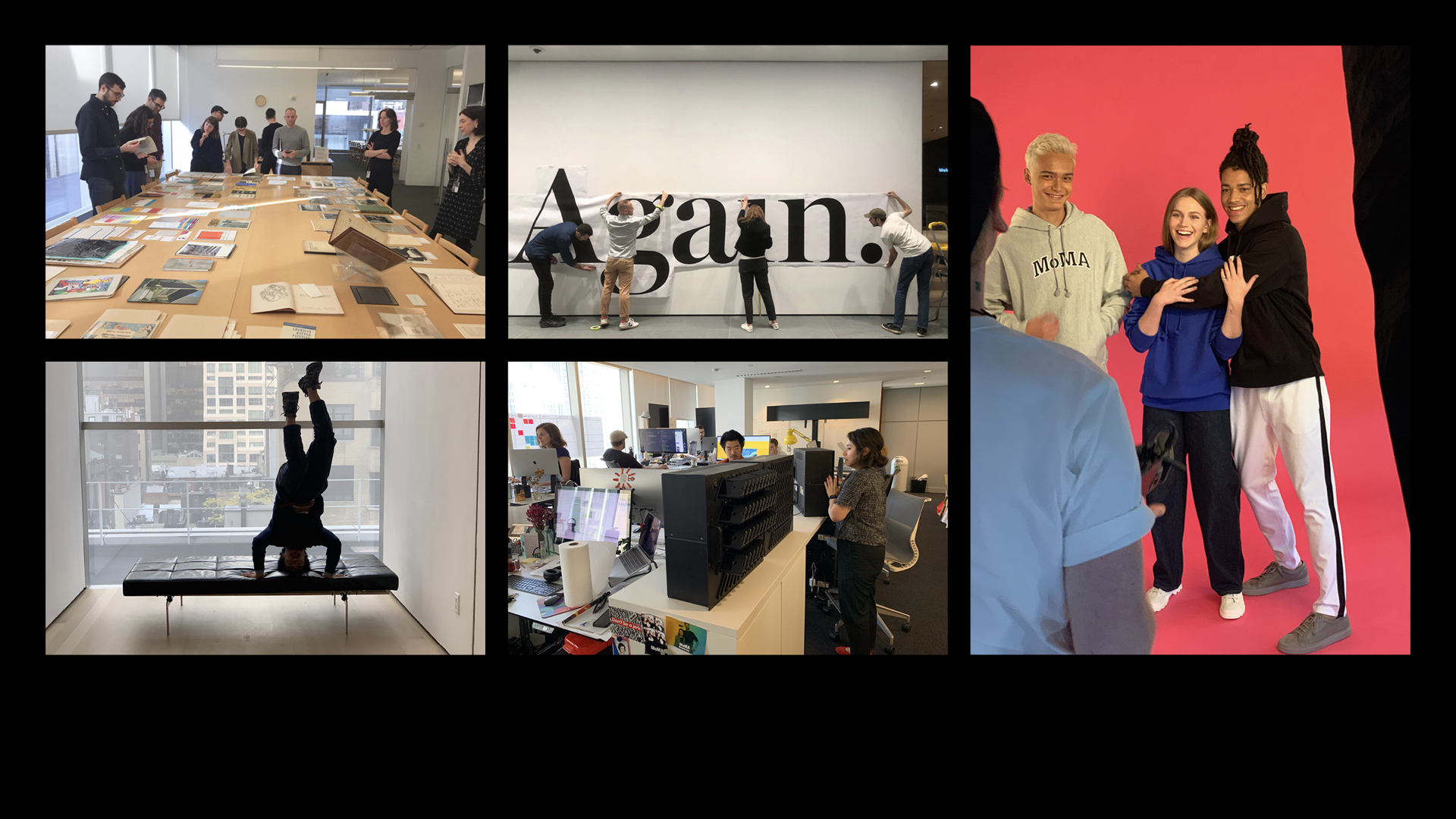
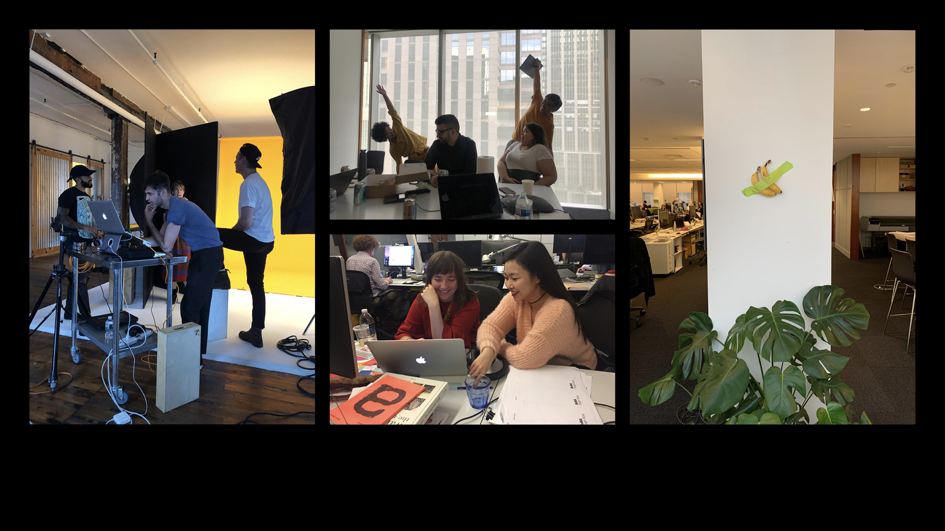
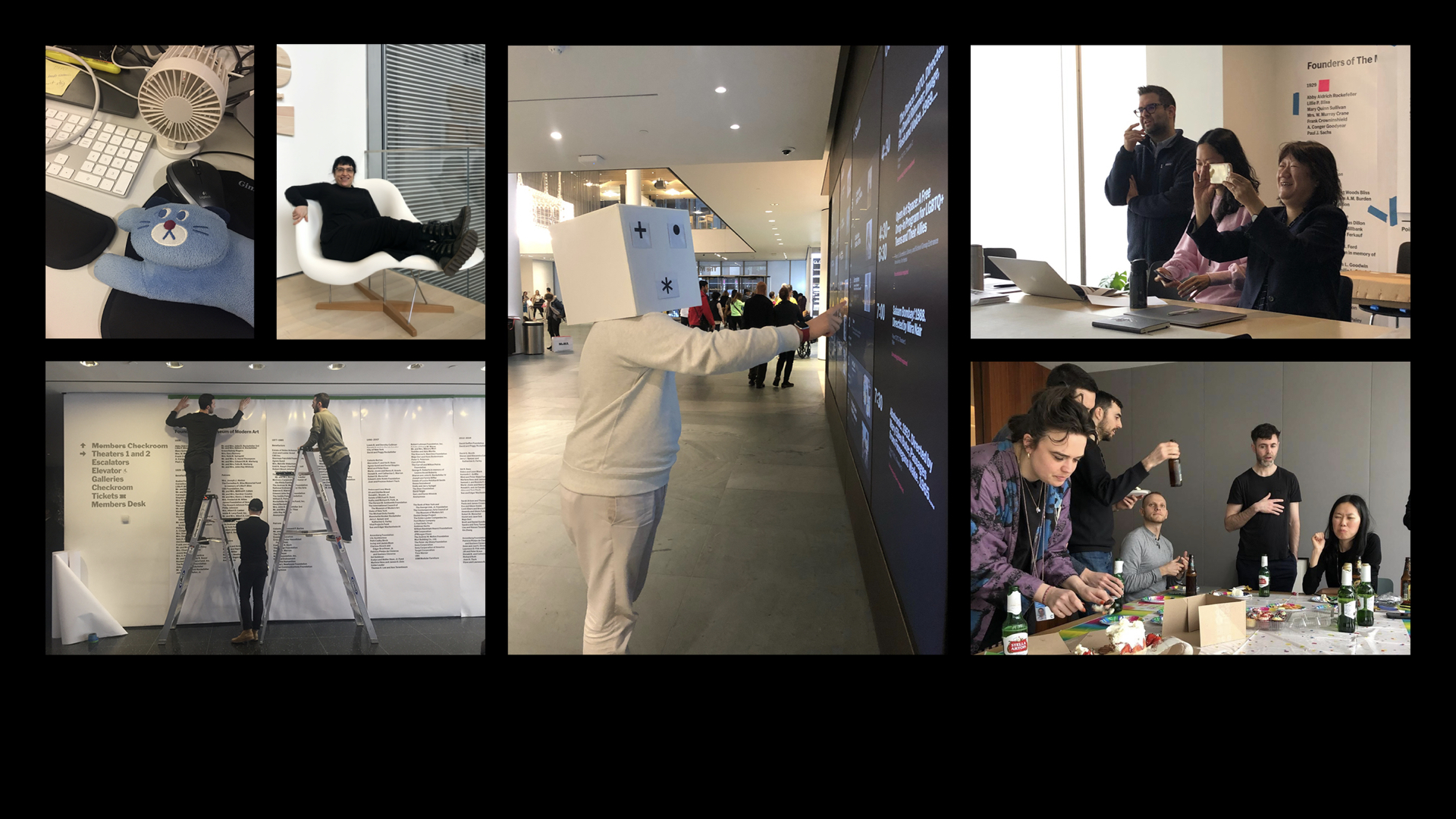
We won’t lie: it’s stressful sometimes, but we have a lot of fun. For us, tonight is a celebration. We’re proud of this work and excited to share it with you.
Our presentation is in two sections. The first part is a close look at the design system we developed for our reopening: How it builds on our 90-year history, how it works across the institution, and how we use it day to day. Then we’ll look at how we crafted every element of the onsite experience, or visitor journey, at our newly expanded campus.
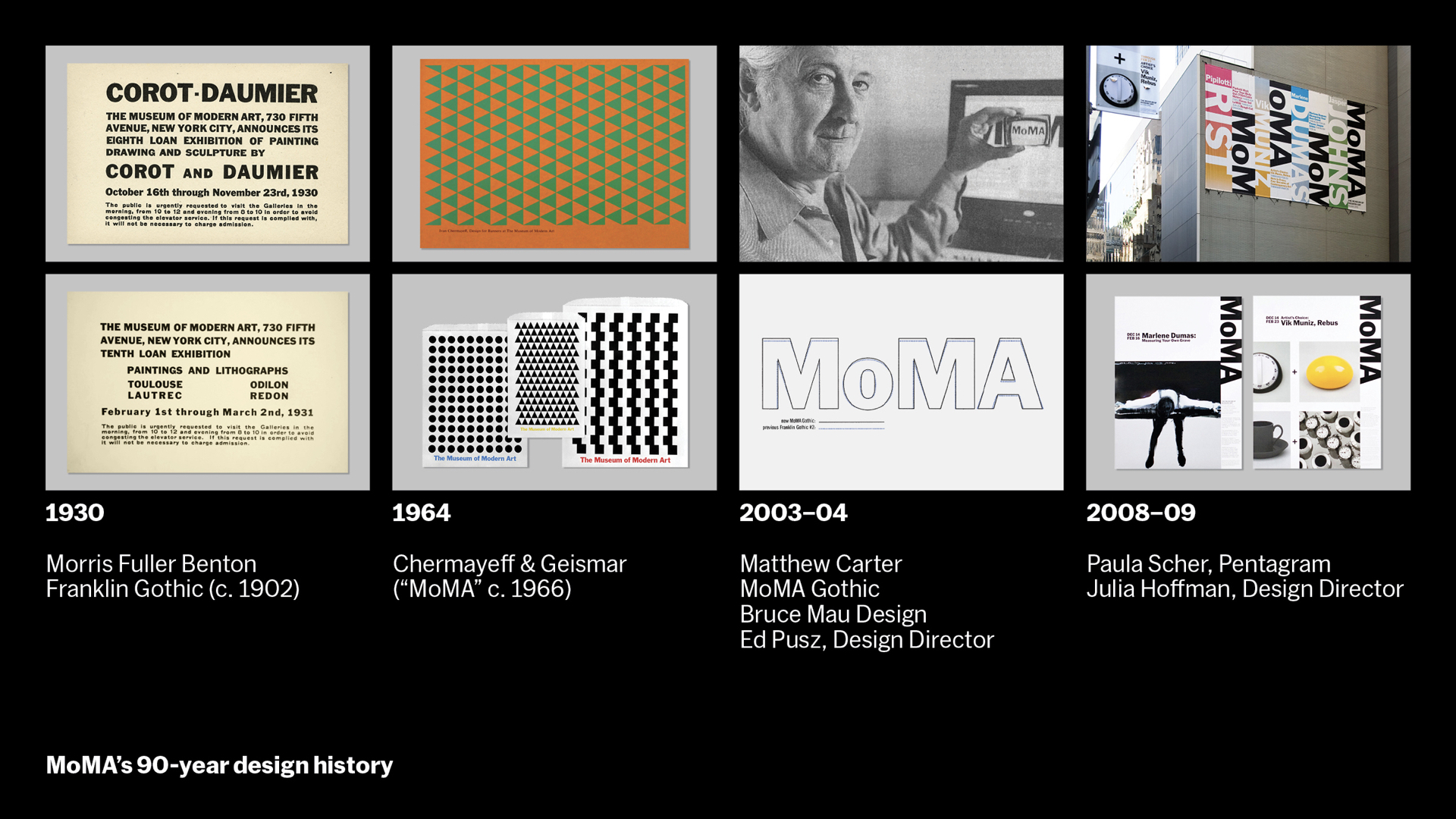
MoMA has a rich design history. We’ve been using Franklin Gothic almost from the beginning. For most of us, it’s a typeface we deeply connect with the museum. And it’s always been bold, graphic, confident, and modern. In the mid-1960s the NYC firm Chermayeff & Geismar introduced geometric patterning and an intense multicolor palette. Over the 2000s, during the last expansion, a vertical “blade sign” was installed to punctuate the entrance as you look down 53rd Street and Franklin Gothic was updated to a more specific historical cut found in MoMA’s own collection, known as MoMA Gothic, which reinforced the blade sign in advertising and onsite materials with confidence and scale.
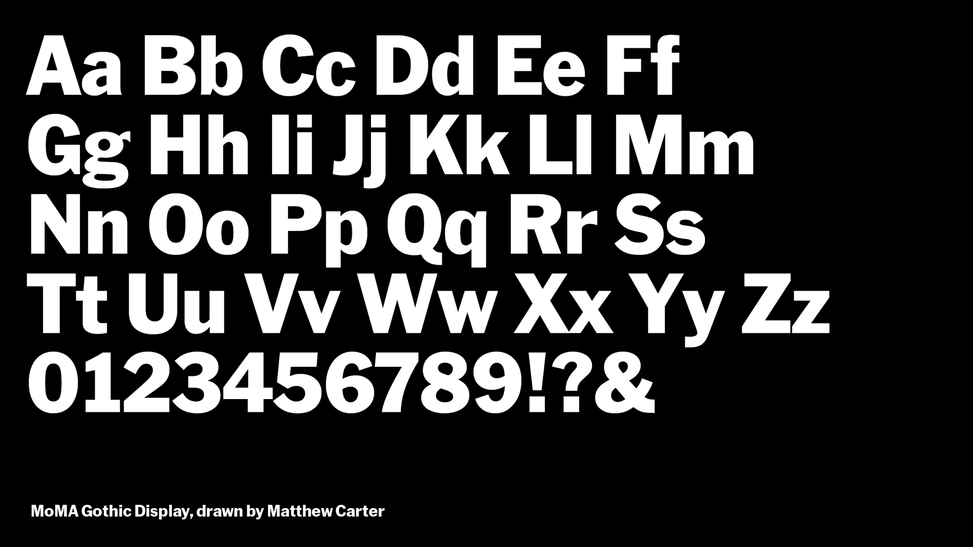
MoMA Gothic was drawn by Matthew Carter in 2004 and came in one weight. It preceded Paula Scher / Pentagram’s work in 2009 which built upon it.
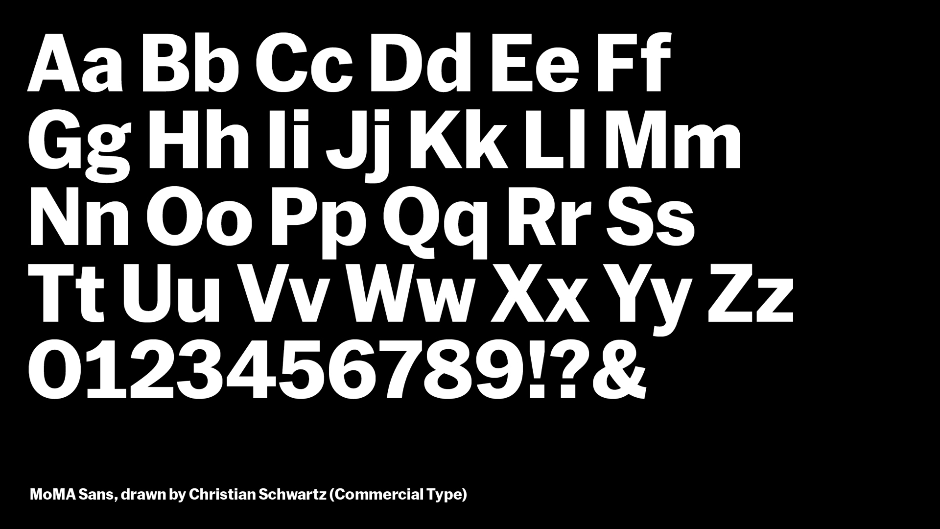
MoMA Sans was drawn by Christian Schwartz / Commercial Type in 2017 and comes in 23 weights. It preceded our new design system from 2019, which we created in collaboration with Order. Before that it was used in 2018 campaign materials and graphics by Made Thought as well. Instead of doing labels with a mixture of sans serifs like News and Trade Gothic, it allows a single typographic voice. It’s designed with readability and accessibility in mind, and helps modernize MoMA Gothic for an increasing array of digital uses.
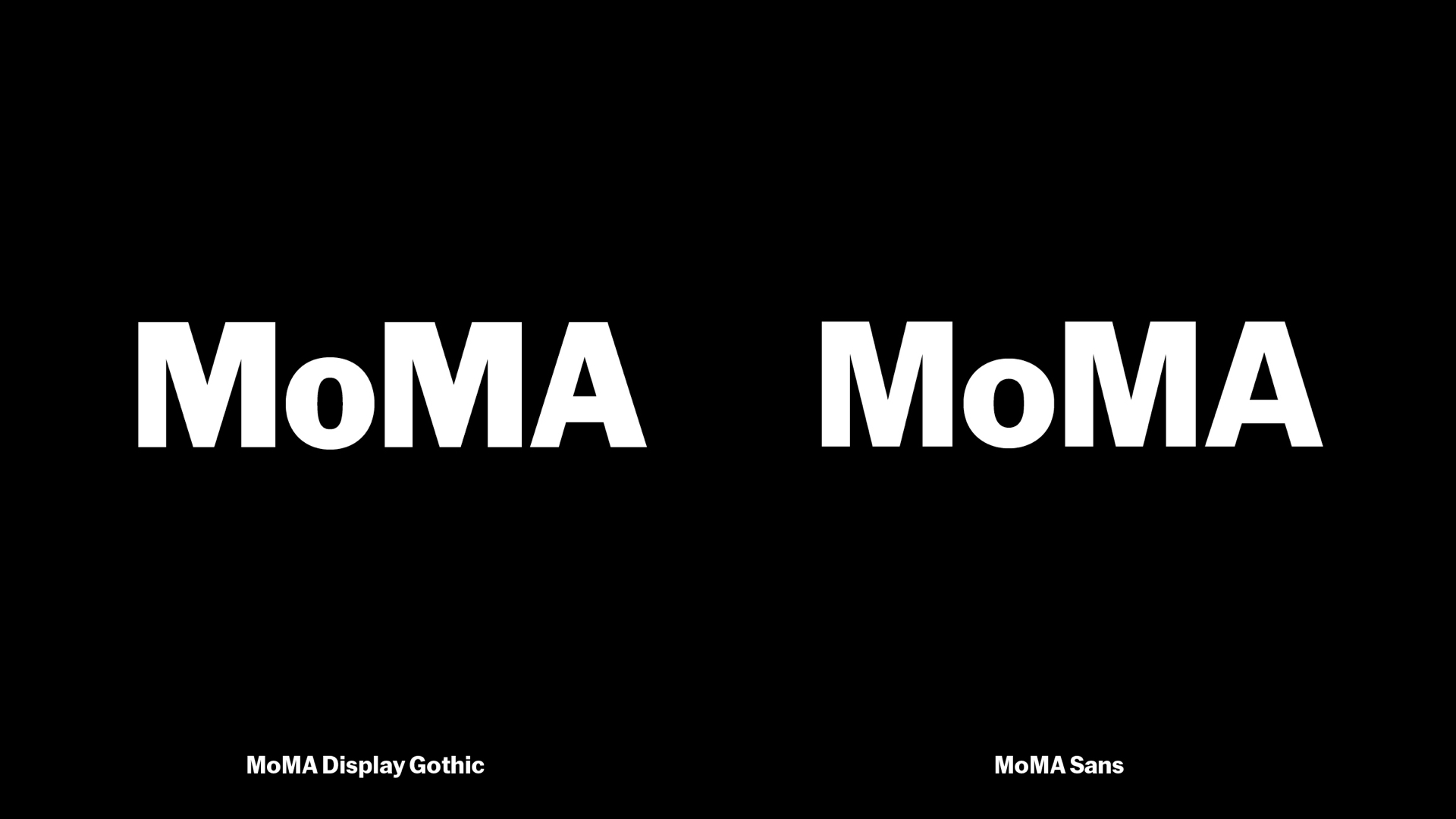
Here are the two logos from 2004 and 2017 side by side. There’s no other way to say it: the difference is pretty subtle. And there’s an adage out there that each reinvention of MoMA’s look is really a slight redrawing of Franklin Gothic. We don’t think it’s such a bad thing to be so consistent. Audiences have a strong connection to MoMA. MoMA is powerful for them.
Maybe we redesign things too much. Maybe to make a powerful and enduring thing vital again, we can make a series of subtle, tactical adjustments. We’ve tried to honor that idea on our work for a new MoMA.
Tonight we’ve each brought a series of tips and takeaways for you.
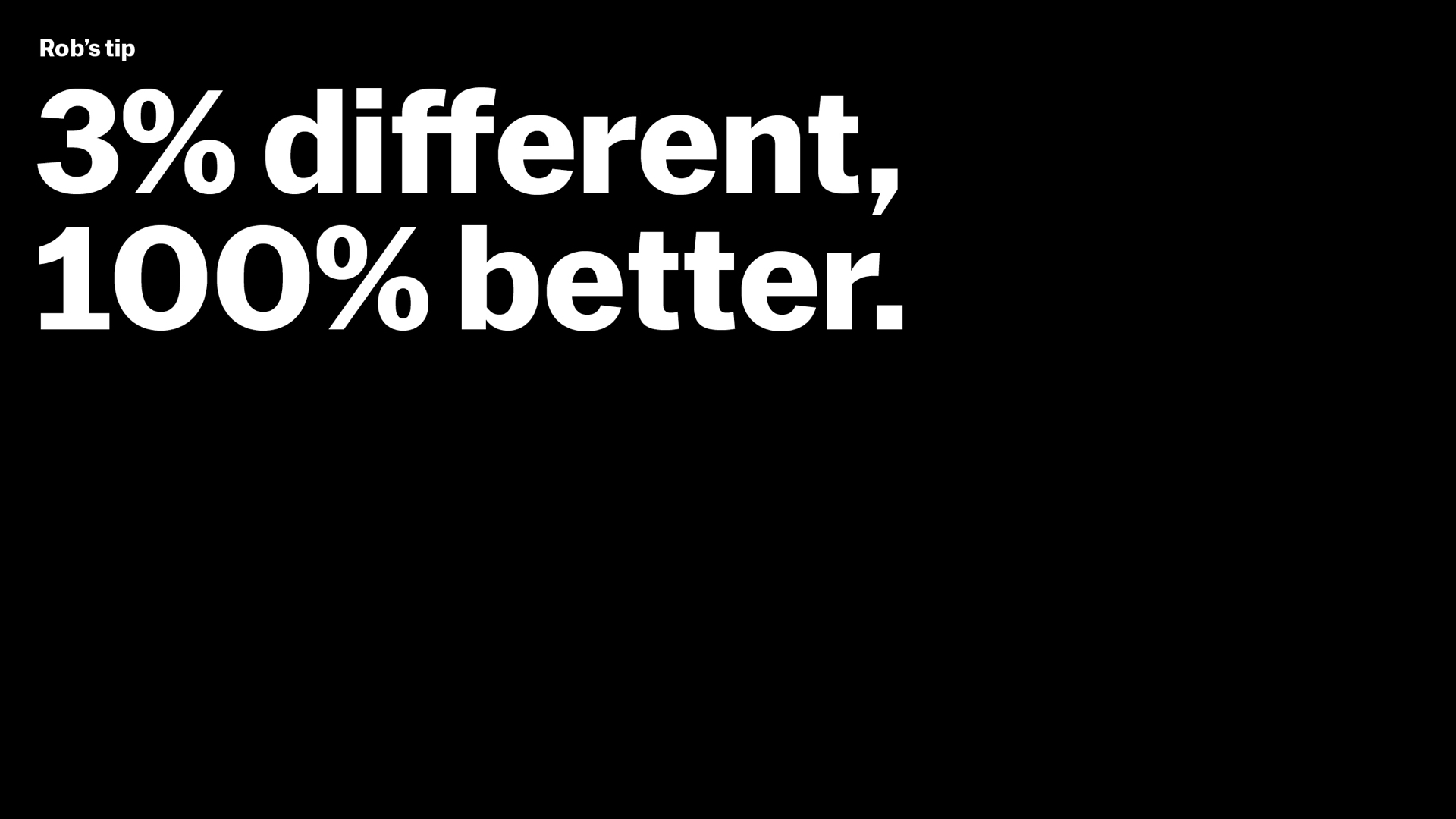
[Rob] The first is mine. It’s a mashup of two related sayings by music producer Rick Rubin and fashion designer Virgil Abloh. Abloh says you can make something new by changing it 3%. Rubin says changing it 3% can make it 100% better. That’s the goal we set for ourselves with this work.
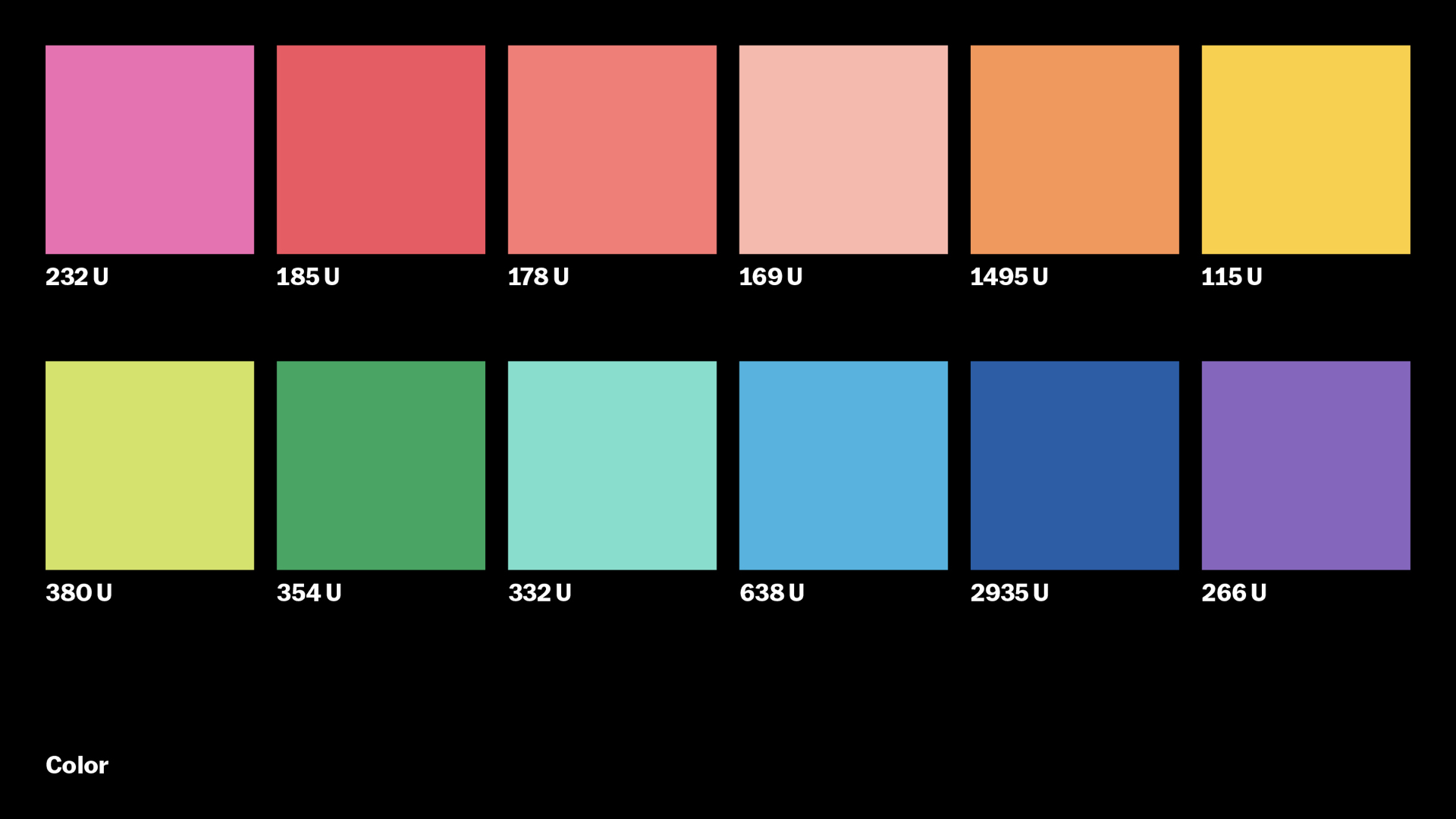
The other enduring element of MoMA’s look, from that mid-1960s Chermayeff & Geismar moment, is our use of bright colors. Its legacy was honored in Pentagram’s work, and we honor it too. We like to say, “MoMA is black and white and multicolor.” For us, colors represent many perspectives and the transformative energy of the creative spirit.
Jesse and Hamish and their team at Order helped us bring these elements together in an adaptable system of modular layers. Show titles, uncropped artwork, colorful messages, and our enduring logo all combine freely in this system. Shows can stack easily into seasons and unstack into carousels, film strips, and stories.
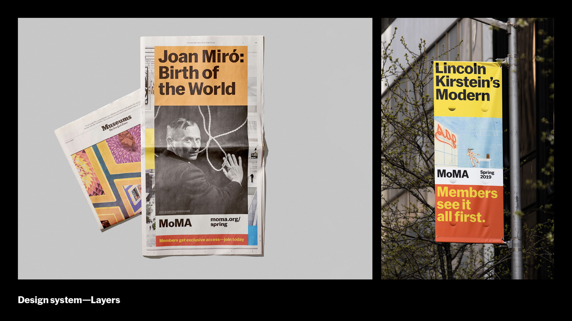
It’s a simple, functional concept that scales across all our outputs. From print and outdoor…
…to screen-based. MoMA and Order worked with Erica Gorochow of PepRally on a motion system to bring the layers to life. This system helps our classic brand move in a contemporary way. We built elevation models and motion rigs in AfterEffects to pull it off, which makes the proliferating and ever-more targeted digital ads we create more scalable for our small team, while embodying the energy and dynamism of our recent expansion.
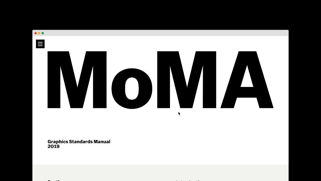
All of this is captured in a set of digital guidelines that’s shared across the museum, so that we can easily update and modify our design system and share it with our partners when needed. We also have guidelines for signage, accessibility, and other key areas.
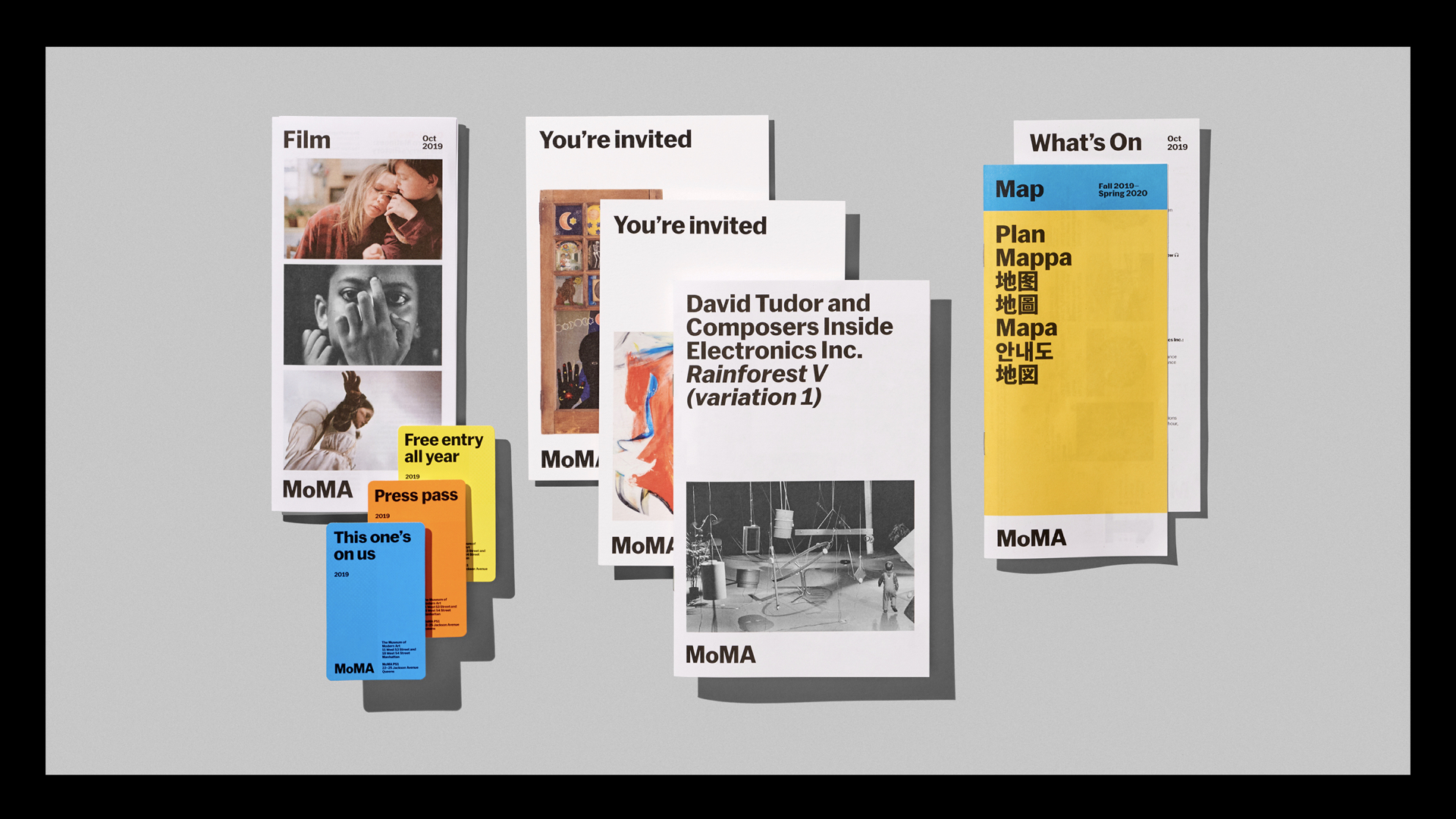
Our design system extends to all onsite materials. Before closing, we took some time to refresh our printed collateral. In evolving our system, we had a basic framework from which to begin: left-aligned MoMA Sans Bold, set tight, a 12x12 grid system, the idea of layering content, strategic use of color. From there we pulled everyone from the studio to work together on a few key pieces. We wanted to make sure that we were working with standardized typographic and trim sizes. For instance, two similarly-sized pieces should have the same margins, logo sizing, typography, etc. Over successive weekly meetings, we came to a collective agreement and those guidelines were codified in the design system standards website.
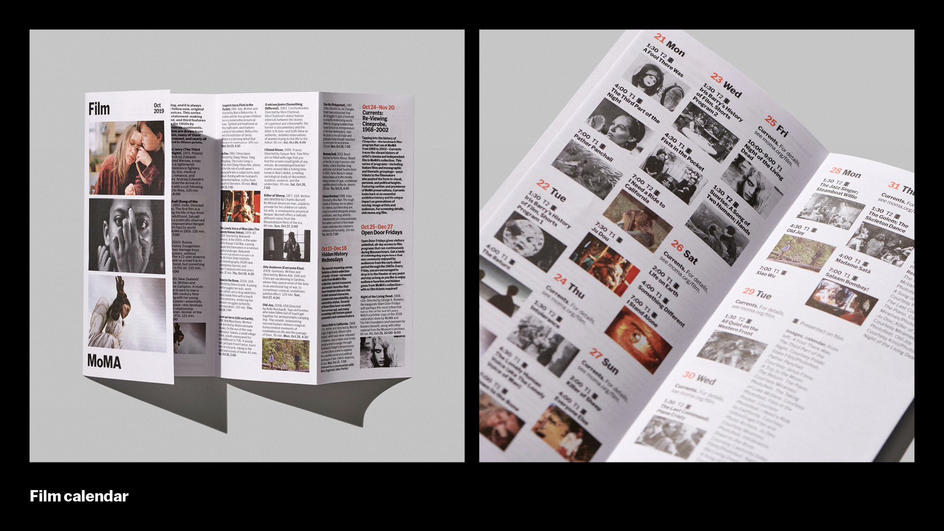
Our monthly film calendar folds in a unique way to make it easy to read descriptions, or browse by date.
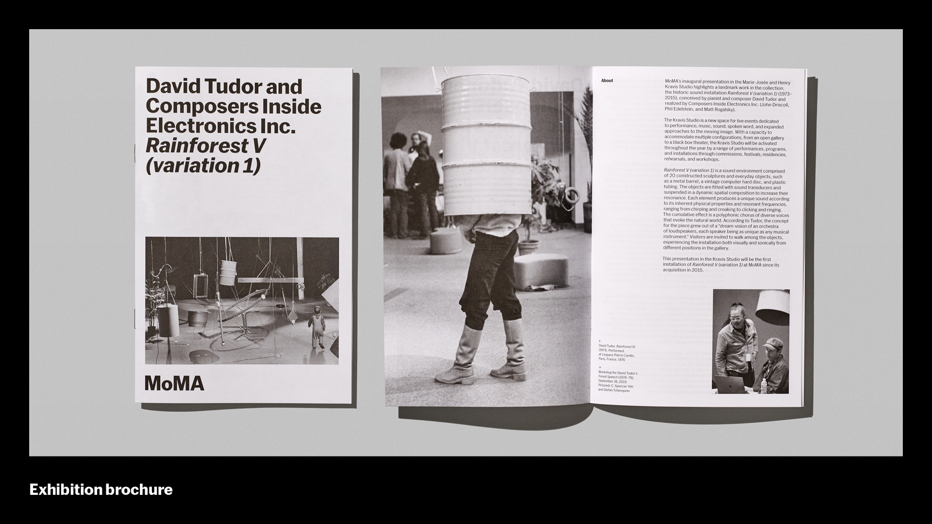
Sometimes curators write extended texts for an exhibition, and we’ll produce a brochure that visitors can take home.
[Damien] Here’s my tip. When working on updating a large system, it can be very helpful to crowdsource from the team. We don’t have bandwidth to redesign everything, and there are projects I am less familiar with. Having everyone touch a few pieces helps avoid pitfalls and creates consensus and buy-in. We are a very flat team. Everything you are seeing in tonight’s presentation would not be possible without a high level of collaboration.
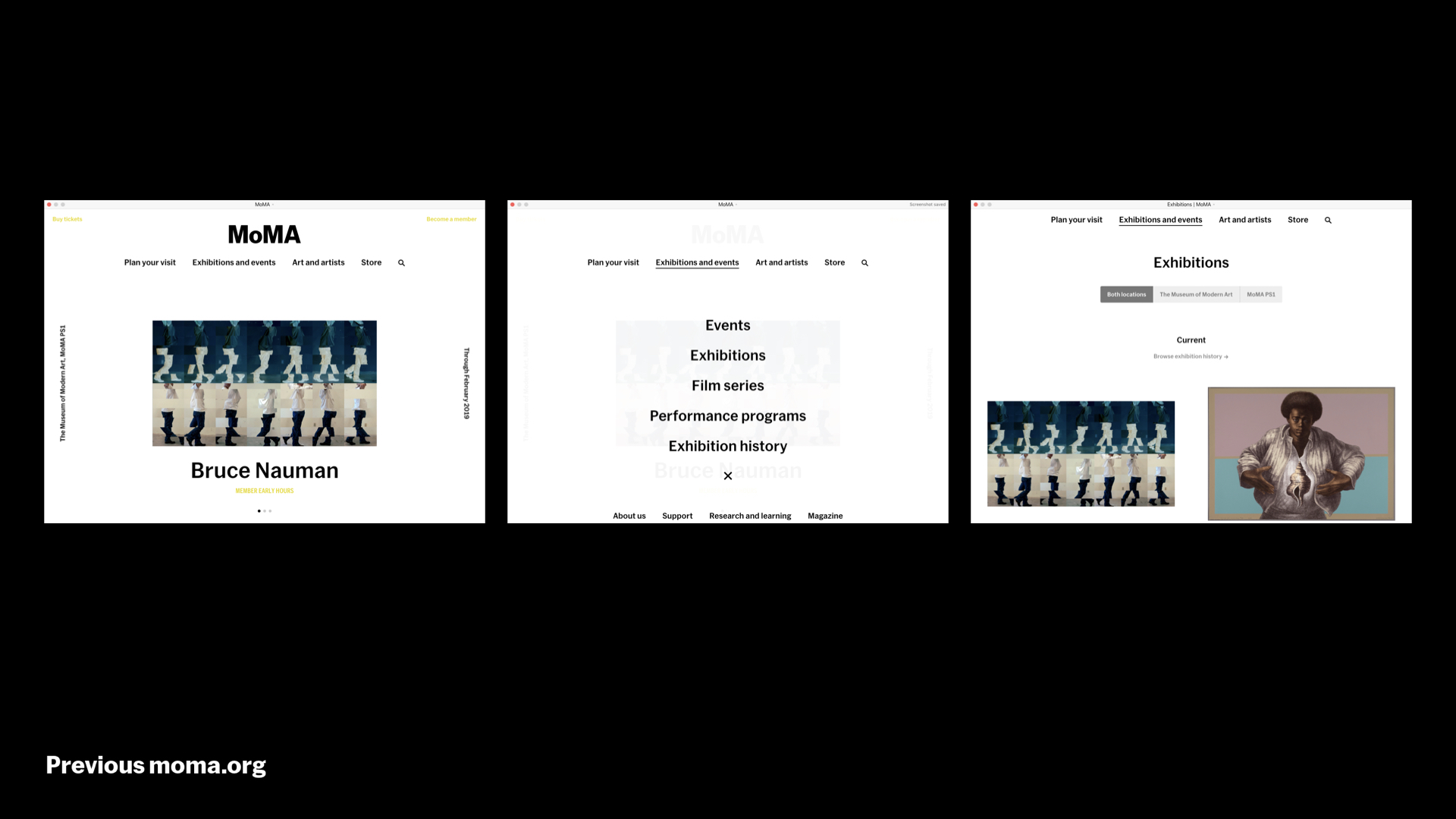
And then there’s the website, moma.org. Here’s where the site was in early 2019 — under a year ago, incredibly — and you can see the distance between it and the evolving design system. We, like I’m guessing everyone in this room, think that inconsistency is painful, so we decided to do a visual design pass before opening, which was a hard decision because there was a ton other work that needed to happen for this date. So here you have center-aligned, black and white, images uncropped…
…and here’s where we are today. Left-aligned, color where it counts, a greater reliance on bold typography. We have moments when the volume on the design system is turned way up, with color and the full-bleed imagery and larger type, and other moments, especially for the more scholarly sections of the site, where it’s quieter and more scholarly. So now when you walk by our digital ads in the subway and then see us on Instagram, and then visit moma.org, and then hopefully visit us at the museum, it feels like it’s all working together cohesively.
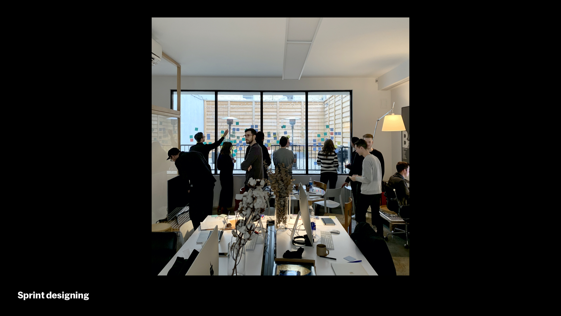
A little bit on process. At the outset, we had high-level guidelines and some examples out in the wild, but we were a long way away from understanding how this would work on moma.org. We got there in 3 steps. The first step was a 5-day design sprint to get to a “northstar,” and we did this with people from Digital Media and the Design Studio at MoMA, people from Order, and some special guests at Order’s lovely office in Greenpoint. The second step was refining, expanding, stress-testing, and prototyping the northstar, and we did this in collaboration with our good friends at Doberman. Finally, the biggest step was interpreting and implementing all of this work, which was handled by Digital Media, and fortunately we were able to get a critical mass of the changes and new UI live before our opening day.
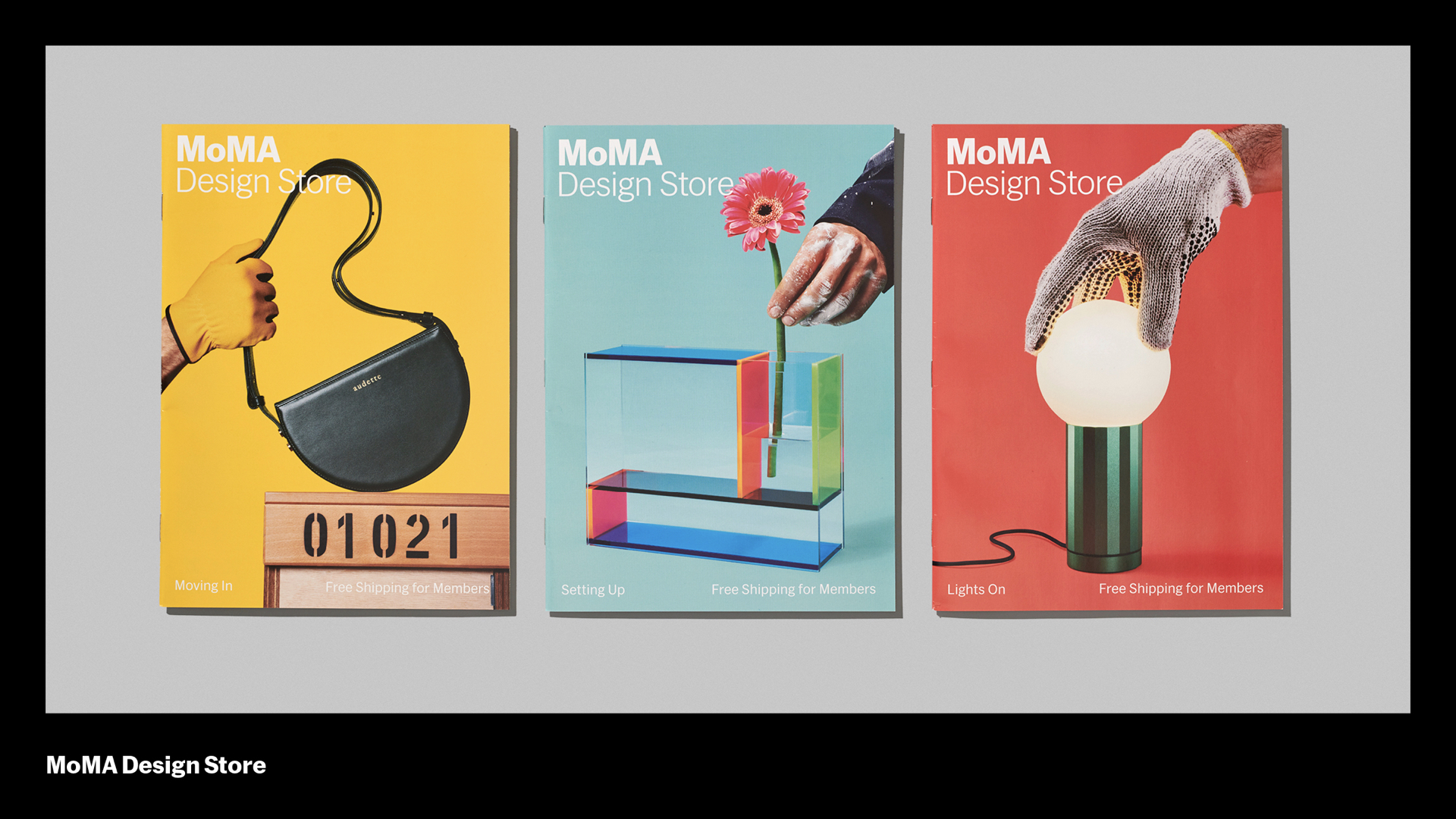
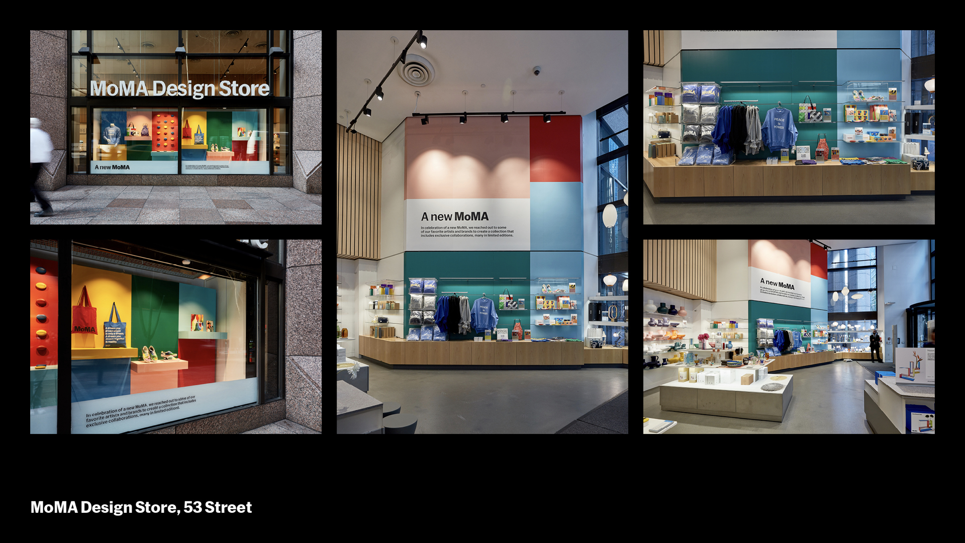
Our design system doesn’t stop with the museum. The Design Store supports MoMA as an institution, and its updated mark extends the MoMA logo by adding to it. The Design Store is an extension of MoMA. Commercial Type helped us craft this thinner “store” weight for the Design Store, which lightens up to better allow the focus to be on colorful product photography and in MoMA’s bold institutional mark. To mark our new store, the Fall catalogues featured three riffs on the theme of “a New MoMA”: Moving In, Setting Up, and Lights On.
All of the MoMA Design Store’s profits support MoMA, and MoMA curators are involved in product selection offered in the Design Store.
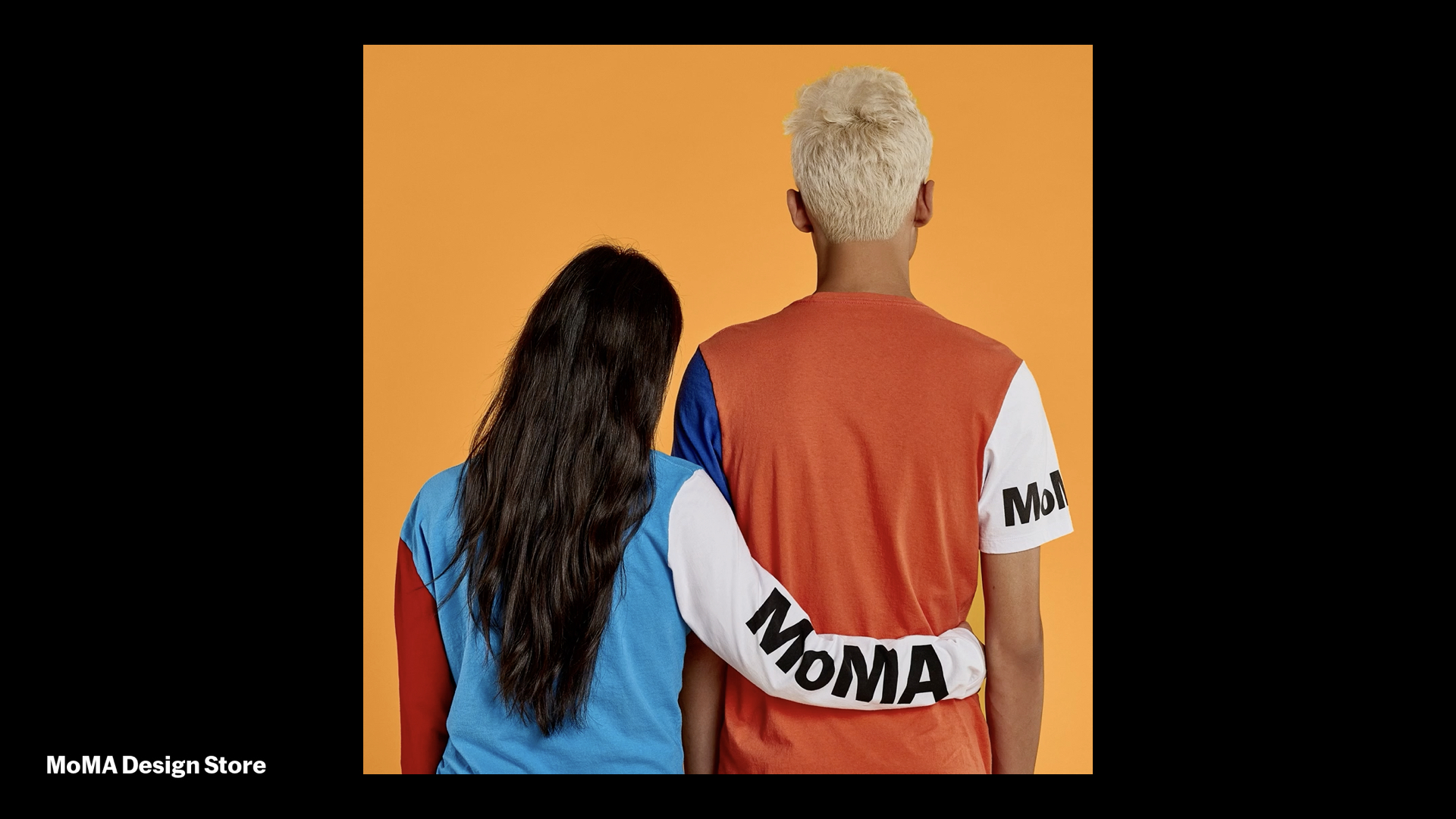
Sometimes we even get to design products ourselves, like these color-blocked T’s and Sweats to celebrate our reopening, along with quote totes and water bottles.
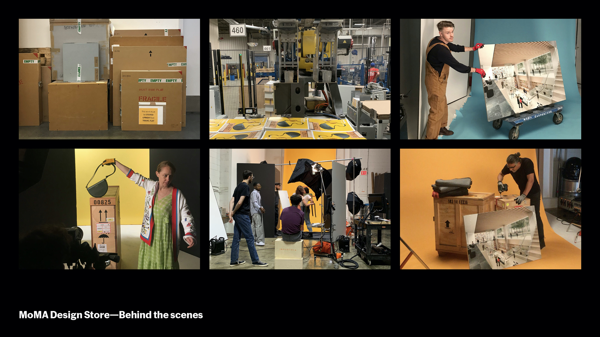
Making the catalog takes a village. It starts with product selection, renderings and mockups, layout, photography, and post-production. For our Fall catalog we collaborated with photographer Bobby Doherty and stylist Sonia Rentsch. We also borrowed a few art crates from our exhibition team, and a trolly from our carpenter shop. The shoot even featured models from MoMA, like Young Sun from Digital Media, and Matias from IT.
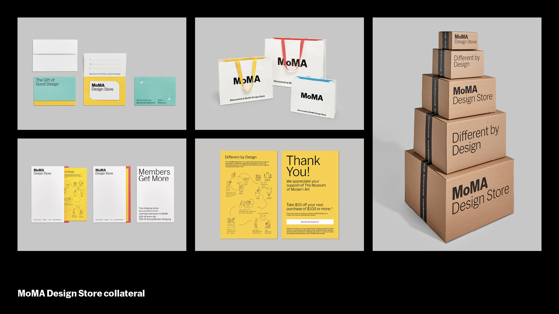
We carry the whole design system into retail environment through shopping bags, packaging, collateral, and communication materials.
These ideas come to life in our displays onsite, at the Design Store across the street…
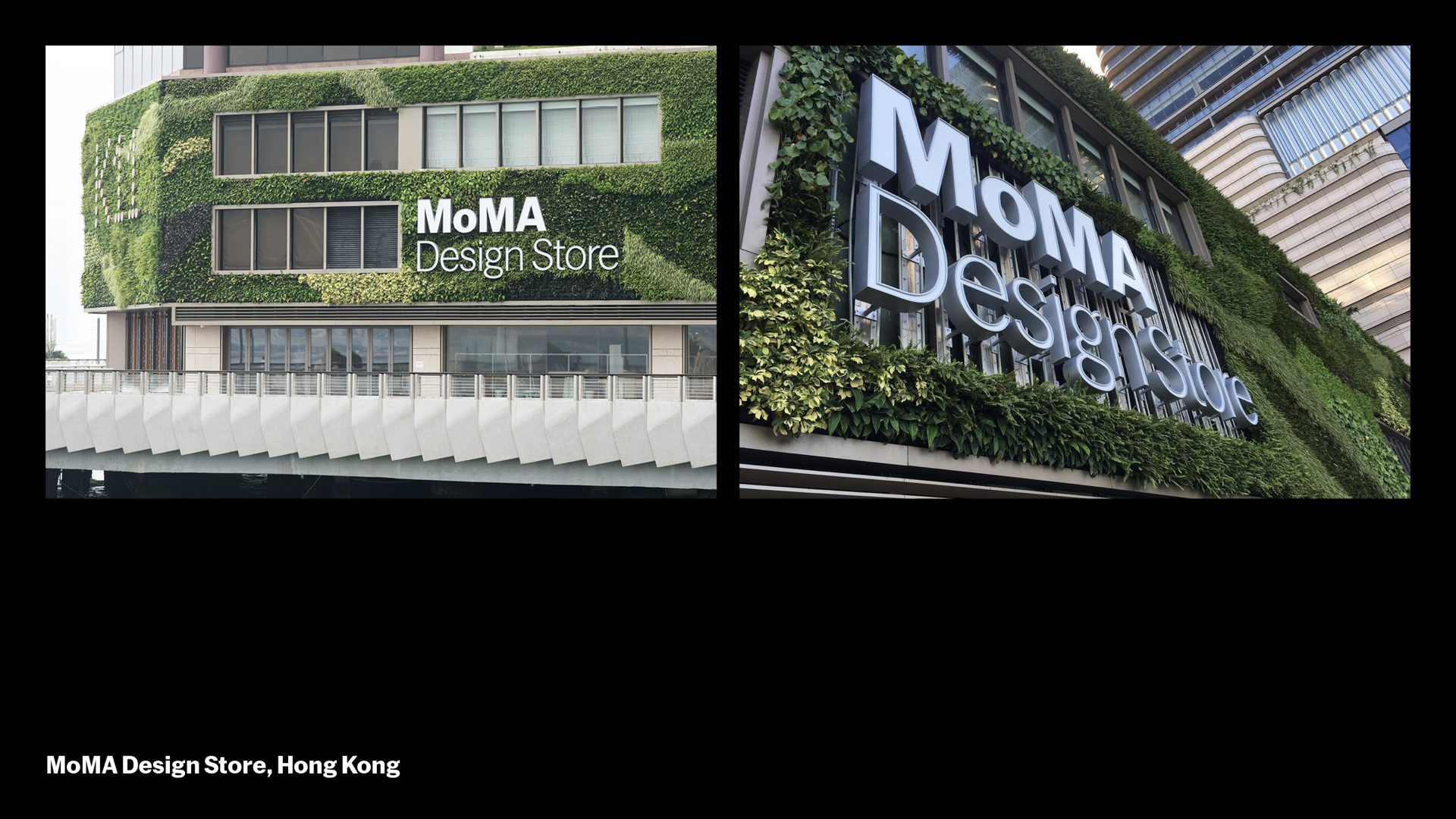
…and halfway around the world, including our new store in Hong Kong, shown here. In addition, we have 2 stores in Japan (Tokyo and Kyoto), and 8 shop-in-shops within Japan Loft stores.
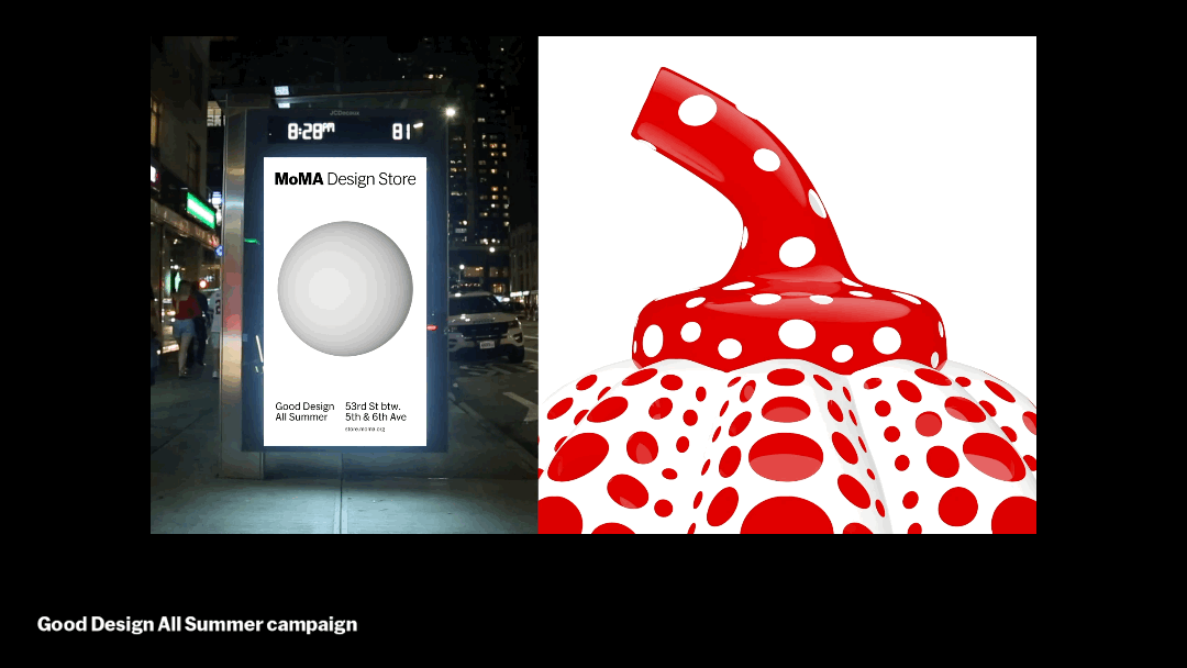
On outdoor advertising, we often explore how the Design Store can connect through motion. The “Good Design All Summer” campaign emphasized that the store was open while the museum was closed for renovations.
In short, eye-catching videos included a mushroom-like Lexon Light that turns on/off, a Dutch toy that springs and hops called a “Hoptomist,” and one of Yayoi Kusama’s pumpkin objects that spins into view. While the objects are only four inches tall, we presented them larger than life.

Sometimes we’re adapting our design system not for a new location, but for a different audience. All our materials for MoMA’s Education department use the core fonts, sizes, grids, and colors of the design system, but they add a twist: the containers are stroked, helping these items to be quickly scanned and easily organized, so key information is concise and accessible and locations are easy to find.
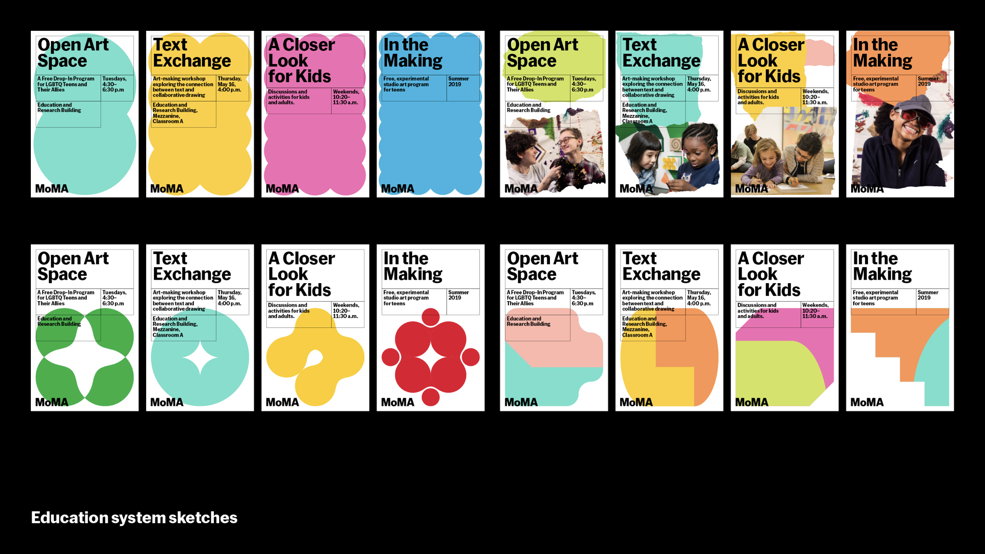
Our Education team is dedicated to fostering creativity through making and through thinking and discussion. To extend the system further, we wanted to evoke similar sense of experimentation, play, and learning, showing process and materiality instead of finished artworks. Here were some sketches we made to explore adding shapes, colors, and textures to the core system in addition to the gridlines. With photography as well, we could further underscore the offering to specific audiences like kids, teens, seniors, and those with special needs.
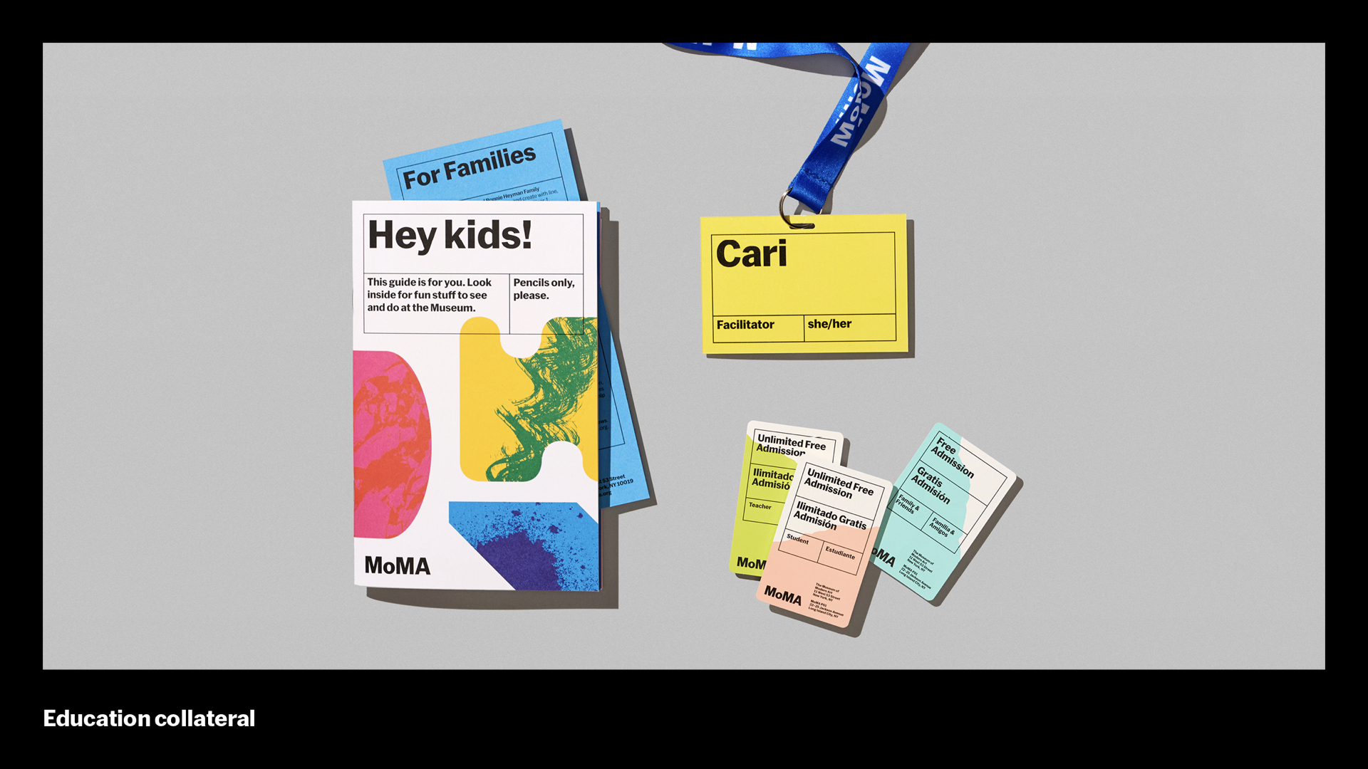
For reopening, every Education touchpoint now shares these elements, so it’s hard to miss the special opportunities found at info desks and all throughout the MoMA campus.
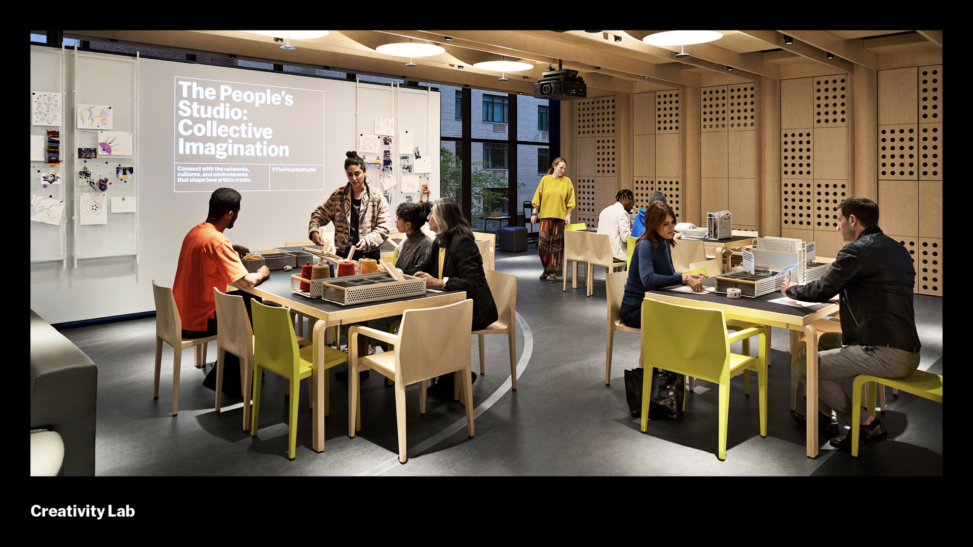
For the Creativity Lab, an Education space on the second floor for teens and adults to explore art and ideas, the system uses projected signage to anchor the entry from a distance.
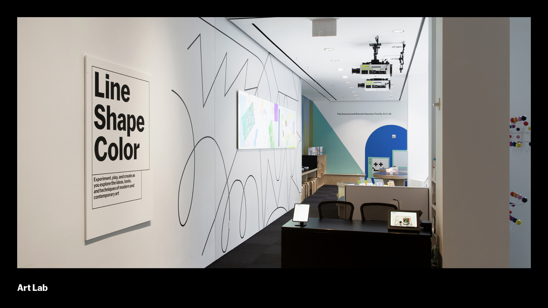
At the Art Lab for families and kids, the entry is marked using floating plaques that we also use in other areas of the museum.
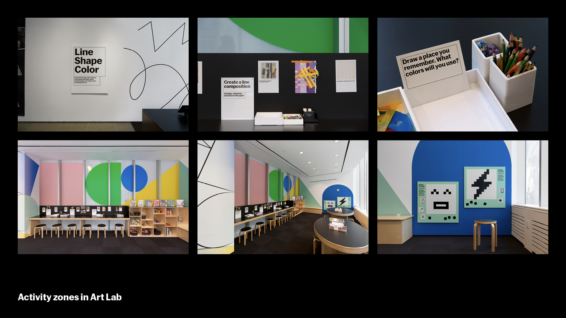
This Art Lab environment is called Line Shape Color. Inside are murals that are playful and engaging for kids along with multiple activity zones that allow staff and facilitators to convey these concepts with guidance and support.
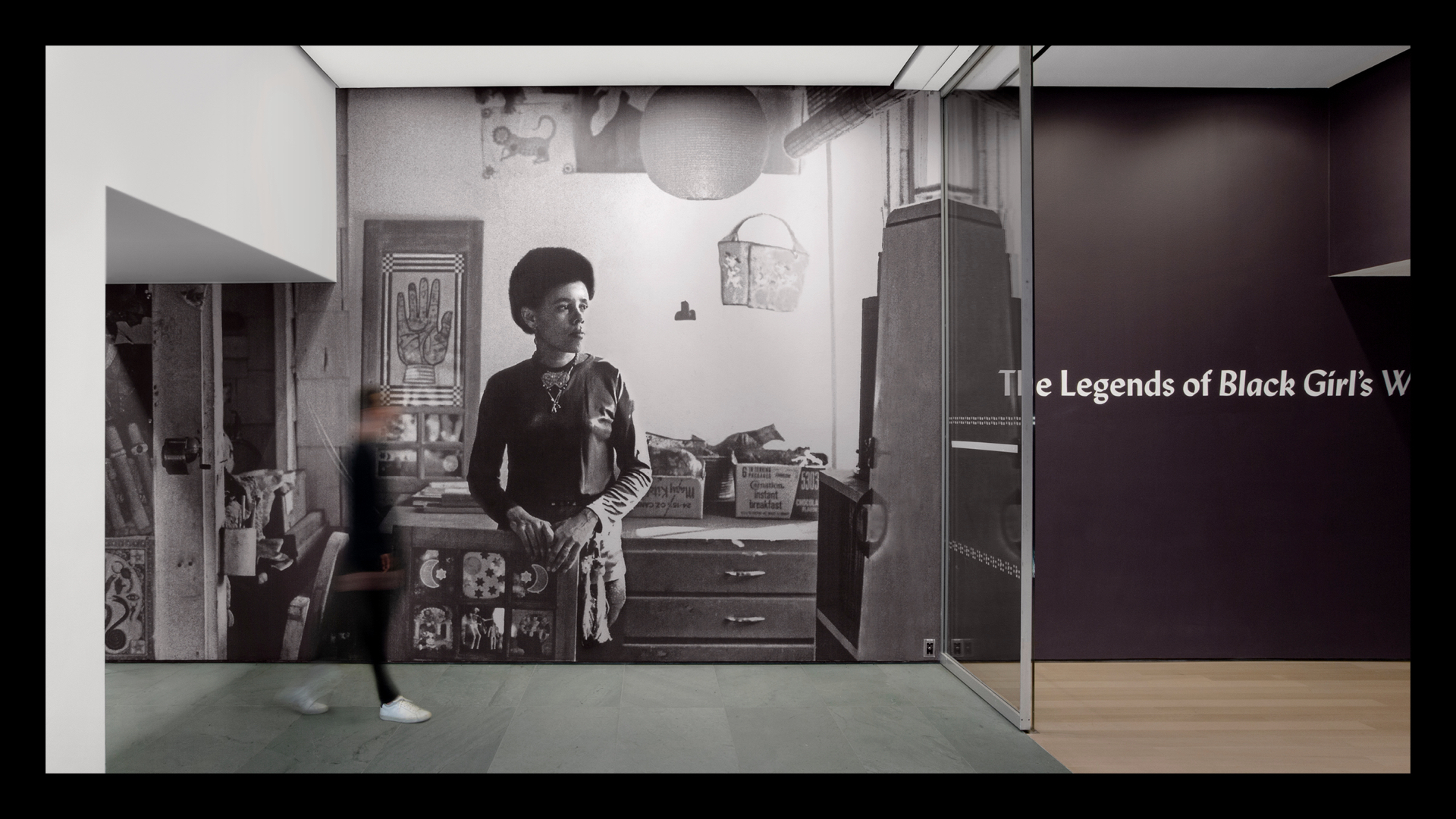
A good system has edges. While our design system serves the institutional voice, our exhibition title walls serve the artistic or curatorial premise of the show. They are part of the furniture or stage set of the exhibition experience. We want to put you in the world of the show, and give you a sense of what’s ahead.
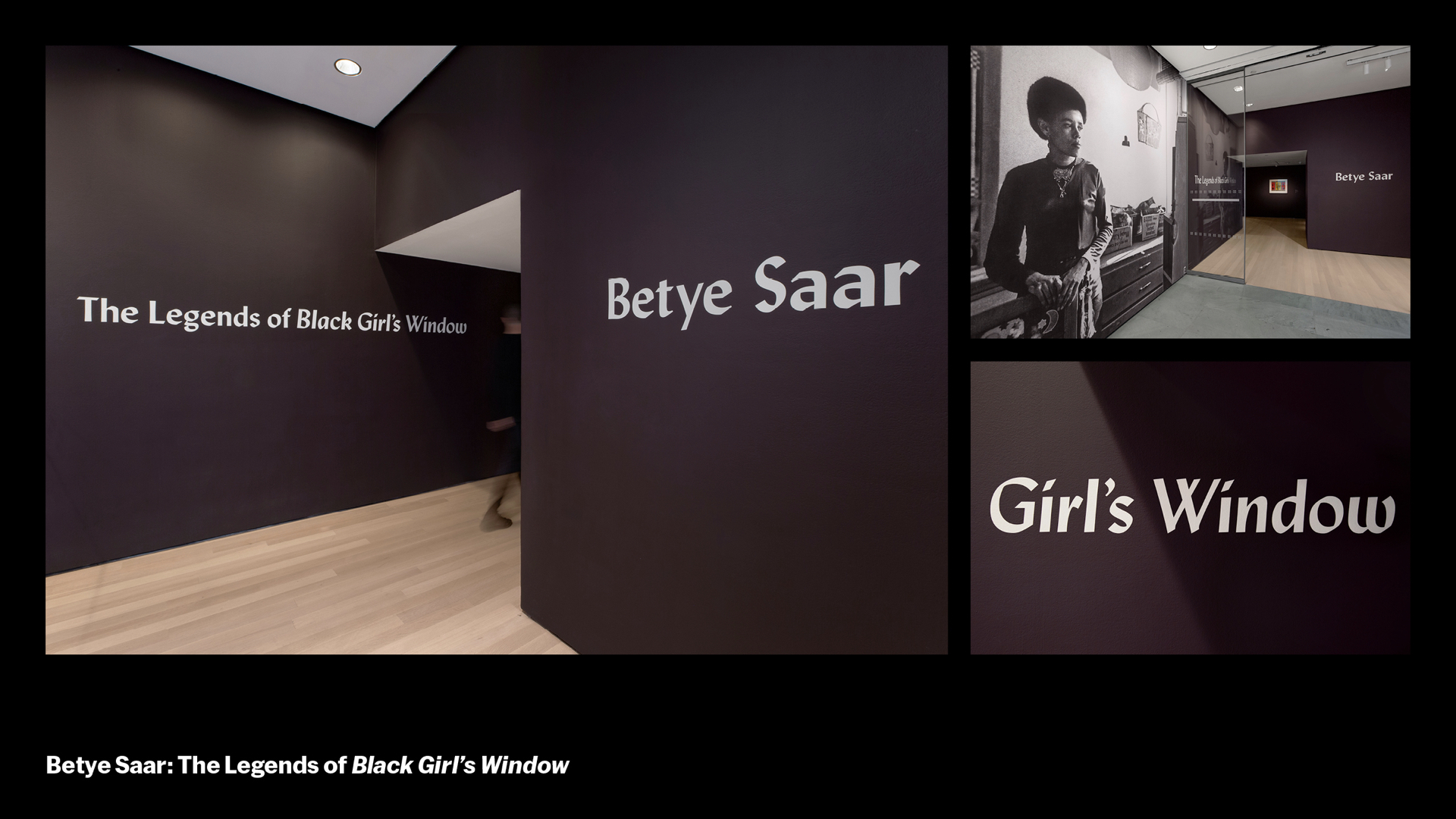
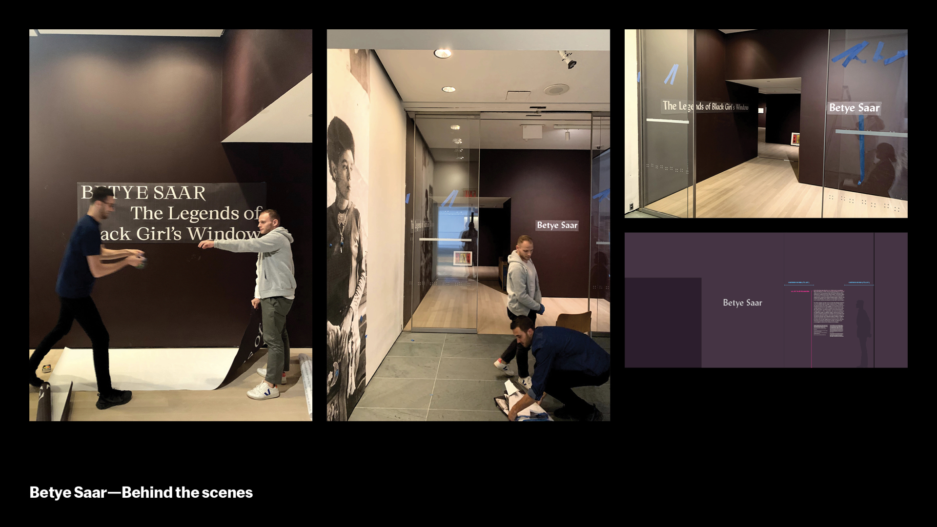
For Betye Saar: The Legends of Black Girls’ Window, we had to think about how to guide visitors through a tricky space with multiple entry points and walls. We used her portrait to guide you in, and placed the title on multiple surfaces. For the title wall, we used Lydian, a typeface that brings a midcentury handmade quality present in Saar’s work. Color, surface graphics, and wallpapers are also employed for a richer experience.
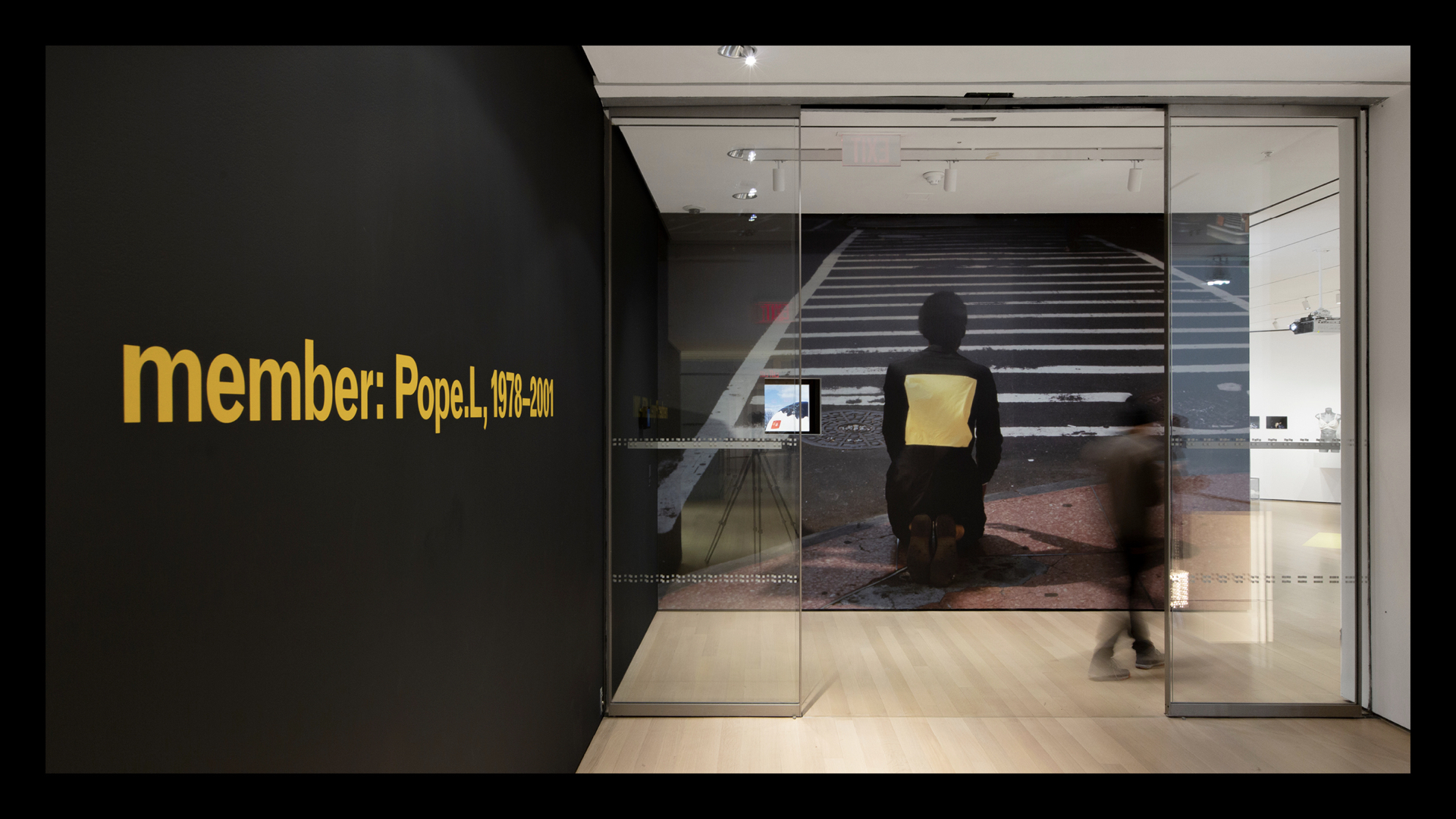
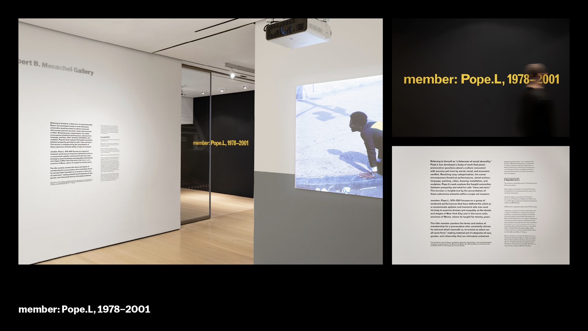
Type in space can be directional too. This exhibition for Pope.L is similar to the one for Betye Saar, so we had the typography draw you down the corridor, and in this case even through a hole in the wall created by the artist for the show.
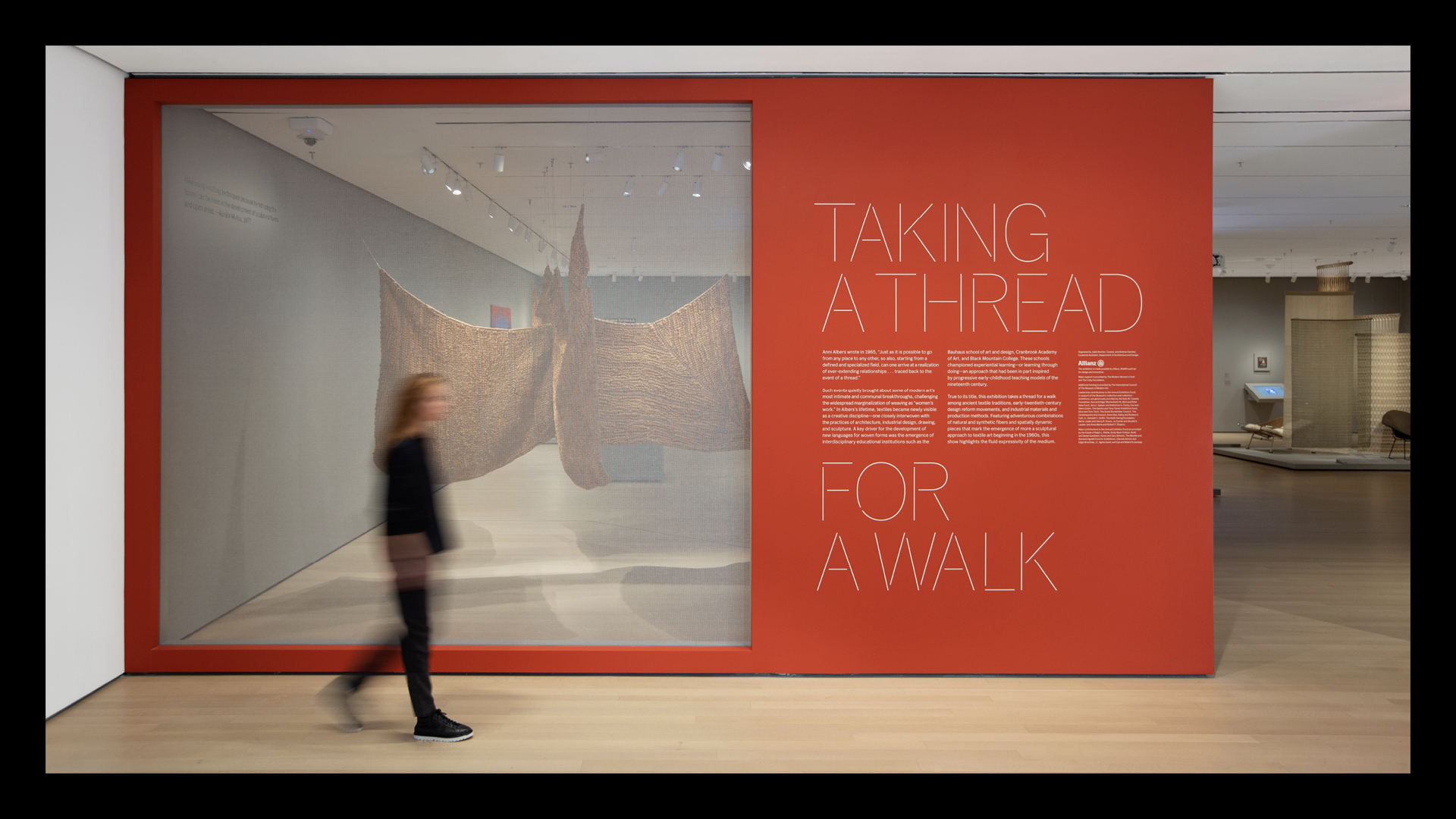
Type can also evoke a material. Here, we adapted MoMA Sans with a stitched motif for an exhibition on textile art.
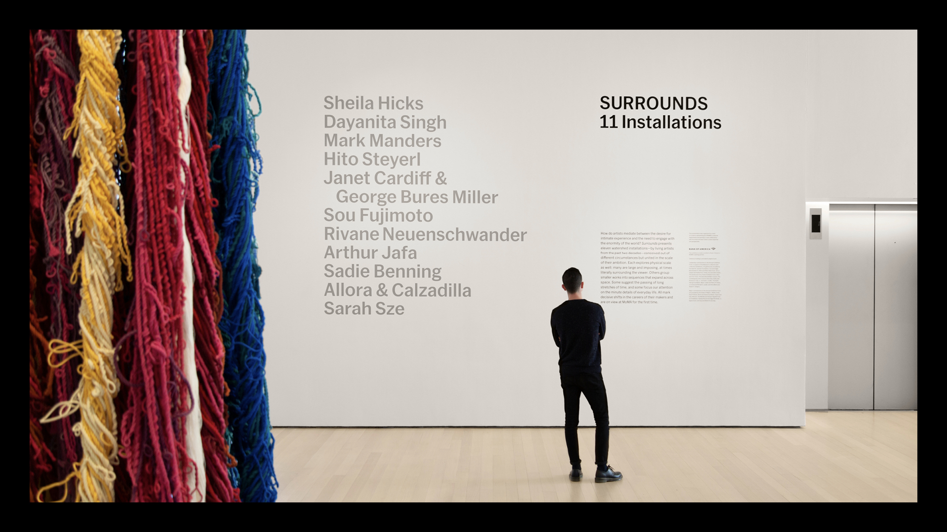
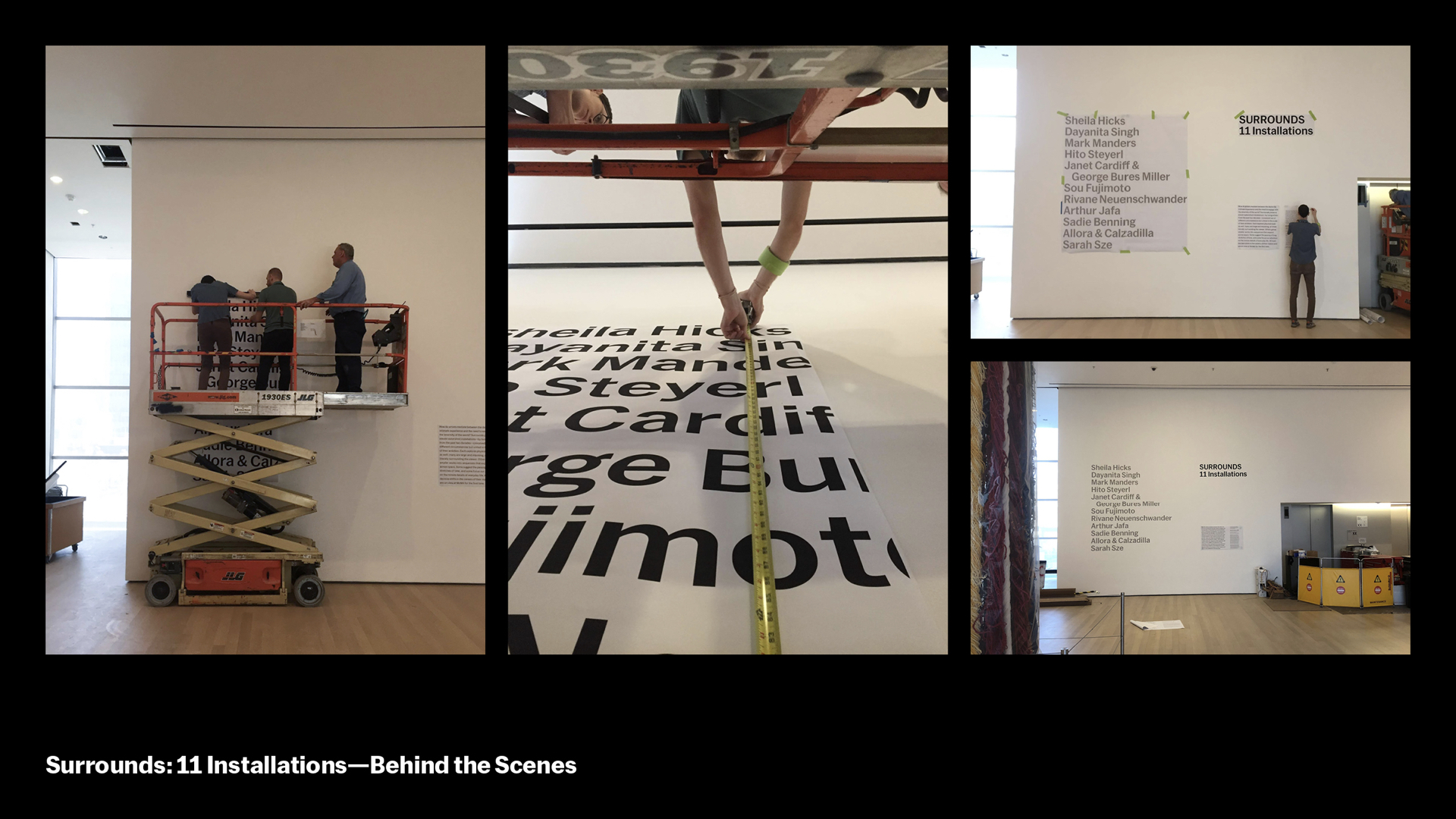
Shows drawn from our collection often use MoMA Sans a bit more literally. Here, for a show of room-sized installations that wound its way through the Sixth Floor special exhibition space, we created a list of the artists’ names stacked in the order they’d be encountered by a visitor.
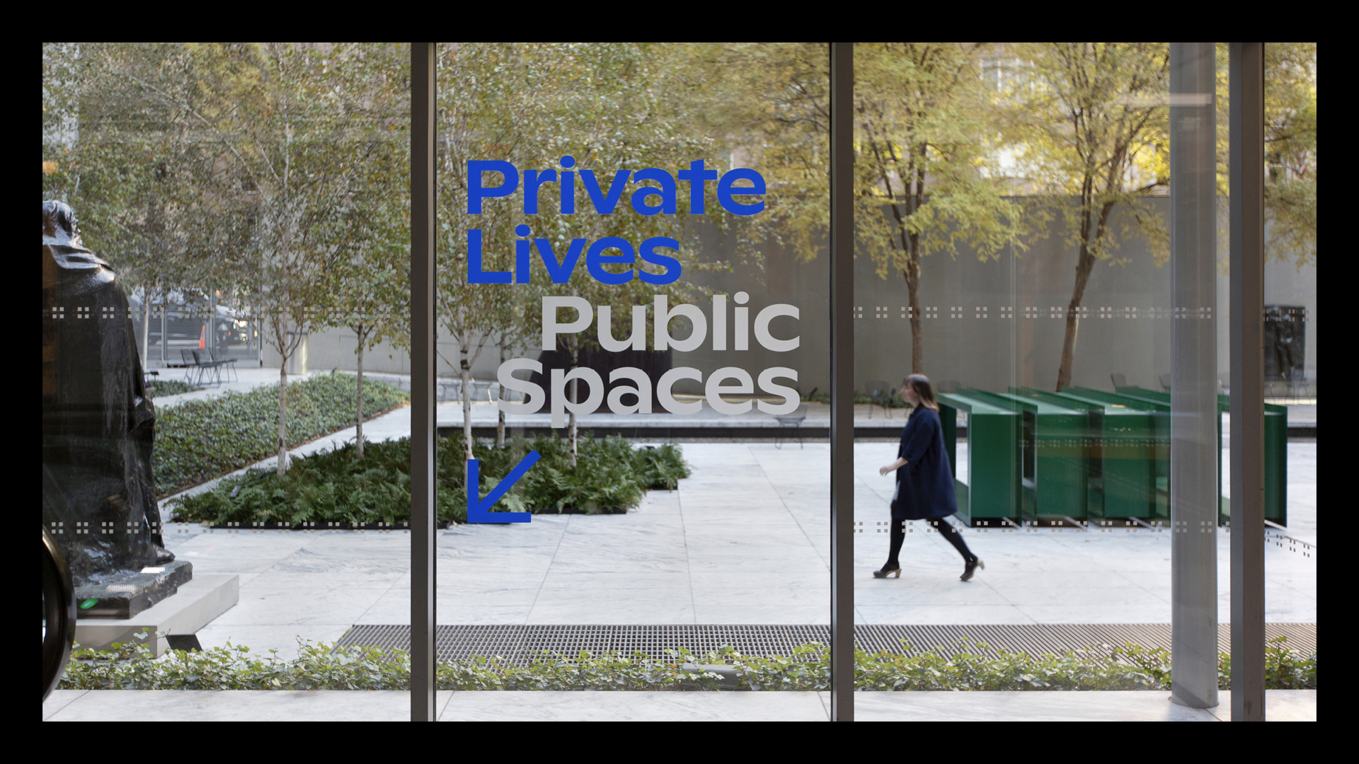
Sometimes an exhibition design idea can be driven by the union of site and sense. Here, we placed the vinyl Private Lives on the inside of the glass, and Public Spaces on the garden side.
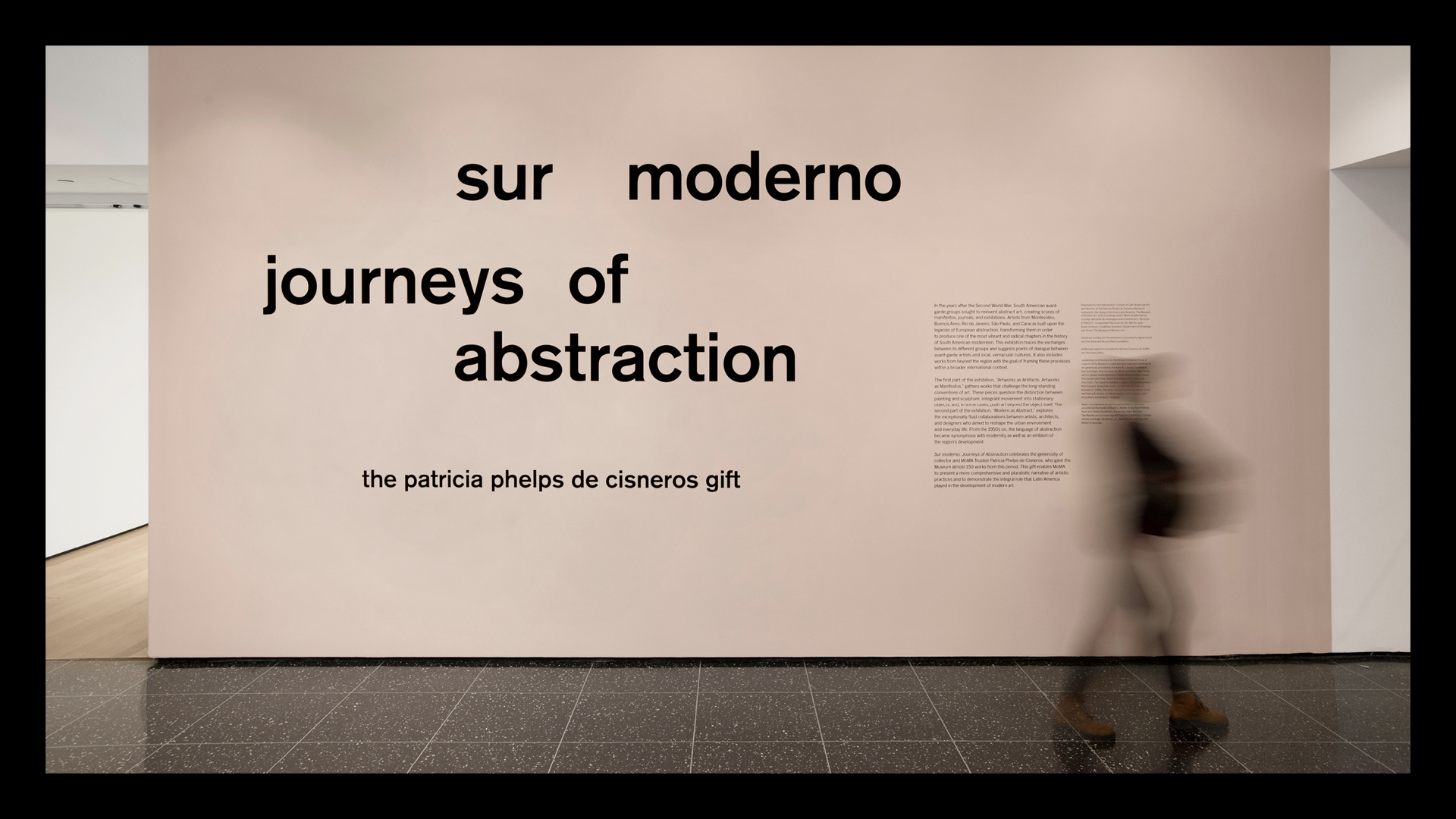
Another example of unexpected siting – for the exhibition Sur Moderno, an exhibition about Latin American abstraction, a deceptively simple paint color choice creates a solar bounce in the corridor and halls – as you head up the chilly marble stair, you get a blast of sunshine and warmth. we designed this rhythmic title wall around the breaking of order and rationality, creating the illusion of movement.
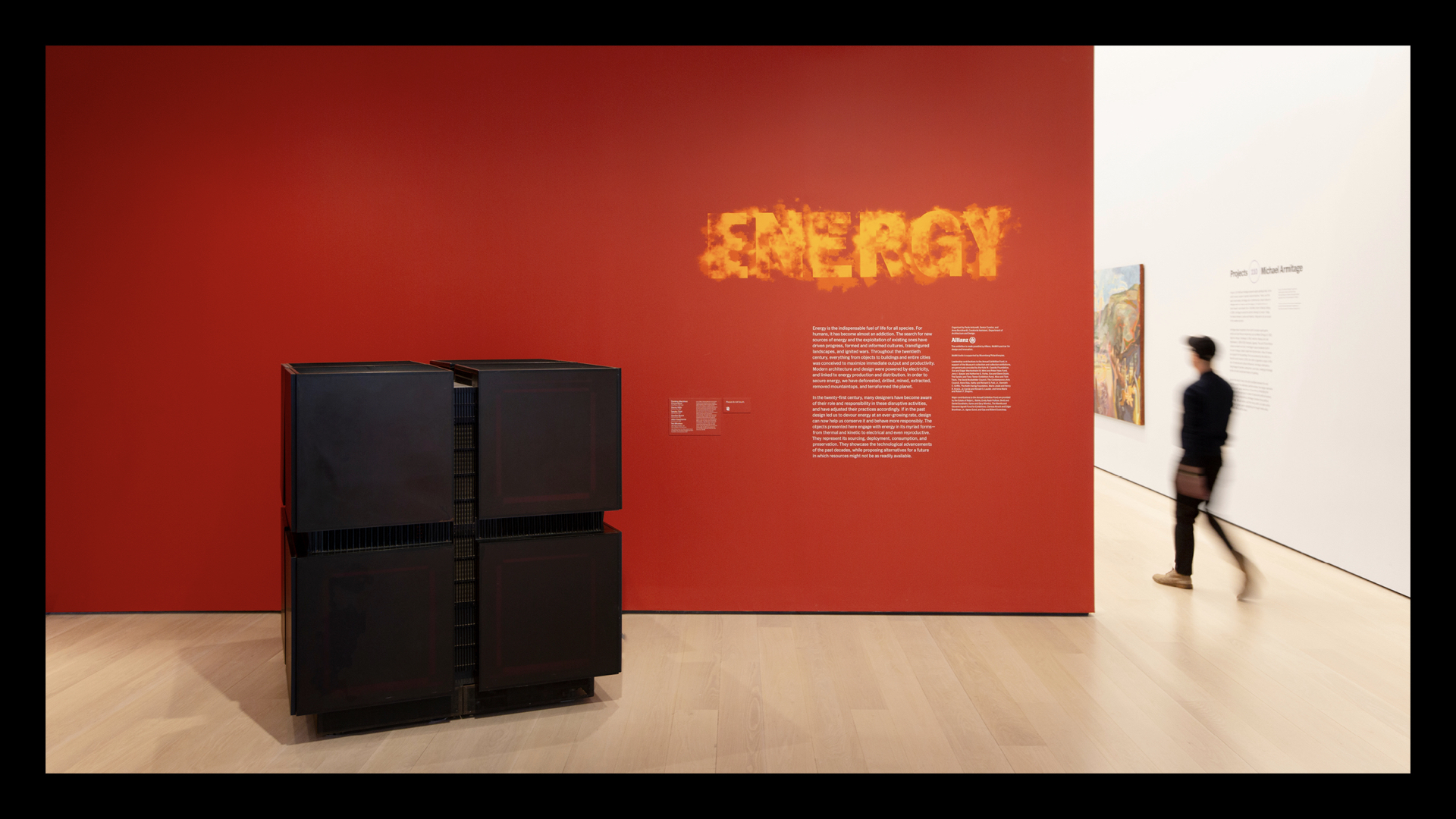
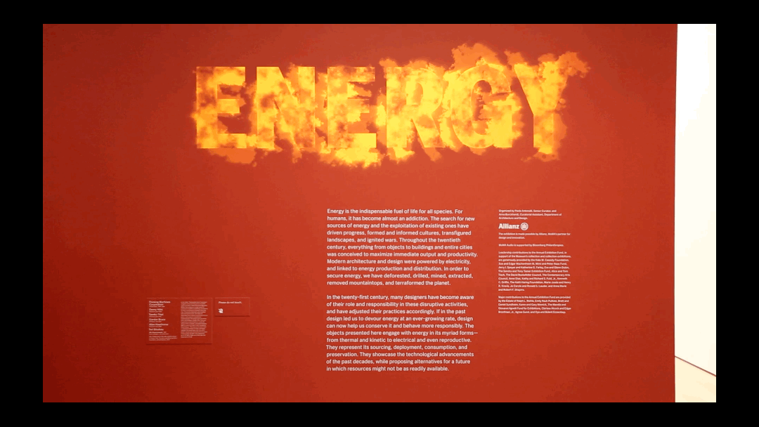
Sometimes our title walls are literally moving. We really enjoyed collaborating with Paola Antonelli, our Senior Curator of Architecture & Design, for her show ENERGY, which is drawn from our collection. Paola explained to us that, in a sense, all energy comes from solar flares, and she wanted us to express that in our title wall. We looked for ways to evoke that, but she rejected them all. She stayed encouraging though – we saw her in the MoMA Staff Cafe and she’d whisper, “Solar flare!” as she walked by. Eventually we went back to AfterEffects and made the reference as direct as we could. She loved it.
Here’s our MoMA Sans on FIRE = MoMA Sans Solar Flare.
Now we’ll talk about our title wall design process, which is in two parts, first with scale models made digitally and then with full-size printouts in the space itself. We do this because when you blow up a design you’ve been looking at on tabloid printouts to a full scale plot in the space, a lot of things can change.
This is an opportunity for us to “experience” the space with the design and make adjustments until it looks and feels right in the space.
Here, we’re trying to figure out the most optimal size and placements in this rather complex entrance area. The installers (silk-screeners, vinyl cutters) will use this positioning to finalize the installation.
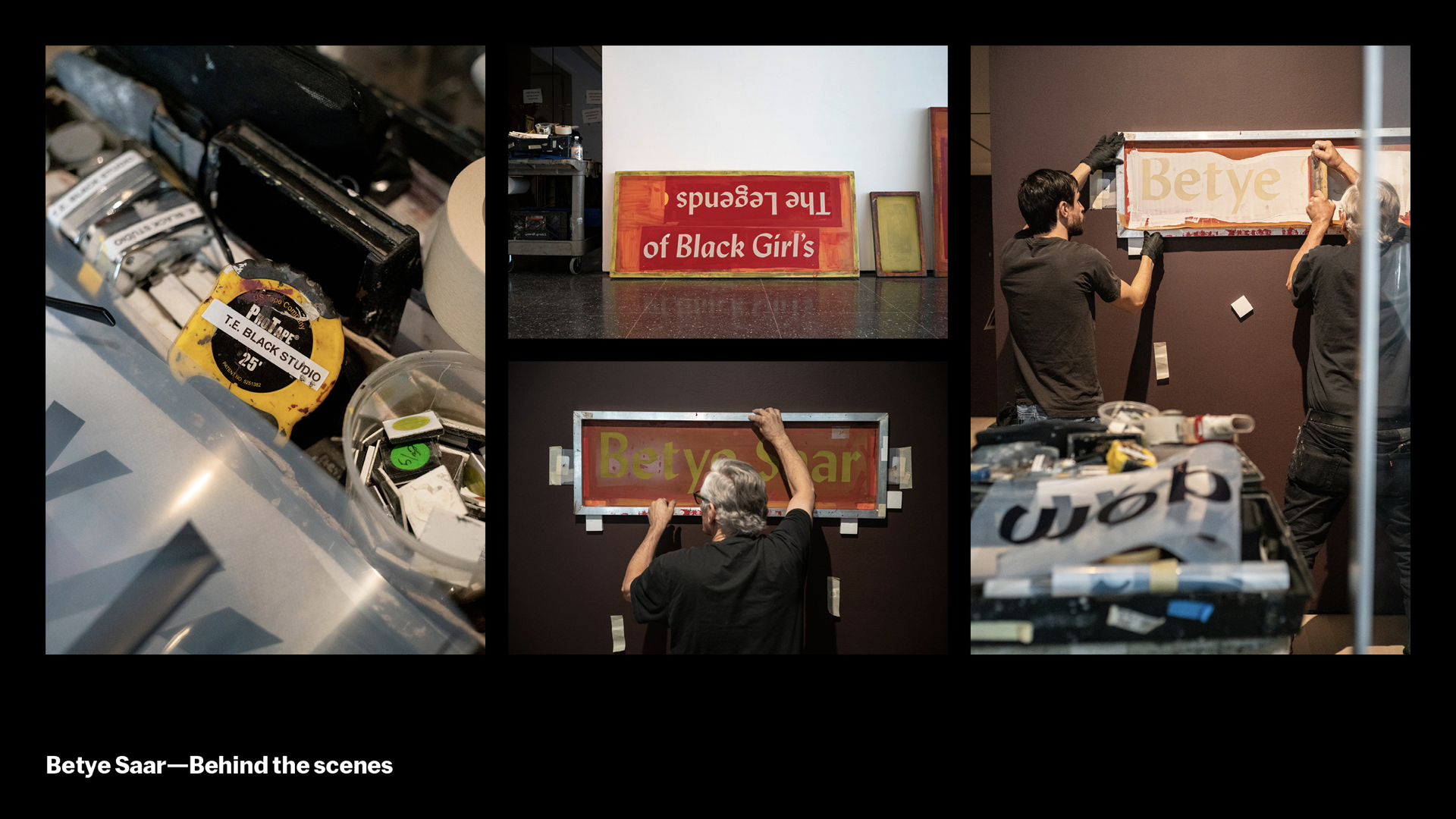
We work with amazing installers for different types of application. Here you see our silkscreen installers from Tom Black studio installing the Betye Saar title wall.
This second section looks at how we crafted every element of the onsite experience, the visitor journey, of our newly expanded building on 53rd St.
That starts with understanding the site itself.
MoMA is a collection of buildings on 53rd St that have been expanded for decades. The interior is cohesive and structured around inner hubs like the sculpture garden and new blade staircase.
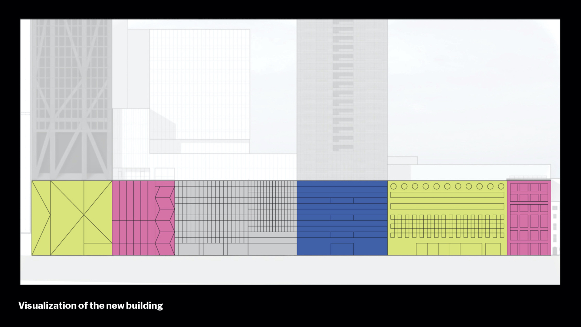
But the exterior is eclectic and varied – it’s not a singular facade. The original site is 11 W 53rd St, built in 1939. New buildings were added in 1964, 1984, 2004, 2018, and 2019, basically moving from right to left.
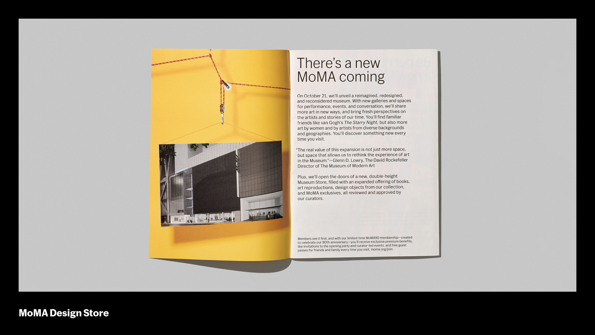
When we announced MoMA’s most recent expansion, we released drawings by our architects Diller Scofidio + Renfro, but these drawings were complex and detailed. Not exactly for a general public. We needed something that would kick off the ramp up to a new MoMA, power us through our closure period, and punctuate the reopening festivities.
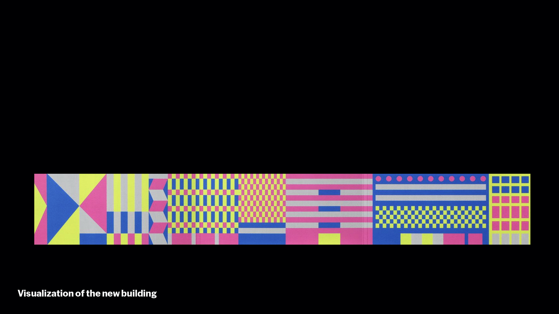
The great NYC studio Triboro helped us to create this graphic, which we affectionately call our “Visualization.”
Can you see that eclectic 53rd Street facade? Hopefully that eclecticism is kind of amplified, conveying the site but also the spiritual energy, dynamism, and excitement of the new building and campus. The diversity of facades came to stand for a diversity of perspectives – curatorial, geographic, demographic, educational – rather than a singular monolithic institution.
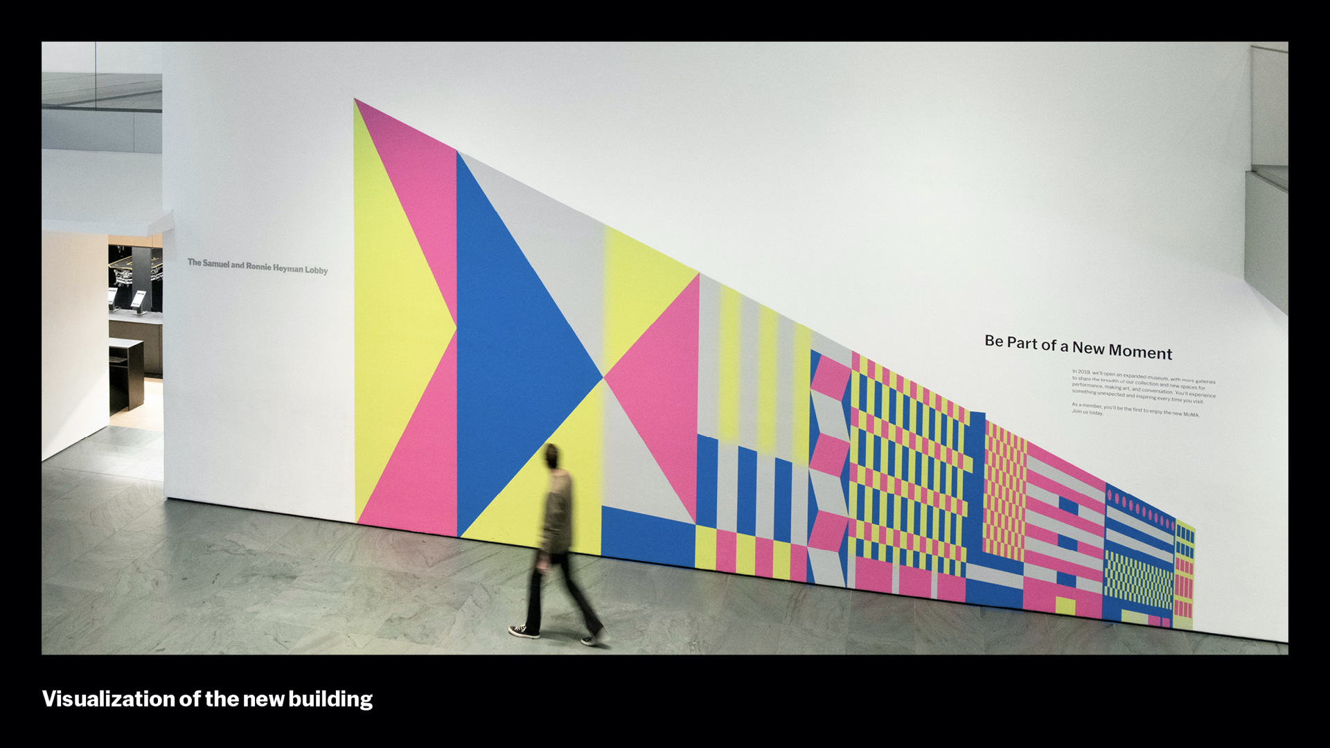
It has a number of expressions. We love this dimensional variation. It was designed to sit alongside our main design system and reinforce it, as with the shapes in the education work.
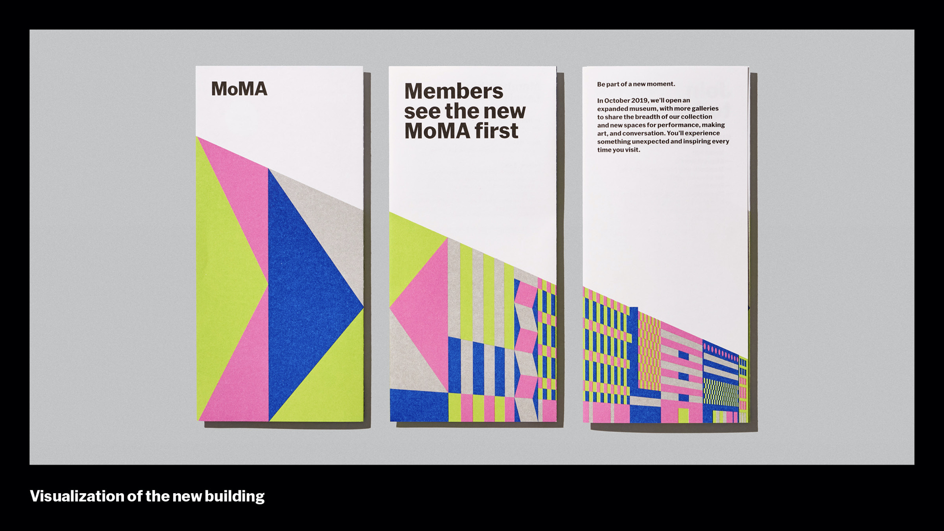
As it evolved and we used it more and more during our closure period, the Visualization was particularly connected with our Membership program, where people signed up to get a first look at our new digs…
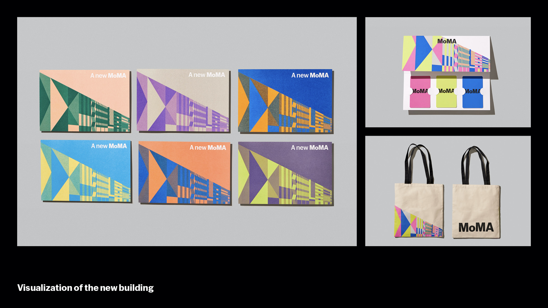
…but it also adapted to dozens of invites, gifts, and other applications throughout the arc of the building project.
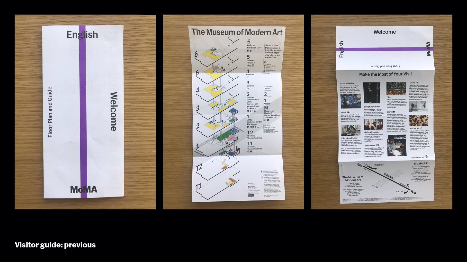
Once we orient you to 53rd Street, we have to help you navigate the building itself. We needed a new Visitor Guide to serve our 3 million visitors and an additional 40,000 square feet of gallery space.
So here’s what we had before. The reviews were mixed, and a lot of people complained. It was cheap, so no one kept it, the isometric projection of the floors was hard to read. Visitors couldn’t figure out locations of the shows or even where to begin.
So we used this reopening opportunity to rethink our Visitor Guide completely, in an effort to create a better visitor journey across the campus from end to end.
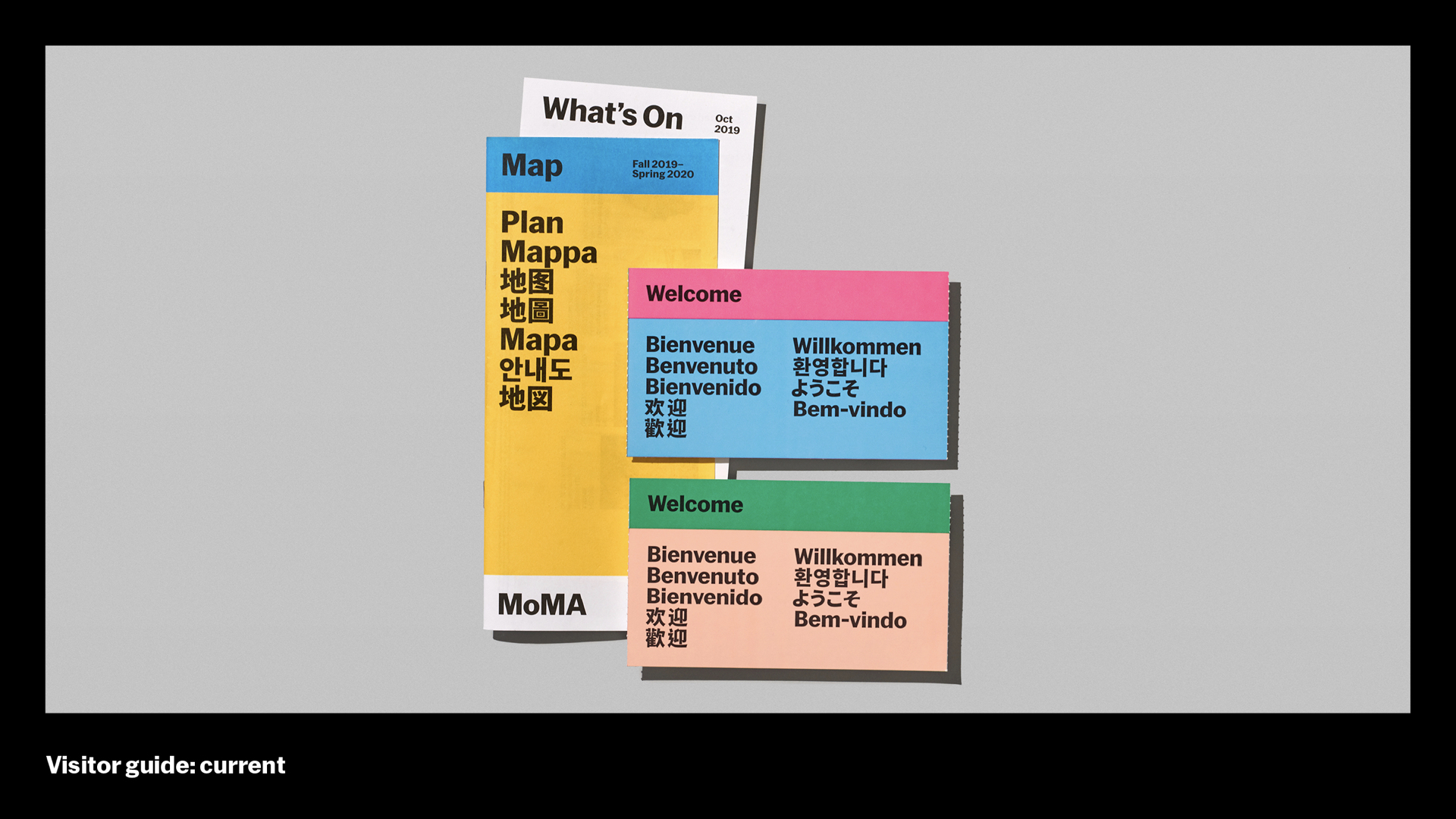
This is our new Visitor Guide, along with the admission ticket, which are the first 2 things you receive as you begin this visitor journey. Everything is printed on 100% post-consumer waste recycled paper, which is one of many steps we’ve taken to be a greener institution.
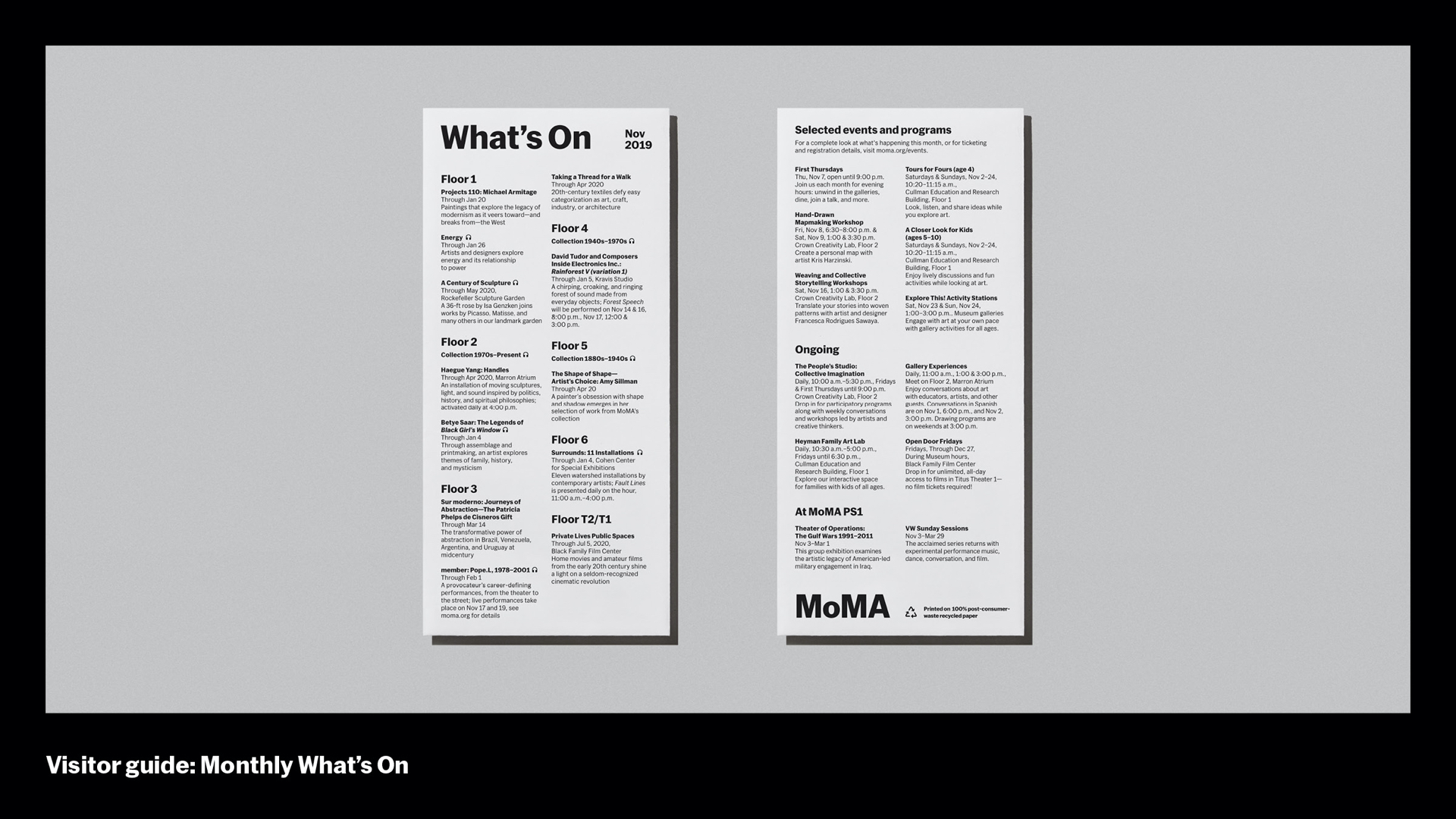
To reduce waste, if you know the building pretty well, we give you a simple “What’s On” guide, which we refresh monthly instead of twice a year. These are quick at-a-glance guides that tells you what shows are on each floor as well as other programs and events.
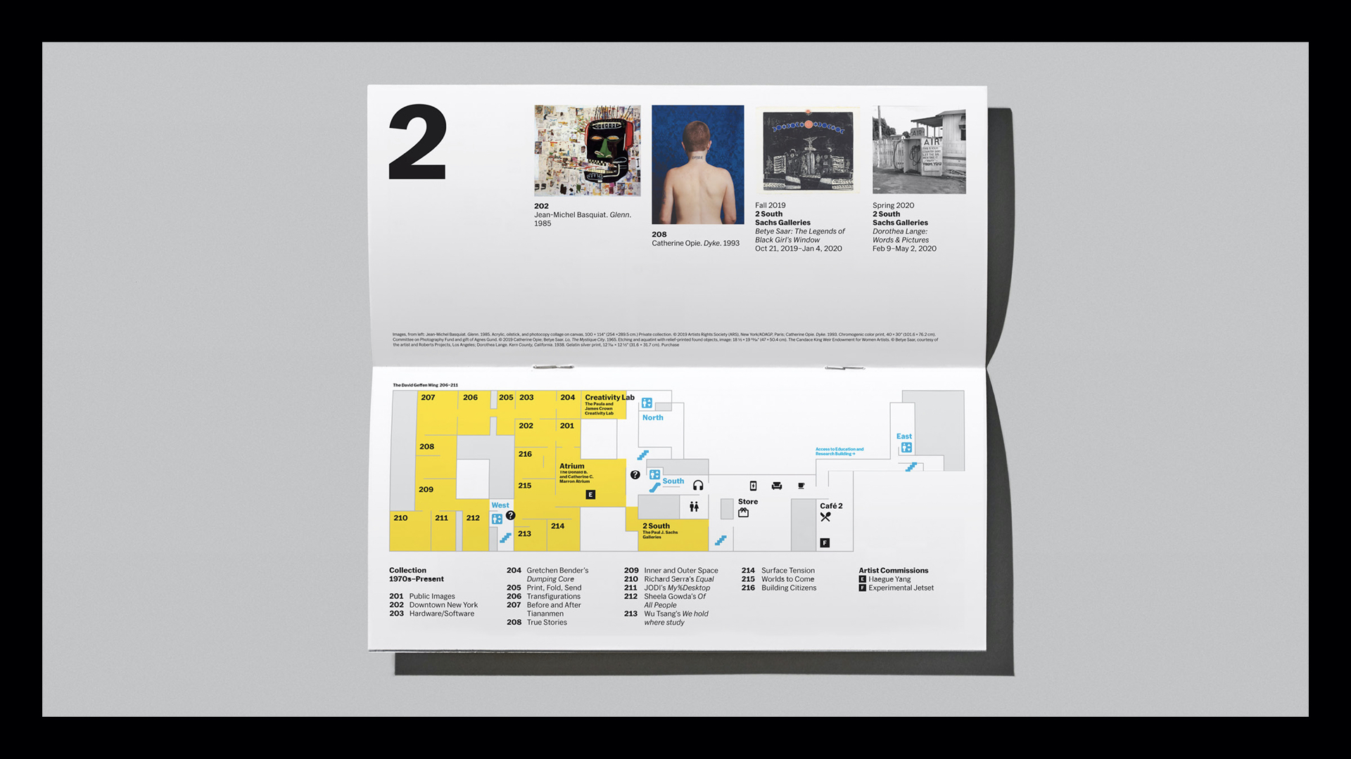
Here’s a couple of improvements we made:
- Overhead floor plan is easier to read (based on visitor testing) than an isometric projection
- Yellow coloration clearly demarcates galleries over public spaces
- Numbered galleries along with artwork highlights offer a place to start and plan your day in the museum
- More visuals and icons help to internationalize the guide, making written translations less necessary
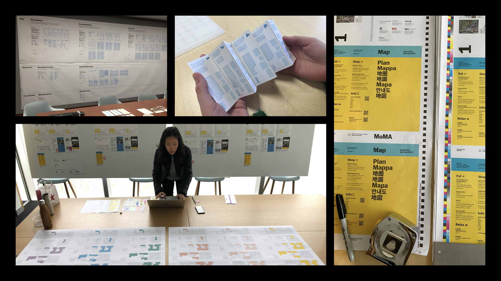
Part of making this Visitor Guide the best yet was to look at where other processes had stumbled. One area was cost. There were beautiful earlier designs that were fully resolved but then surprised everyone with their expensive unit cost and were then wholly scrapped. We started with an acceptable cost range by and explored different formats from there.
We also reframed our goal – we were not trying to increase volume of Visitor Guides being picked up as previous efforts had used as their KPI. This led to clutter in the galleries and higher volumes of paper waste. Our goal was to drive positive sentiment by making something keepable and memorable. We aimed to give out fewer guides (you got one per group, and had to ask for one from volunteers vs having them displayed), make them better (with the improvements above), and, for those first-time and international visitors (for whom it should be a key souvenir), we wanted to see fewer of them in the trash. As a happy side-effect, usage of our enhanced in-gallery wifi went up too.
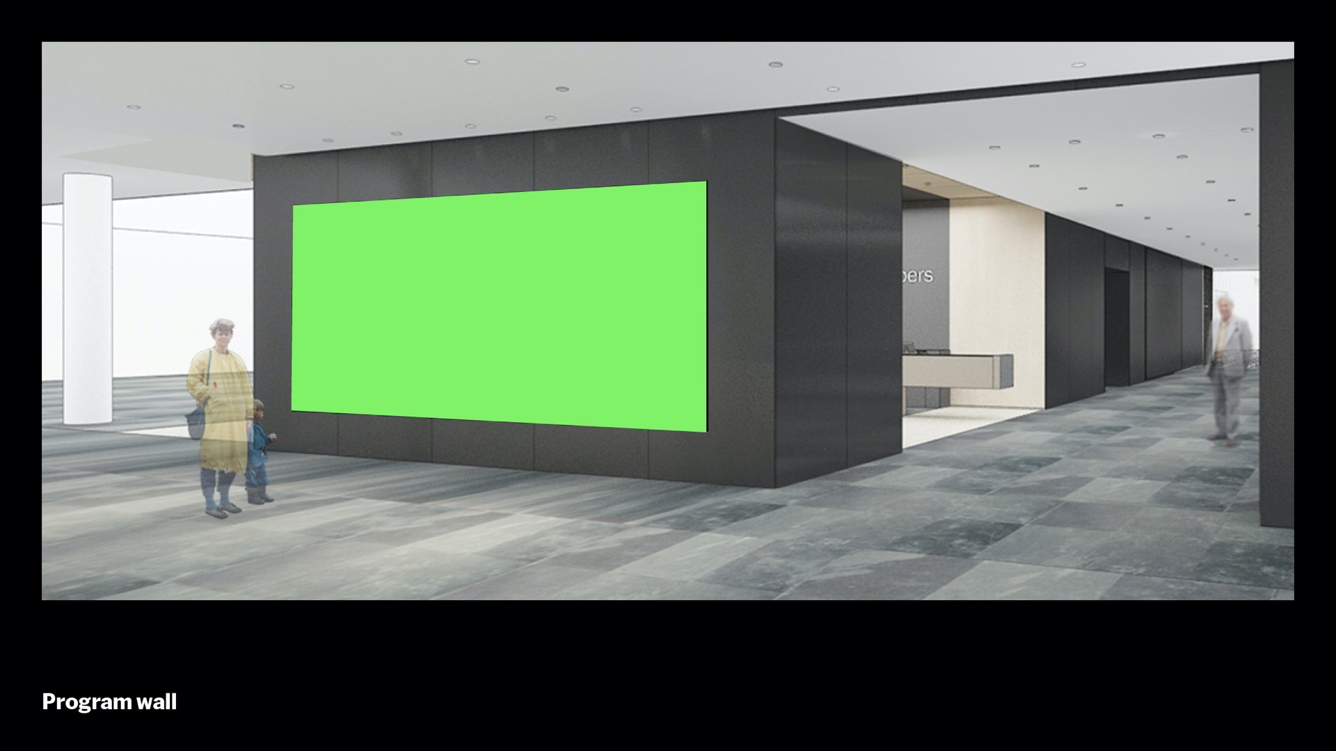
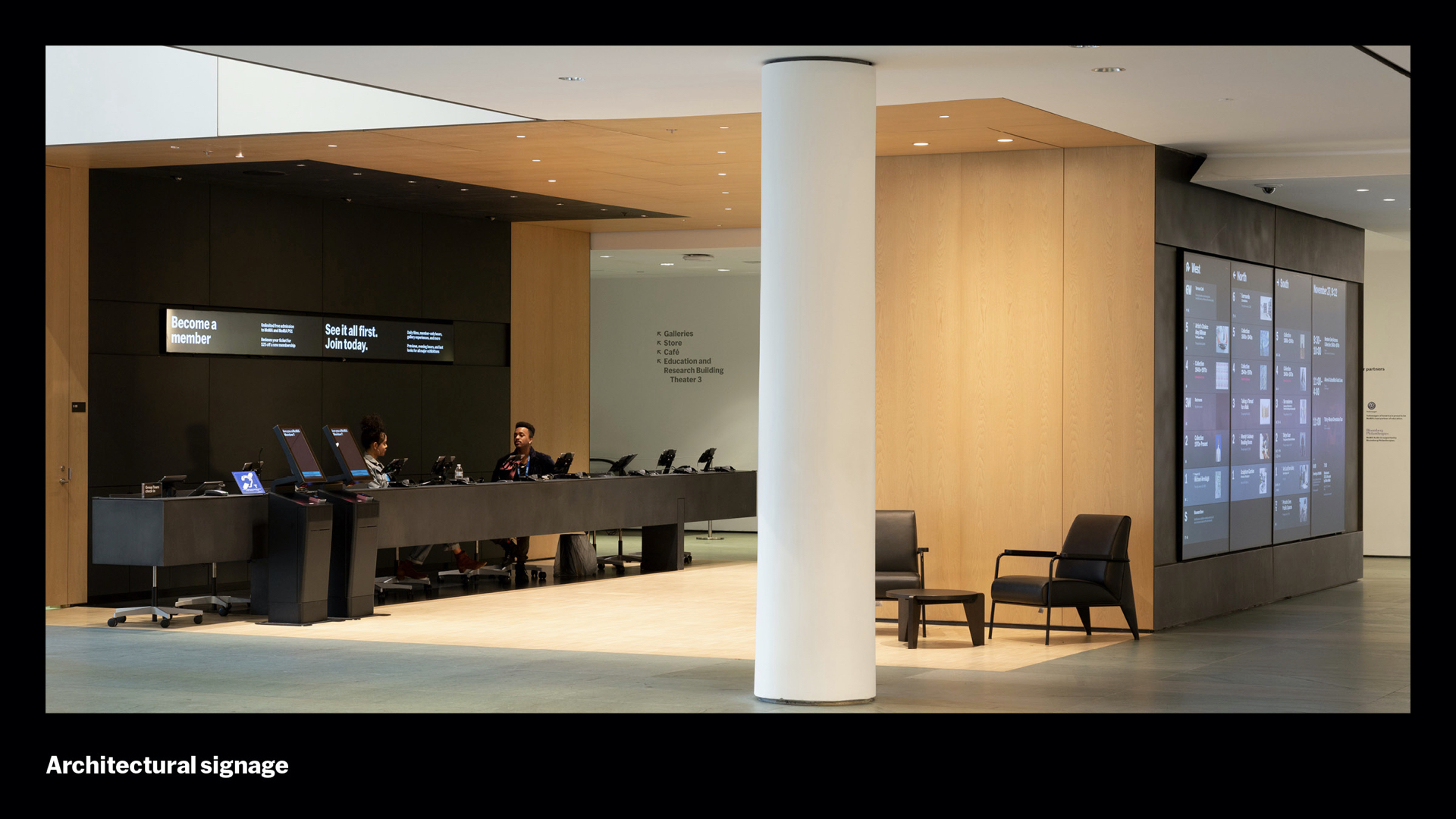
So you’ve picked up your lovely tickets and Visitor Guide – now you see what we call the Program Wall. This is a rendering from about 9-months before opening. The architects, Diller Scofidio + Renfro, had reserved this wall for digital signage but the form factor wasn’t determined – after a lot of back and forth we agreed on 4 98’ vertically-oriented 4K monitors. That makes for a 16 x 7 feet of screen, which translates to over 33 million pixels of digital real estate. There were two goals for all of these pixels. One: Show the everything happening for the day of your visit – daunting since there’s so much information to absorb. Two: Don’t create bottlenecks in the lobby around this massive screen; our traffic flow models showed that ideally visitors would spend less than 10 seconds glancing at this wall. So goals one and two are basically opposed. And then there was ambiguity around the purpose – “program” could mean building program, as in architecture, which might lead you to more of a map, or it might mean curatorial program, as in the shows and highlights of the collection, basically a big “What’s On” guide. We needed to get stakeholders aligned around those ambiguities also.
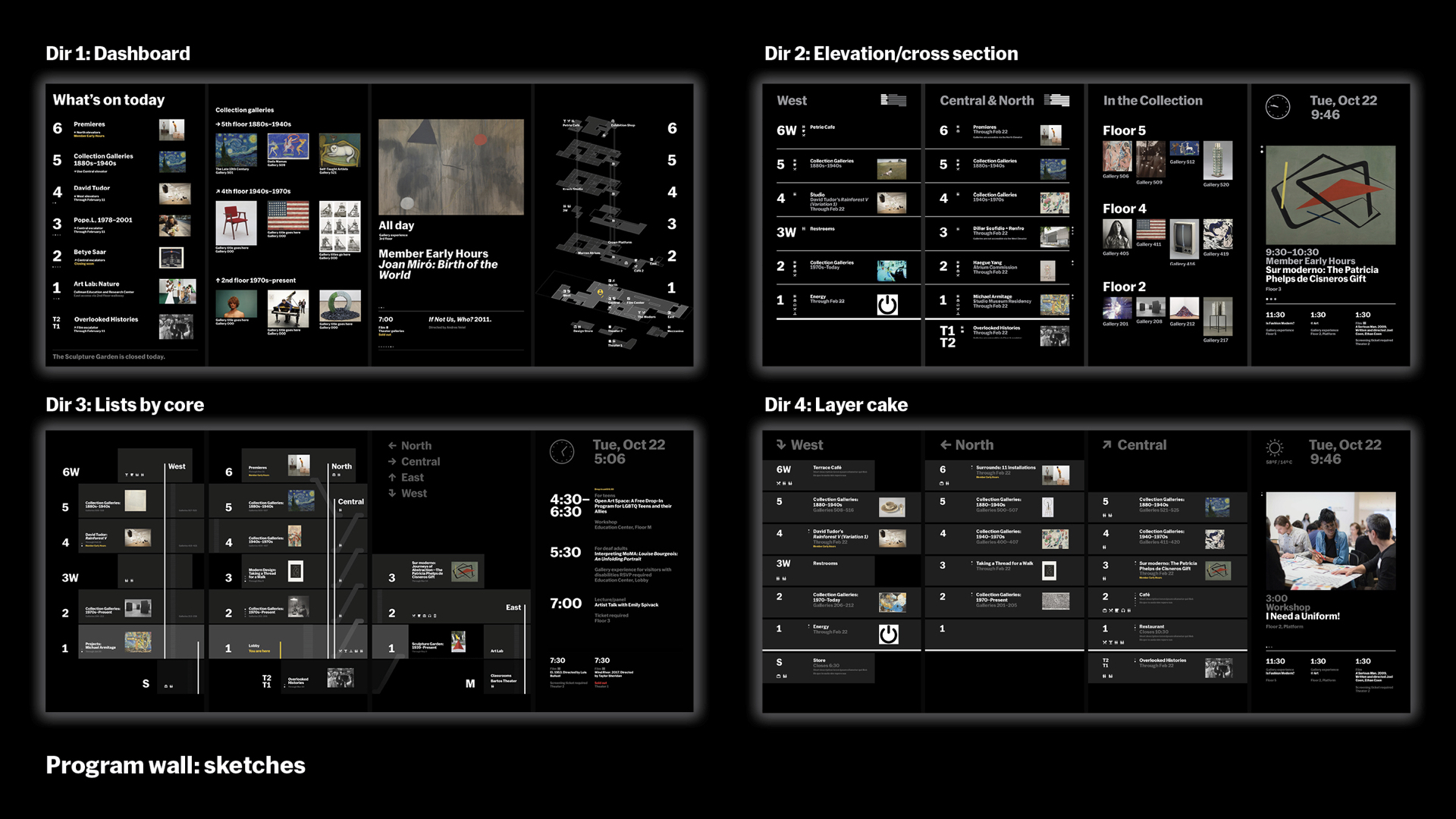
We started with a couple designers from the Digital Media and Design teams sketching broadly, which coalesced into the four directions shown here. “Dashboard” (upper left) allocates one monitor per function. A “What’s On” guide, collection highlights, a single upcoming event, and an isometric floor directory (these sketches were done before our testing showed this projection wasn’t that helpful to visitors). “Elevation/cross section” (upper right) allocates two screens to an abstracted set of elevations, not architectural really, but suggestive of the building’s organization. But it’s less helpful in choosing which elevator or escalator to take, because it combines two cores, Central and North, on a single screen. It repurposes the collection highlights and event screen. “Lists by core” (lower left) attempts to give each core its own screen, but leans a bit more on the architectural meaning of “program,” showing elevators and staircases and a more literal view of the building. In testing, voting, and every other way we looked at it, the winner was “Layer cake,” which combines the abstracted elevation view of “Elevation/cross section” with three distinct cores, leaving a final screen for an event view, which was a firm requirement. Thus, the two senses of the word program are combined – program of curation on program of architecture – and this elevation helps visitors quickly decide on their ascent core and get on their way, avoiding lobby traffic.
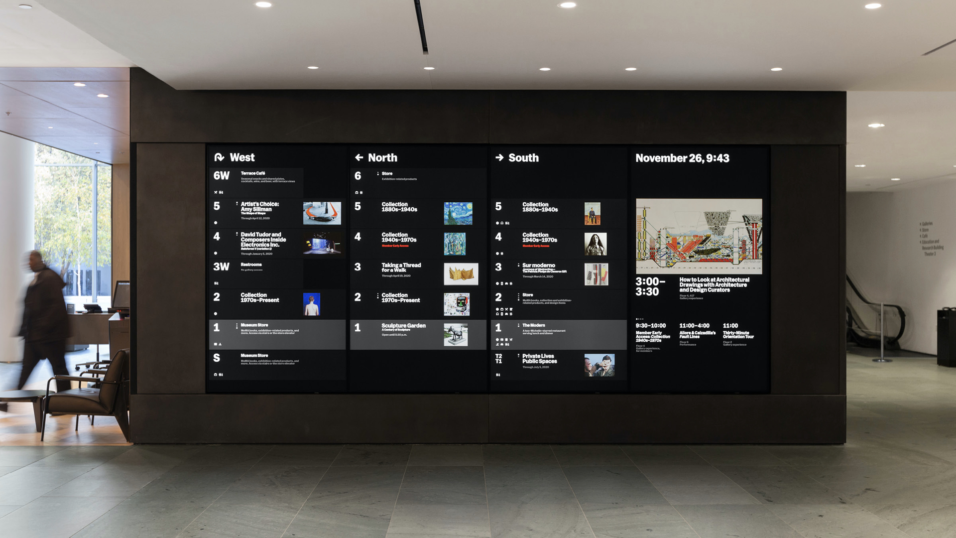
Here’s the final result with “Layer cake.” In our first round of user testing, visitors preferred Layer Cake unanimously, 50 to 0. But curatorial and expansion teams liked it. But originally much of the team didn’t think this would be the result – there was a huge focus on showing the building, perhaps because the screen originated from the architectural team. But visitors were already in the building and by now their focus had shifted to the next phase of their journey. The result, despite all we went through, is obvious in hindsight – it focuses on the goals ruthlessly, and presents the information in the simplest way.
[Shannon] So I’ll insert my tip here: Keep it simple. This isn’t original and you hear it over and over so much that it’s kind of a mantra but then, with all of that, I find that again and again we are seduced by more complexity and are constantly reining it in. So start simple and keep it simple.
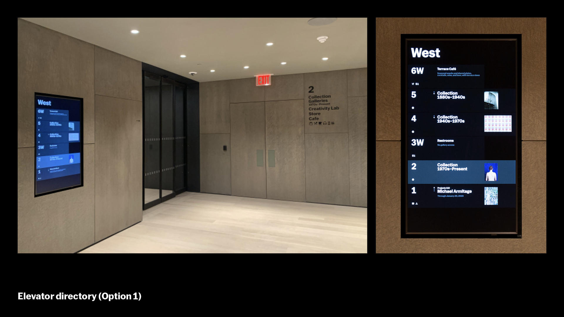
But that simplicity is hard to achieve in the midst of ambiguity, and that was the situation we had while we were trying to design these screens, the program wall screens, and the architectural signage at the same time, working to align them visually and schematically, with each sometimes shifting in terms of the conclusions and next steps in each unique area. What you’re seeing here is one of the 17 elevator directories that punctuate the campus. The system we built has a single screen view that localizes content based on location and context.
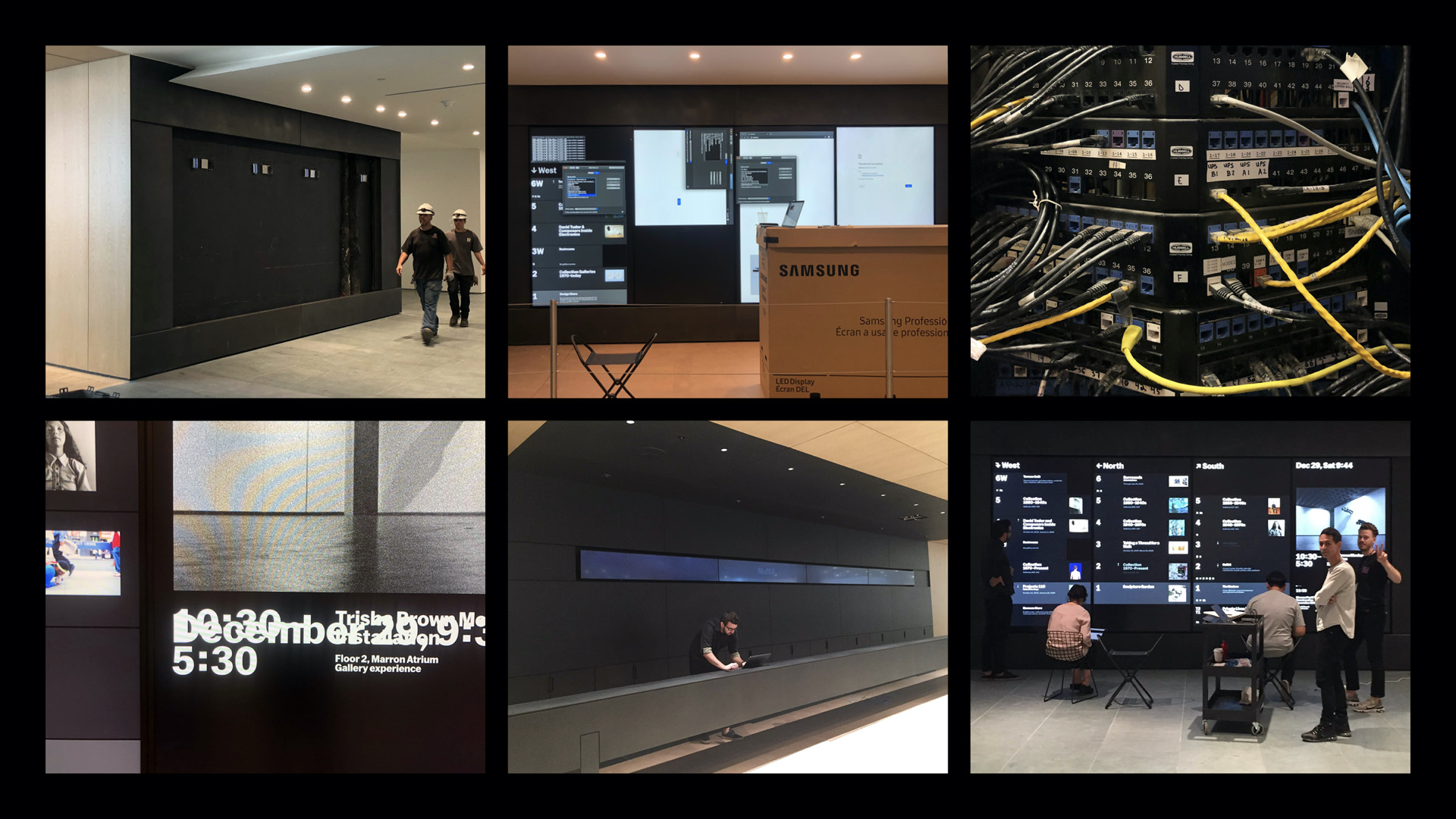
There was a lot of crazy infrastructure and AV work in this project and those teams deserve a lot credit And on the bottom right, there we are a couple days before opening.
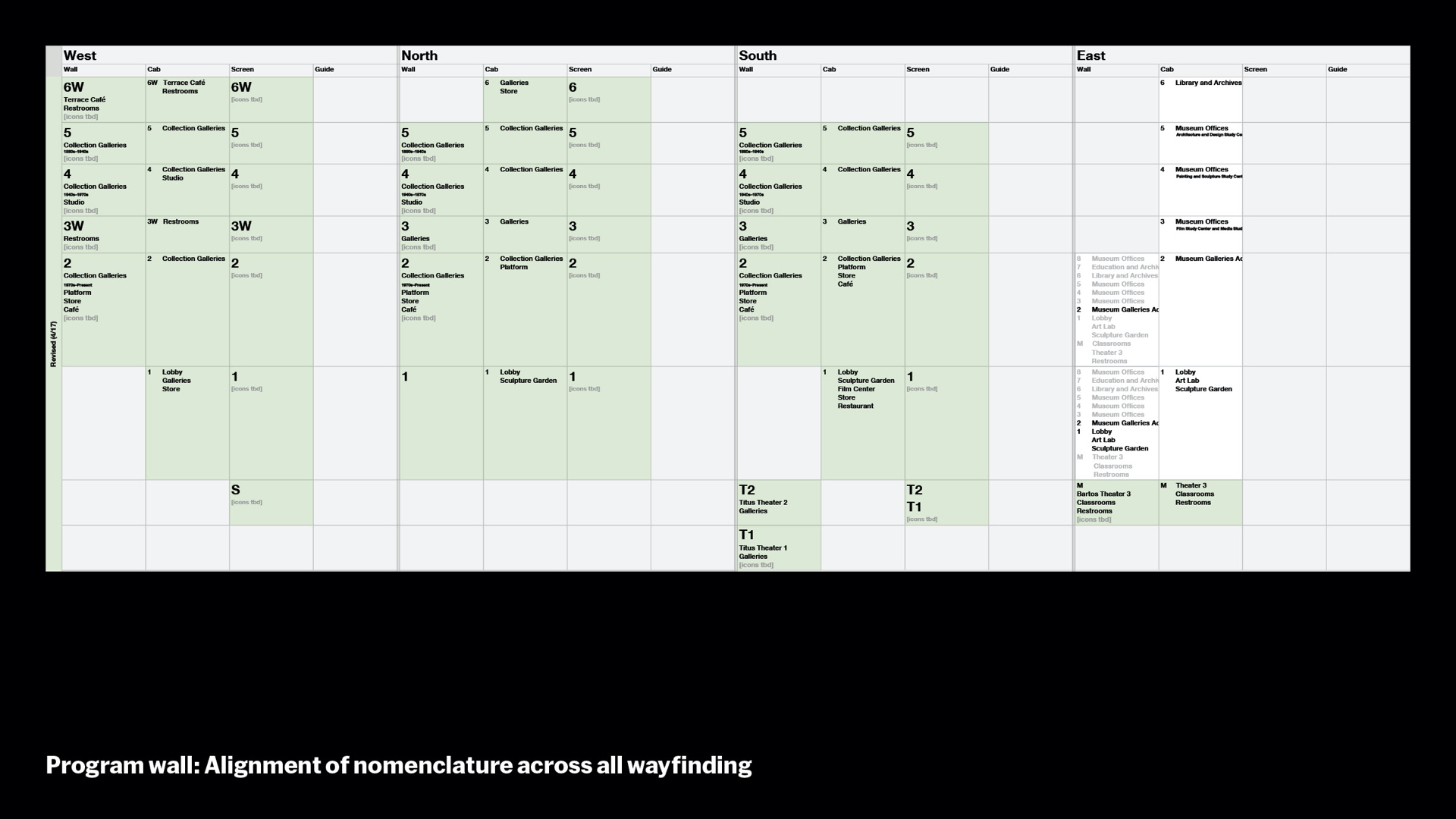
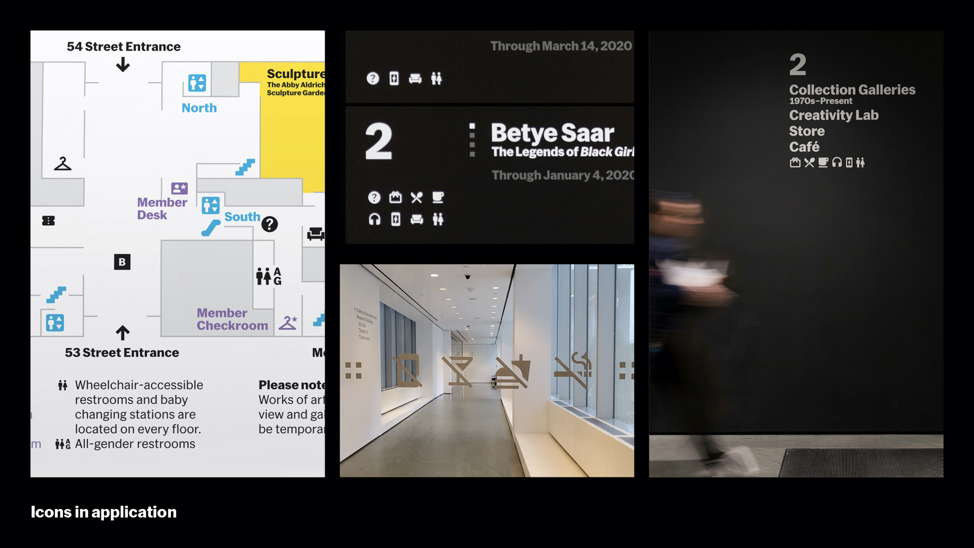
As program wall developed, we realized that the 17 screens were not only extensions of that large screen in the lobby, but they were also adjacent to and extensions of our architectural signage – we needed coherence between all of these to create a seamless wayfinding experience for our visitors. This chart shows how we defined what features of a floor to disclose at each touchpoint: on the walls, inside the elevator cabs, on the screens, and also on the Visitor Guides. While the screens show only those things that are best reached by that elevator, the architectural signs on the walls of each floor landing show everything reachable by foot on that floor. This encourages wandering around the floor but creates a pause point before shifting between floors. The Visitor Guide, of course, shows everything.
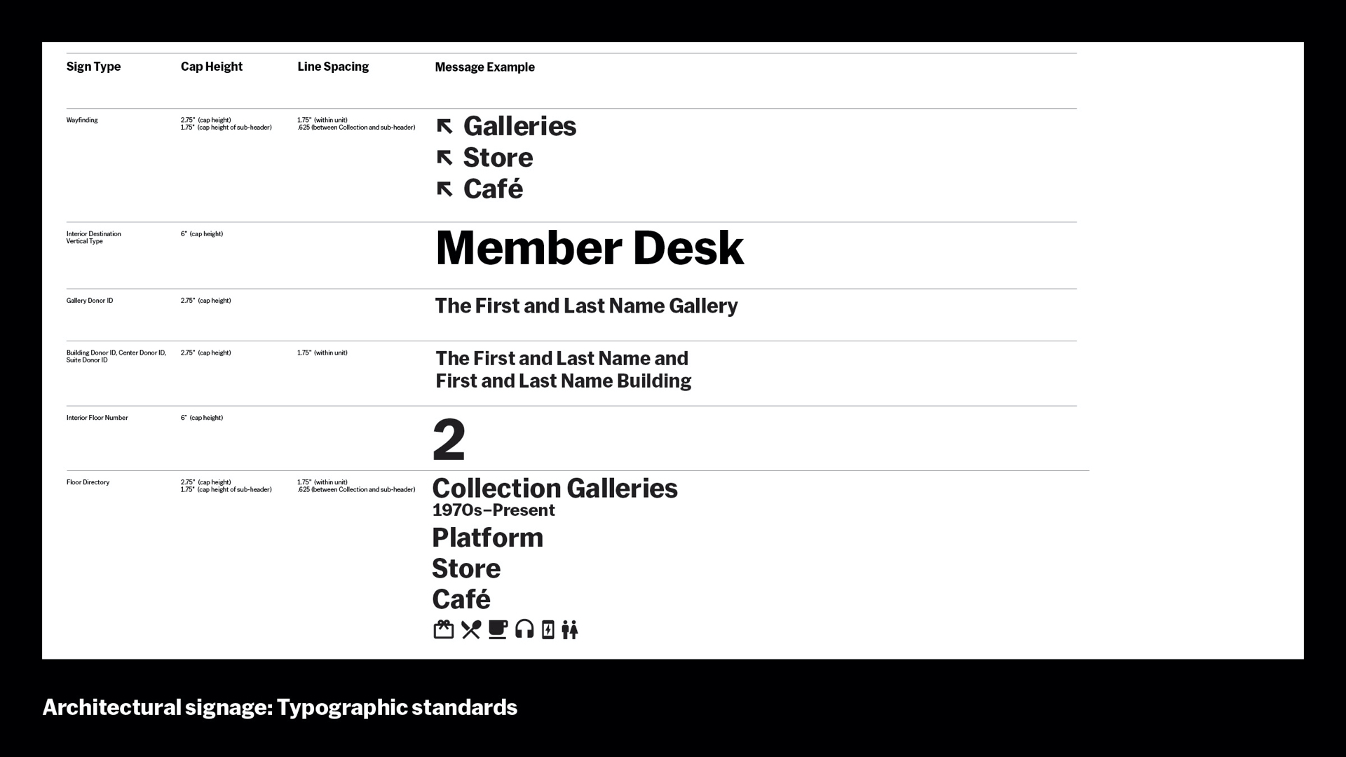
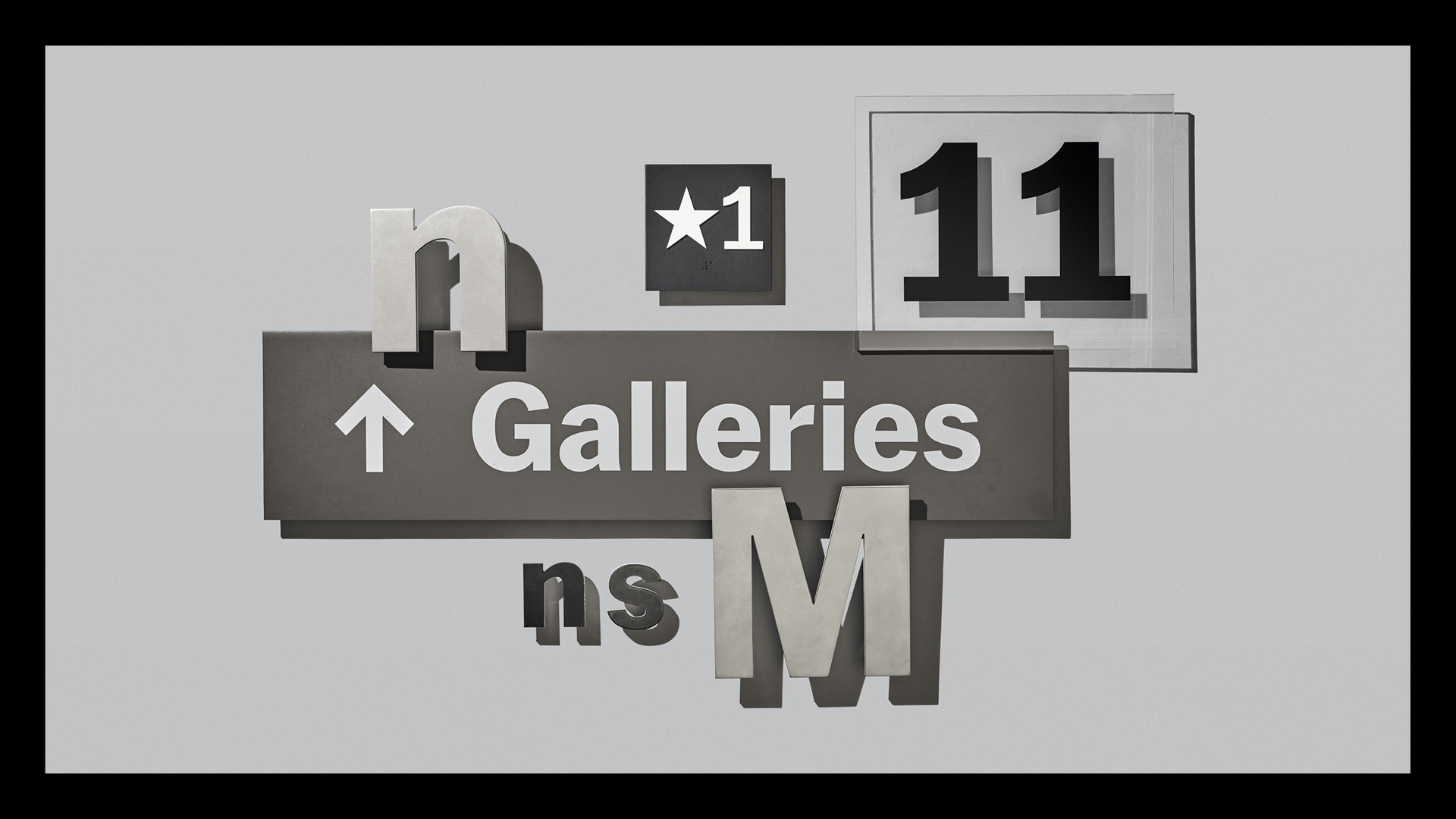
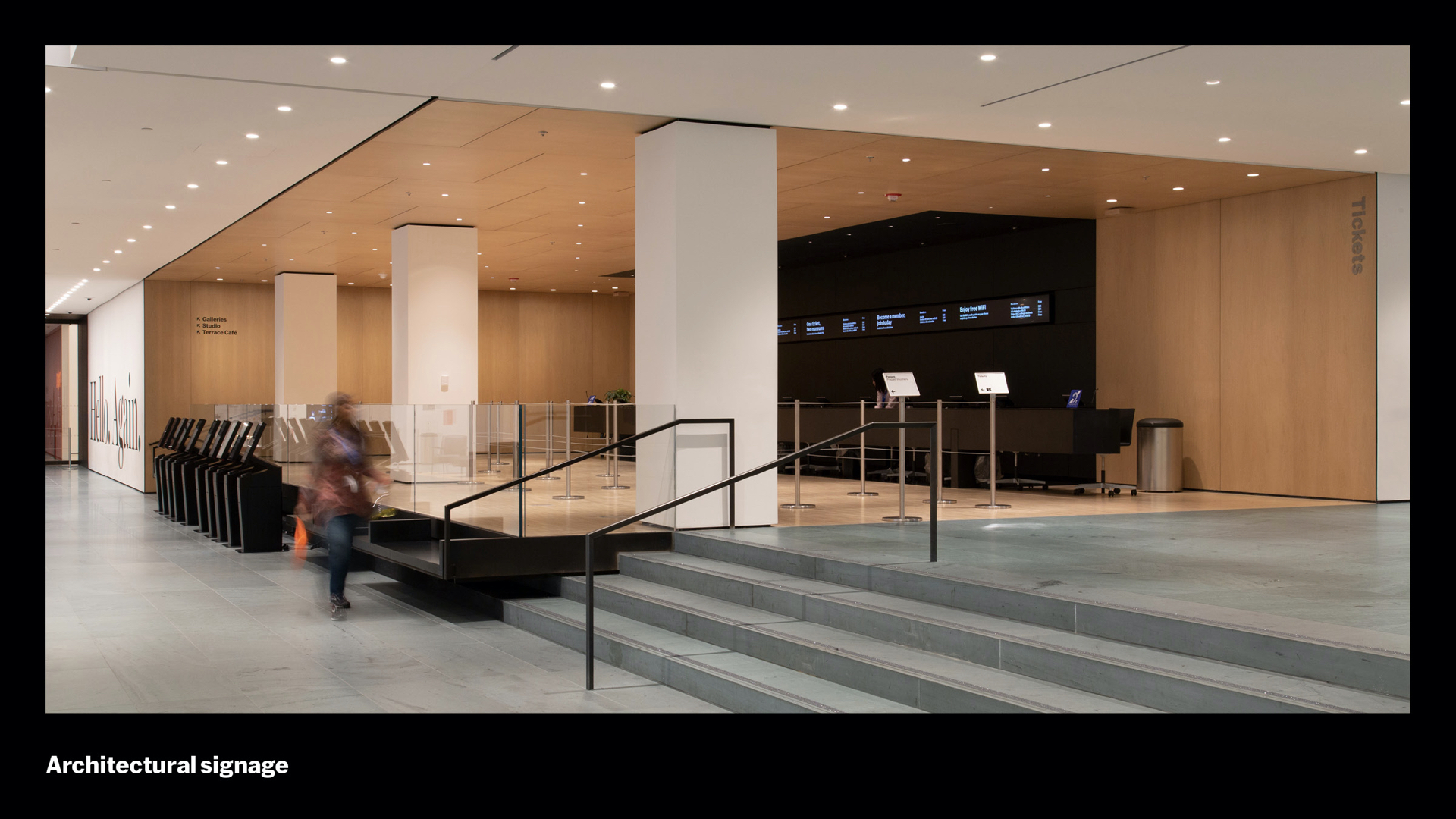
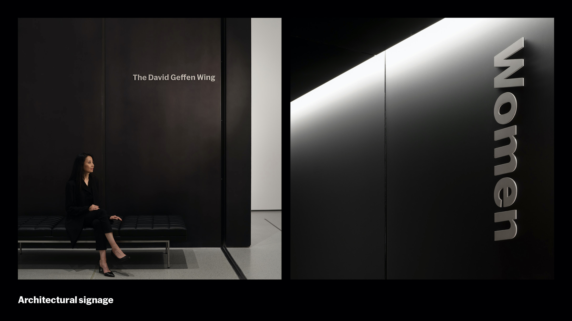
Our architectural signage in the new campus features over 600 signs. And these needed a design system too. This typographic scale was one of the first things we developed with Gensler, our partners on the architectural signage of the new campus.
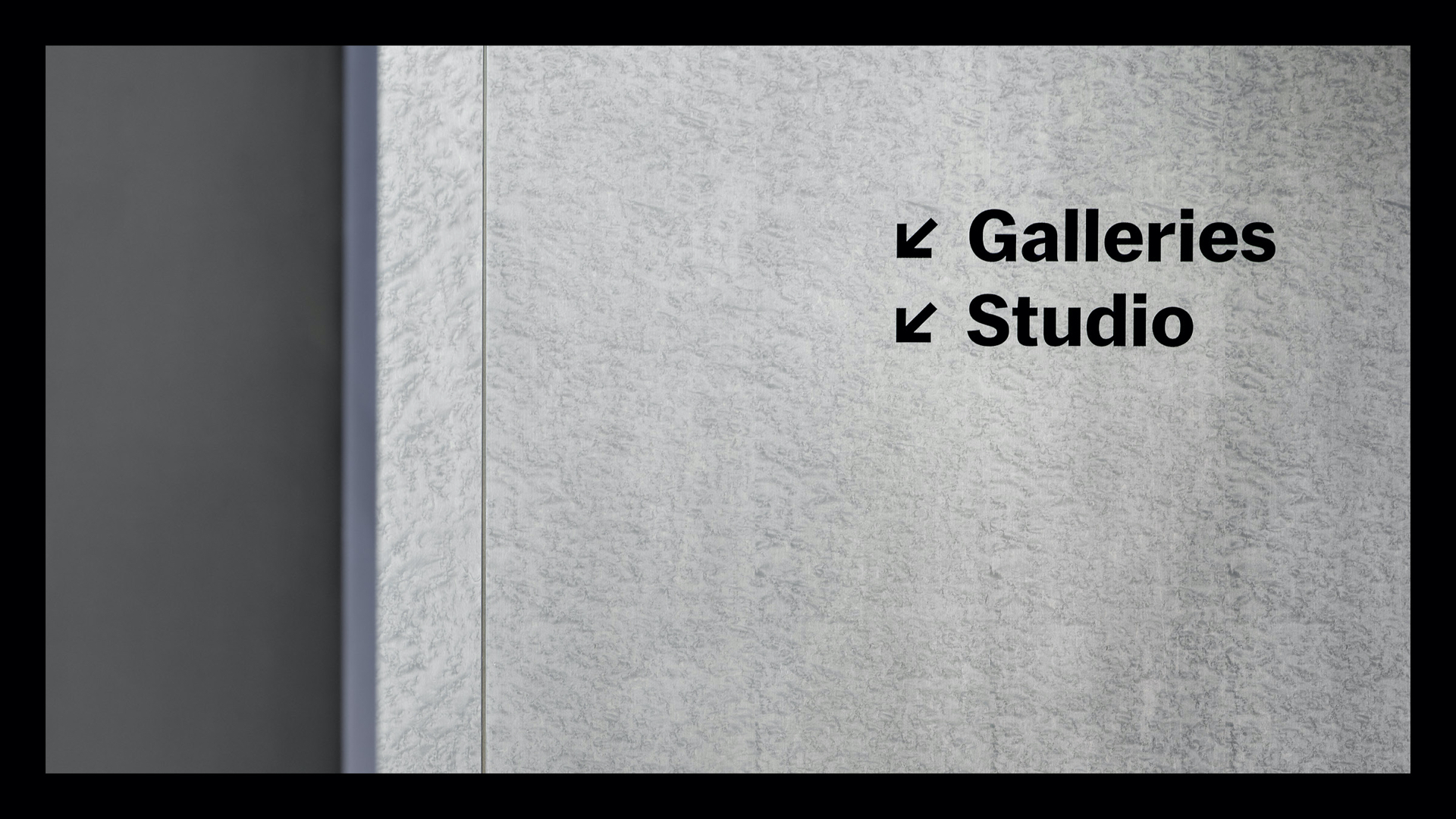
A key principle in the system, which you can see on this chart, is the idea of progressive disclosure. You begin a journey with general signs, like “Galleries” in this example. We call this “first encounter,” and we disclose more specific information as the visitor progresses, like “Collection Galleries: 1970s–Present,” and, later, “Lastname Galleries” as an abbreviated donor name as you close in on a single destination point. When you reach a discrete destination, “The First and Last Name Gallery,” we call this the “Destination” sign. The gallery numbering system supports circulation in a more intuitive way alongside the donor and programmatic signs. By scaling back the number of words on the wall, we create a more streamlined environment for focusing on the art while reducing the number of words you’re seeing to only those that you might be looking for nearby.
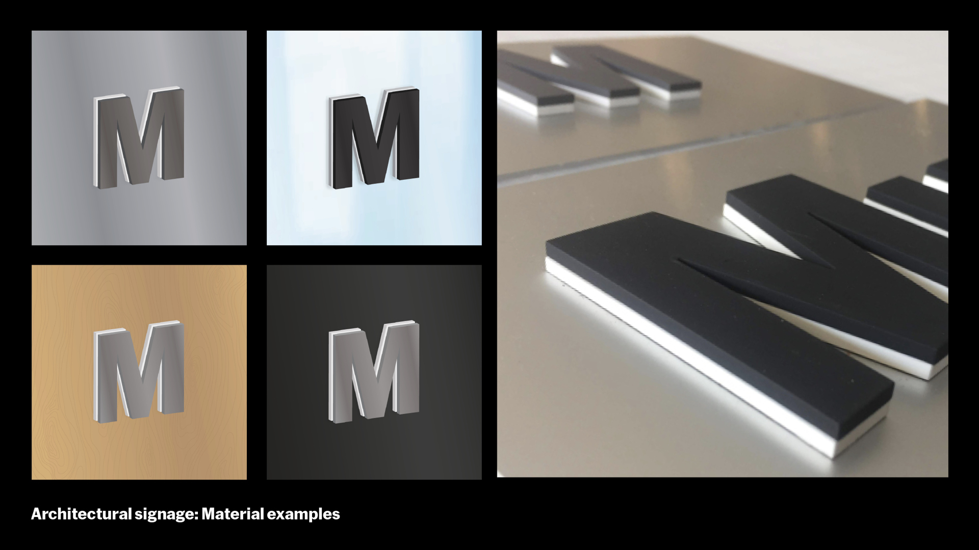
Gensler also helped us build on earlier concepts from Wkshps to use two-layered dimensional letters to hover off the wall, which is meant to compliment the new architecture and bring elegance and refinement as discreet object.
The final materials for our signage includes stainless steel, glass, acrylic, vinyl, silkscreen, magnets, and more
In the final installation, it all comes together. And, of course, this is the part where everything that can go wrong went wrong,
Things happened, parts couldn’t fit, colors didn’t match. Problems solved, and re-solved. Each time with fresh eyes, one at a time. But the result is so satisfying.
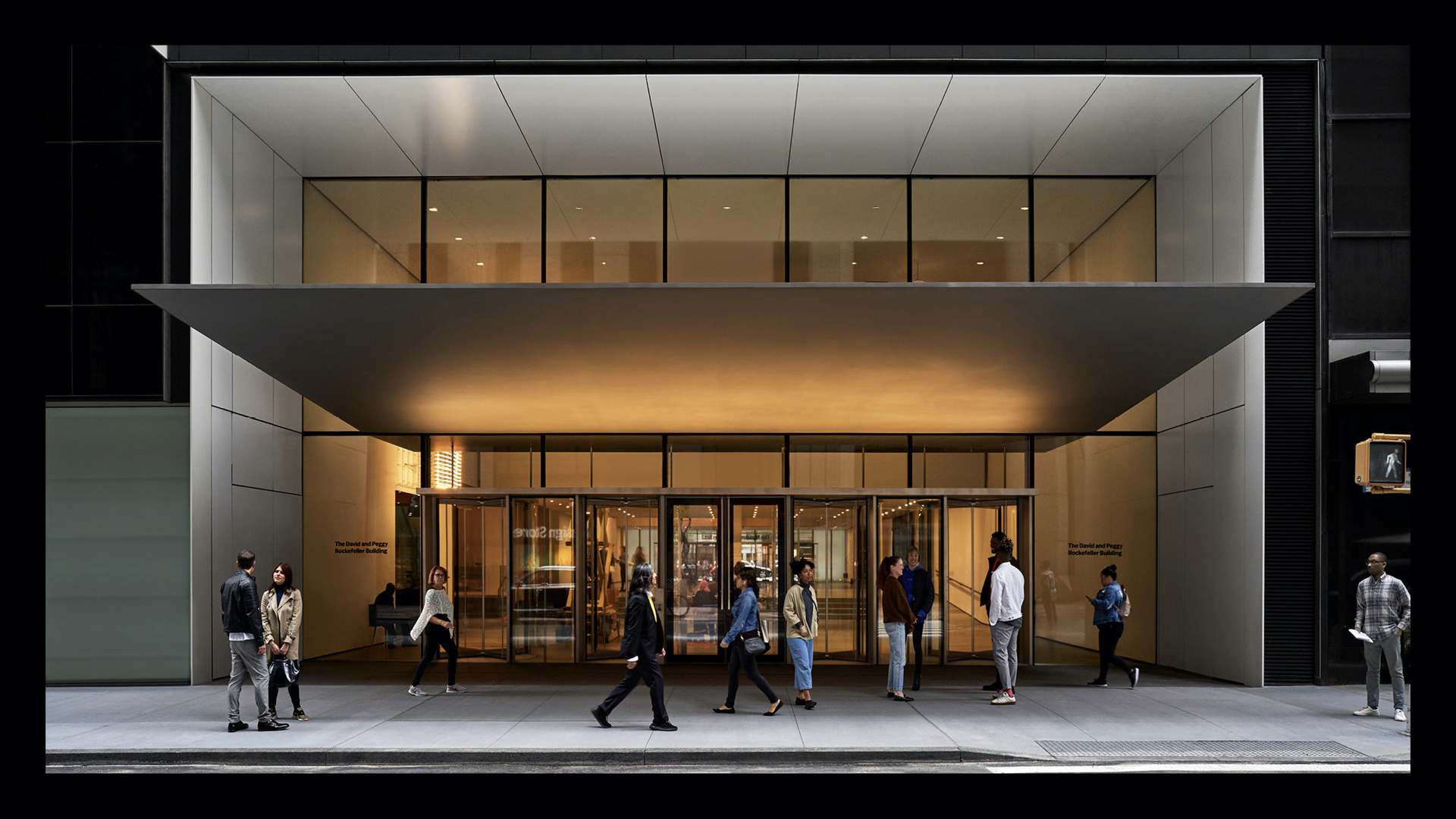
Let’s start start with the building exterior. Steel finish on acrylic backing signs sandwich the glass, marking the building destination.
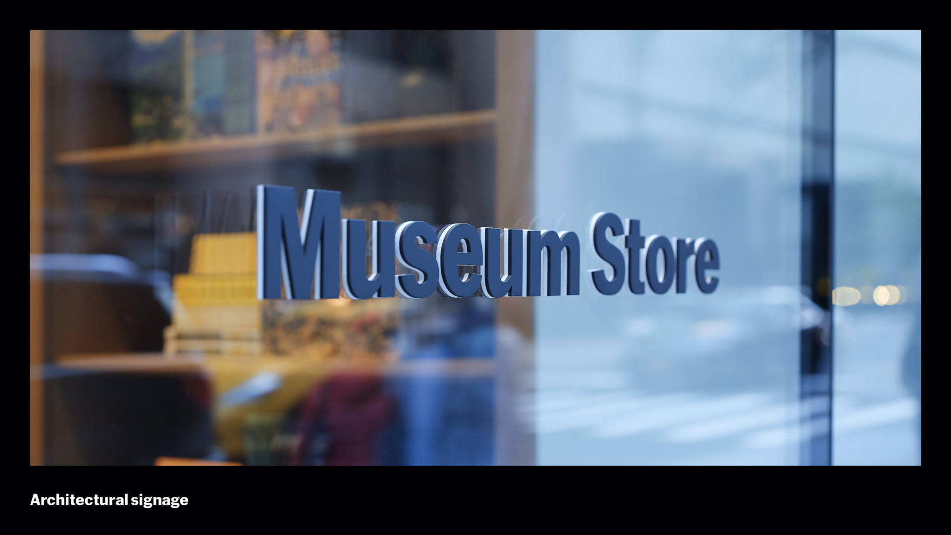
As you progress into the lobby, silk-screened, vinyl, and dimensional steel signs are used through out the building – all in balance.
Every corner you turn, you are greeted with carefully tuned visitor journey from touchpoint to touchpoint. Digital screens to destination signs even share the same typographic scale, creating a sense of calm.
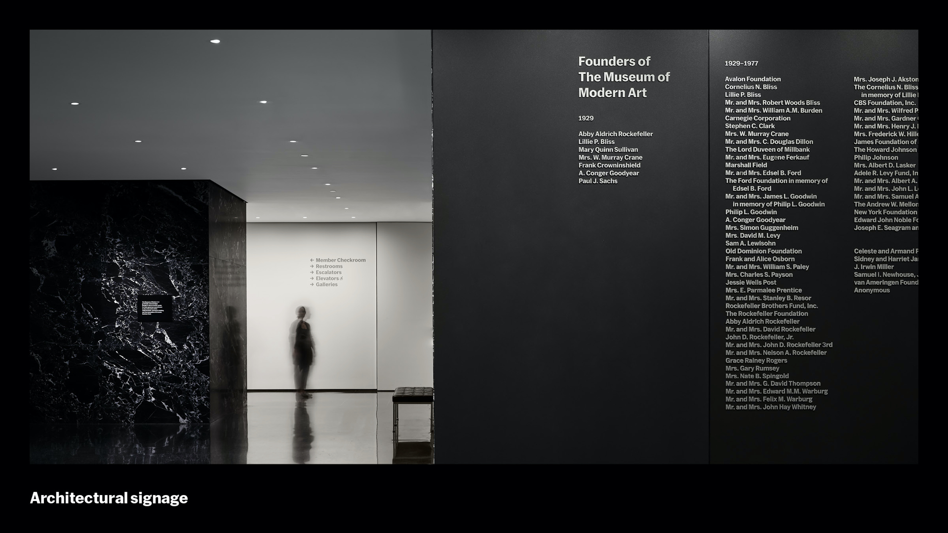
The Founders wall is composed of 3D letters on blackened steel panels, an elegant, precise fit within the architecture
Simple, discreet, plainspoken directional signs throughout the building.
Dimensional donor sign and vertical designation sign highlight and extend the material choices of the interior architecture.
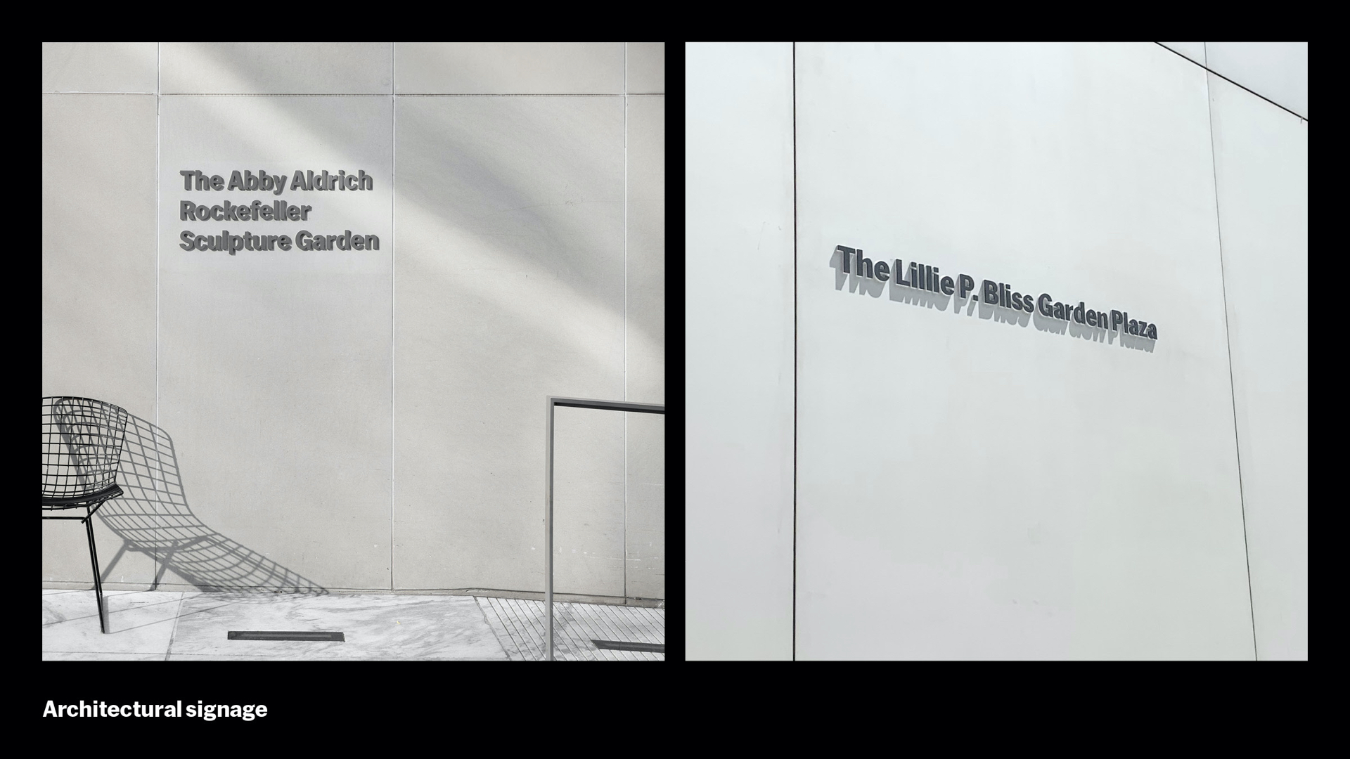
The dimensional donor signs in the Sculpture Garden were one of our favorites to install. White acrylic backings give a floating effect. On a beautiful sunny morning, the dimensional letters come alive with their ever-changing shadows.
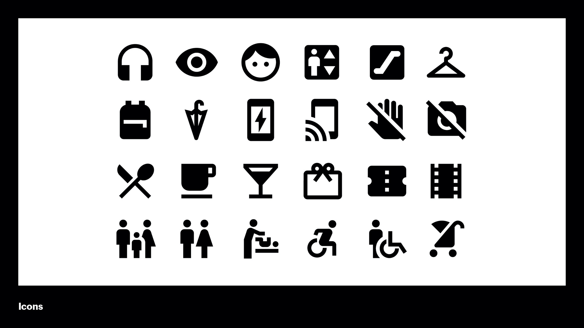
Icons are vital part of our visitor journey throughout the museum. You’ve probably seen these icons a few times now – they come from Google’s Material Design system. We worked closely with SeHee Lee from Google Material Design to create an extended set of icons for our needs on the new campus.
These icons are in our Visitor Guide, program walls, and architectural signage. And they help make our signs accessible to all international visitors.
These photos show a sliver of what it looks like to get those 600 signs on the wall. Measuring, testing, proofing, checking, and then back to measuring and do it all over again. The foam temp signs helped us hold places for signs during the chaotic final weeks of construction to inform other teams working around it. Most wayfinding signs were silkscreened right on the walls, but we used a lot of special tricks too. Dimensional steel signs used magnetic pin-mounted letters, so they can be removed easily whenever we have to paint the walls for the next show.
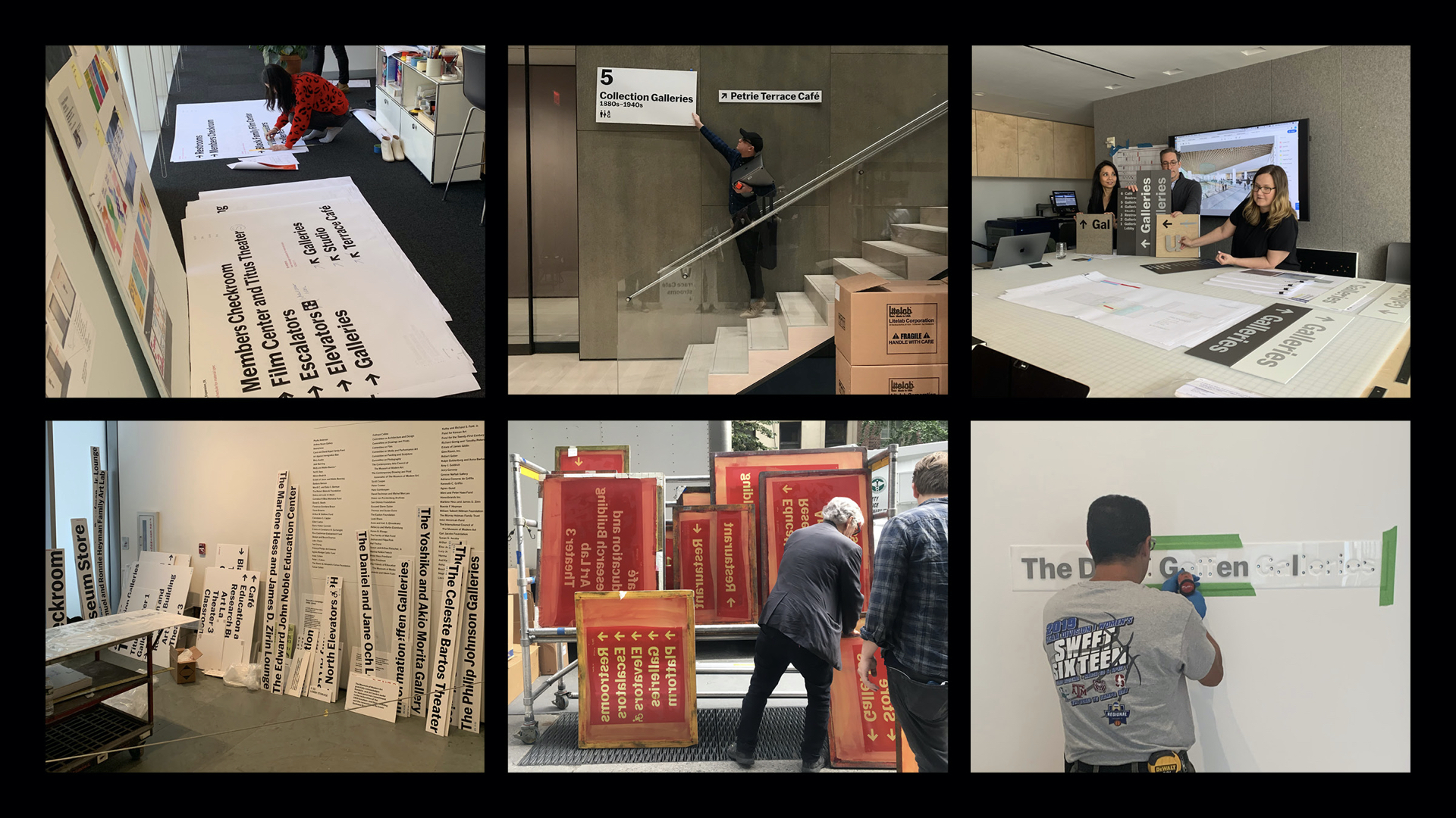
[Elle] And this leads to my tip which I learned the hard way: Just go with the flow. Everything will be OKAY. We started bulk of our installation when the museum was closed for just 4 months – we didn’t have much time and it was stressful day-to-day, but everything did go as planned.
Our multimillion dollar architectural signage project was so big and complex, there were a lot of moving parts, plus we had to constantly coordinate with 8+ departments within the museum to closely track each other’s progress. So if the construction of a space doesn’t get completed on time, the painters can’t prep the walls, we can’t install our signs, and art handlers and curators can’t install art. And yet, the museum was still going to open on October 21, 2019.
So you can try to plan every step and line up all your ducks are in a row, but when all sorts of problems that you never even imagined come at you from all directions to solve, and to solve fast, you just need to throw that plan out the window, find your Zen, be flexible and just go with the flow. Because (somehow!) it will all get done.
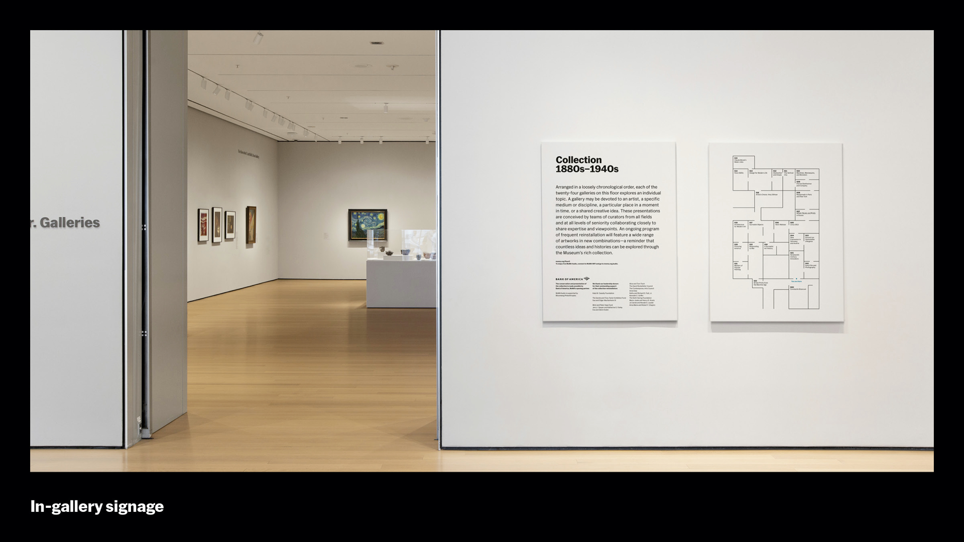
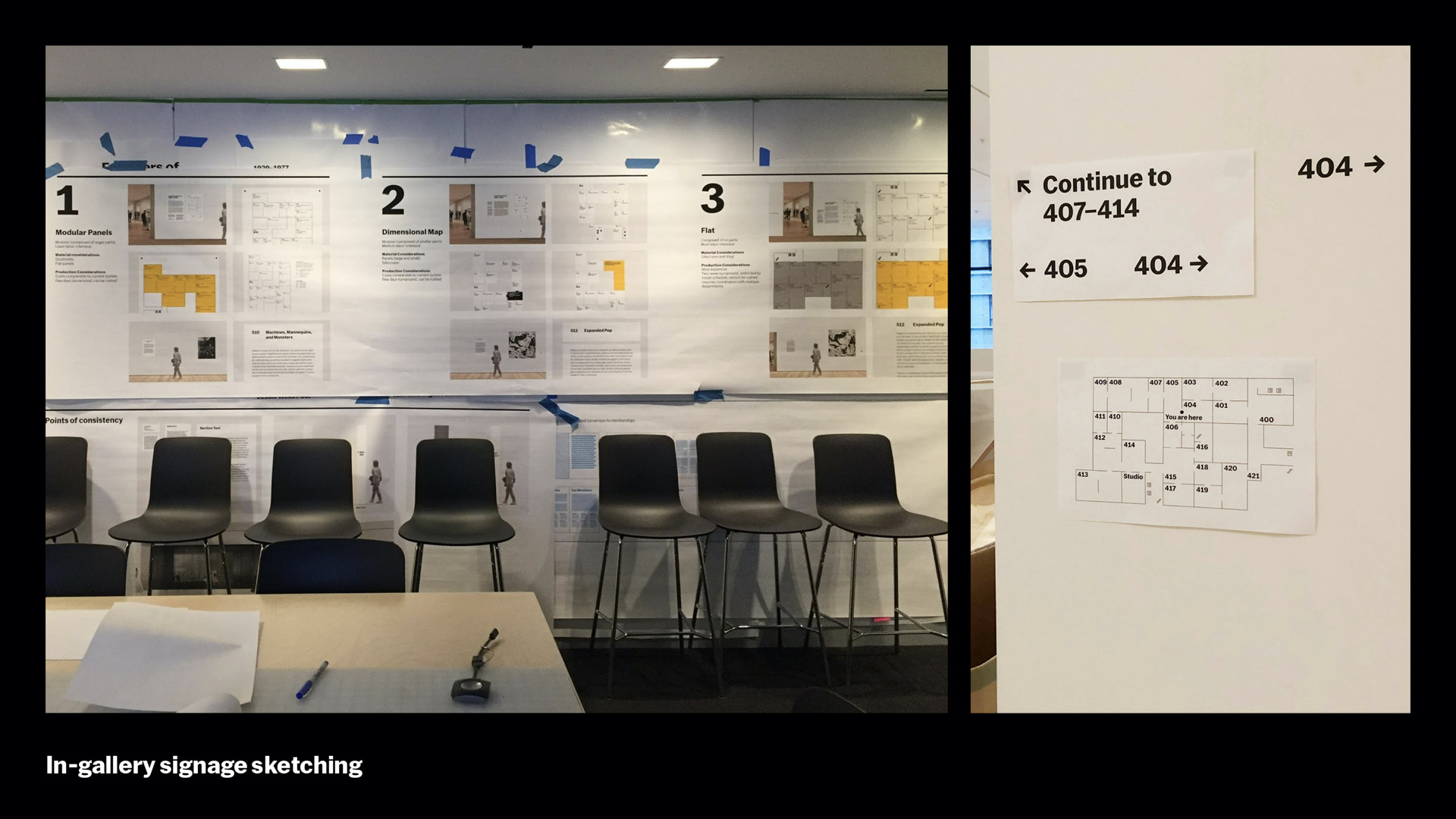
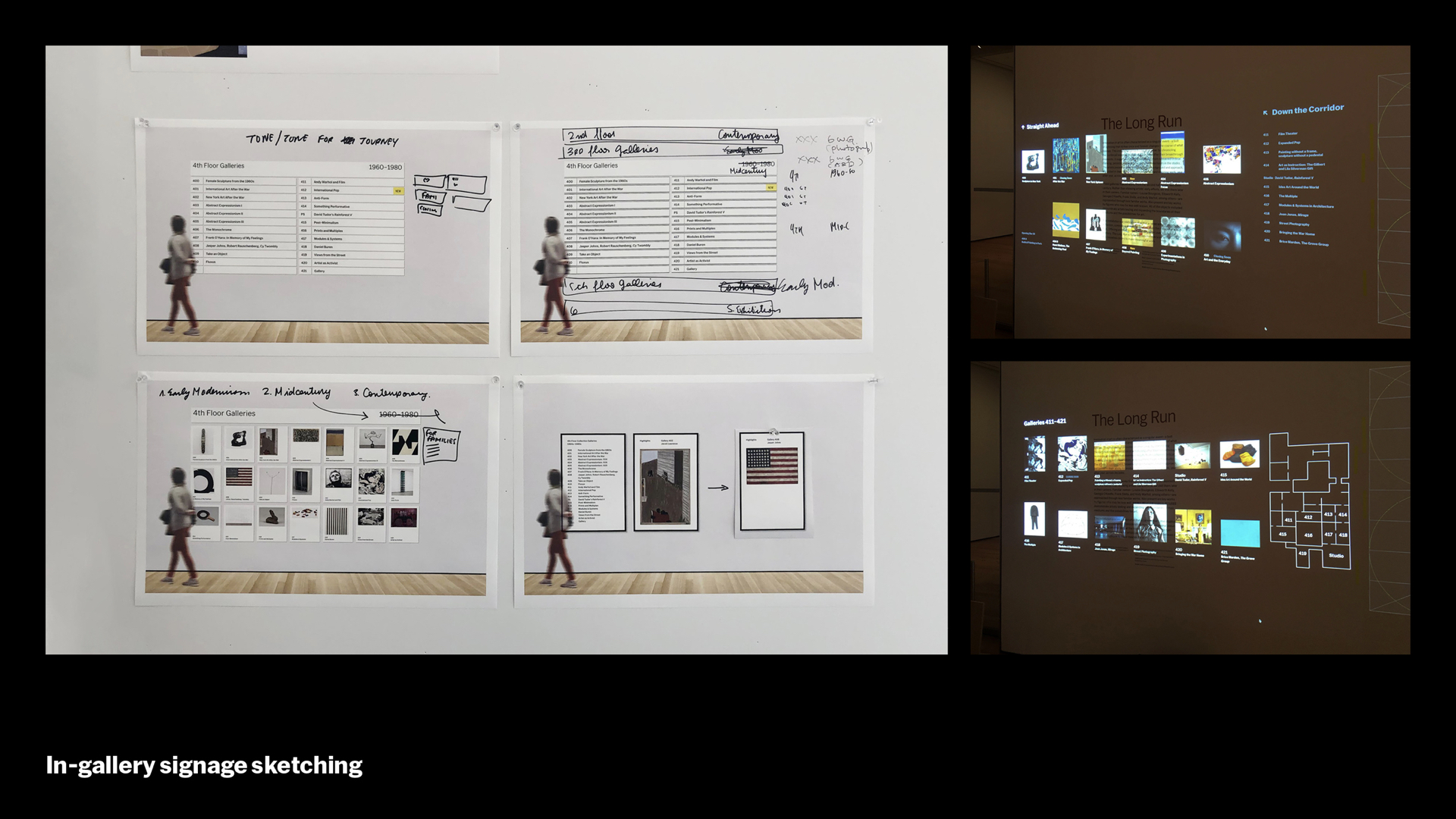
Once the signs, screens, and Visitor Guide have brought you to the entrance to the Collection Galleries, we have in-gallery signage that kicks in, and works to further extend the architectural signage, especially in our Collection Galleries on Floors 2, 4, and 5.
These large panels offer a curatorial introduction and overview to the floor. In this context, we oriented the floorplan to a heads-up view, so up is forward, similar to how you’d navigate on Google Maps. So you can see how the many different projections of the map – overhead, elevation, heads up – work together.
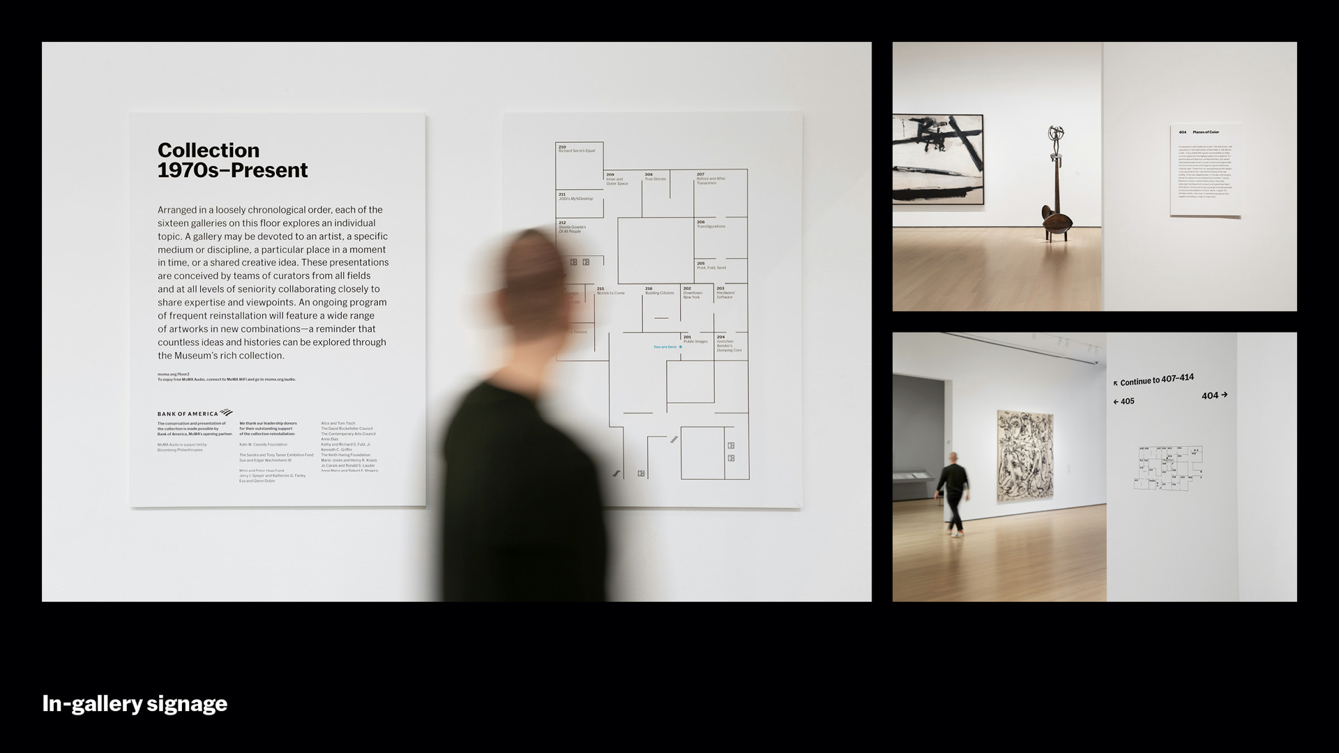
Here’s a closer look. The Collection Gallery intro text and map from the previous slide, along with a few other examples of in-gallery signage. The panel structure makes them easy to change and swap out without refinishing walls – like the magnetized letters – which is important since we rehang our Collection Galleries in two rotations over the course of a year.
On the top right, as you move into the galleries, we purposefully designed these signs to become more restrained and minimal – at this point, navigation should really fall away and your encounter with these incredible works of art should be the focus.
On the bottom-right, we placed the gallery numbers in the doorways to give visitors a sense of where they are, and we also reinforce those numbers on the text panels to function as informal destination signs. The formal destination signs, you’ll recall, are the magnetic pin-mounted formal gallery names. But the two systems – numbering and naming – roughly mirror one another.
Getting this part of the signage right involved many, many tests and proposals. As with other large-scale projects, the Chief Curators and other stakeholders were very involved. As we got access to the new galleries, we also tested the progression sequence right on the walls and did a lot of refining, especially around sight lines, at that time.
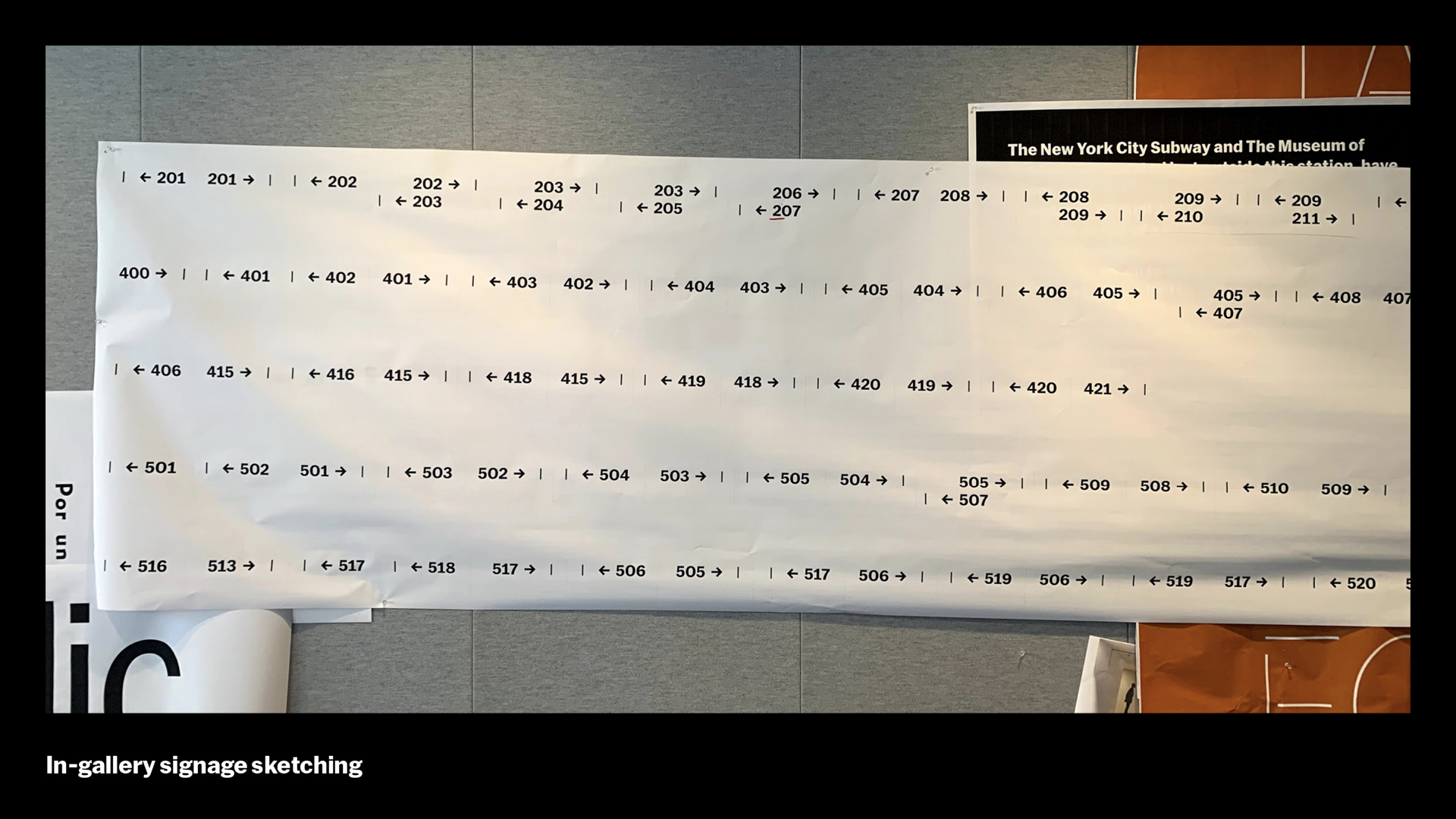
MoMA’s campus is made of so many different buildings coming together, which means there are many different threshold widths. This is a test we did making sure we could use a consistent type size throughout and is one of our favorites. Like the architectural signage, all the in-gallery signage has a typographic scale, including these directionals.
For something really simple, the development process was exhaustive. We looked into slats, panels, and interactive digital screens. We even tried projection at one point. While it definitely upstaged the art, it let us know how far we could push something, and it helped establish the importance of the map, which remains in the final design.
The final set of in-gallery signs are the smallest – and every museum designer has a love-hate relationship with them. Labels! Oh, labels.
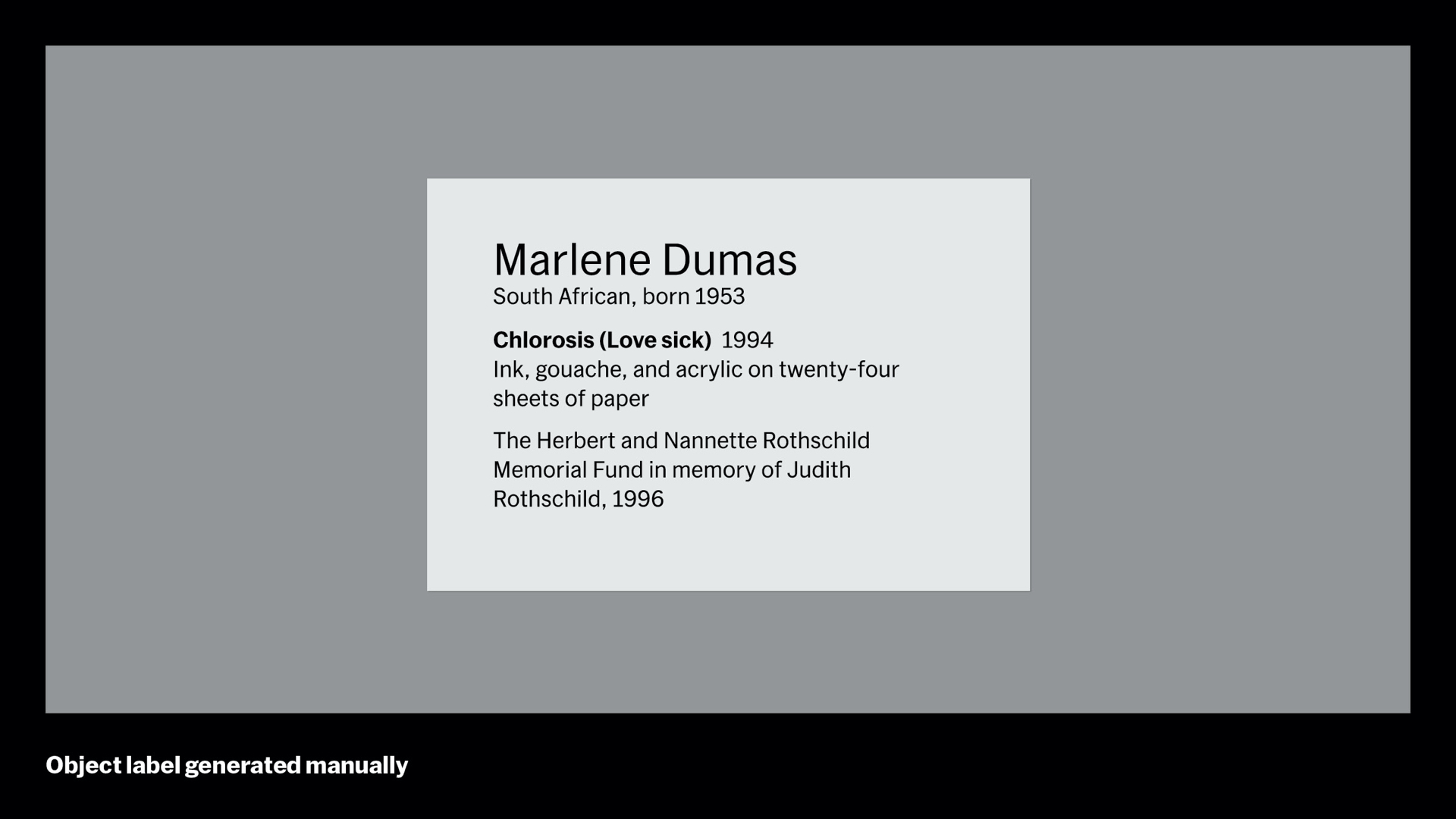
Here’s a typical label before our reopening. It had to go through 6 departments before it was placed next to an artwork. With the reinstalling the whole museum in mind, we knew as deadlines slipped we’d be faced with making thousands of new labels in a very short window of time. So we decided to take a closer look at the label design process and where we could innovate.
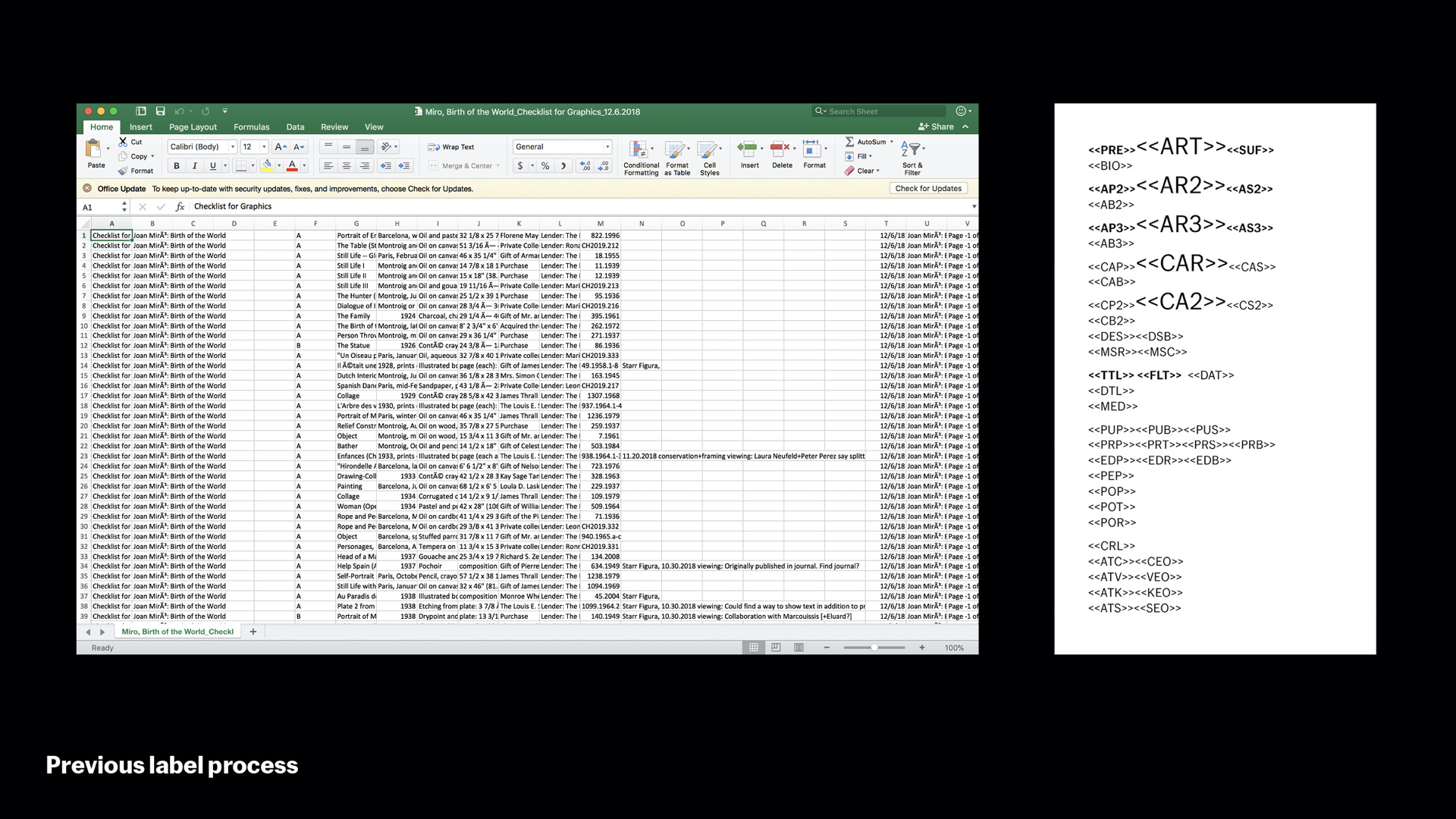
This is how we used to do it. Our collection database exports a checklist into spreadsheets (.CSV). From there we used InDesign’s data merges to pull contents into the program, where we would output PDFs. We were the only ones that could do this, so as labels were reviewed and minor tweaks were made, we’d be constantly asked for new print previews. This doesn’t scale to making thousands of labels at once. To make matters worse, during the Toward a Concrete Utopia show, many of the eastern European diacritics were not parsing properly in InCopy, leading to errors and time-consuming manual corrections. We were at the mercy of using software hacks and bottlenecking the process.
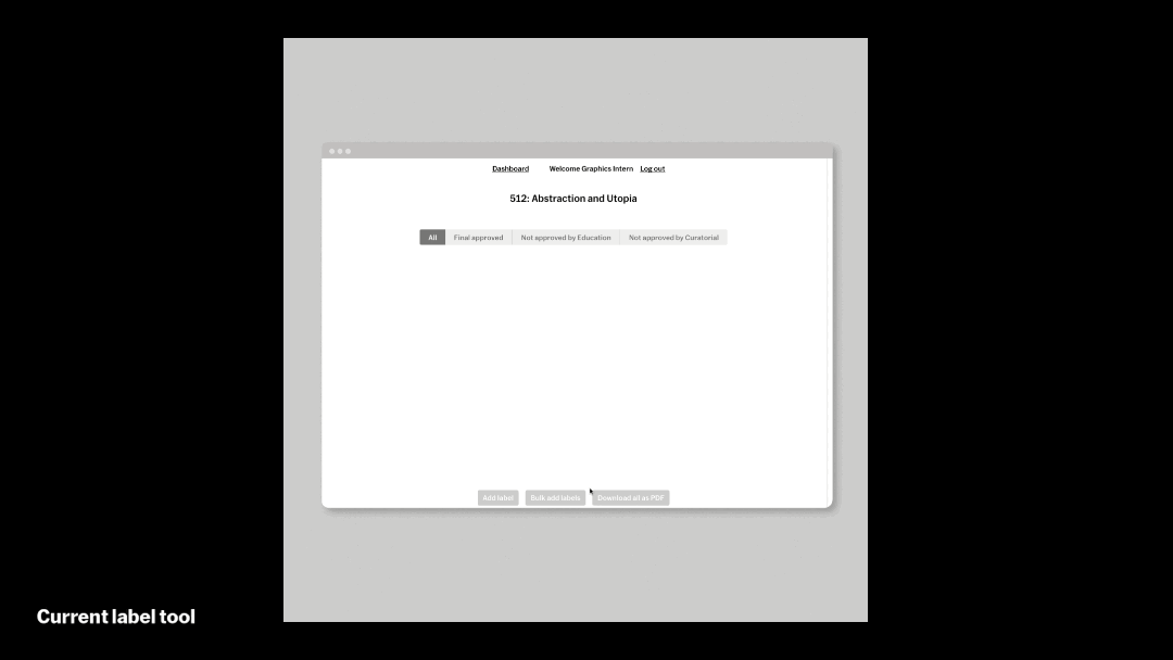
The new label tool’ streamlines and automates that process significantly. It connects directly to MoMA’s collection acquisitions database and generates labels from acquisition numbers. This is the same database used for moma.org – so all materials stay in sync. Editors can log in and see what a label looks like as they write it without asking us for a preview. The system also writes labels back to a separate field in the database for curators to see as new shows are mounted, and curators can flag data errors for collections specialists to correct within the tool as well. When editing is complete, our team reviews everything, sends to an out-of-house production shop, and coordinates with art handling to install the label in the galleries.
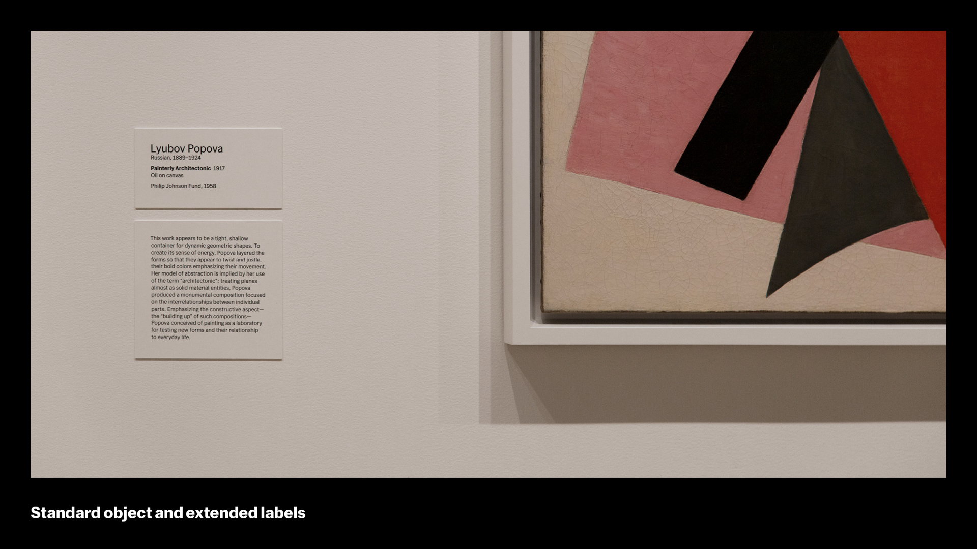
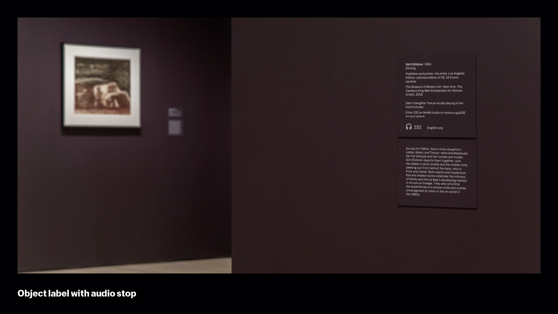
The tool can produce most kinds of labels we use at MoMA. Here is a standard object label with an extended label caption.
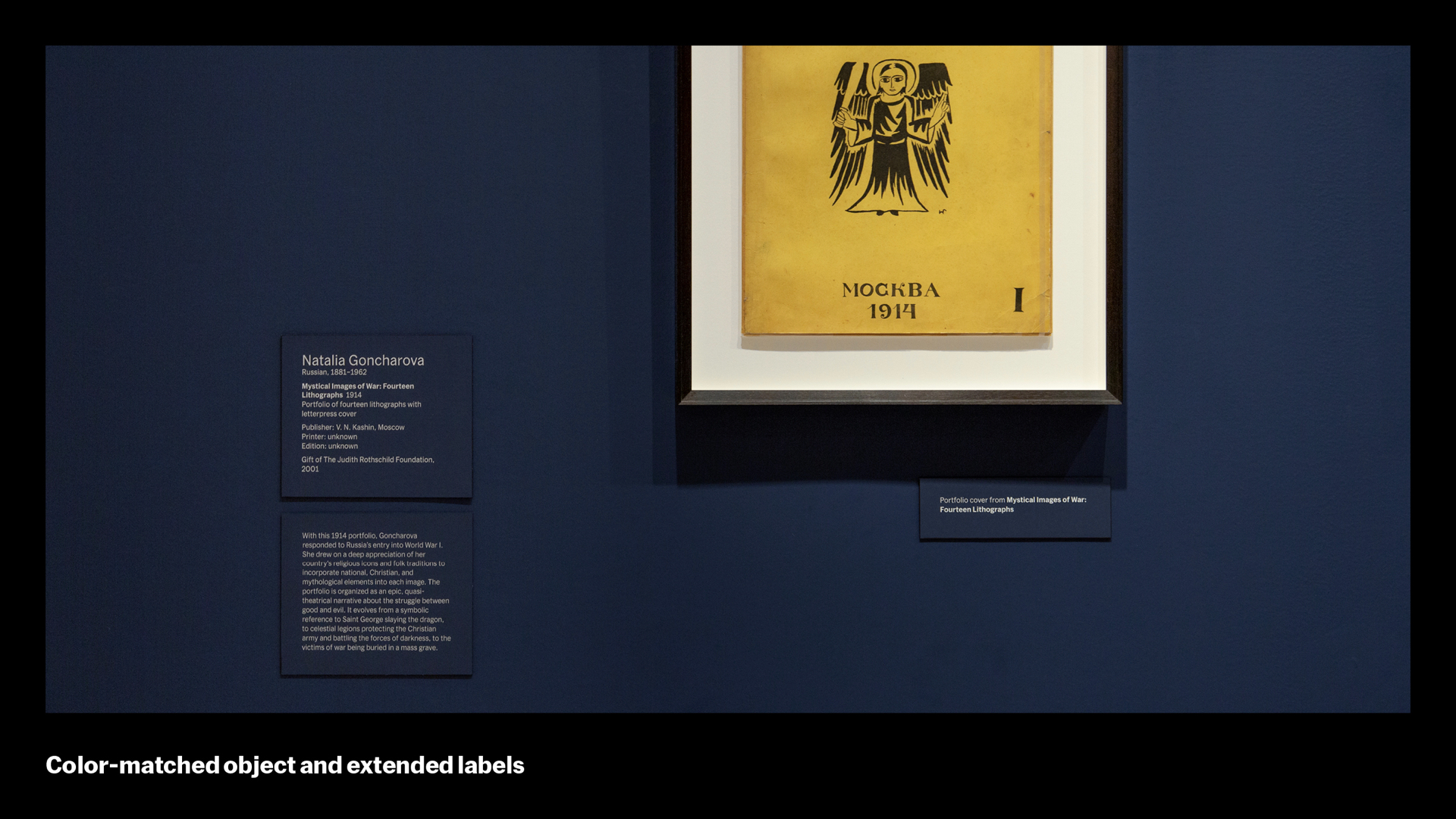
Rooms with special wall colors can have labels made that match those colors. The tool allows us to attach CMYK values to each label for printing.
We can easily add icons for audio labels and other prompts.
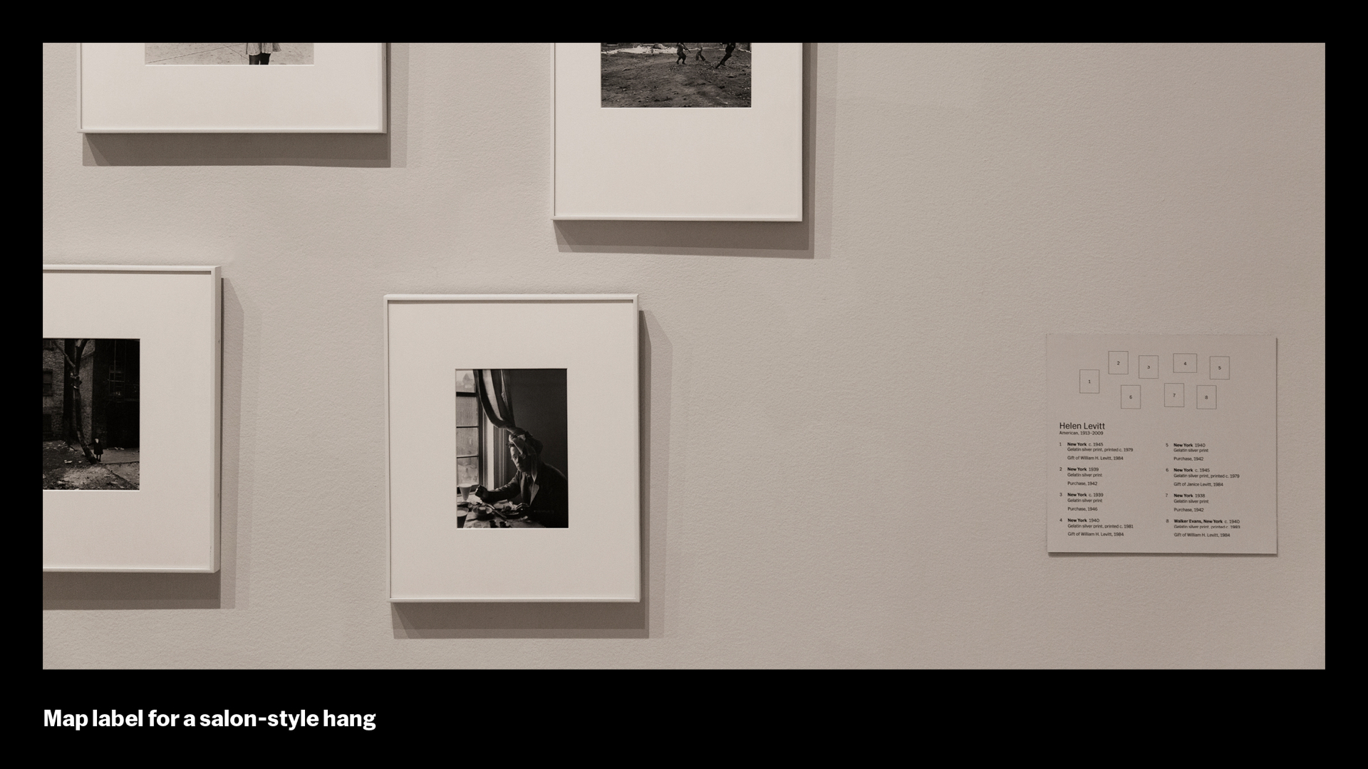
Often we need to create diagrams of the wall layout (“map labels”) and we can add these as an image.
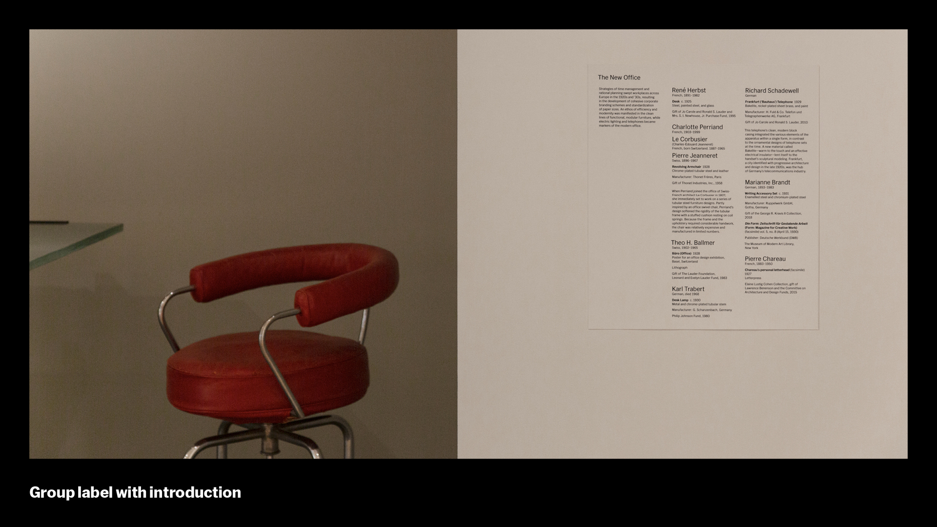
We can also easily merge several labels together to form group labels.
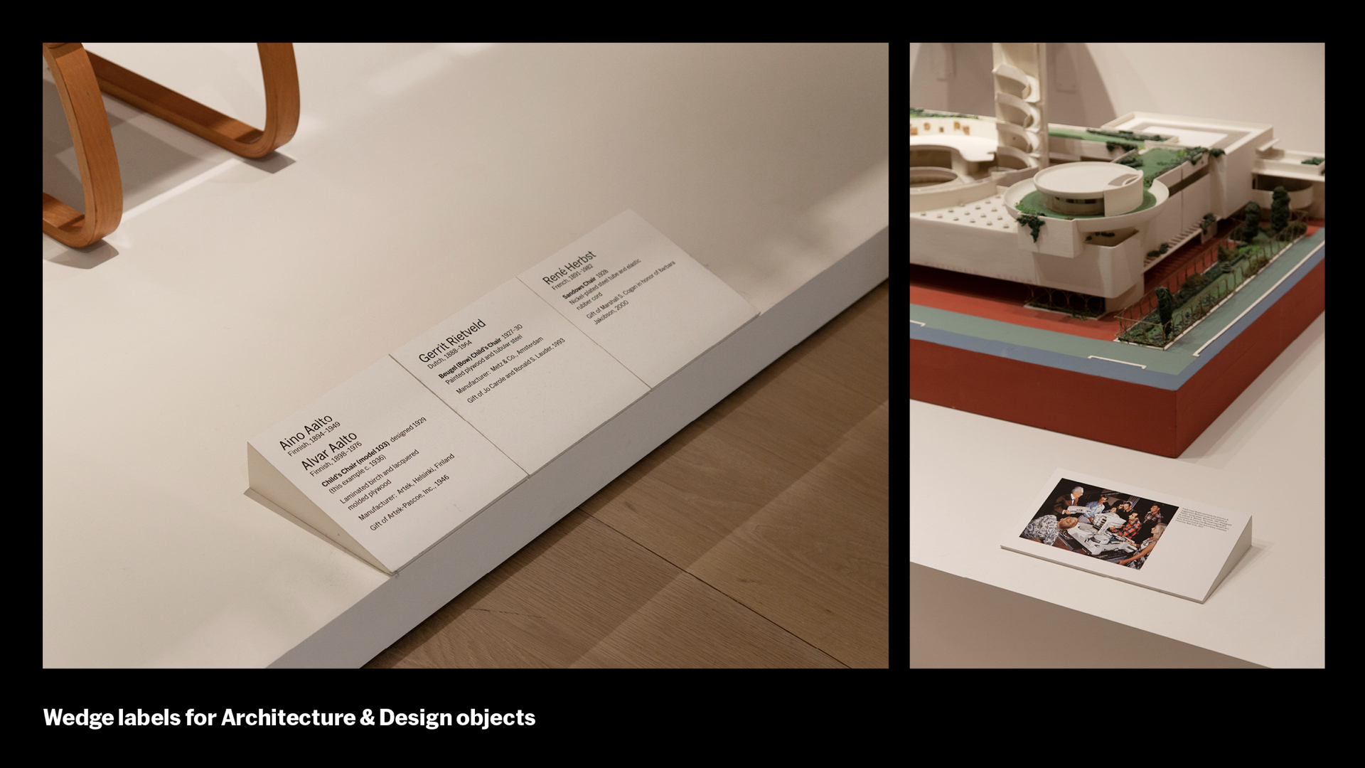
And we can scale enlarged labels that might need to be viewed at further distances from the eye

So: Same label you saw earlier, identical design – but a totally different process. The new label tool helps streamline the process to 3 simple steps: editorial, design, and production. It provides flexibility to scale a small group of designers to a large task in a collaborative way. Over 3,000 labels were generated as part of our October 2019 reopening. A big thanks to all the teams at MoMA and to Systemantics in Germany for helping us create this tool
[Ingrid] Change your attitude – that’s my tip. Change your mindset when you encounter difficulties. The ability to change your attitude from negative to positive is a necessary skill to have as a designer, (and as a person). If you dislike something deeply, change your attitude and see it in a different light. See it as a problem to be solved. When you change your attitude toward a difficult prospect, you can change the outcome.
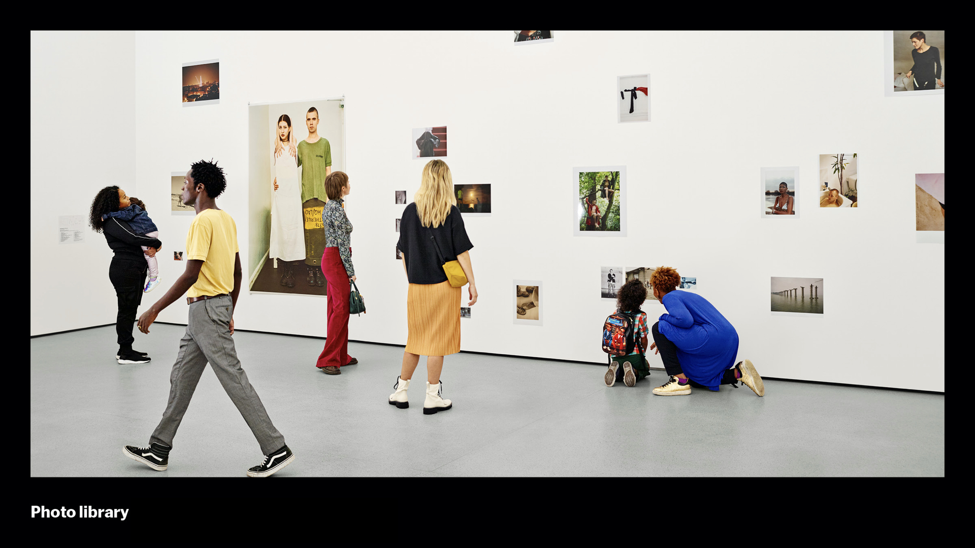
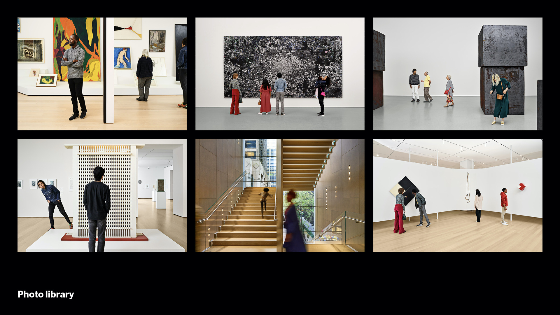
Our first project in this section, you’ll recall, was an abstract visualization of our new building. Our final project in this section is a direct depiction of the lived reality of the building once it was complete. In the final weeks before reopening, we worked with photographer Noah Kalina to create 75 images of experiences around the new campus. These were used in ads, communications, and on moma.org. We call this the new MoMA “photo library.” These images help to simplify the idea of what it’s like to visit the new MoMA, showcasing the rich and diverse tapestry of our members and our public.
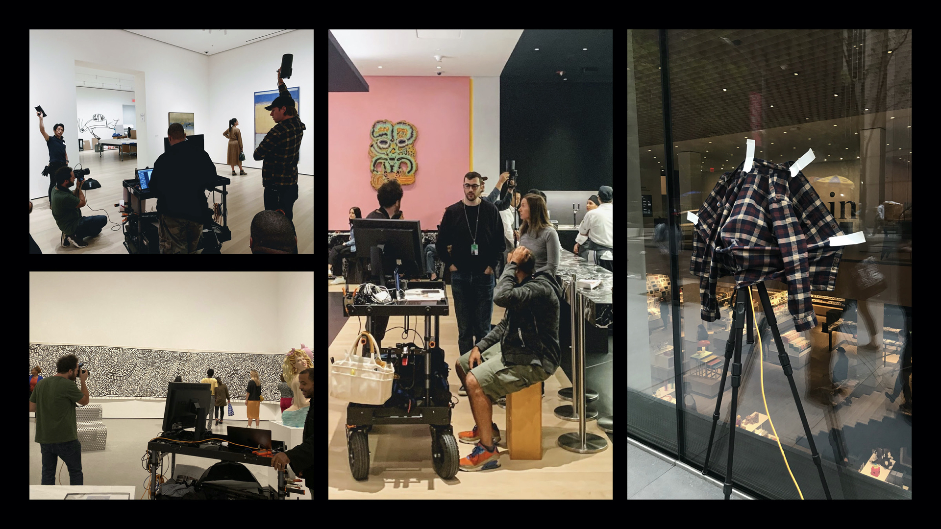
Producing them was anything but simple. We were restricted on things like how much light we could use around precious works of art. How much space we could occupy – you can see this amazing rolling cart. As we went, we had to jury-rig bounces and light filters, and sometimes shoot spaces to look complete that were definitely not there yet.
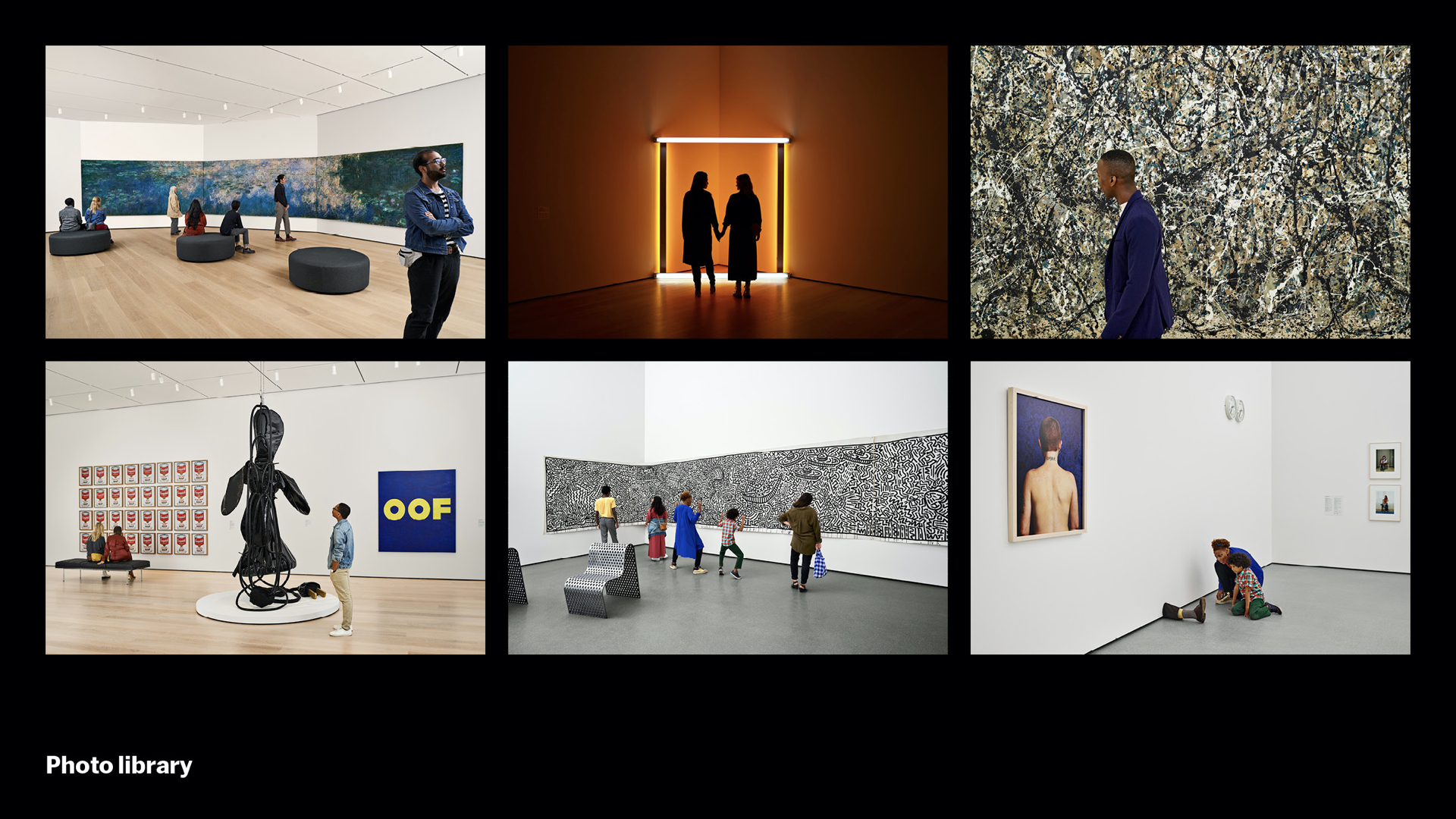
But what we hope emerges is a museum where the people and the art almost merge together into a whole. Where one really needs the other. It’s sometimes fun, sometimes quiet…
…a place of many perspectives, of humor, of discovery…
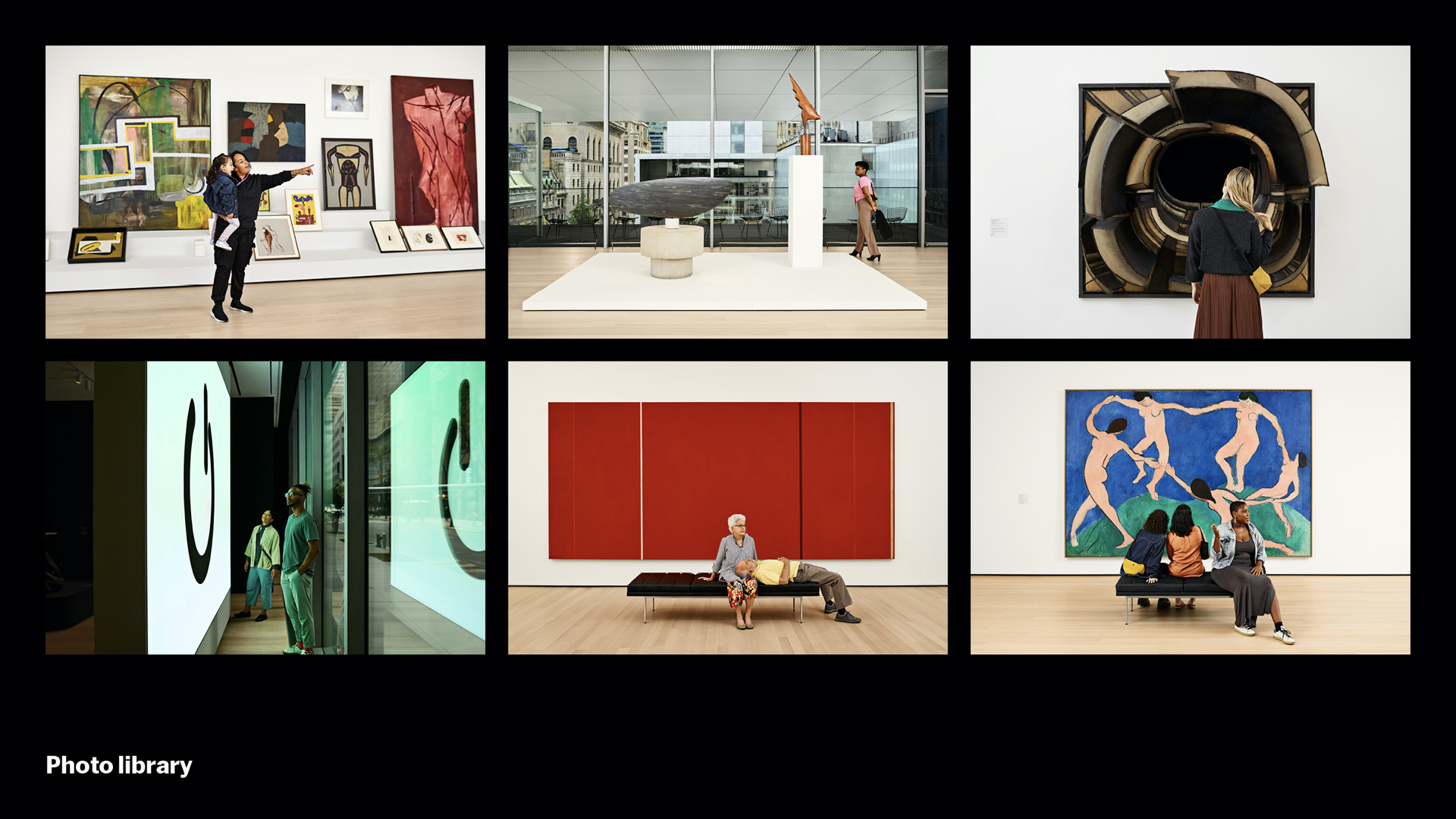
…of wonder, of pause, of vision…
…a place that, after many months of work, we’re happy to say, is finally here.